I know some of us play this game, so I just put it out there…
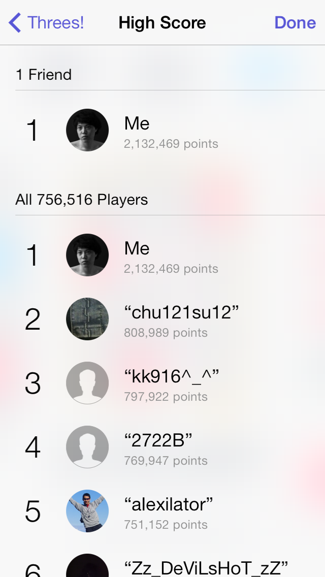
I am now the king of Threes.
:p
I know some of us play this game, so I just put it out there…
I am now the king of Threes.
:p

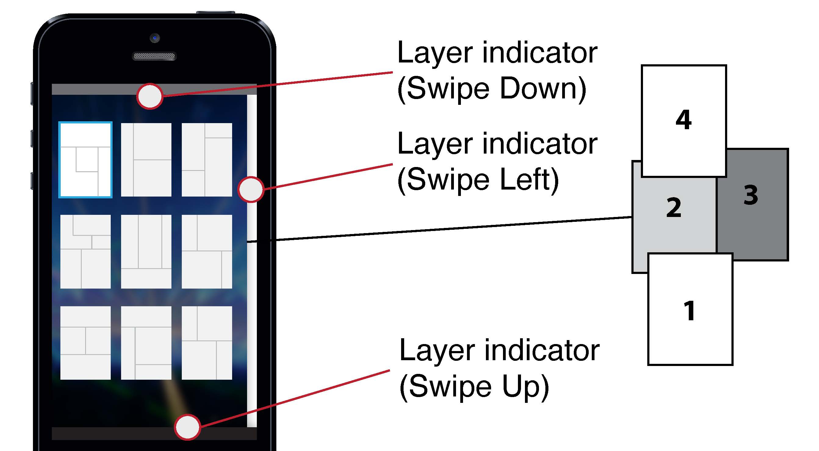


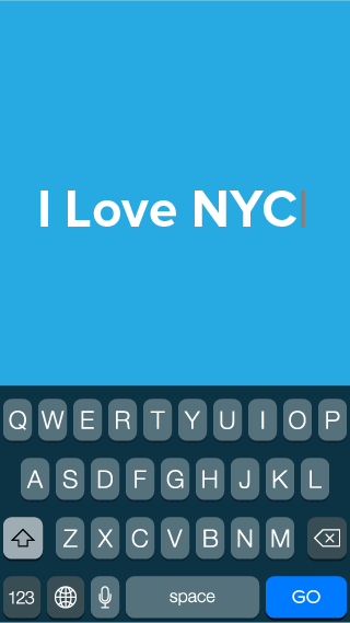
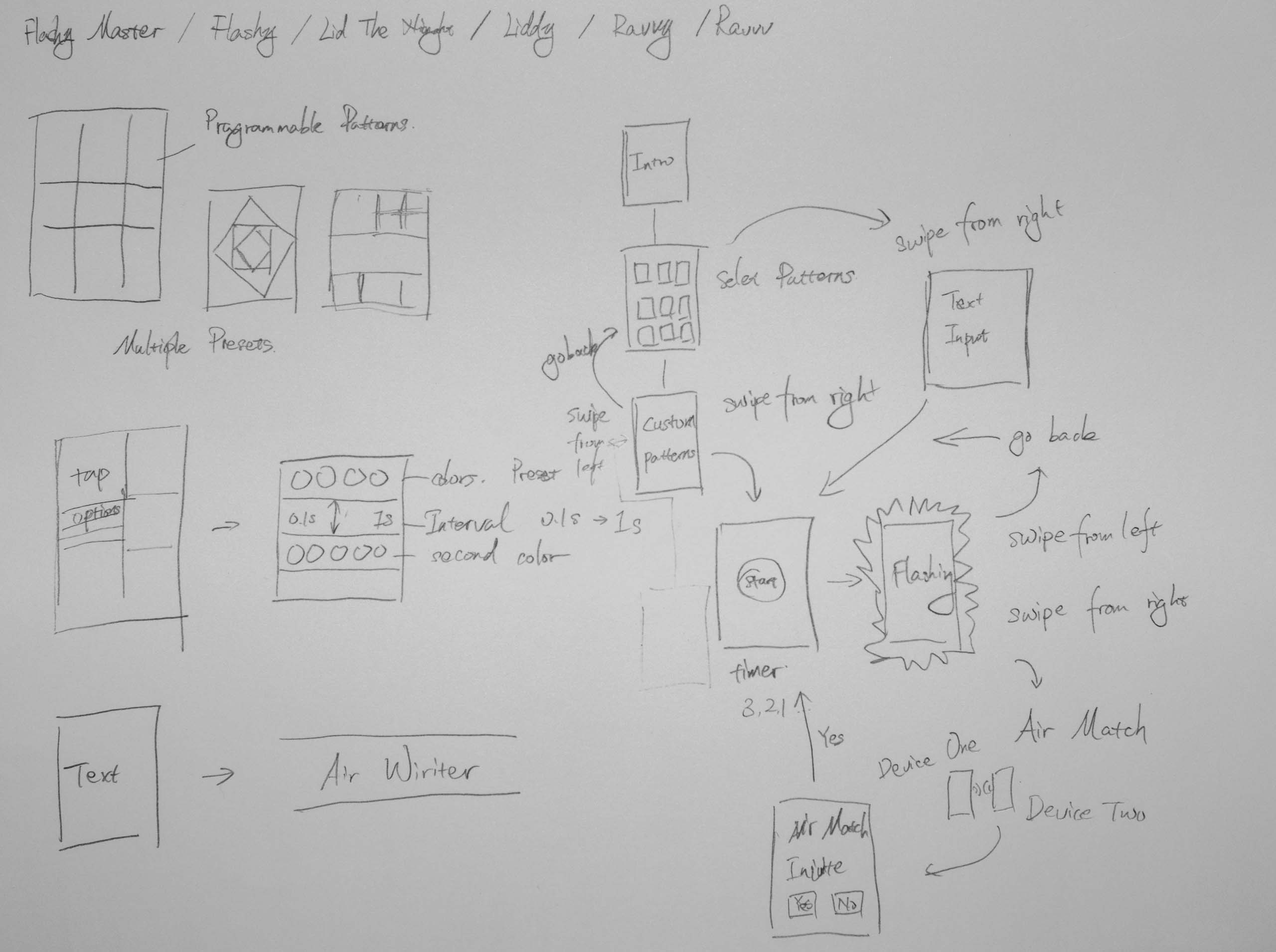
One of the most important note I took from my initial user testing is that people do not read introduction text. Besides a number of users have limited ability in reading English, native English speakers also found reading irritating when operating a mobile application.
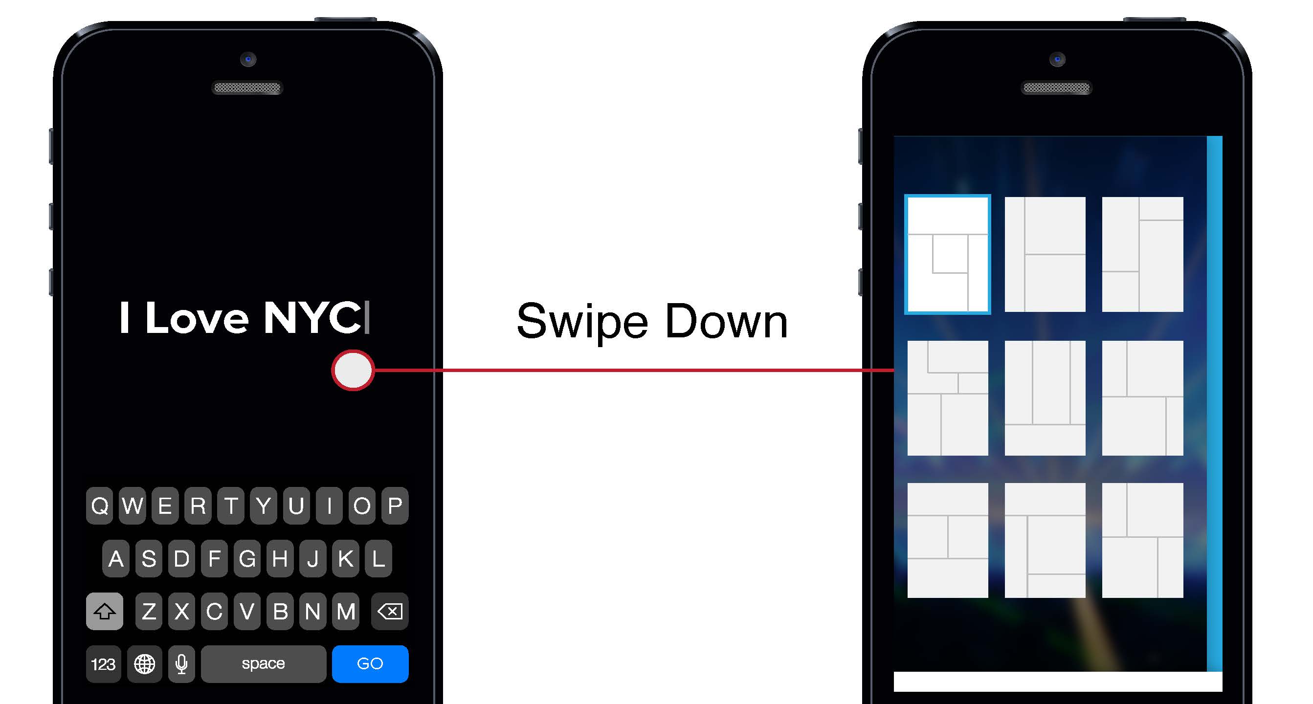
Pin-pointing the challenge, I removed all text instructions and introduction screens. Instead, I experimented with a few different visual hierarchy to encourage swipe gestures. At the end, I have discovered that laying screen on the edge of the screen while using shadow to indicate the depth appears to be the best solution.
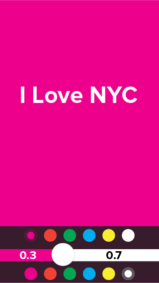
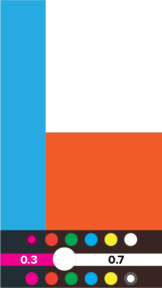
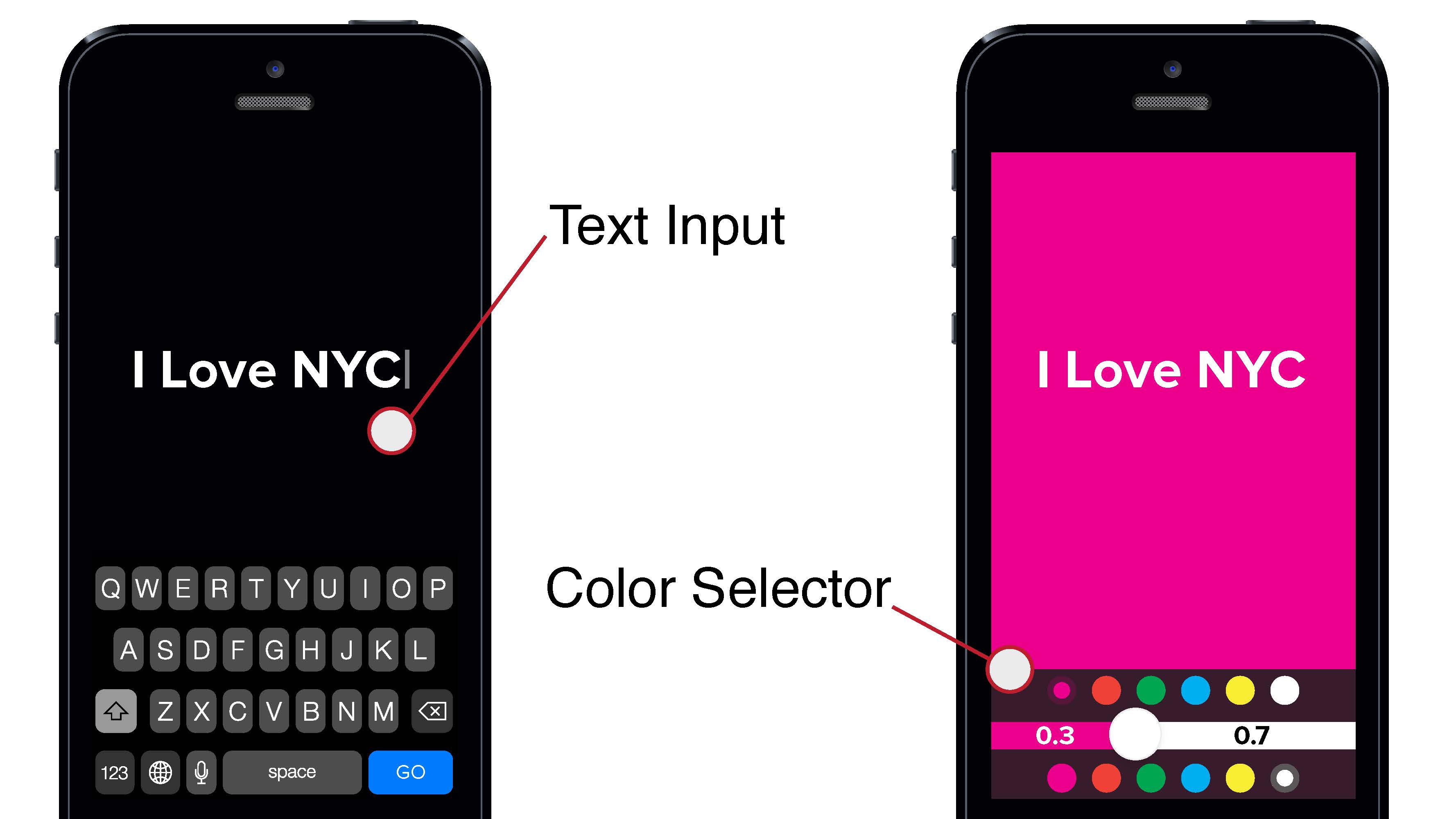
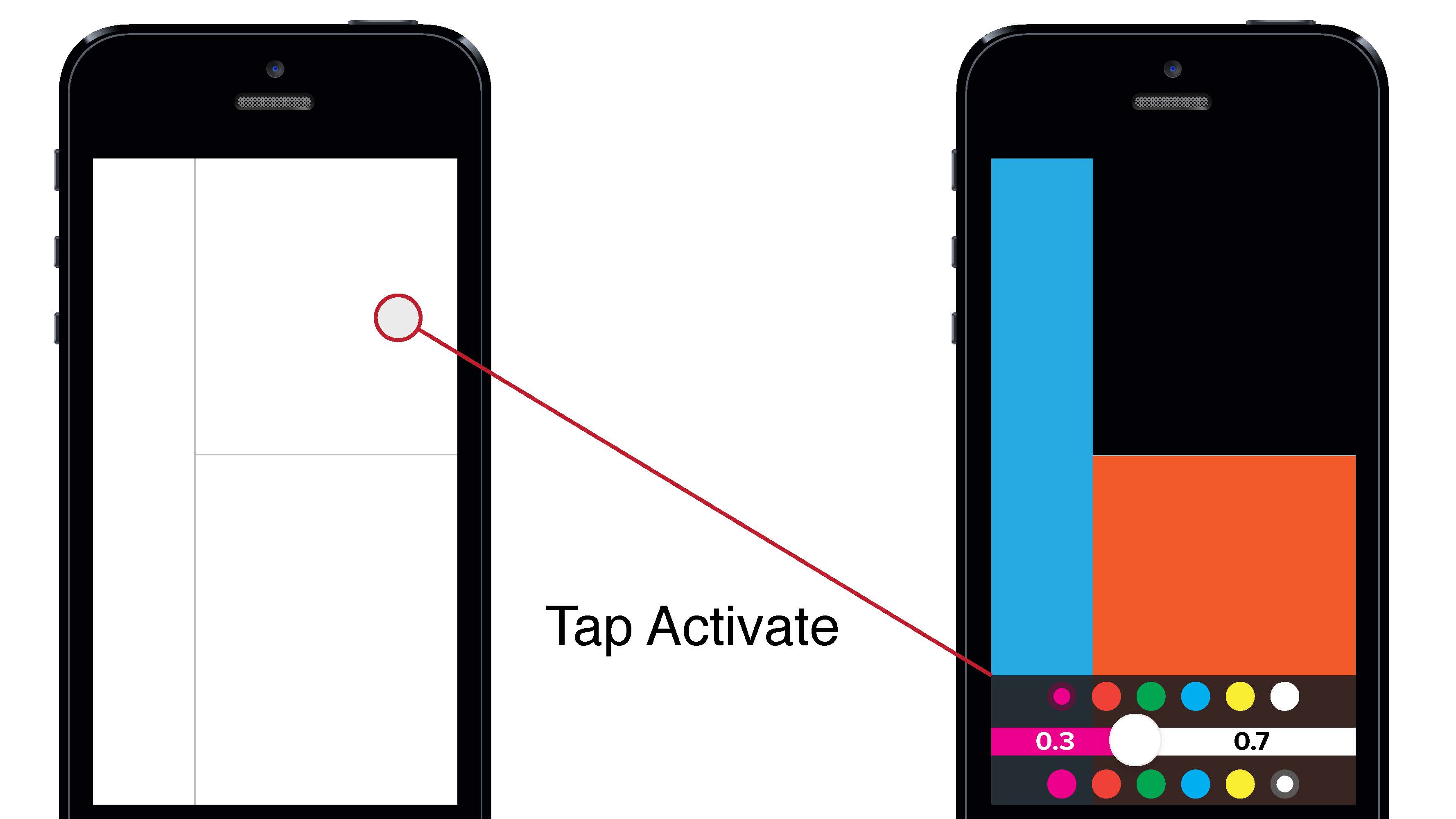
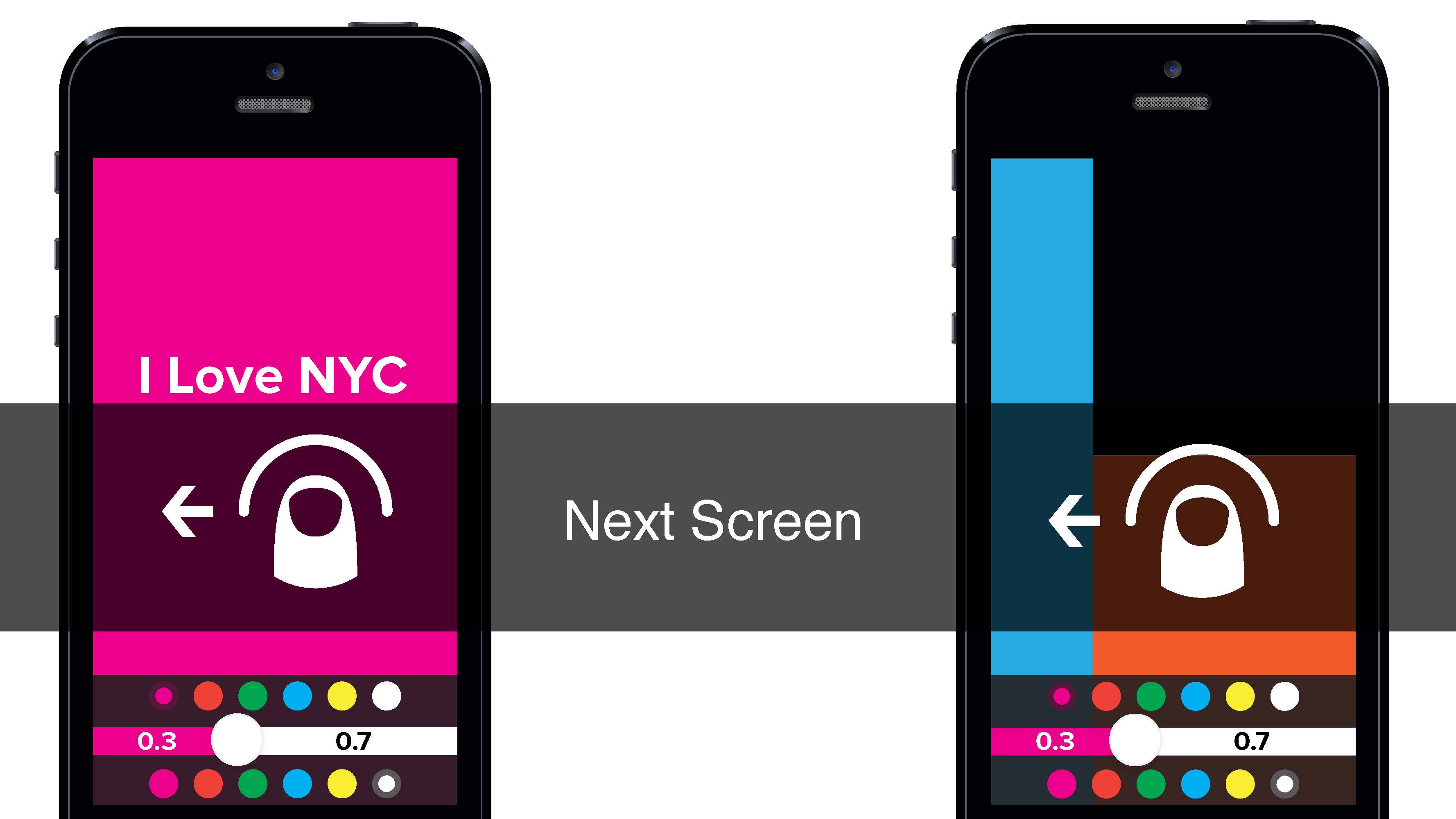
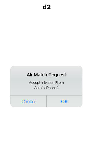
The least confusing part is the color selectors for both air writer and screen flasher. Therefore I have kept the design.

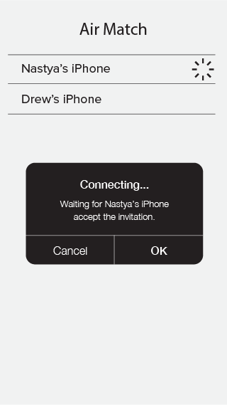
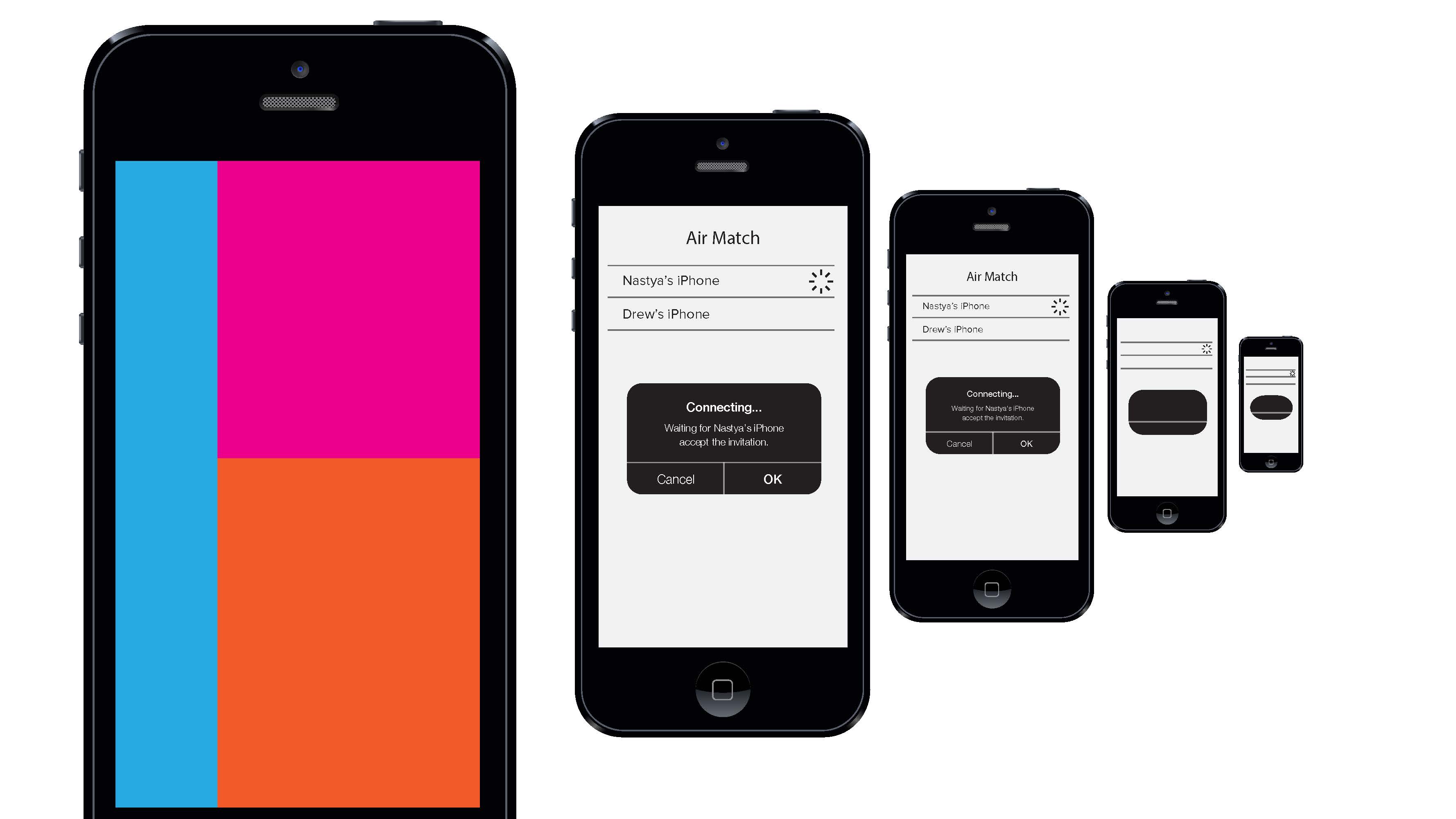
One of the debatable visual element is if the layering design should remain when a user has entered the flashing screen. My decision is to break the consistency due to the fact the flashing screen must take up the entire screen to work properly – especially when using air writer.

Therefore users must be experimental in order to discover ways to go back to the previous screens or entering the air match mode one they have entered the flash screen. The test result shown that they are able to do so based on the fact they have previously educated by the gesture control environment.

For those who doesn’t know, Nasa Trained Monkeys is the company behind the top popular iPhone app “Pomodoro Timer.” (https://itunes.apple.com/us/app/pomodoro-timer-focus-on-your/id703145045?mt=8)
“Timers” is basically a simple version of “Pomodoro Timer,” if you don’t care much for the Pomodora technique but you need the easy-to-use timer feature.
Here is a link to the app: https://itunes.apple.com/us/app/timers-the-multi-timer-app/id744173946?mt=8
Quincy and I made a new game!!! :3
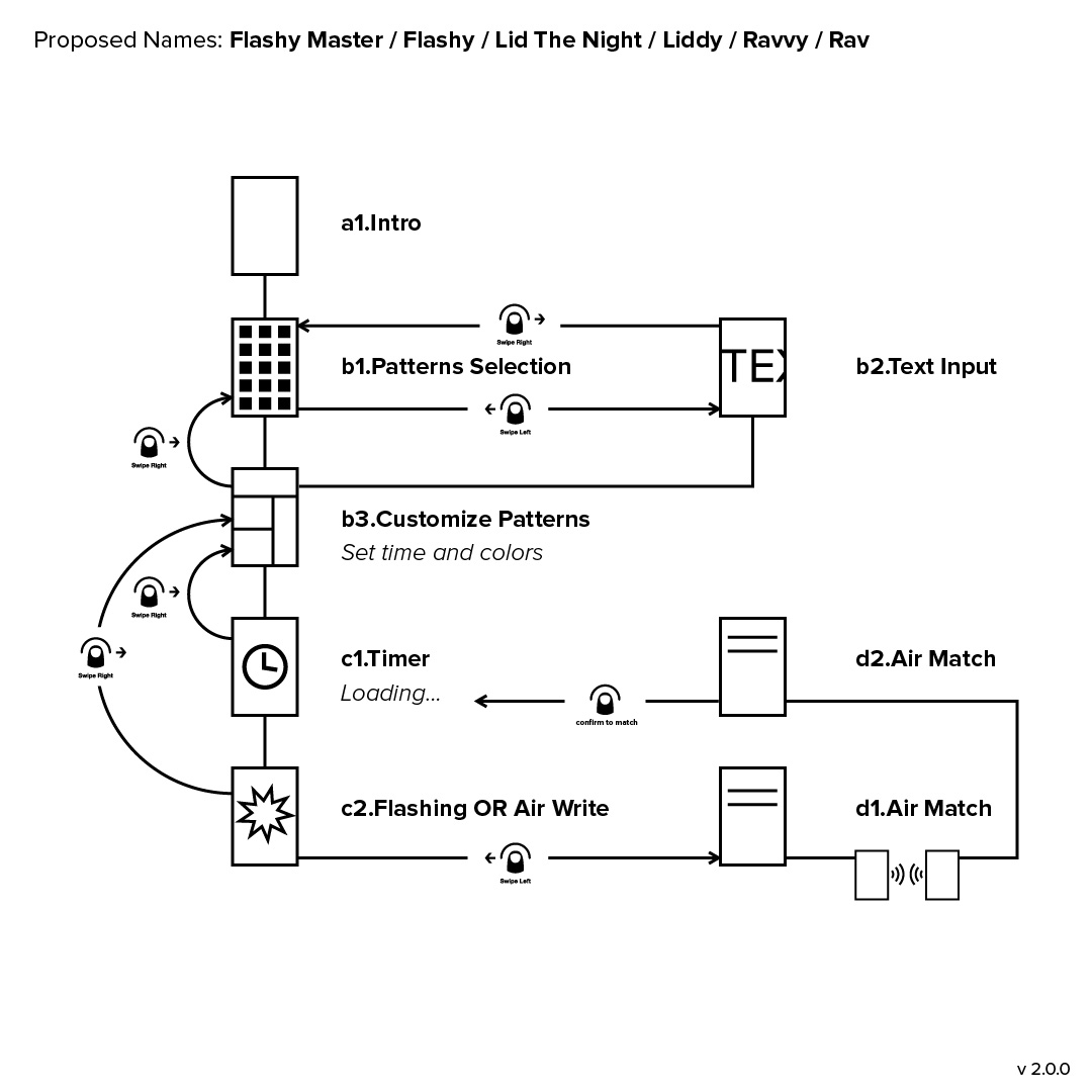
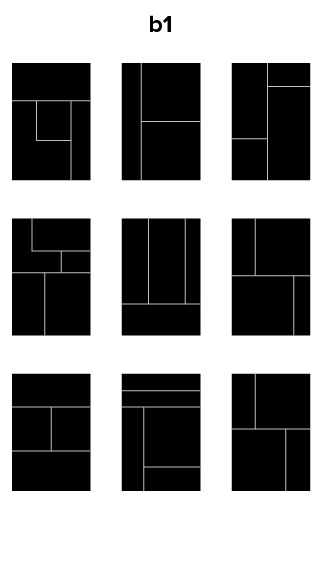
Rave’s wireframe reminds largely the same, considering the last wireframe presented was a third iteration. The fourth iteration has one minor update towards user experience mechanic on color selection screen.
Originally, the color selection screen is designed to have color block selector beneath the color block, adding playful flavor.
The downside is that it might ends up being too small if the color block is set to be very tiny. The new wireframes split the color selector’s action into two:
When the color block in the on the top part of the screen, the selector will slide up similar to the iOS keyboard.
When the color block in on the bottom part of the screen, the entire screen will shift up. The advantage here is that in either of these scenarios the user can see the color change of the block on the screen.
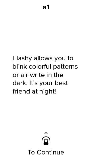
Rave allows the users to blink colorful patterns or air write in the dark.
Draft:
App Map:
Wireframes:


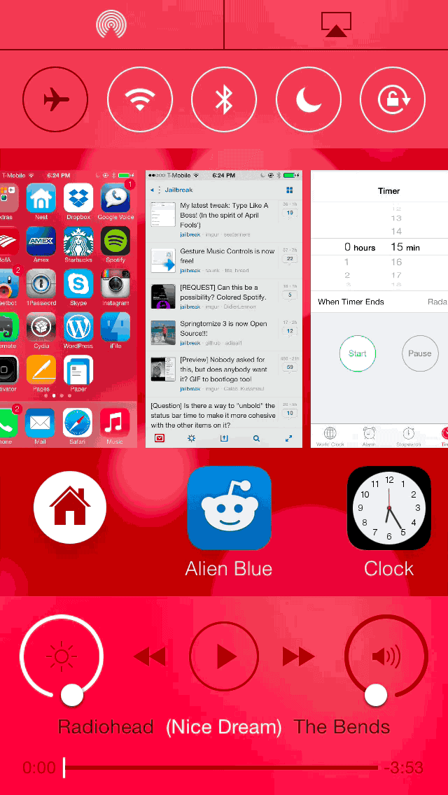
Auxo 2 comes bundled with quite a few options, but there’s one feature that stands head and shoulders above the rest. That feature, is of course, the Quick Switcher. There’s a reason why the Quick Switcher has been showcased in teaser videos. There’s a reason why Sentry calls it his favorite feature in Auxo 2. It’s because the Quick Switcher will change the way you use your iPhone.
The Quick Switcher allows you to switch apps using nothing more than touch gestures. Its precision and ease of use make it a feature that feels second nature after just a few minutes of hands-on time. It’s not a ground breaking idea per-se, but it makes more sense in usage than any app switching tweak that’s been released on Cydia to date.
Using the Quick Switcher
Position you thumb near the bottom left-hand corner of the screen and drag up. You’ll witness the current app zoom out and six app icons appear near the bottom of the screen. In one sweeping motion, drag your finger across the screen towards the right to switch between apps. As you switch apps, the full screen app preview will change to match the app icon appearing below. Release your thumb when you’ve located the app you want to switch to, and voila, you just switched apps in one beautiful sweeping motion.
By default, the Quick Switcher allows you to switch between the last six recently used apps, but there’s an advanced option in the tweak’s preferences to allow switching between all recently used apps.
The wonderful thing about the Quick Switcher is that it features fluid animation, it’s extremely precise, and it’s all accomplished in one sweeping motion that allows you to keep your thumb on the screen. Switching between apps with the Quick Switcher feels natural, not forced. It’s a function that is sure to cure the most striking cases of Home button dependency disease.
The next most notable feature to be found in Auxo 2 is Multi-Center. Multi-Center has done the obvious thing and combined Control Center together with the App Switcher. Multi-Center eschews the barren App Switcher view found in stock iOS 7 for a feature-packed view that features toggles, the App Switcher, and media controls.

Multi-Center is not the standout feature that the Quick Switcher is, but I believe most will find it to be a useful, if not an unheralded part of the package. Multi-Center allows you to retain all of the functionality of the App Switcher, but throws in additional features. You can use swipe-down gestures to select apps in one fluid animation, and access a kill-all-apps option when swiping up on the Home screen card. Auxo 2 is even smart enough not to kill apps that currently are playing music.
Inside Multi-Center you’ll find all of the familiar assets of Control Center. There are media controls for playing music, brightness and volume controls, Quick Launch shortcuts, toggles for Airplane mode and Bluetooth, and the AirPlay and AirDrop controls.
It was no small feat to squeeze everything into the Multi-Center view, so a few different measures were taken for crowd control. First of all, the Control Center elements are split up, with some assets, like toggles and AirDrop/AirPlay controls appearing at the top of the screen, and other assets, like media controls and Quick Launch shortcuts, appearing at the bottom of the screen.
iTranslate Voice redesigned itself and came back with a faster and more responsive interface. Although pretty much still the same Google Translate APIs behind the scene, the app feels faster and easier to use.

And the Air Translate is a completely new feature based on Apple’s Air Server APIs.