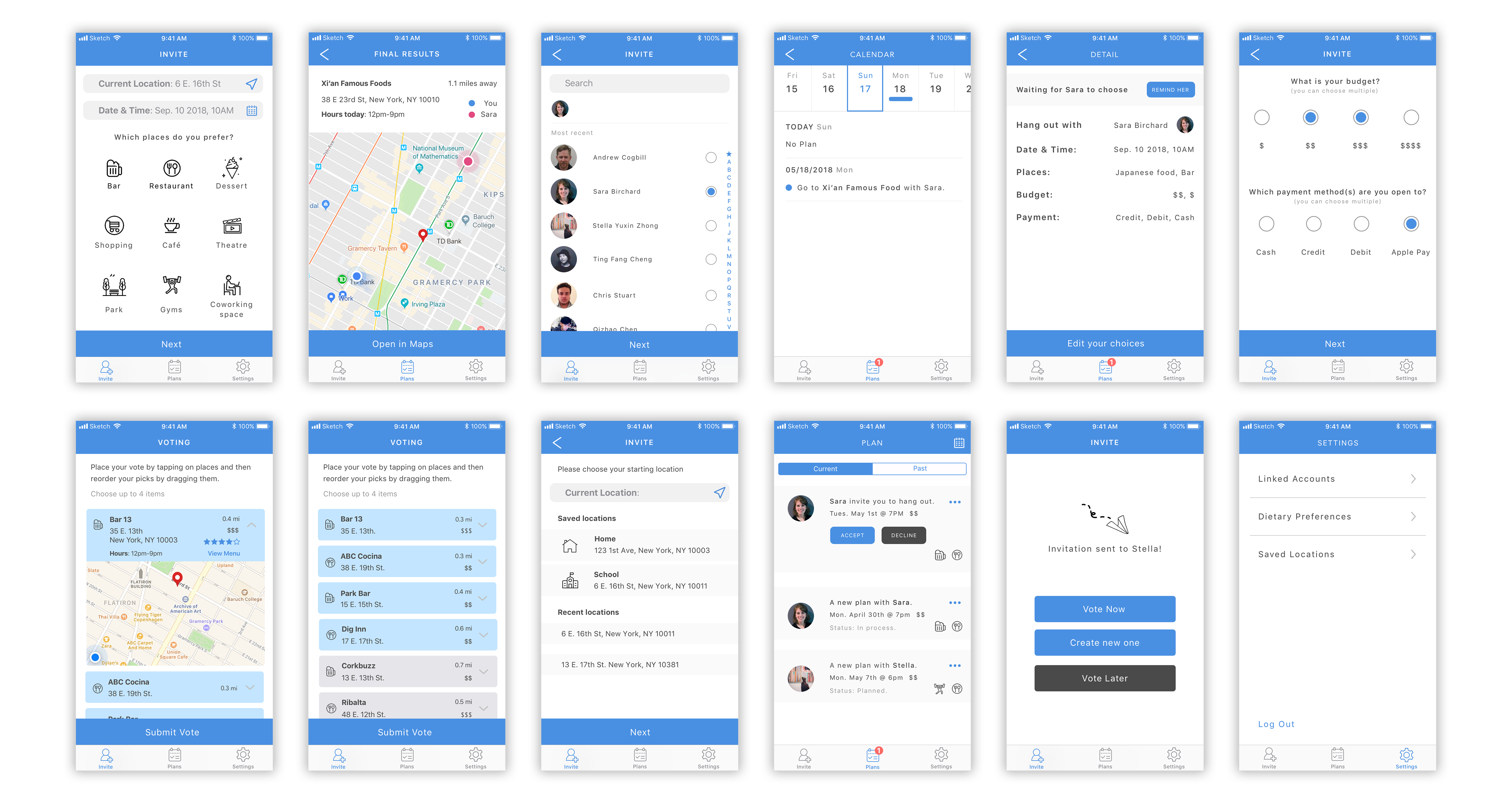
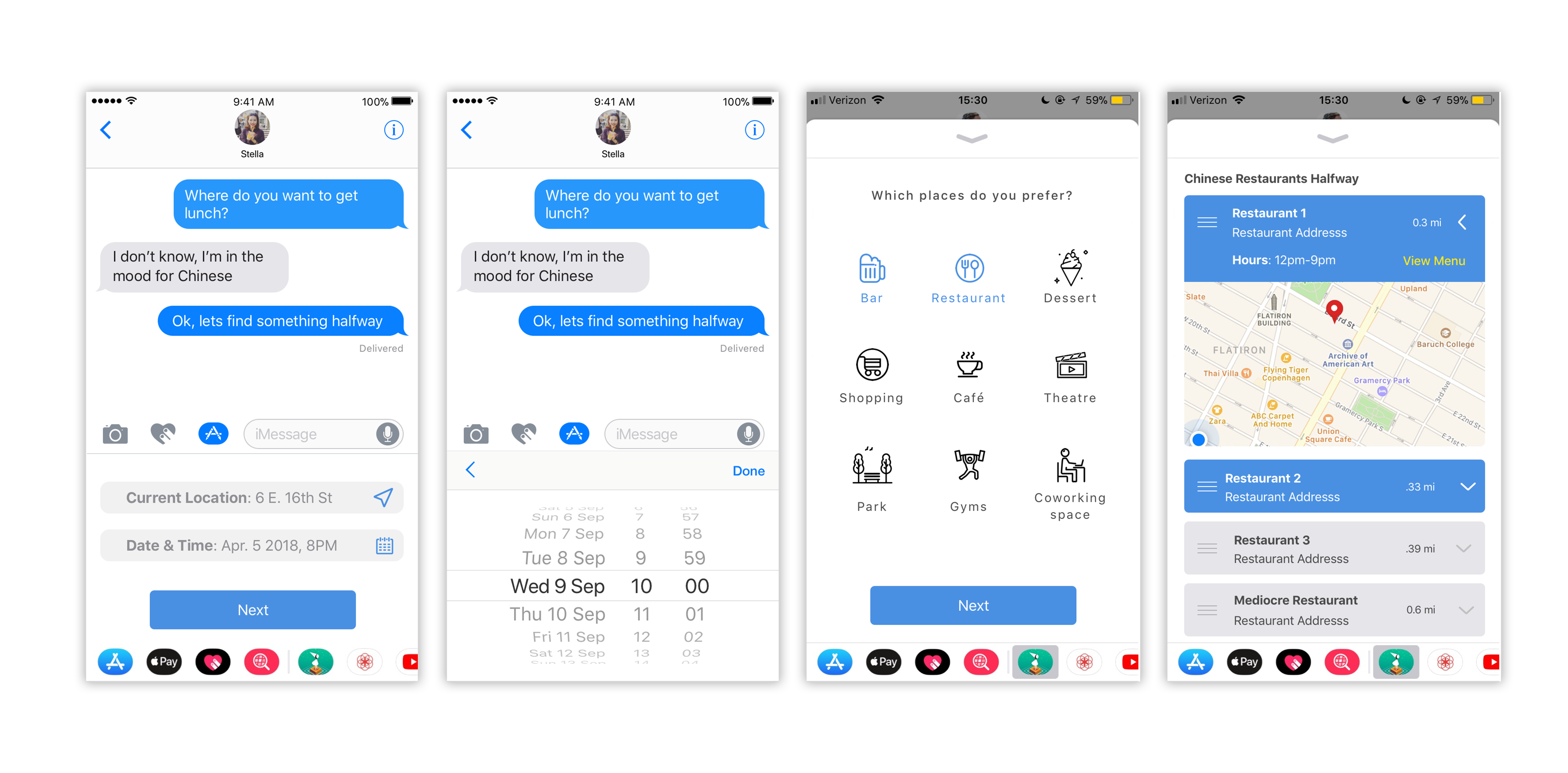
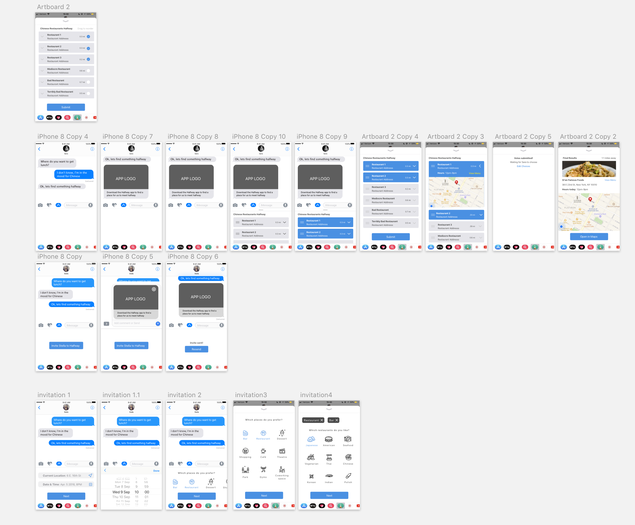
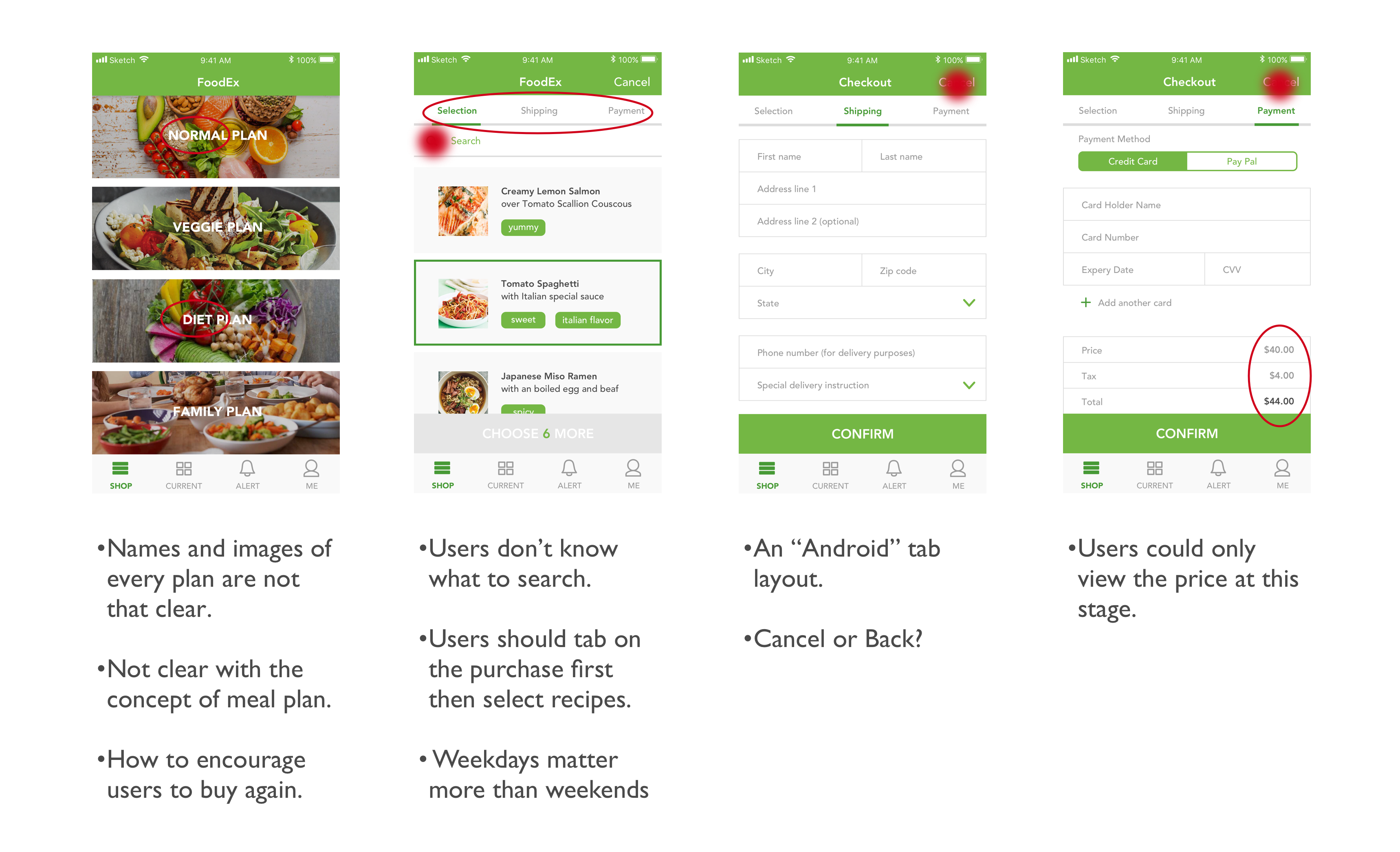
wk15_Sara&Stella

For our final version:

  1. We unified the color of the tabs for different categories to avoid misunderstandings.
  2. We added “vote later” and “create new one” buttons on the view after users finish sending out invitations.
  3. We added a overview view before users send out their invitations. They could also leave a message for their friends.
  4. We changed the texts shown on the “Plans” view to make it more attractive.
  5. We added a calendar view in the “Plans” tab.
  6. We added a detail view for each plan in the “Plans” tab.

Final Digital Prototype.

Final Presentation

#ThursdayApp_Memorado_Stella

Memorado is a leading brain training platform with the mission to improve the mental well-being of everyone. It could improve our memory, concentration, reaction, logic and mathematical skills with 24 fun and challenging mind games over 720 levels. Users’ statistical progress would also be tracked during the process to record how they gradually get into a sharper mind.

There are three main features in Memorado including Games, Mentors and Audio. Users could select whatever they want to either train their mindfulness and memory or just kill the time.

From my perspective, I love the whole concept of the app to use really simple games or training sessions to improve people’s mental well-being. I also feel that it could be a really good choice for people to spend their fragmented time. As people could set up time by themselves for each session, users are given enough freedom to decide how to use the app based on their own preferences.

wk11_Sara & Stella

Halfway

From last week’s feedback, we noticed that the iOS system actually couldn’t read users’ messages. Therefore, we decided to create an app that allows 2 or more people find a place to meet up at a midpoint between them based on their information shared on the Facebook. It picks up personal preferences from your Facebook account as well as your locations to figure out what kind of place you want to meet up.

Insights from user test on 04/05

1.  Users care about the price of each place so it is important to show the price range in a conspicuous way. ——  “$”,”$$” and “$$$” to indicate low to high price.

2. What if users want to revote —— an “Edit Choices” button after they submit their votes.

3. Users feel confused about the dragging icons. “They look like a burger menu” —— delete the dragging icons and add a text instead.

4. How users know their friends have already made decisions—— Notifications from the app when both decide.

5. How to check the chosen place is at a midpoint——both people’s location will be shown on the map.

6. Users want to know more details about the places.

Iterated App Map

Iterated Wireframe


wk09_Stella

2-3 user insights that I learned from paper prototyping

  • Reconsider the category for the menu tab.

From the critique as well as the user test, I found out that the initial category on the menu tab is not that familiar to users. Hence I referred to some shopping applications on Apple TV and redesign the menu tab. I added a logo on the left corner and an icon for shopping cart on the right corner, which correspond to users’ habits more.

  • Redesign the layout in the “CURRENT” view.

From the user test, I figured out the vertical layout for current recipes was not that efficient, which didn’t keep consistency from the layout of “SHOP” view as well. Hence, I changed it to the grid layout which is more clear and informative.

  • Rethink user experience in the “SHOPPING CART” view.

Initially I only designed a confirm button in the “SHOPPING CART” view. However, I found that users may need more actions such as reviewing the recipe here. Accordingly, I added more features in this view. For instance, users could set their start and end date for the plan, and review the recipes they select before the confirmation now.

Final Visual Design

wk06_Stella

What I’ve learned from the Apple TV Human Interface Guidelines

  1. Consider the user’s distance from the screen. Design interface elements appropriately, so they’re legible, easy to find, and aren’t overwhelmed by background images or adjacent items. I feel that it may be one of the biggest differences between designing an iPhone APP and an Apple TV APP. Users’s distance from the screen should definitely be taken into designers’ consideration.
  2. Don’t display a cursor. People expect to navigate fixed numbers of items by changing focus, not by trying to drag a tiny cursor around a huge screen.
  3. No need to show the “BACK” button.
  4. Design for different focusable item states. On Apple TV, focusable items can have up to five different states, each of which should appear visually distinct.


tvOS App Map

tvOS Wireframe

wk05_Stella

User insights:

  1. The processing bar on the “SHOP” view is clear enough so there is no need to have an extra view to show the details. Also, “remained” should be “remain”.
  2. The icon to add recipes in the shopping cart does not make much sense. An “add” icon may work.
  3. The color of the shopping cart checking button should be consistent.
  4. The first page of “SHOP” is not that efficient. More useful information should be shown on that view.

Final prototype

Documentation

#TheThursdayApp

inkHunter is an AR mobile app for people to virtually “try on” various tattoos. By drawing a cross on the skin you want to have a tattoo on, you could easily preview the tattoo via the inkHunter.

Basically it is a simple app with this only feature, but I feel that it is great example to combine the AR technology with the mobile app in the real life. Users could select their favorite tattoos in the Gallery and tap on “Try” to try whatever tattoos they like.

wk04_Stella

Among all the feedback, what tangled me most was the process of how users select and buy a weekly plan in the app. Initially, I just considered it as a normal buying process, however, during the user tests, I noticed that there are many other factors which should be taken in my consideration. For instance, how to encourage people to buy again? Or how to differentiate various plans with each other? Therefore, I did a redesign of Order-A-Plan.

digital prototype

wk03_Stella

User insights I learned from my second paper prototyping

  1. It’s important to keep how users would interact with the app in mind, which means a simple and clear user task flow is vital. Specifically, how people get into a specific view, and how people could get into another view afterwards should be completely logical. For example, users would care about how they could go to the home screen, and where a “back” button would lead them to. They all require us designers’ consideration.
  2. Even a single word on the screen matters. Though users are accustomed to viewing icons and images in a view first, it is still significant to care about every word and text in the app. For example, “alert”, “notice” and “notification” are quite different from each other. Users may also feel confused about “Skip” which is used for users who need to eat outside on a specific day. However, in my user testing, this feature, or maybe this word is really confusing.

Visual Design

Digital Prototype