Here’s the final presentation for our self-quantifying app.
Quantifee Me Final Presentation
Cheers,
M/J
Here’s the final presentation for our self-quantifying app.
Quantifee Me Final Presentation
Cheers,
M/J


Stumbled upon (literally) this infographic that I think is just gold when designing for mobile, at least until you get the concepts etched into your mind.

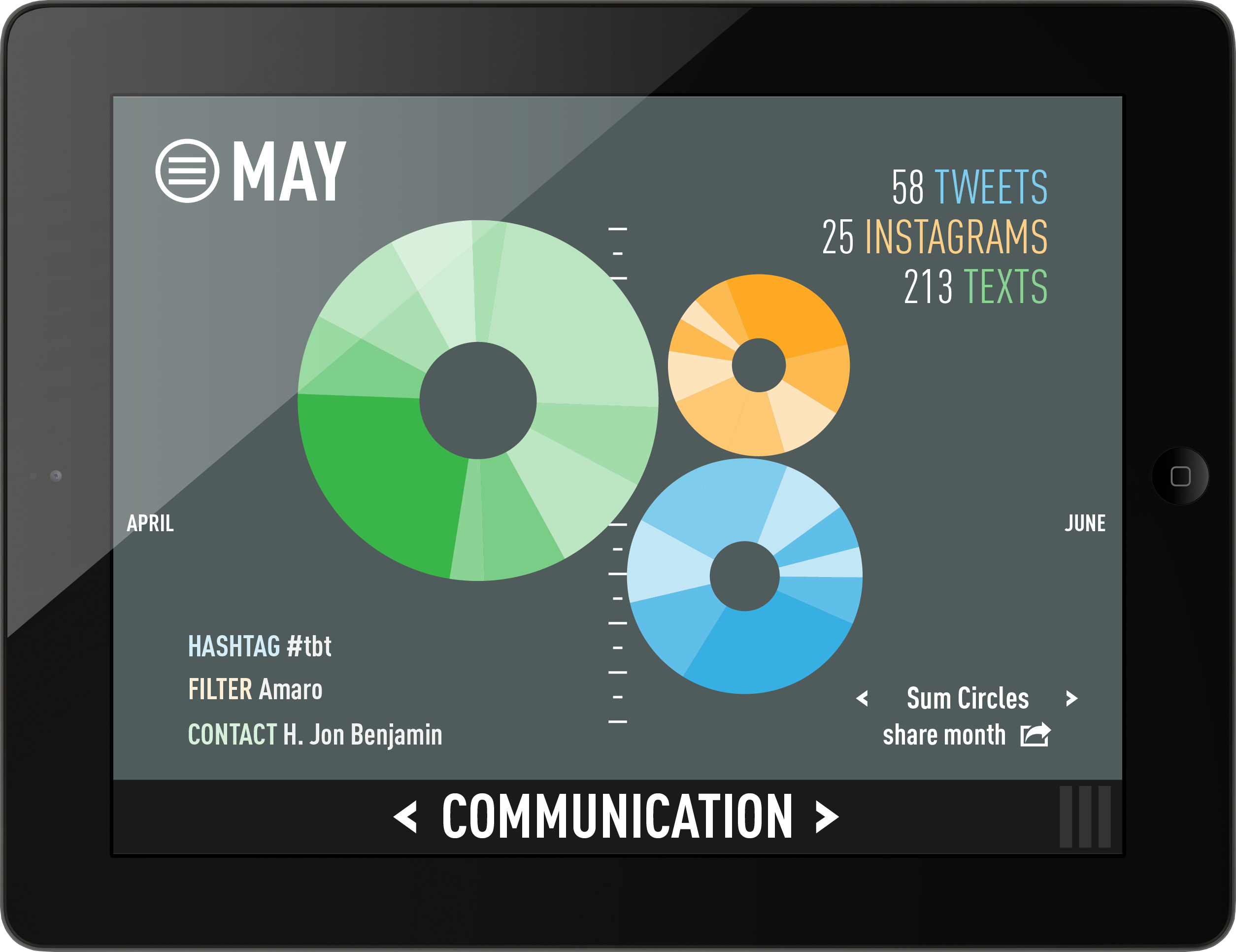
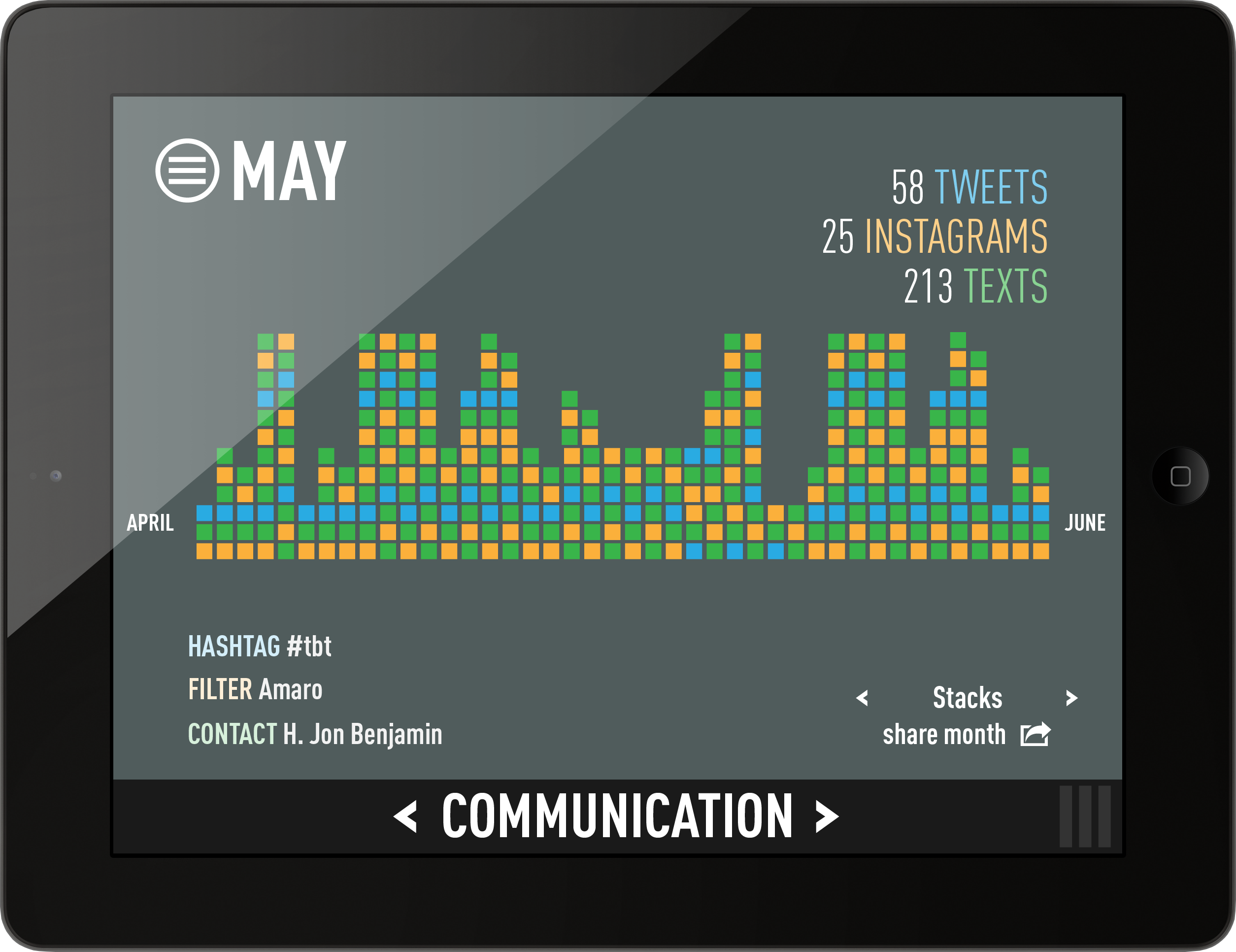
We are both interested in making an app that has no real purpose. We want it to look cool, and to tap in to as much passive data collection as possible because we both are quantified selves. So we are taking our inspiration from Nicholas Feltron and his annual reports.

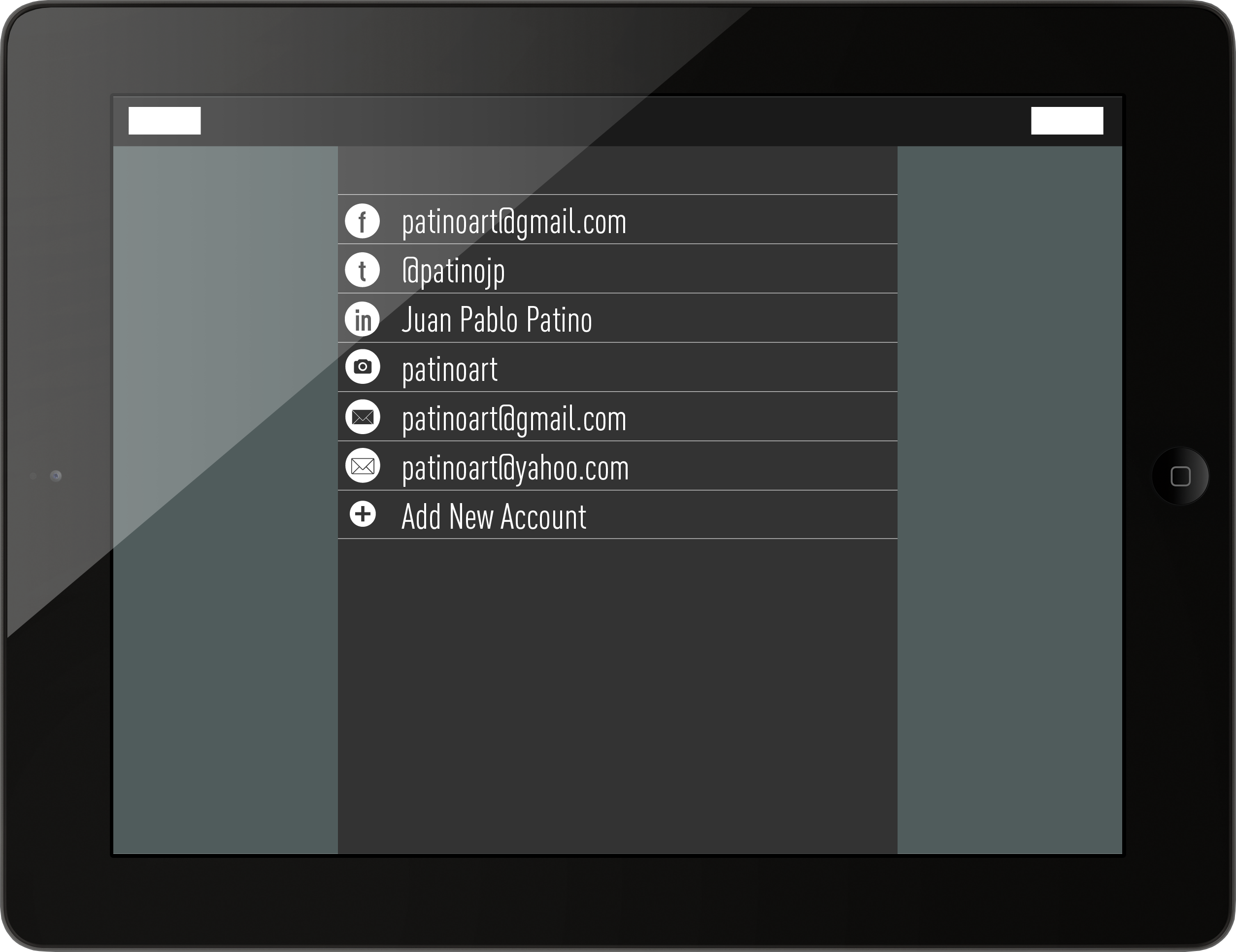
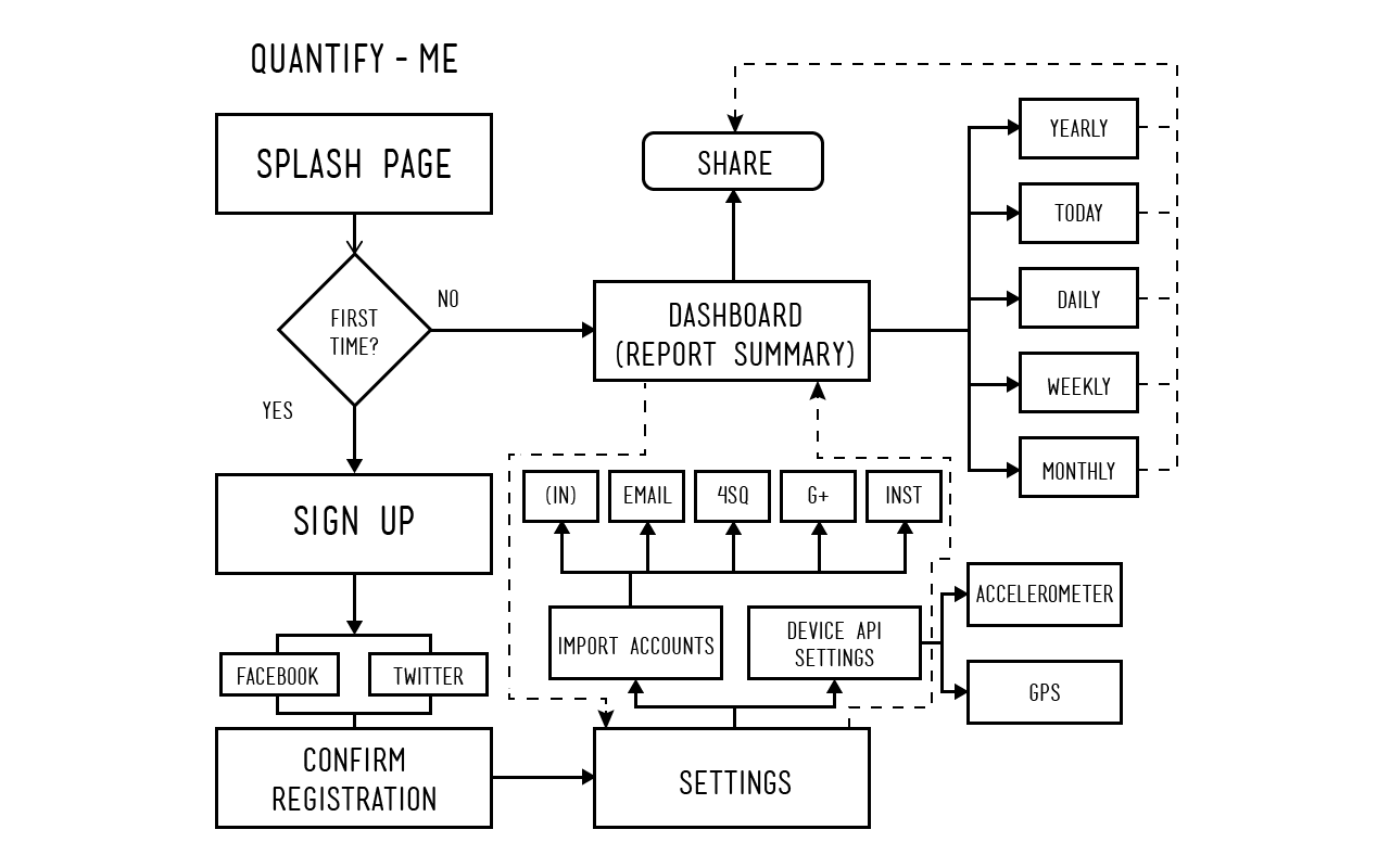
So the basic idea is that users will download an app, and then input information on their various social media outlets (FB, Twitter, Instagram, etc.) and then let the phone start grabbing all that information and begin a data visualization on the website that will show that info in a visually striking way.
bon appétit – PAINT YOUR PLATE
7 Day Color Diet – one primary color each day of the week
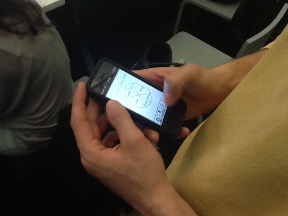
The Color Wheel Diet – What color is your Diet?
The 5 Color Diet – “Color Way” campaign by Produce for Batter Health Foundation
The Rainbow Diet Meal Plan – mix it all up into your meals
Color Collection – http://www.twostatesaway.com/development/color-collection
The Diet of Colors – website down
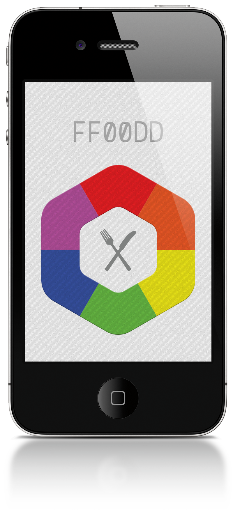
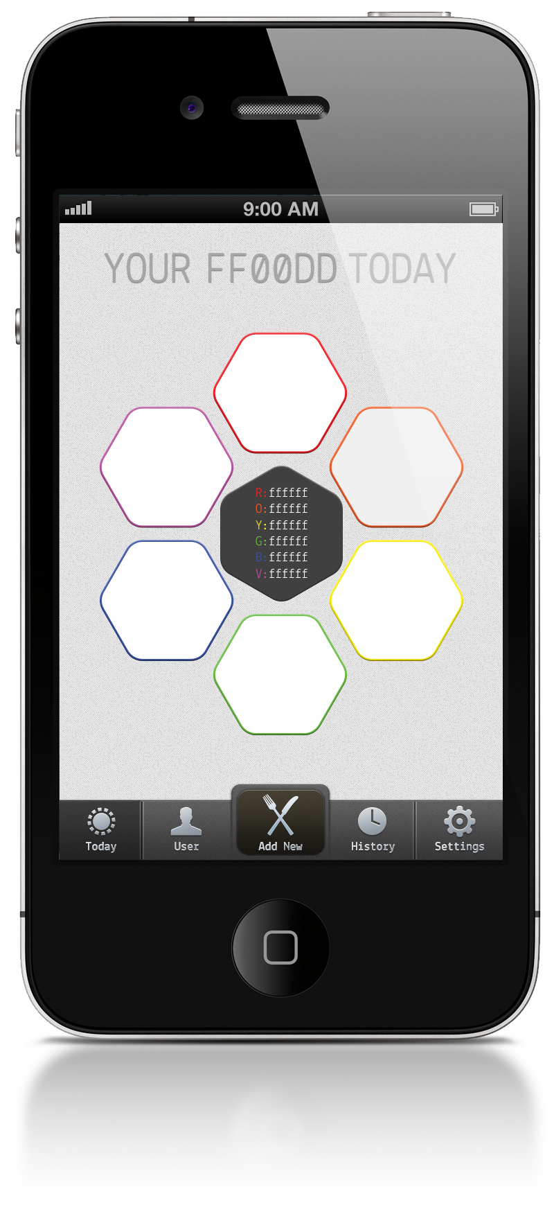
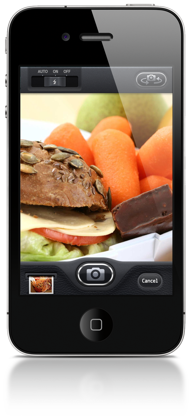
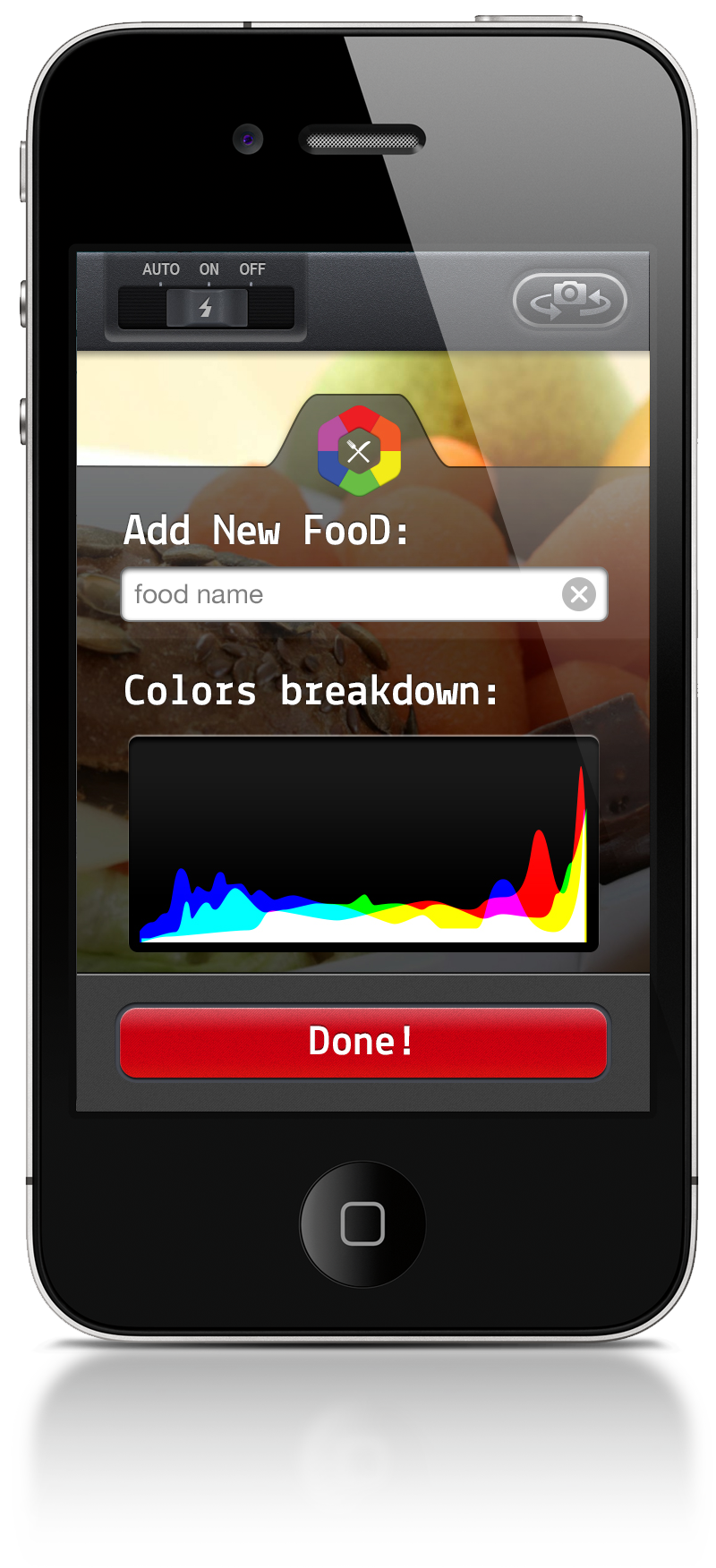
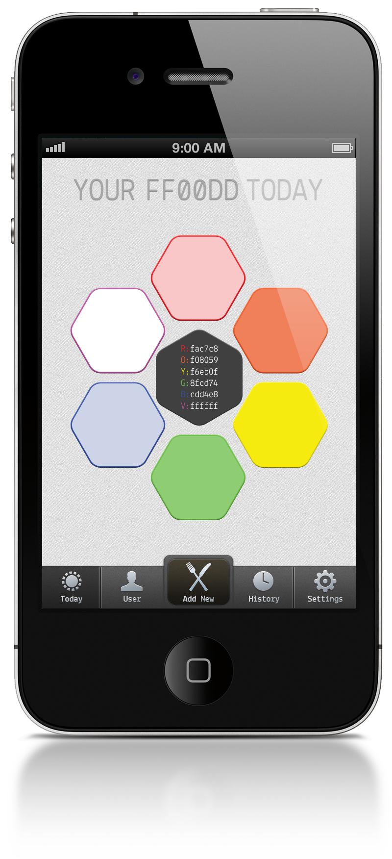

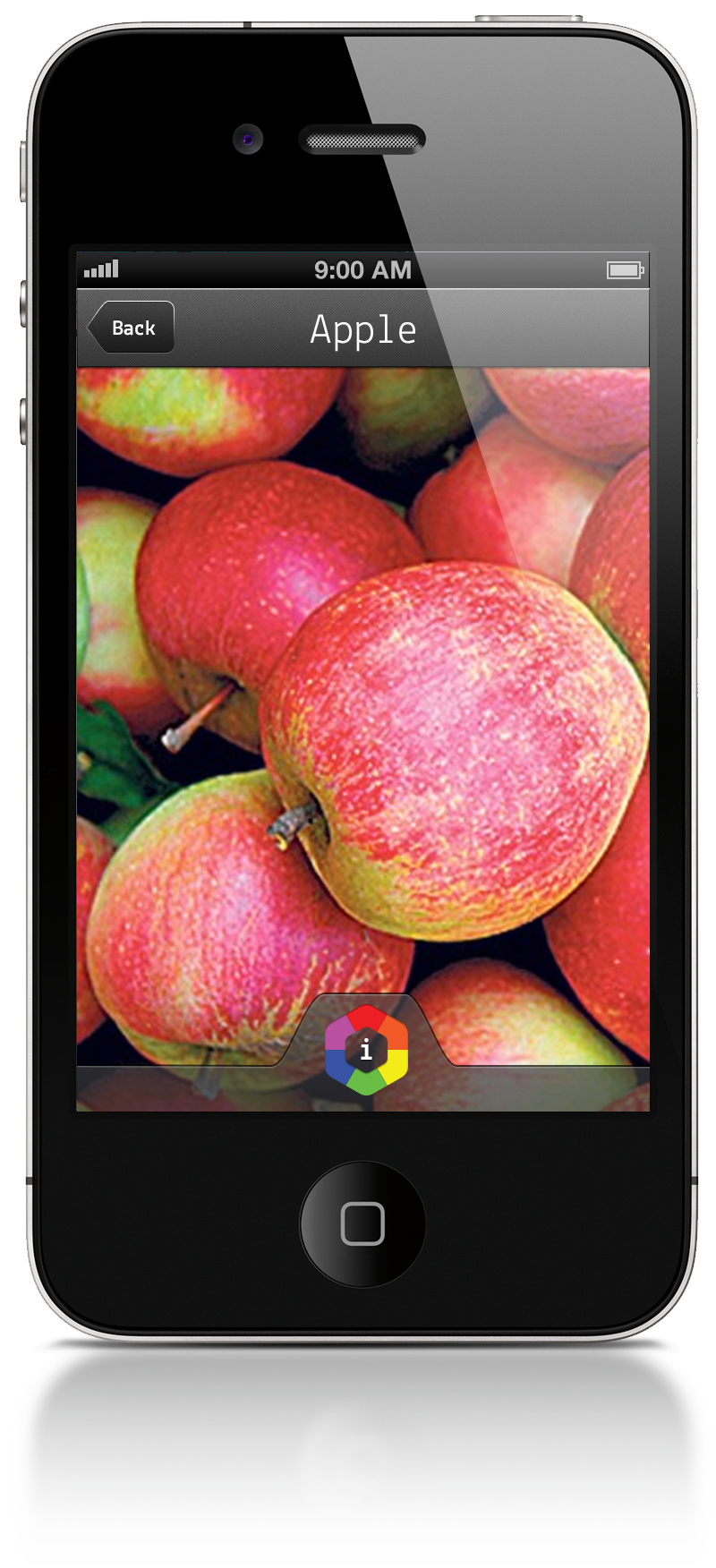

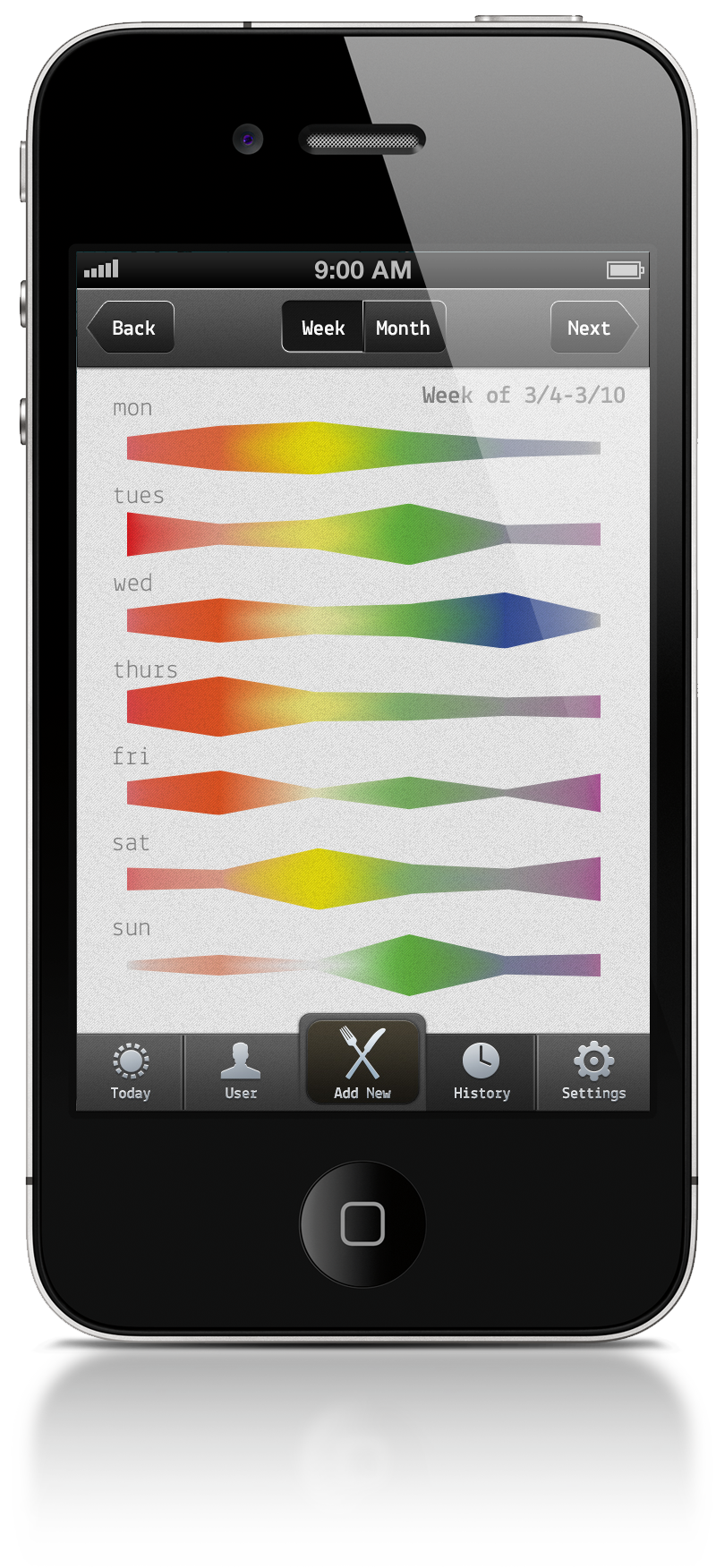
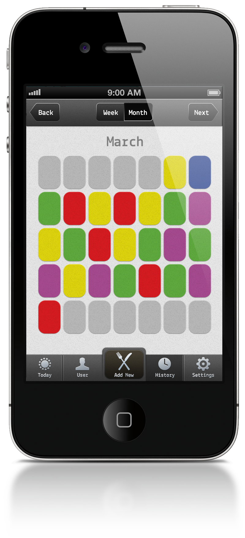
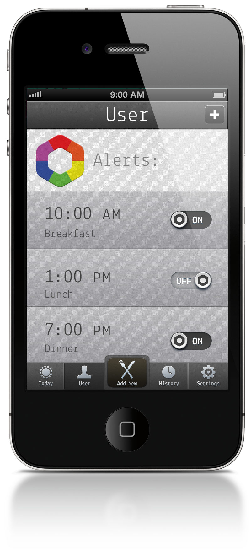

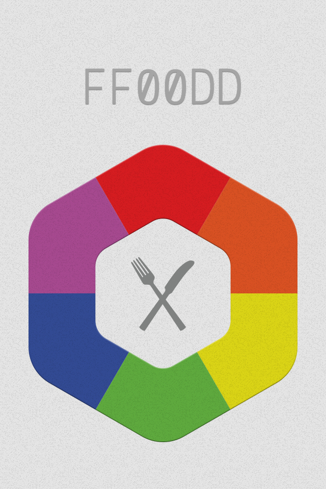
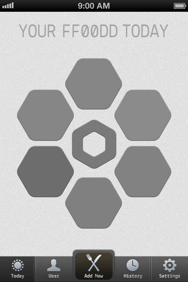
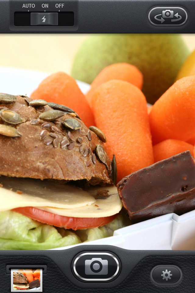
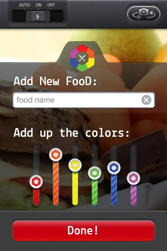
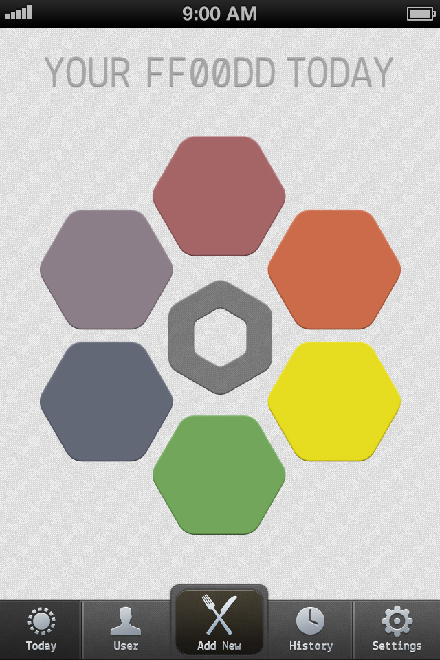
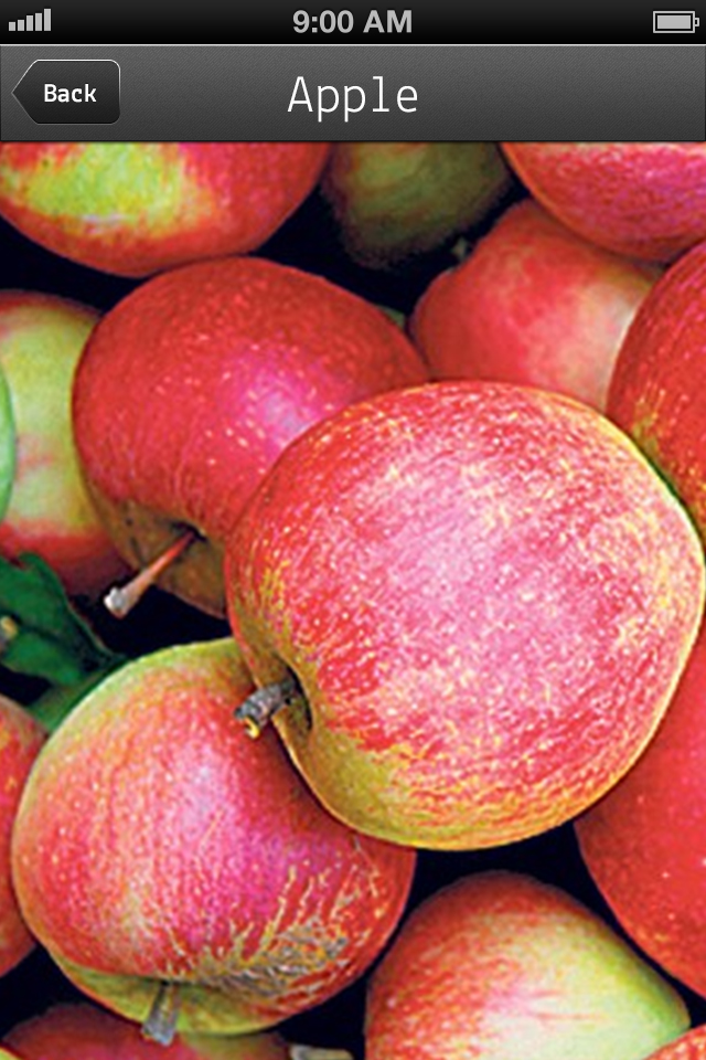
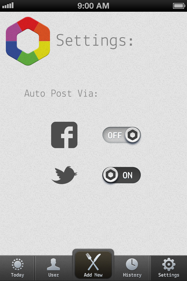
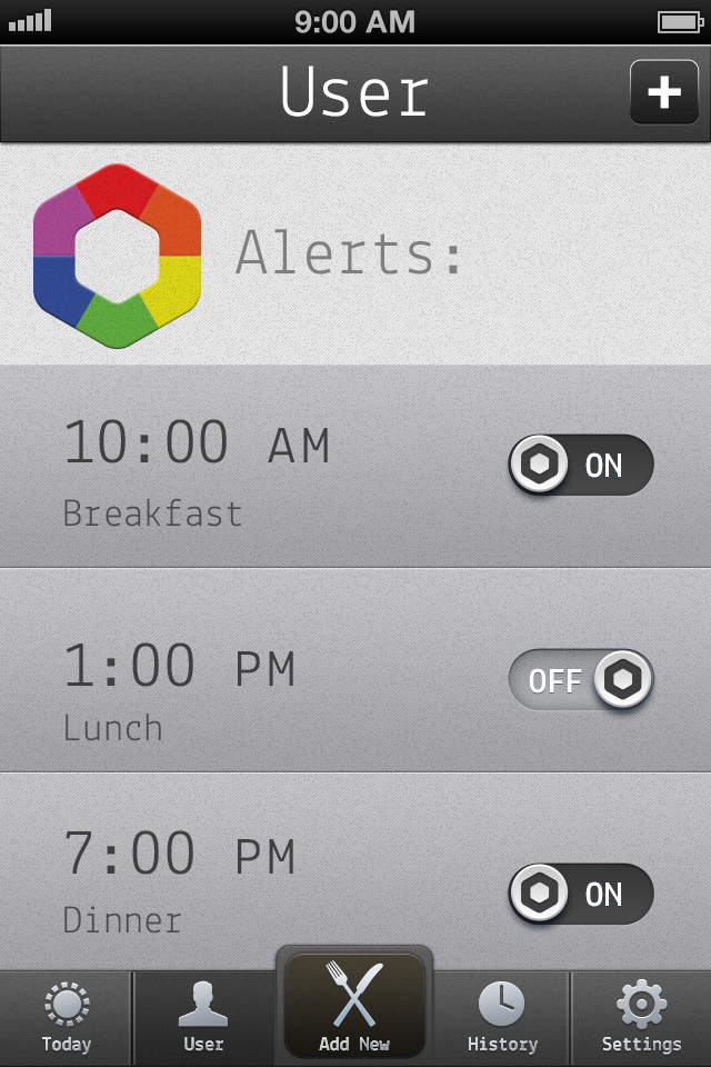
Here are the designed layouts for my ff00dd app. Big help from iPhone GUI from teehanlax and 365psd.com for putting together some great UI elements in PSD that I was able to tweak.
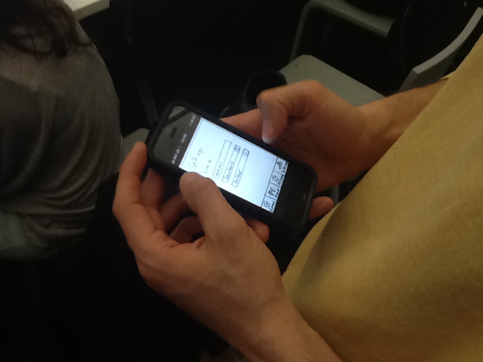
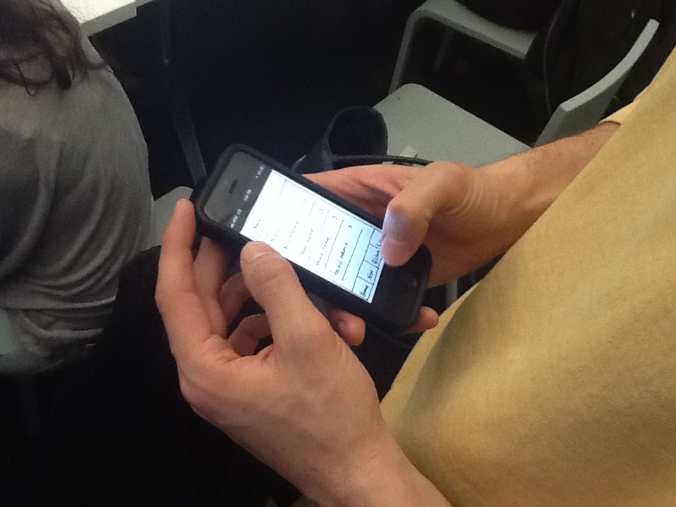
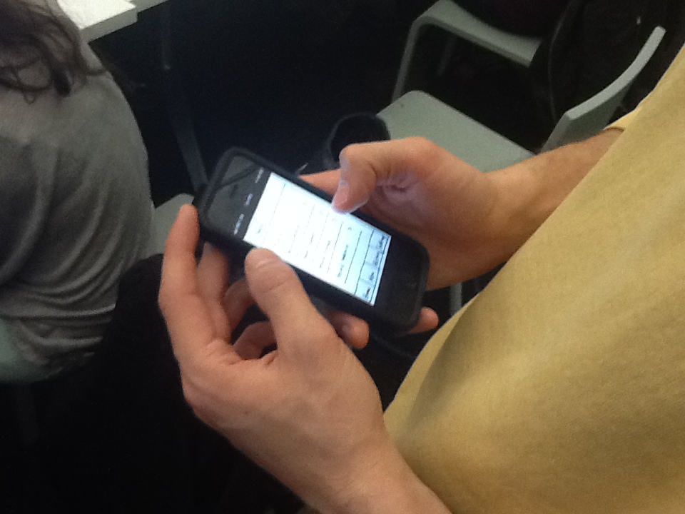
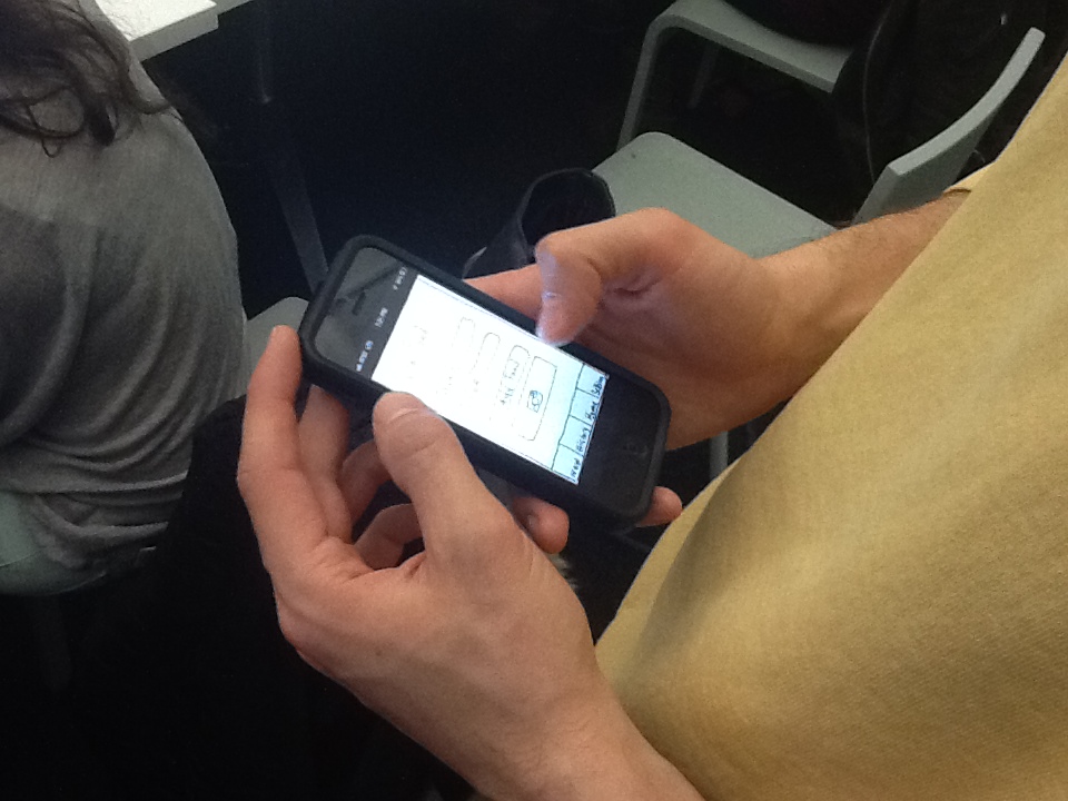
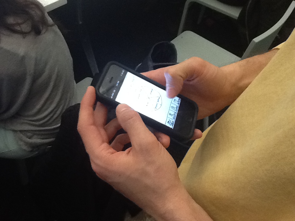
Here’s a working prototype thanks to POP app here.


Mani had a chance to test out my digital prototype in the POP app.

Beautiful and simple with real time data. Dark Sky

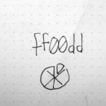
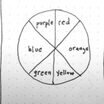
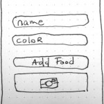
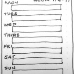
Here’s the wireframe with what I think are the core elements of the app. Logging in the data is one thing and then being able to view it over time and by color could be very interesting.