Thursday Play

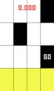
I just downloaded a game called piano tiles. Its a very simple speed based tapping game.  It was most probably made by a developer without the help of a designer because it is pretty plain.

The game could be improved with some simple touches, for instance you are supposed to touch the black squares on a grid, but just bringing some color and texture into the grid to make it more inviting could give the app a new life.

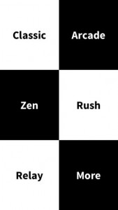
Also, there is little to no variation on the type used throughout the application, some visual hierarchy would have been nice. You can’t really differentiate the buttons from what is just text that is on the screen. Simply making all of the buttons be one color would have been an easy solution, perhaps the same color as the squares you are meant to tap.

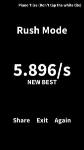
The score is just kind of displayed on the top of the screen, center justified, but doesn’t feel like it belongs. Additionally, once the round ends, at the top of the screen it says ‘Piano Tiles (Don’t tap the white tile)’, while I commend the created for saying tap instead of click, it is awkwardly positioned and it is the only thing in the whole app that is right justified. Also, it is displayed after you have stopped playing rather than before you begin.

Right now the application is not pleasant to look at, and that makes me not want to play it. With the addition of nice colors and animations, along with a more careful choice of typeface and visual hierarchy the app would be more pleasant making me feel happy (the feeling I typically want to feel while playing a game). Because the user is rushed to tap fast, it easy to become anxious playing this game, but with some more design consideration that can be changed.

Regardless of what I mentioned, the app is still super successful.screen568x568 unnamed screen568x568-1
 

Samir

Now App

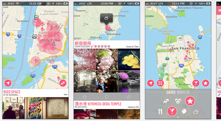
I recently downloaded the application ‘NOW’, which is interesting. I found it because it is similar to what I am making for my thesis. The idea is that it is a map of what is going on around you right now. It pulls data from instagram and Vine to figure out where people are. It doesn’t feel like what it is a native application, runs a little slow and the design, while nice, seems like it was a web app that was embedded into the iPhone.

It has a menu that pops up which I don’t like as much as a toolbar and it runs a little slow, but that may be due to my phone being old. I do like when you expand a view to see all of the photographs that some are different sizes than others, like what Facebook has done with the newsfeed.

It uses a condensed typeface which is fine for the tittles, but in areas where there is more writing, like tweets describing the events it gets to be a bit difficult to read.

It regularly has the map displayed at the top third of the screen, but doesn’t let you expand the map which is a bit annoying because I would like to see where everything around me is when I click on the map.

The application is also sparsely populated. While it is supposed to be about sharing things that are happening now, all that it displays is events that occurred in the past. This is problematic because the application doesn’t do what it sets out to do. While one could argue that that is because the application is not popular yet, it really doesn’t make a difference because the data is being drawn from instagram and vine instead of users posting so it is a flaw in the design of the application. When I sign on I want to find out what to do now, rather than see all the things that happened in the past that I can never go to.

It also has these cute little icons, and when you click one on the menu page the map displays the icon to let you know what page you are on, but it doesn’t say the name of the page, like “Local” or “Sports” which is inconvenient because their are 12 categories which is too many to memorize what all of the icons stand for.

http://www.getnowapp.com

Thursday Play: PolyFauna

One of the applications I brought up in class was called PolyFauna, which was collaboration between Radiohead and Universal Everything. It is an experimental application that allows users to be immersed in an abstract world of graphics and sounds. To navigate throughout the world the user can just turn their phone and look around, moving it around them to see the world from different angles. The application does not tell you anything but instead allows the user to discover how to use the application through trial and error, which suits this experimental world. You learn that there are more useful ways of navigation by swiping rather than having to physically face your phone in different directions, which become part of the journey in learning about the app. There are 3 icons on the bottom which allow the user to take a photograph of what they have created, go to the website, and are told about the red dot that they can follow. This is a very interesting navigation tool; if you make the red dot collide with you then you are taken to a different world. It’s a new way of doing things rather than just pressing a button, and while it definitely is not easier because often you miss the dot as it passes you, it does make the experiment feel more like a game or challenge even though it isn’t.


http://www.wired.com/design/2014/02/take-deep-dive-strange-mind-radiohead-new-app/


https://itunes.apple.com/us/app/polyfauna/id793263070?mt=8


http://pitchfork-cdn.s3.amazonaws.com/content/polyfauna1.png


Samir

Pancake Flipper

My application is called pancake flipper, and is a game centered around making fast, perfect pancakes. The user is able to try the tutorial, then choose between a time trial where they can see how many perfect pancakes they can make in 2 minutes, or they can try to see how many perfect pancakes they can make in a row. The way it works is that the user has to pour the batter onto the skillet by drawing on the pan, then they must flip the batter before it burns to cook both sides, and set the pancake aside so they can make room for more batter.

Below are the wireframes

Wireframes

App Idea & HIG

For the food assignment I want to create an application that allows users to flip pancakes. A timer would count down letting the user know how long to cook each side of the pancake, they would need to flip the pancakes by flipping their wrist that’s holding the phone, which will be detected through the phones accelerometer. If the user were to burn the pancake they would loose. When each pancake is completely cooked they would slide it off the pan by shaking the phone, and would then pour a new pancake on the pan by using their finger to draw on the batter. They would then repeat this process. The more pancakes they cook, the hotter the pan becomes and the faster they have to flip the pancakes before they become burnt.


Reading HIG was useful and brought up a lot of things that I never noticed before, like the fact that iOS applications never display a close or quit option. I suppose it was always just second nature but reading the text allowed me to think more intently about the interactions I am designing for the users. When reading HIG one of the things that stood out to me was to avoid a splash screen when creating an application. In designing applications I always questioned if it would be a nice way to introduce a person to your application or if it was superfluous. It makes sense to avoid the screen in order to allow users to get to an application as fast as possible without being hindered by seeing another image, but previously I thought of it as a branding opportunity to show the users your logo once again.

However, this ties in with another thing I read in HIG and that was to resist showing your logo on screen, because the screens are small and you don’t want to take any of the real estate away from the interaction. This makes sense when you acknowledge that the users know what app they are in, because they tapped the icon to open it, and similarly they wont need to see the splash screen because they are aware of which app they are clicking when they tap the icon. It also suggests that if we do use a splash screen it should be very similar to the first view we see in the application so the user has the feeling that the application runs quickly.

Another good tip is to delay a login requirement as long as possible, often times users are deterred from applications that require them to log-in so if we prompt them with a log-in in the beginning they may never give the application a chance. It is better to allow majority of the users access to using the parts of the application that do not require a log in, and then prompt them with an area to log in once they need to.