

Author: rahaghassemi
Thursday Plays: LifeSum
I’m going to “be healthy” this summer so I decided to try one those calorie counter apps. I used MyFitnessPal during Prom season in high school and it was an unexpectedly helpful experience. I decided I wanted to try a different app though, a newer one with a nicer interface, in my opinion: LifeSum.
 So when I started it asked me what my main goal was:
- Be Healthier
- Lose Weight
- Gain Weight (hah)
I chose lose weight. Next question: Gender? Female. Birthday? 8/10/1992. Height? 5’5. Current weight? too scared to check, but let’s say 135. Goal weight? 120. It then gives me some stats:
You can achieve your goal in 15 weeks by losing 1 pound a week, with a daily calorie goal of 1429. after pressing next again, it prompts me to log in. I feel

invested at this point so I’m not as annoyed about it as I am when apps tell me to do that right out of the gate. It then prompts me to allow reminders with a big green button, and a tiny no thank you in simple black font underneath.smart move. I allow reminders. It then attempts to get me on the “Gold membership” which costs money, but this time the big green button no longer tempts me. I tap the tiny “No thanks, start free” button at the bottom.
It then starts you off but prompting you to start adding meals, snacks, or 
 exercise. I add my frosted flakes, and then the app pops up and tells me I did a great job adding my first log…which seems unnecessary and kind of patronizing honestly. i have to press “Get started” again to continue logging. Extra steps for no reason.
I finally make it to the landing page that shows me how many calories I’ve consumed, have left, and burned off. Under that, it shows me some details on how much  carbs, protein, and fat I’ve taken in so far. I can tap on details to get more info. Here I see a pie chart of my nutrition intake, so I can see it as a percentage. Under that I see it in a bar of grams. Under THAT, There’s a breakdown of how much of my carbs was Fiber or Sugar, and other breakdowns. But to my great irritation, the breakdown is only available for people who useGold…so instead of seeing the grams there i just see the word “GOLD”. This really annoys me. I understand why they do this of course, but it seriously takes away from my experience to have all this extra content in my view that i can’t actually interact with or use. What they SHOULD be doing here is showing this with the ability to hide it
  from the view. The less content the better. So if I can’t use it, let me remove it. In this details view theres also a segmented controller th
 at has a Progress Diary…Doesn’t seem like the right location for a progress diary at all
  since all of the other content here is related to nutrition details. but regardless…it’s for Gold users! So I can’t access it anyway.
I go back to the landing view. as I keep scrolling down I see the details of my logs for the day, and a little sections for keep track of how much water you drank that  day. This is weirdly my favorite part, because of the animation. When you tap on a glass, it fills up with water, it’s really cute. Might be the reason I’ve even kept the app at all. Underneath, it gives me little tips for when I should be drinking water, which is also nice.
Now, I’m taking a look at the tab bar. In the center, is a green box with a plus sign that is clearly for adding more logs. Makes sense. To the far left, the little Lifesum icon is the landing view with all the calorie and nutrition info for the day. Next to that is my profile, which houses my picture, a reminder that I only have a basic account *eye roll*.  Underneath that, there’s 4 icons that are a little overwhelming. One is for body measurement tracking, the next is for nutrition tracking (both over the course of 1 month, 3 months, or all). The next two icons are for adding friends and viewing your favorite foods. It seems like these two are different than the first too, so they could maybe be put somewhere else, or look different in some way. I can also track my weight on my profile page, which is good, and it also shows my weight progress. Then there’s a whole tab bar for choosing a specific diet regiment that’s right for you…that doesn’t seem like it needs to be in a tab bar cause you’re probably just going to play around with it once then never change it again, or very infrequently. Doesn’t seem
  active enough to need it’s own tab. And then, unbelievably, there is an entire tab bar icon devoted to upgrading your account, which absolutely horrifies me.


 Overall: Way too much content in the Profile and Landing View….could definitely be spread out better among the tabs. And they need to have some chill with the gold account. They are absolutely trying to force that upgrade down your throat and it had a hugely negative impact. It’s a good thing they have such nice illustrations, colors, and animations because if they didn’t I would not continue using it.
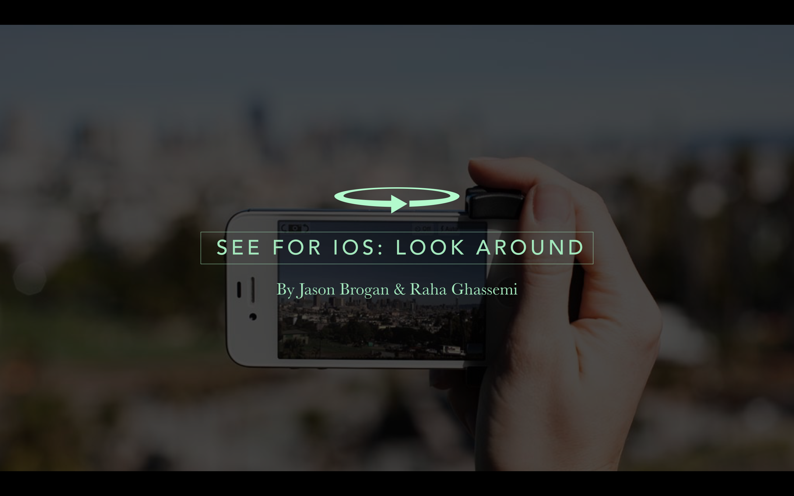
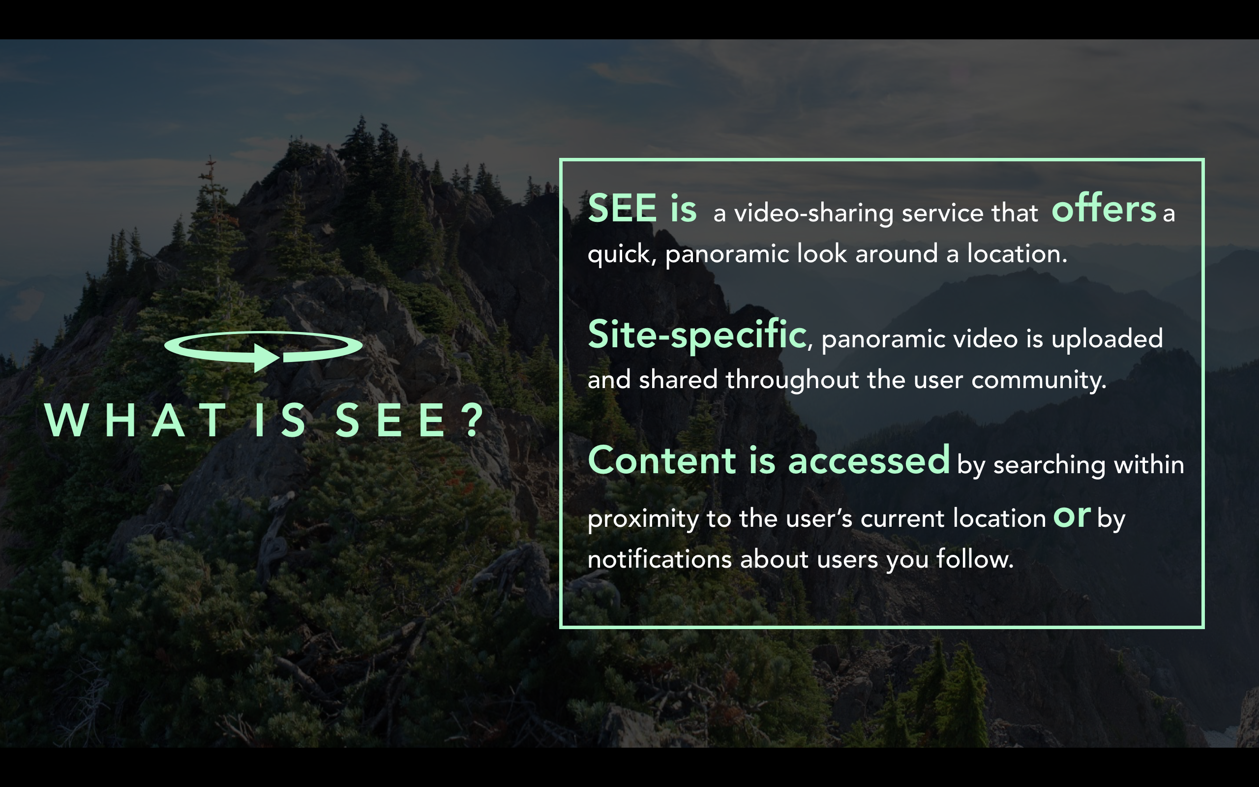
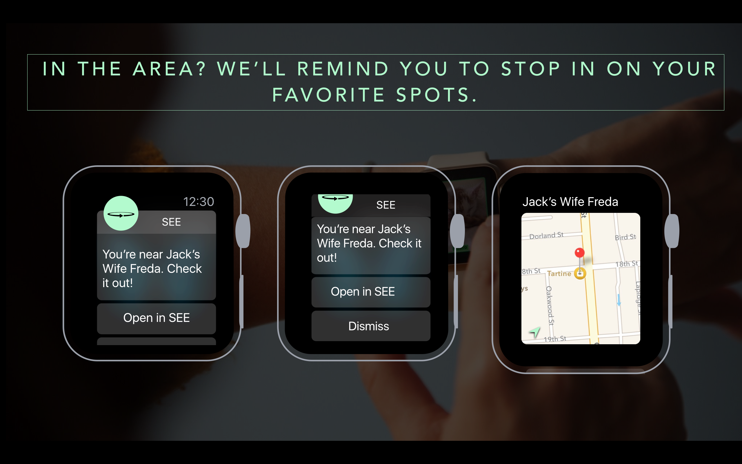
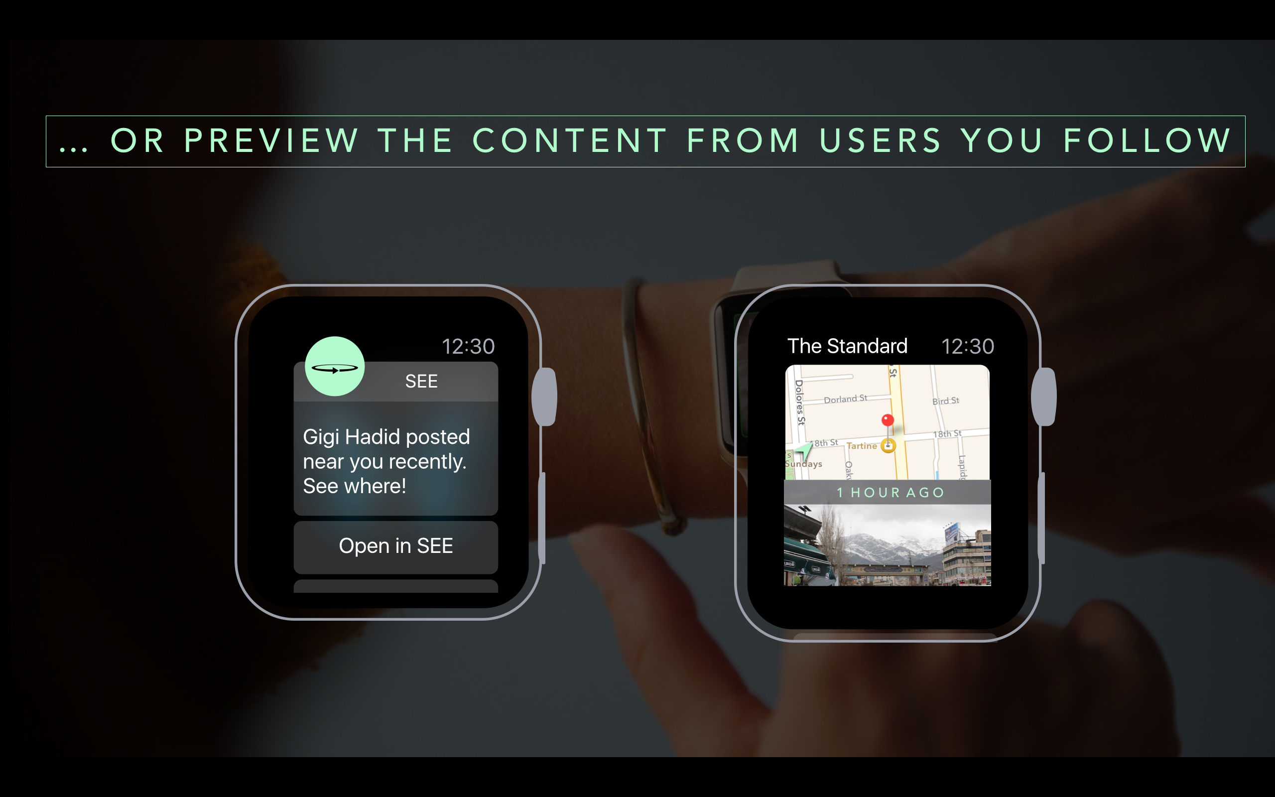
User Insights for SEE: with Jason Brogan
https://marvelapp.com/iibgi5
User Insights 1:
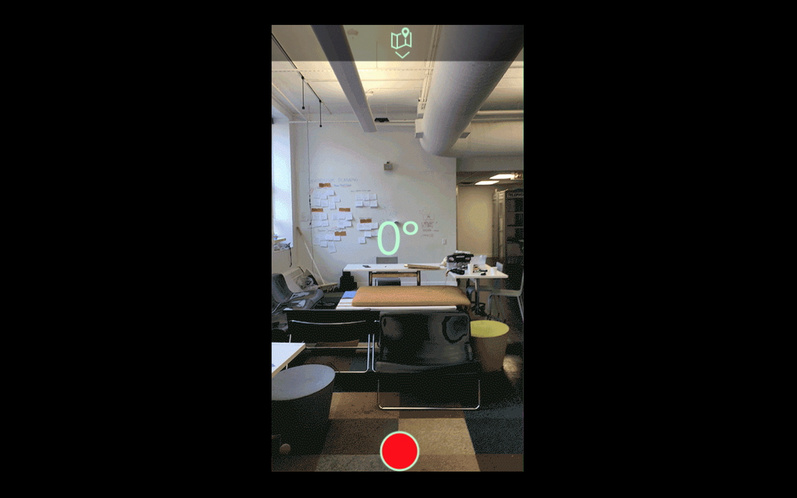
wan’t intuitive to swipe up or down, just clicked on both camera view and map view: “The arrow is too small to tell”
got confused with upload icon, should be clear that it has something to do with location
“feels like snapchat”
“0-180” camera view made it clear what the concept was…which is panorama video not 360 video.
like the color scheme
User Insights 2:
tried to push first then then swiped on his own for camera and map views, navigated easily but didn’t get the sense that it was for panoramic video
also liked the color scheme
would like map to echo the color scheme with roads in seafoam green and everything else in off-black color
see video of interaction with camera
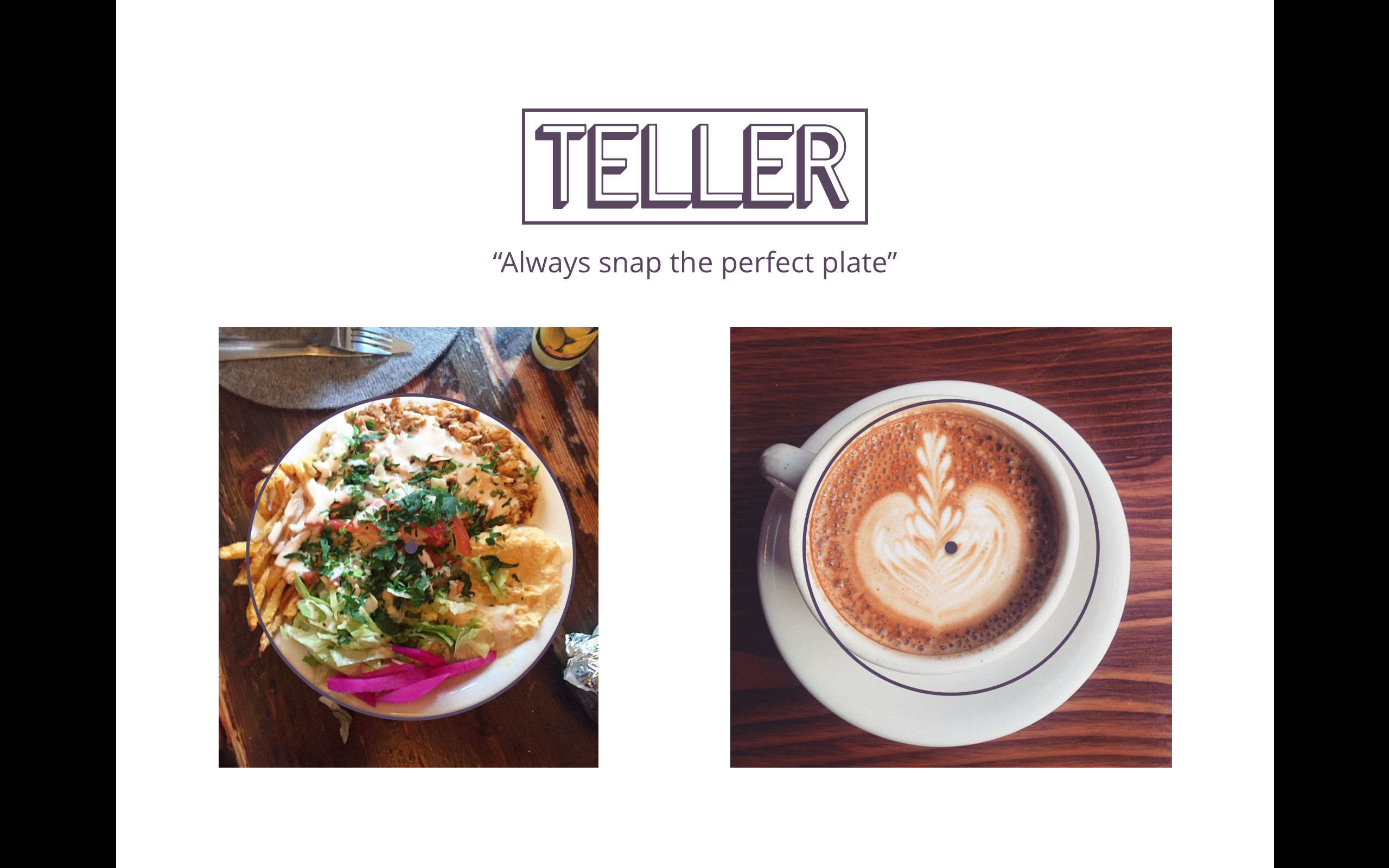
Teller tvOS Final
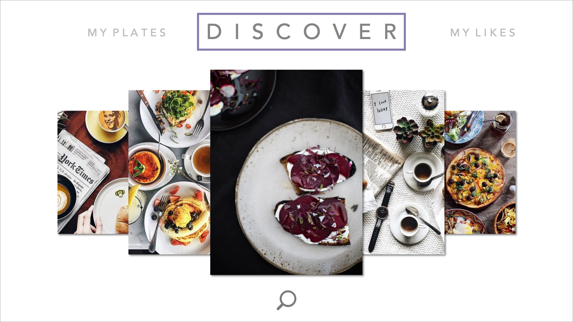

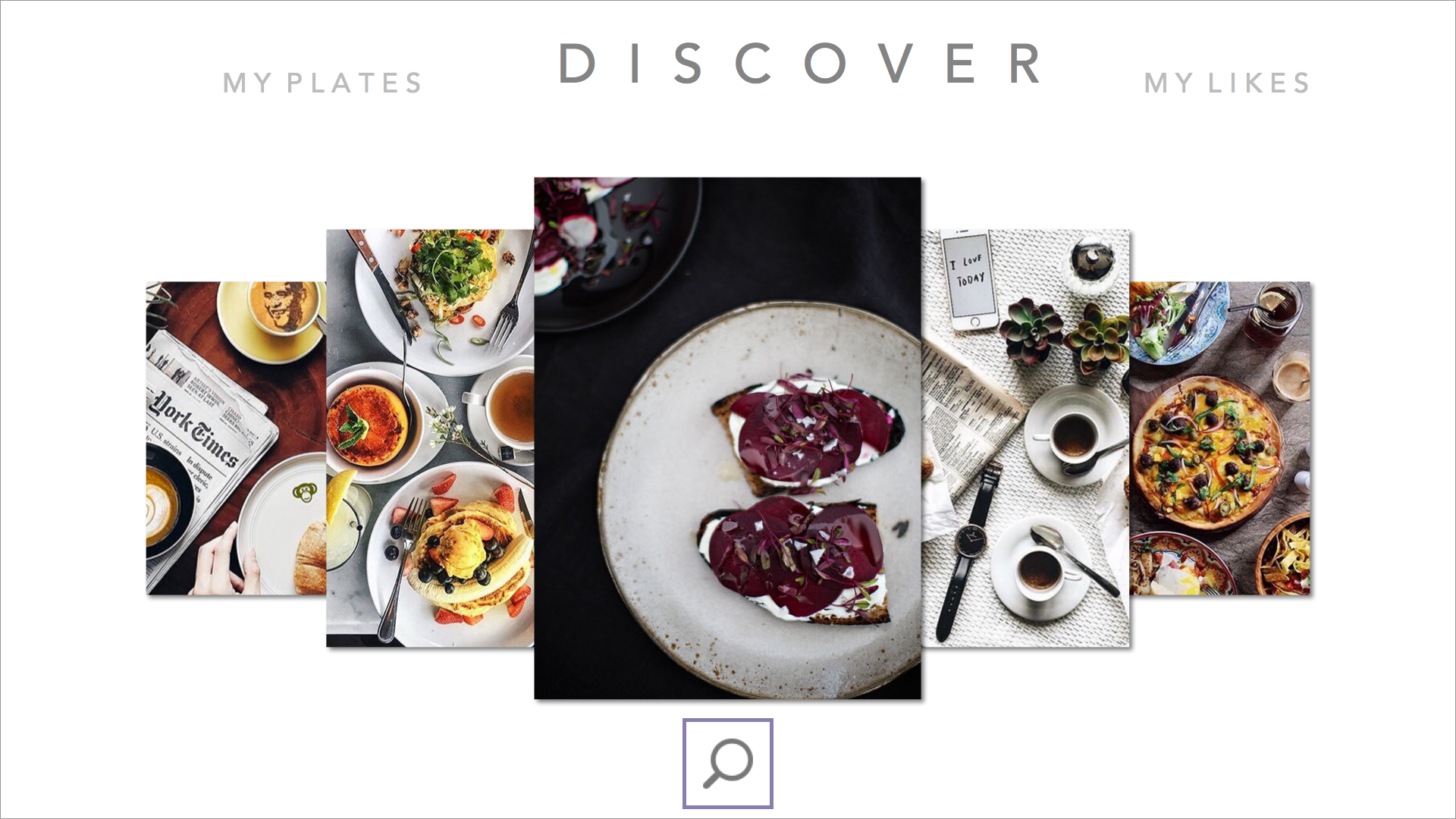


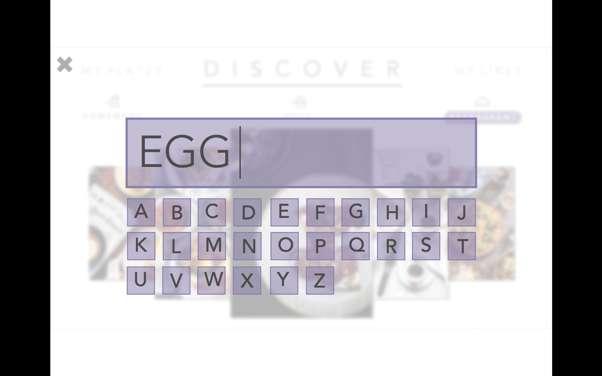
changed the wording of the segmented controller after user feedback saying “both” confused them, and also put the segmented controller into the search view as a way to filter in order to make the main discover page have more room for larger images.
#ThursdayPlays Today
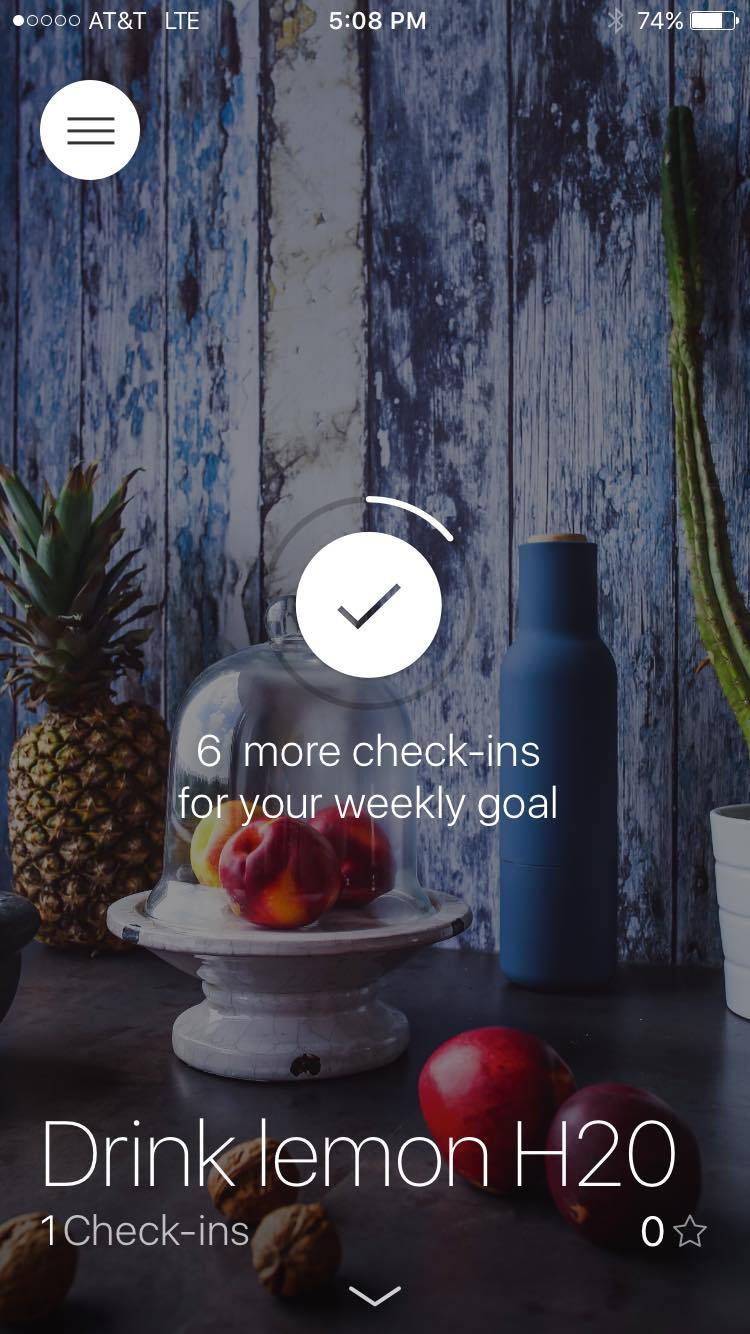
I’m trying out a habit tracker app mostly because the interface is pretty, but also because I want to see if this kind of thing would actually work for me. The interaction is really great I think so I could see myself continuing to do yoga and ab workouts regularly because of it.
To start, you add a habit by first setting a name for it- let’s say: drink lemon water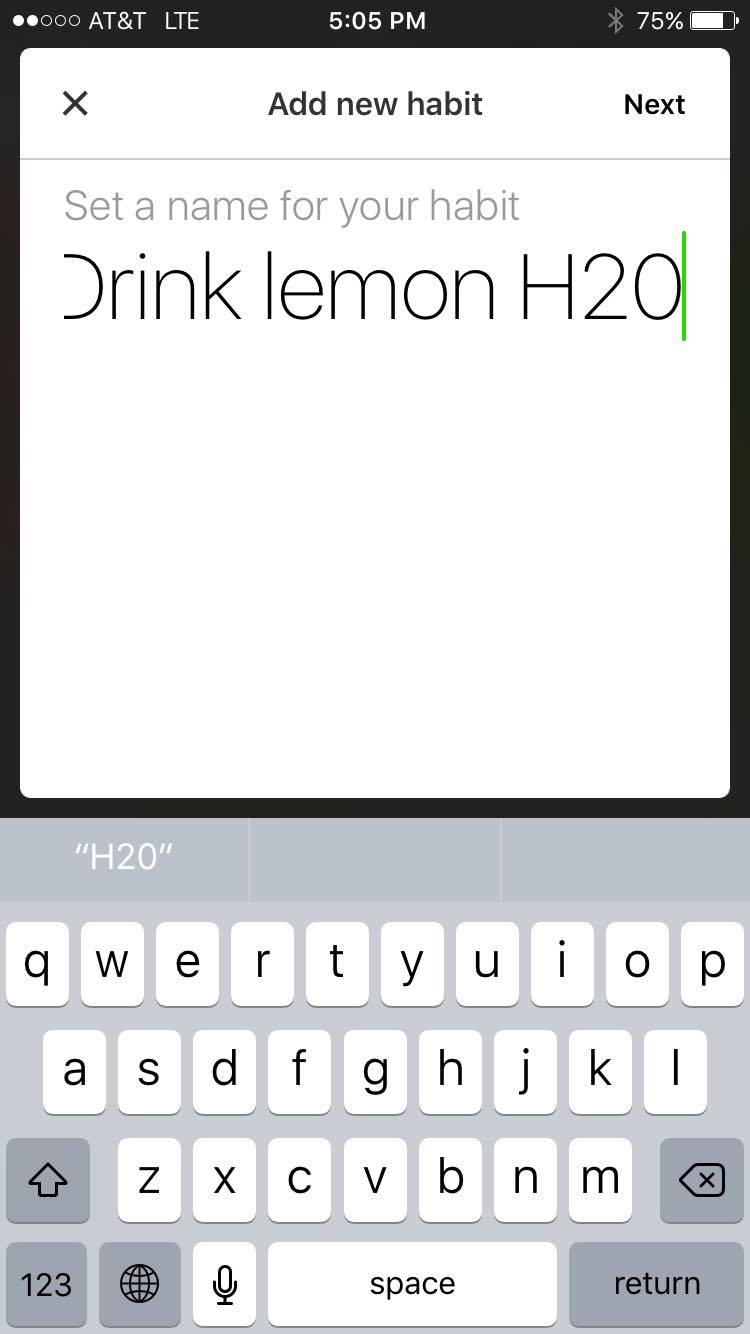
Then, you can add the frequency: aka which days of the week you want to be reminded or how many times a week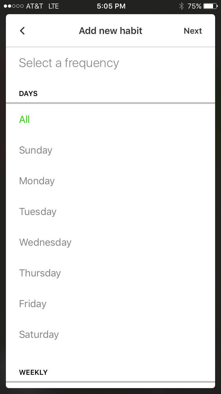
It then asks you if you’d like to set up a reminder for the habit, and to select a time for that reminder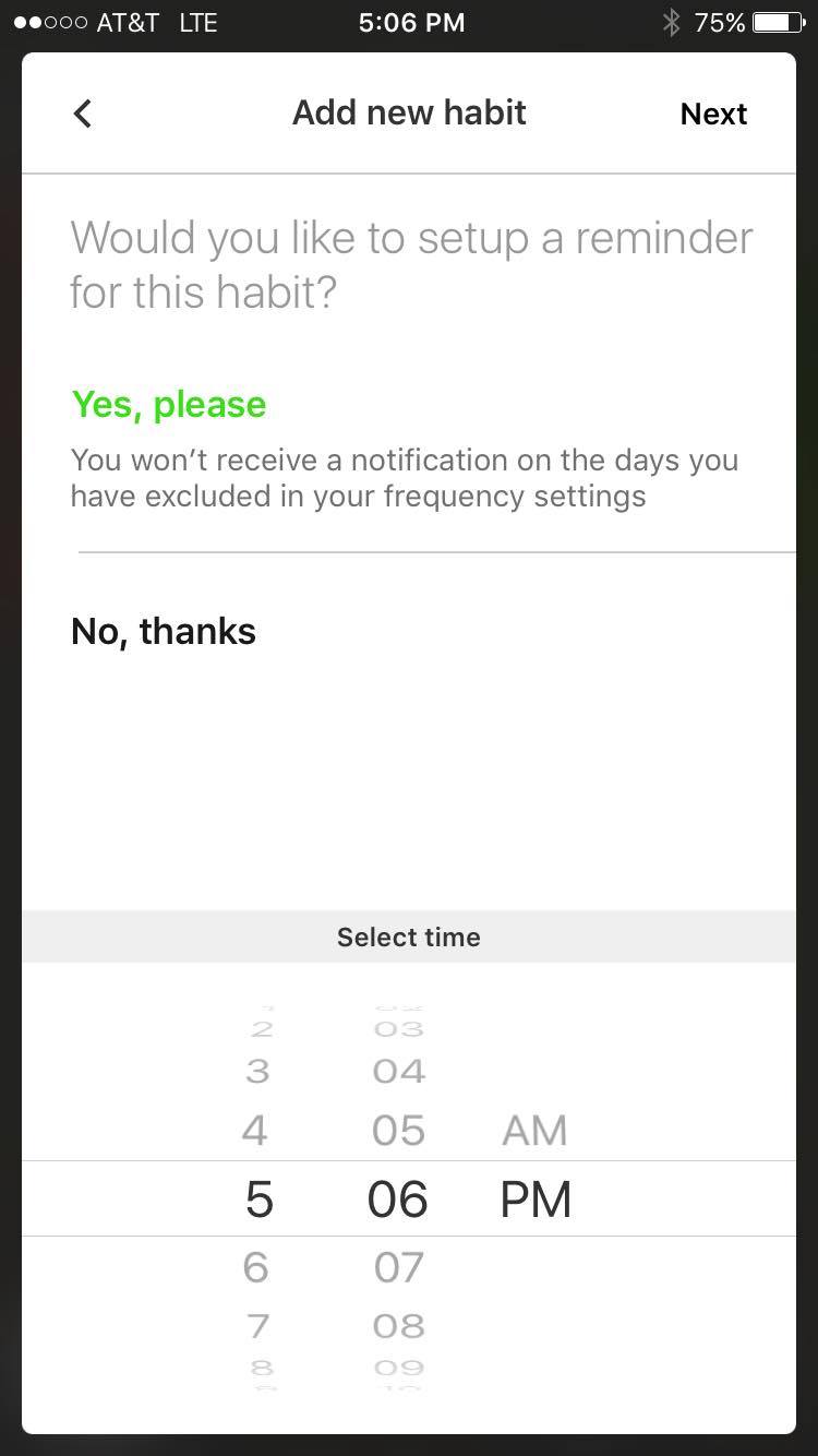
You can also choose a specific day to start this habit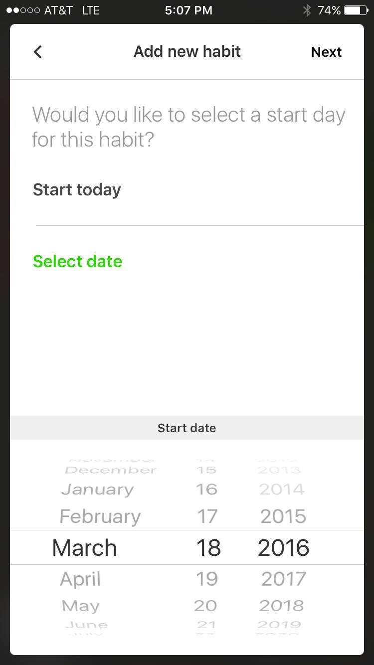
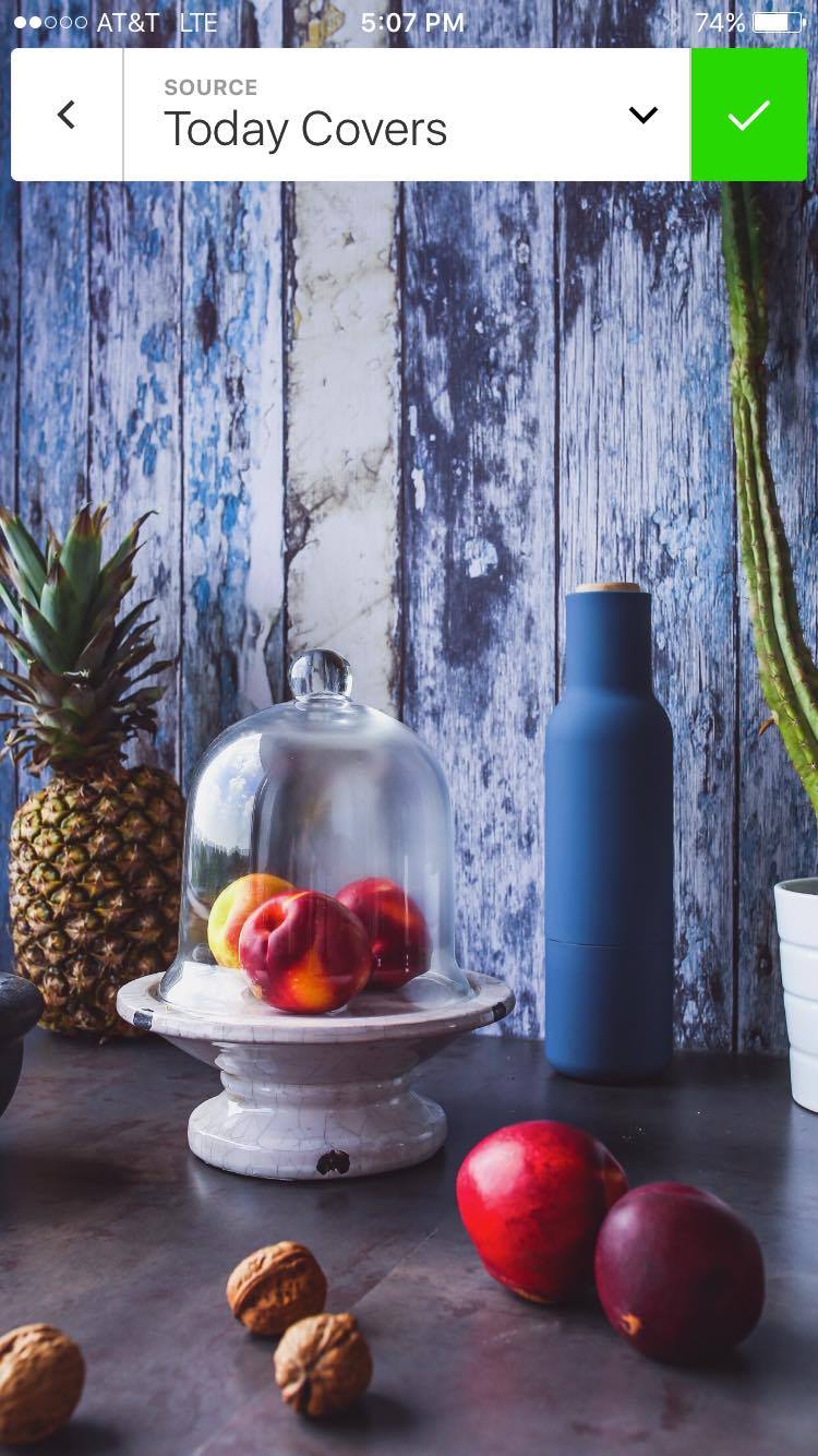
choose a background cover
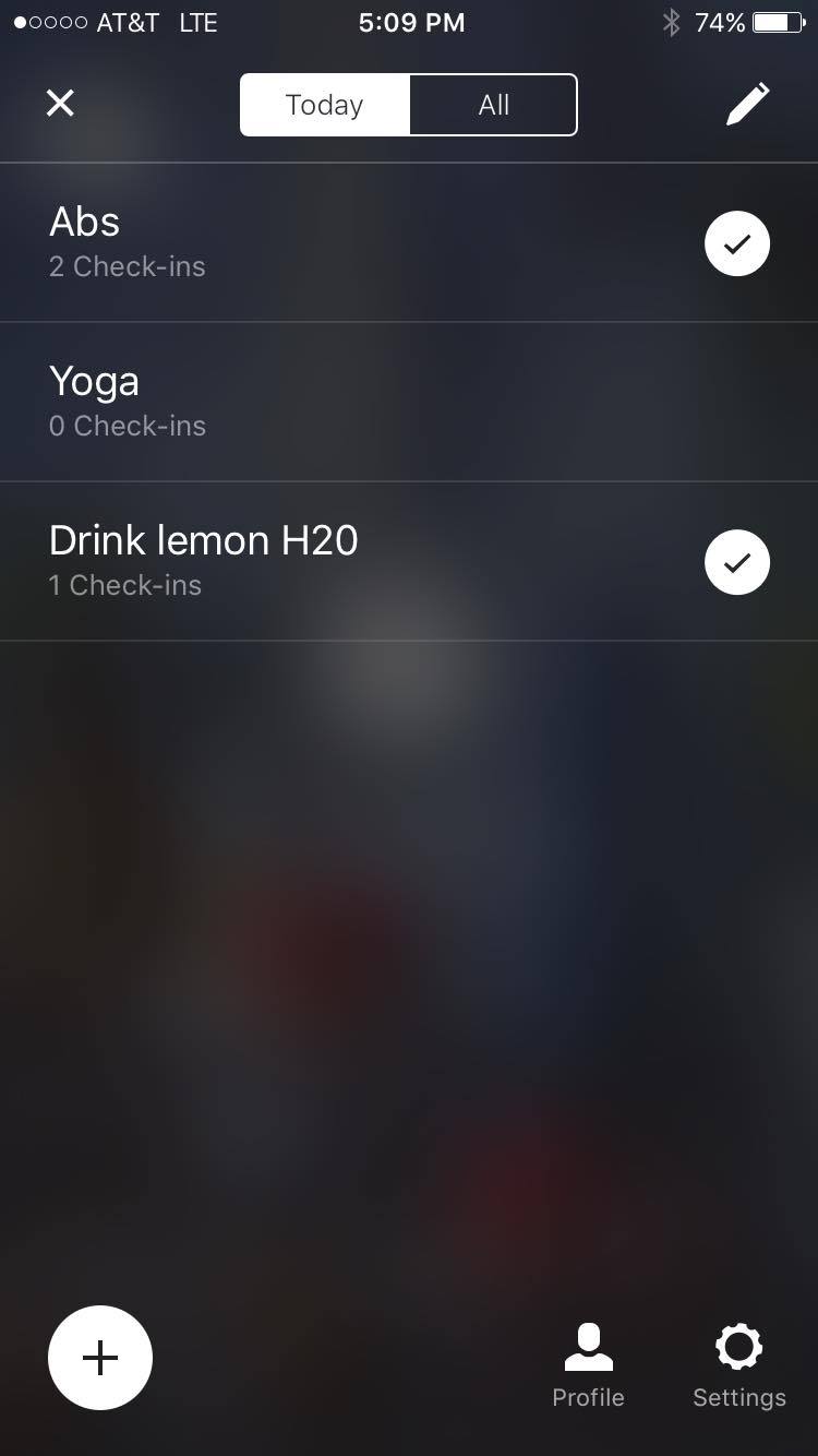
 to check-in and show that you’ve accomplished the task, just double tap on the screen for that habit! each habit has a separate screen that you get to by unfortunately pressing the hamburger icon, but i think since there’s so few elements to tap on it’s OK…I’d still prefer something different though.

to see your check-in streak on a calendar, just swipe down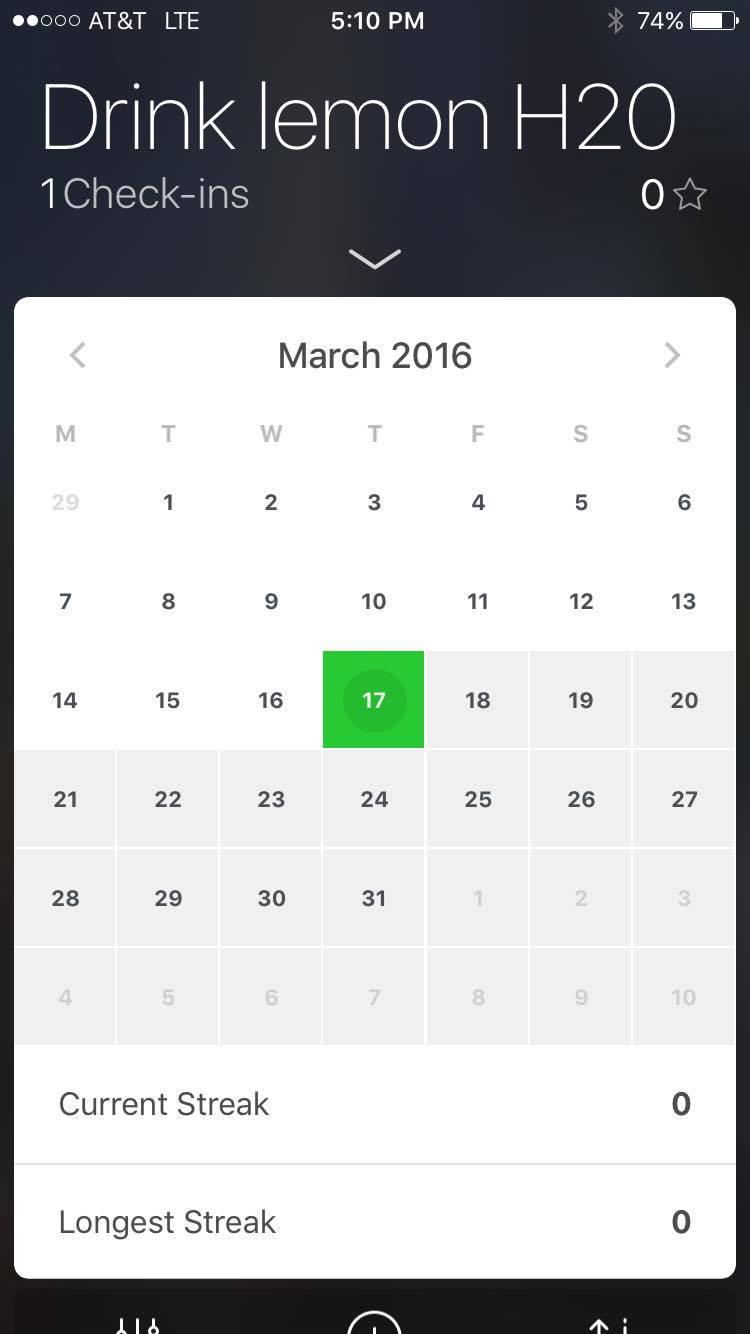
you can add widgets with other health data in-app, from the apple health chart, or inputting your own info about things like body fat percentage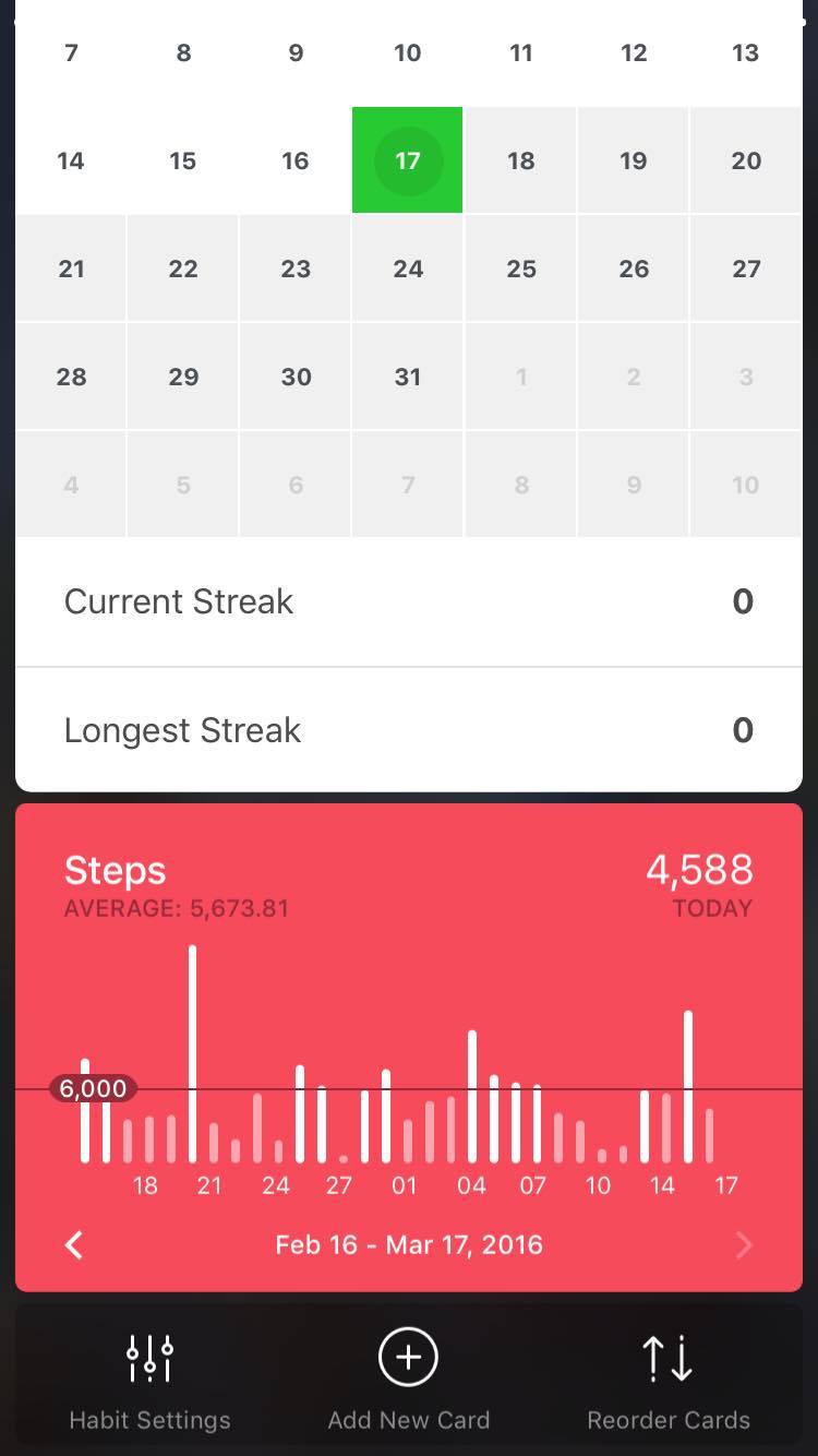
you can also achieve badges for reaching certain streaks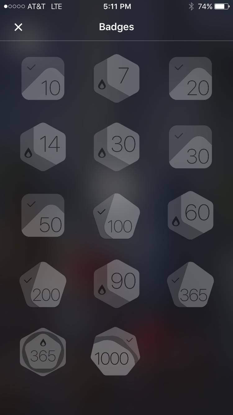
the profile page is super simple and nice as well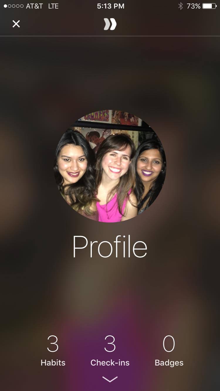
I really like this app, i think the one thing I would change is the hamburger icon, instead I would play along with the swipe interaction they have on the habit view and use an up arrow icon to reveal the other habits so that you can swipe up to change the habit view and swipe down to see your calendar streak, i don’t think the hamburger icon is necessary.
Teller TVOS
Final Prototype and User Insights for Teller
User Insights from previous prototype:
Tester 1:
- discover icon is not recognizable (take out the telescope and use something else)
- change search, also not recognizable, make it a tab bar icon
Tester 2:
- taking the picture is the most important aspect- make that clear somehow
- feeling of luxury
- 11 font minimum
Presentation feedback:
- try to get a simulation of camera view working
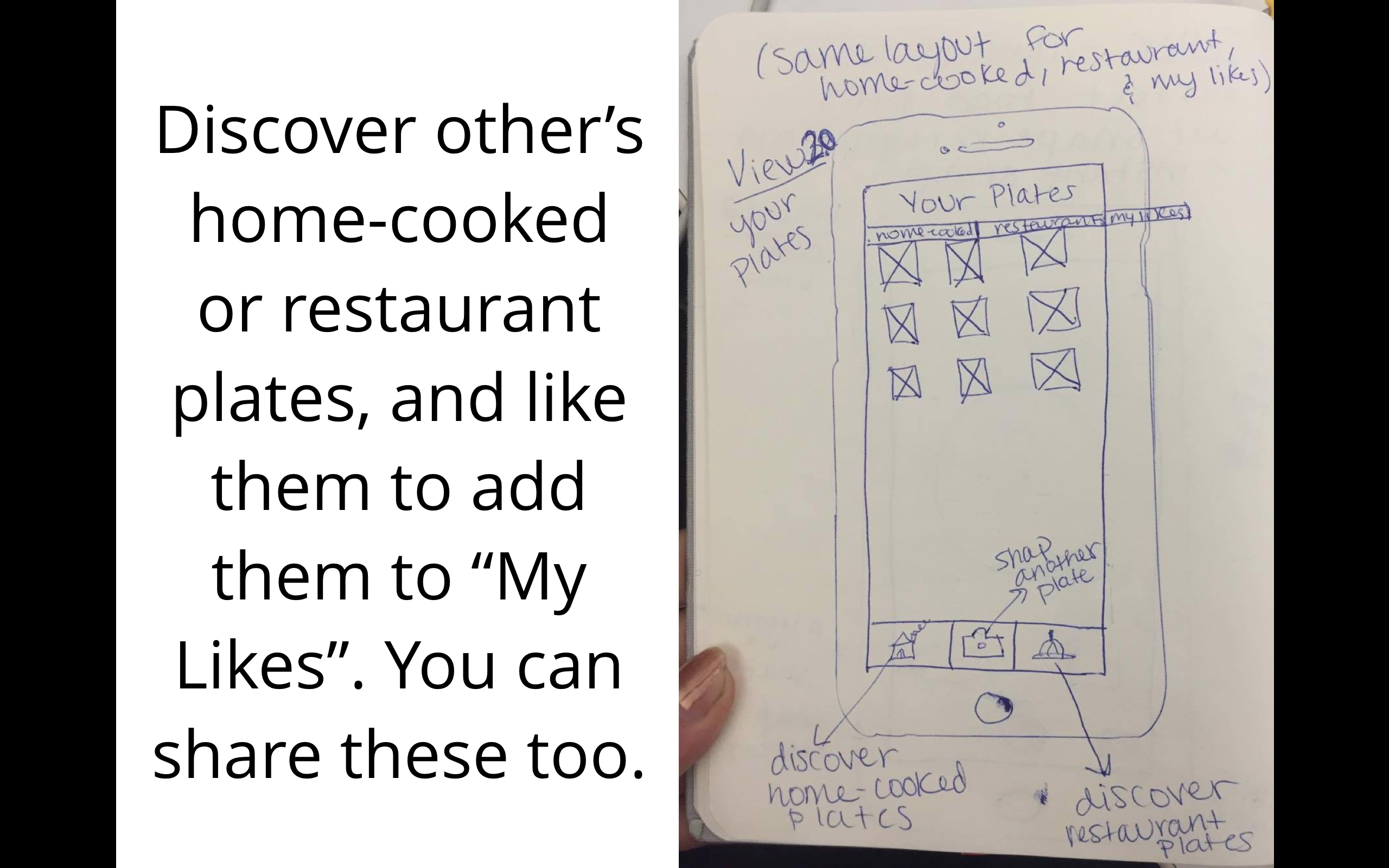
- make the places tab in “my likes” more about restaurants not just random places
- make your like button more obvious, it’s currently very ambiguous how you like
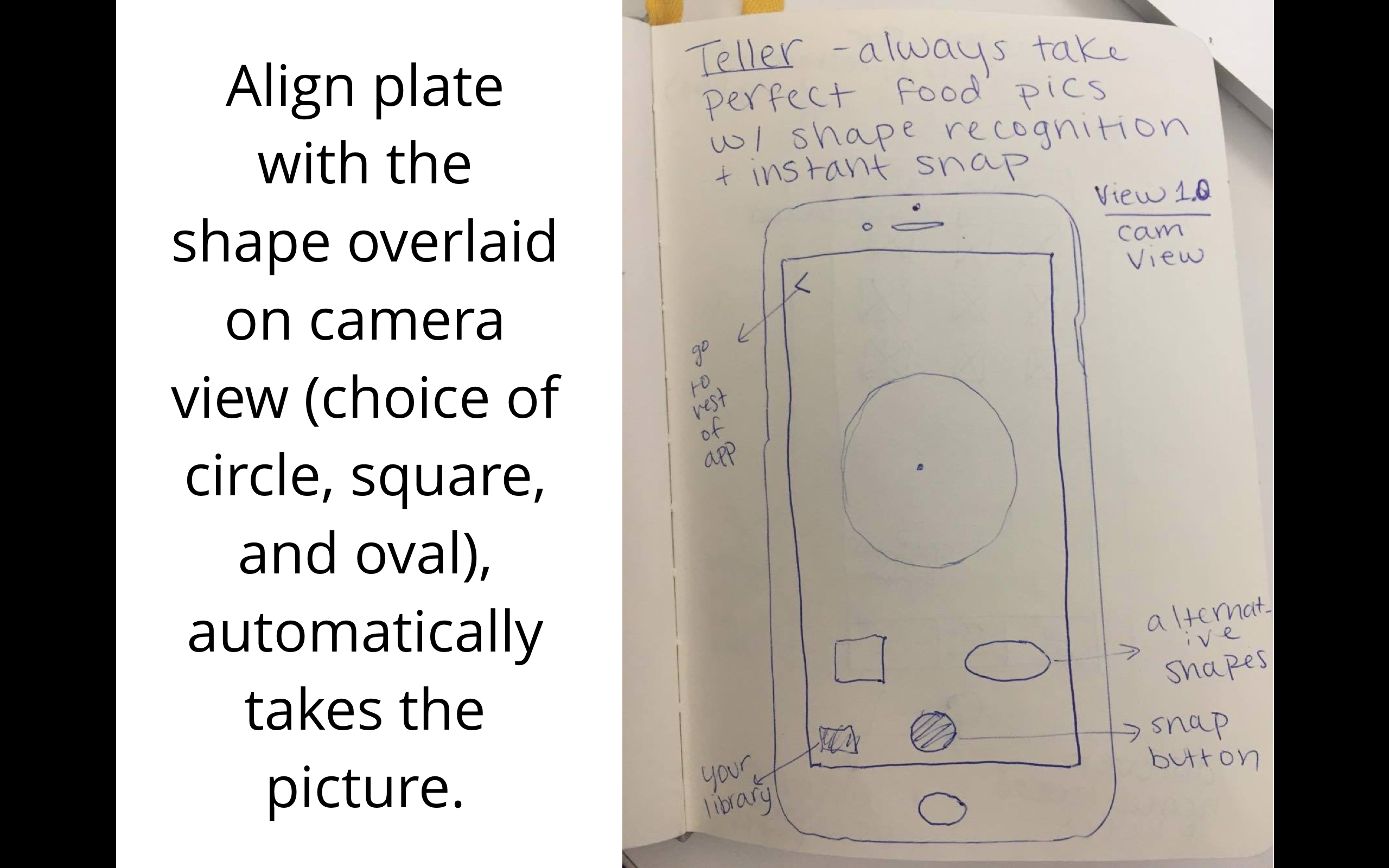
- think about making it possible to add more masks
I wasn’t able to show how to add more masks in the prototype but basically if you want to add more you just click on the circle or square multiple times and it’ll keep adding masks to your camera view so that you can position them and size them however you want.
final prototype:
see previous prototype at: http://www.rahaghassemi.com/#/teller/
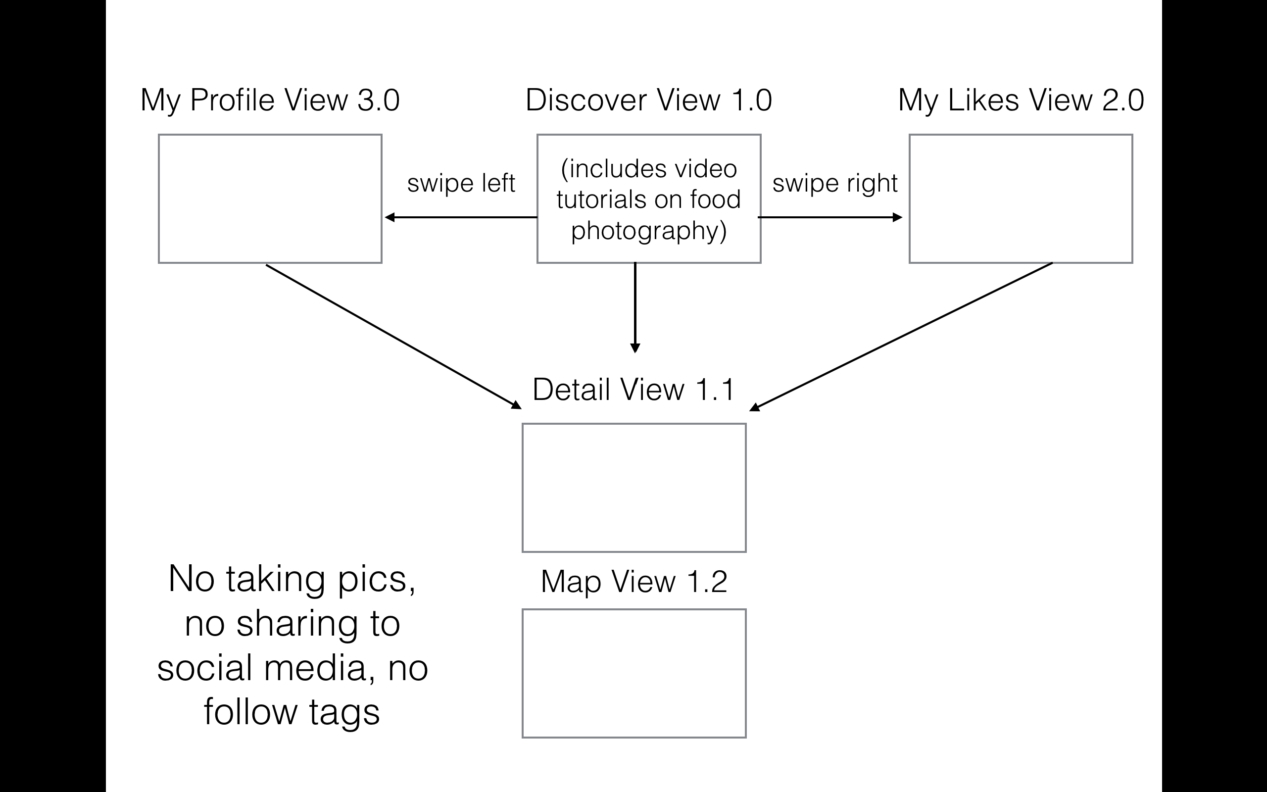
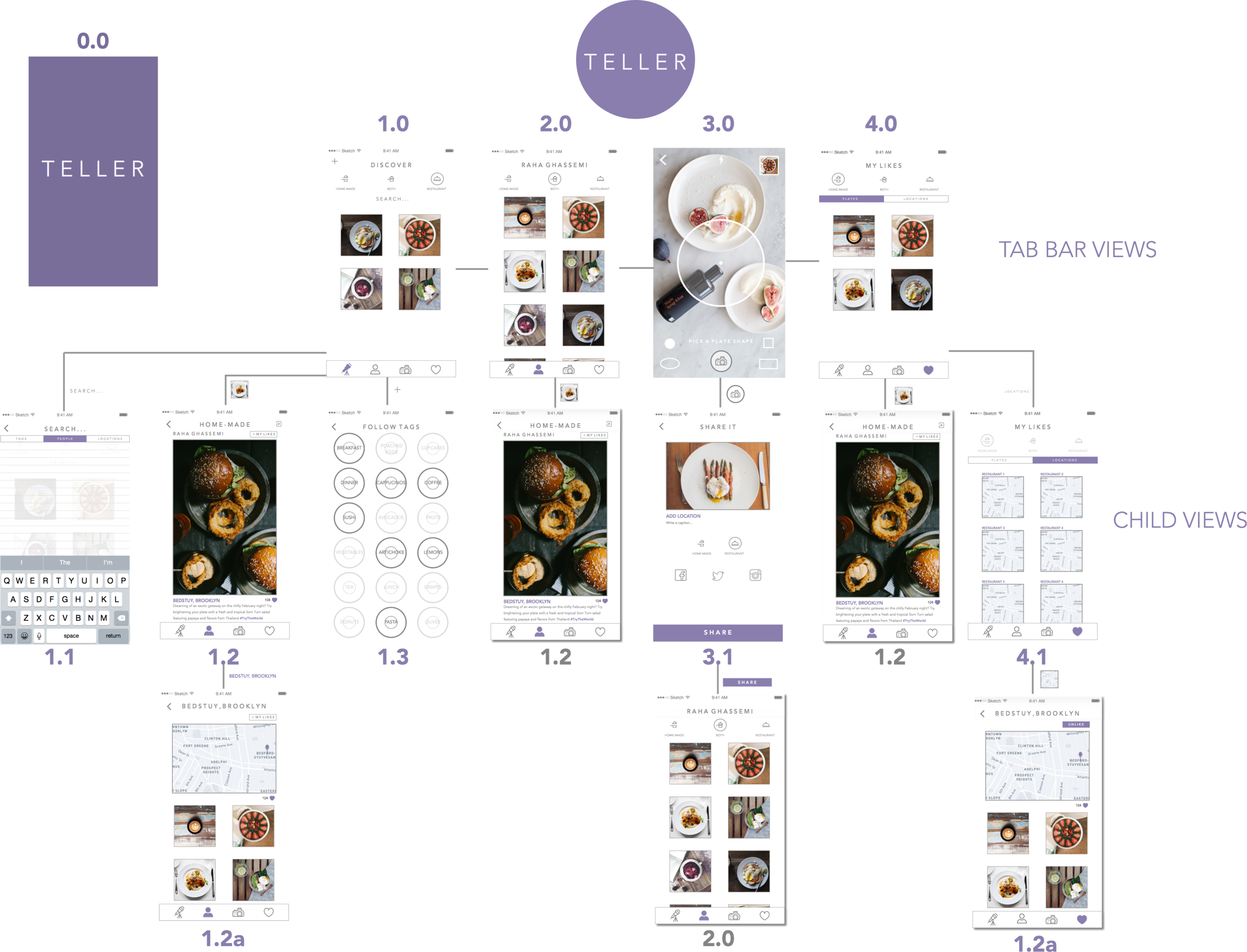
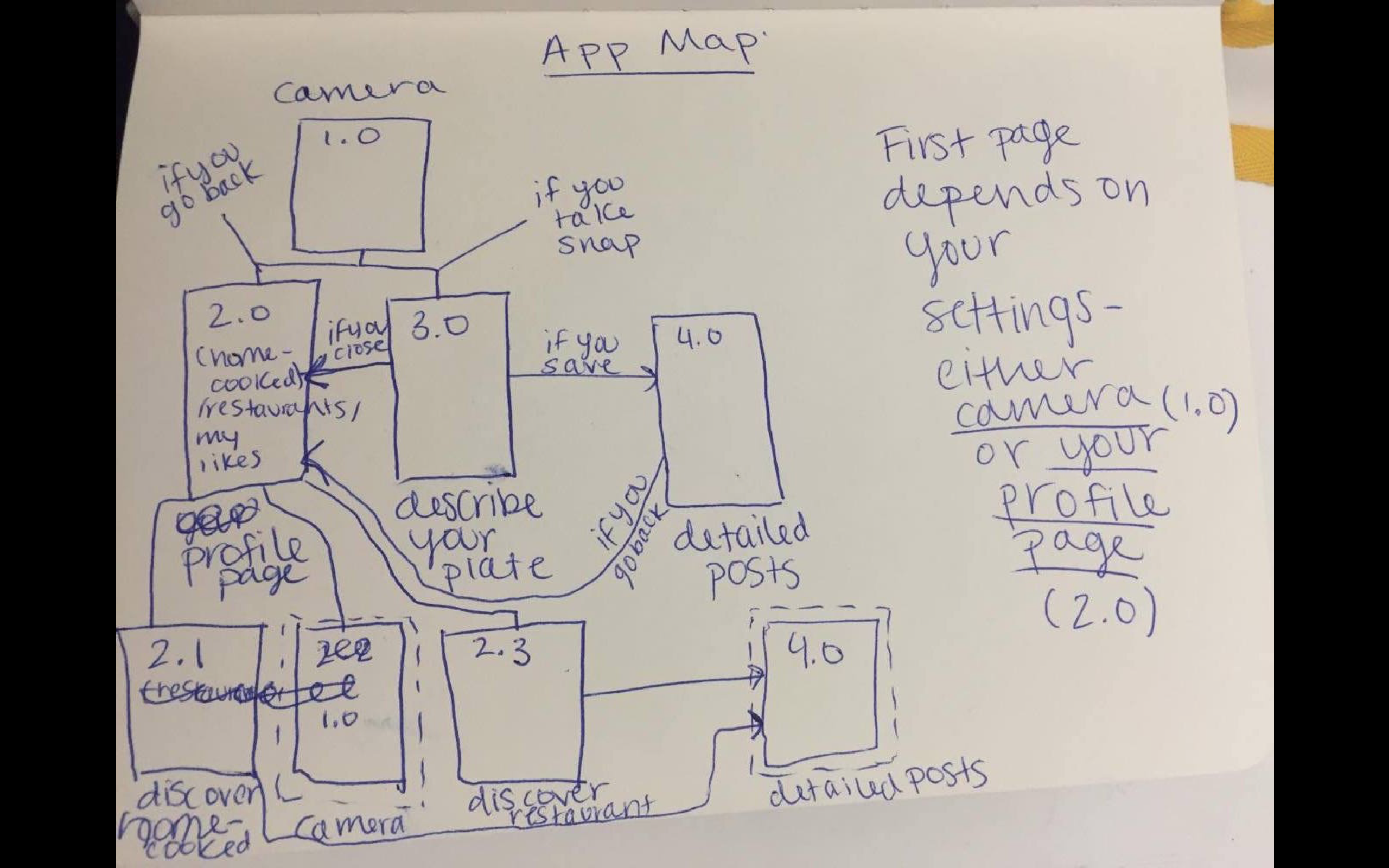
Teller App: New App Map and Features
After user testing I added a few new things:
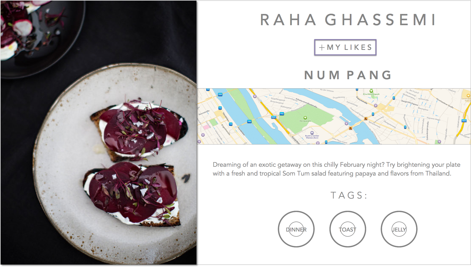
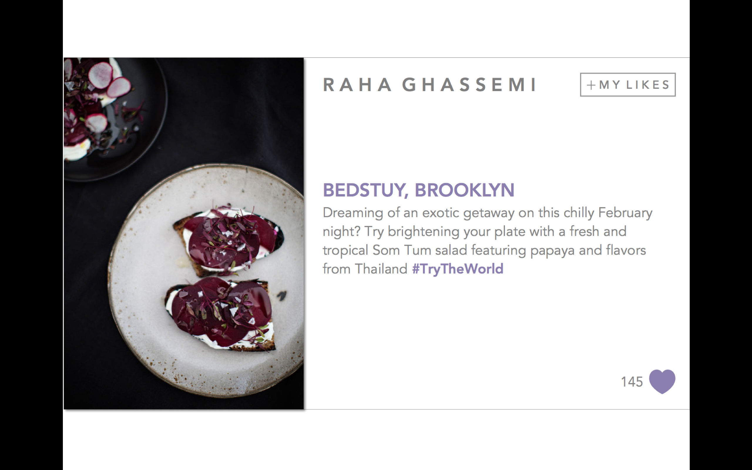
- a more prominent like button in the detail view (1.2)
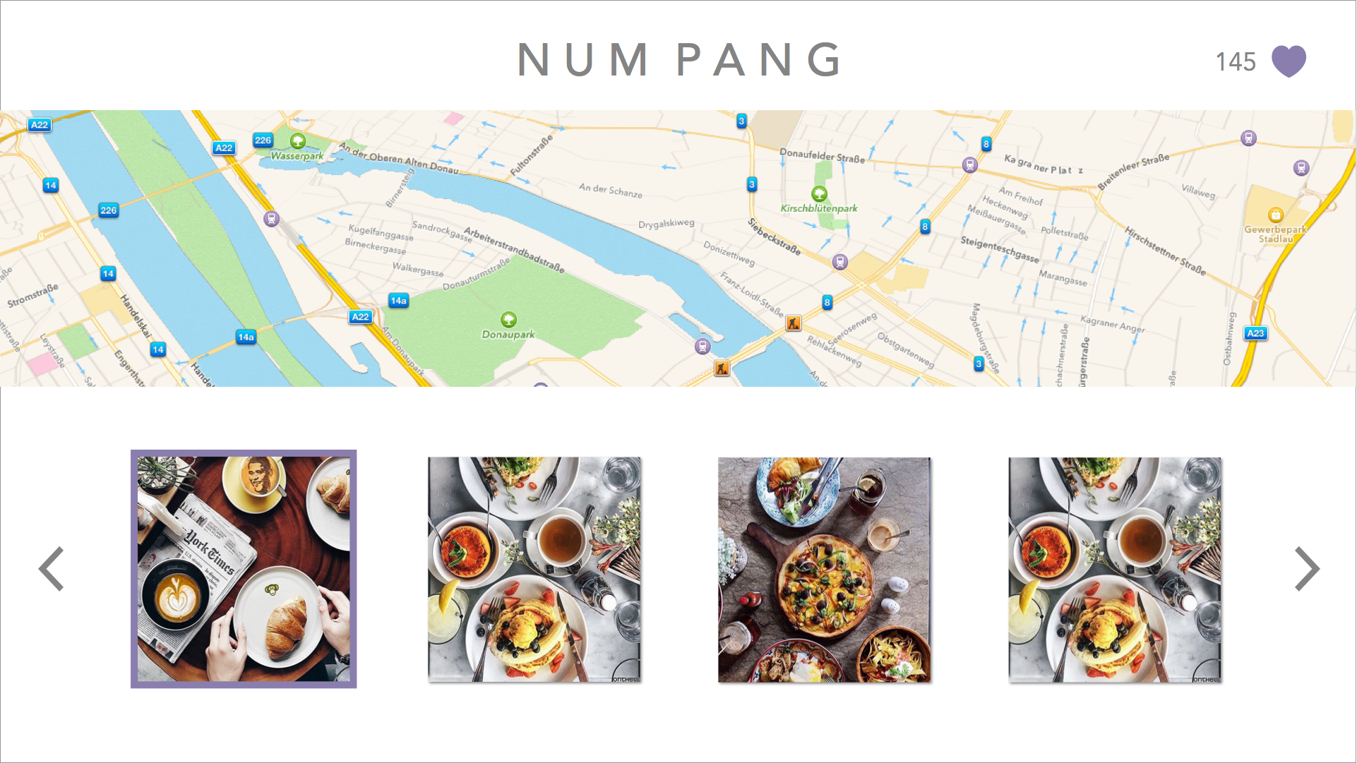
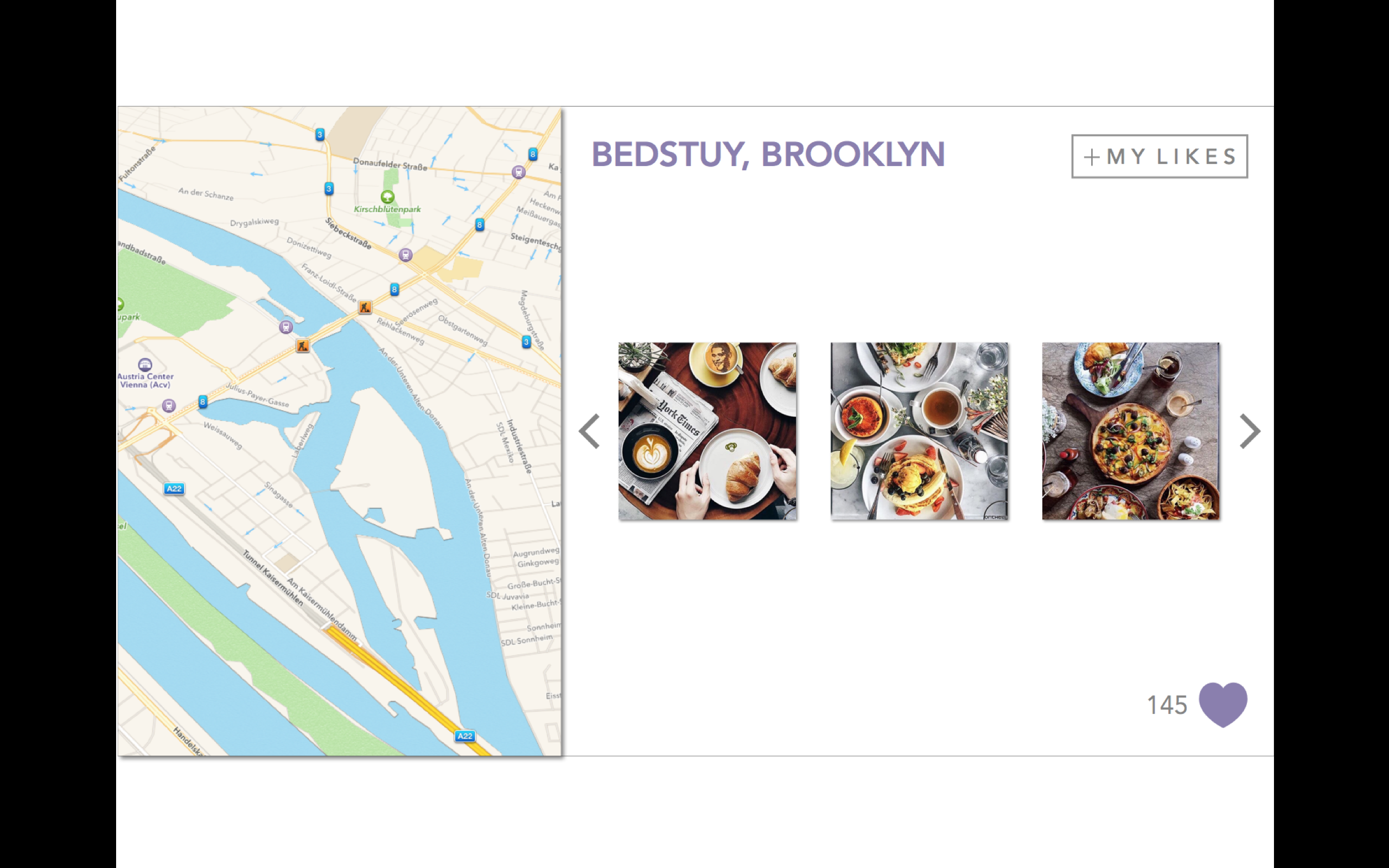
- the ability to like and save locations and view other plates from those locations (1.2a + 4.1), the my likes view (4.0) now includes a segmented control of “plates” and “locations”. In the locations segment (4.1), the filter of home-cooked, restaurant, or both is disabled as it doesn’t apply to locations.
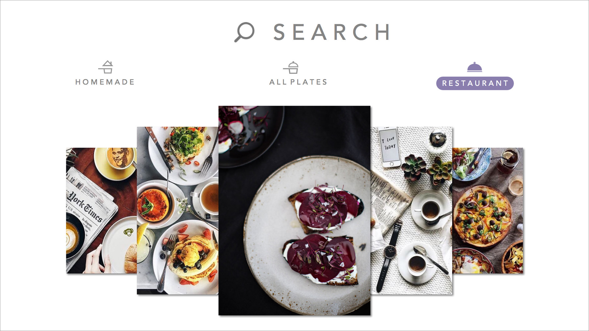
- I added a search view which filters searches using a segmented control of “people”, “tags”, and “locations” (1.1)
- I created a loading screen
Teller Prototype 2: New Navigation Organization (App Mapp)/Invision App

Next Steps: Currently, I have kept the social aspect simplified. ie there is no following users, just tags, and no comments, just likes for the purpose of keep a list of favorites. This makes the app a jumping off point for sharing to other platforms. Next steps include comments and follows making it a niche instagram. I need to include a notifications tab as well, plus a search filtered by people, tags, and location. I also need to create a mapview for when someone clicks on a location. I would like to make those locations likable as well, in order to keep a list of locations as well. That way, in the “my likes” view I could add a segmented control that shows liked images on one view, then liked locations on the other.
Teller: Paper Prototype for Project 1


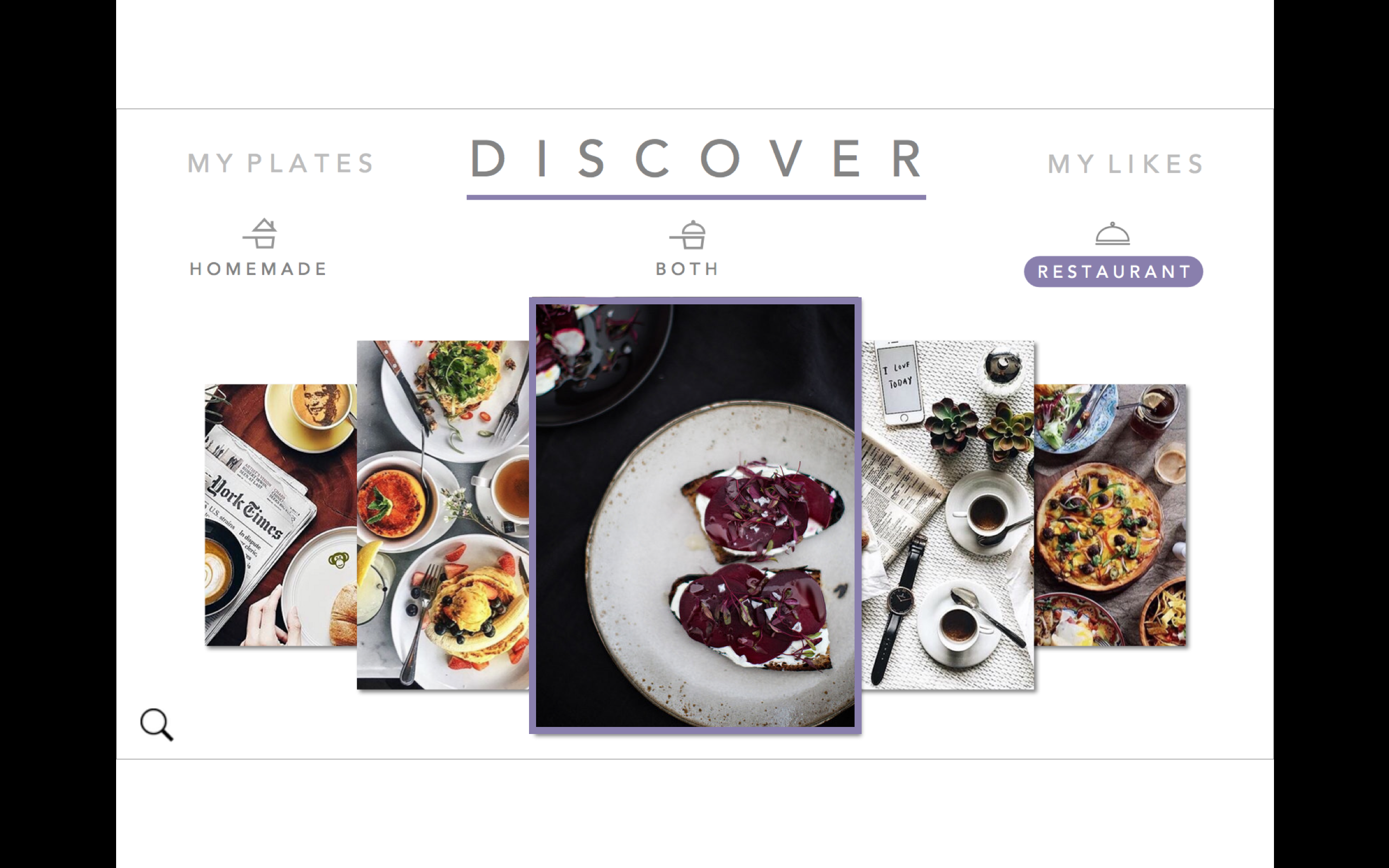
 I had a new idea for the organization: instead of segmented controls that then hide some of the content…what about a filter option at the top in the form os a thin slide that has the options: Home-cooked, Restaurants, and Both with a default setting of Both. That way they can be exposed to all content at once on any page. Tab bars would be Discover, Personal Profile, Camera, and My Likes. All of those except camera would have the filter option at the top.