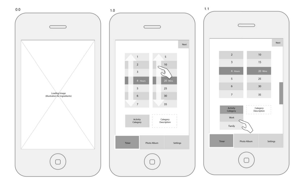
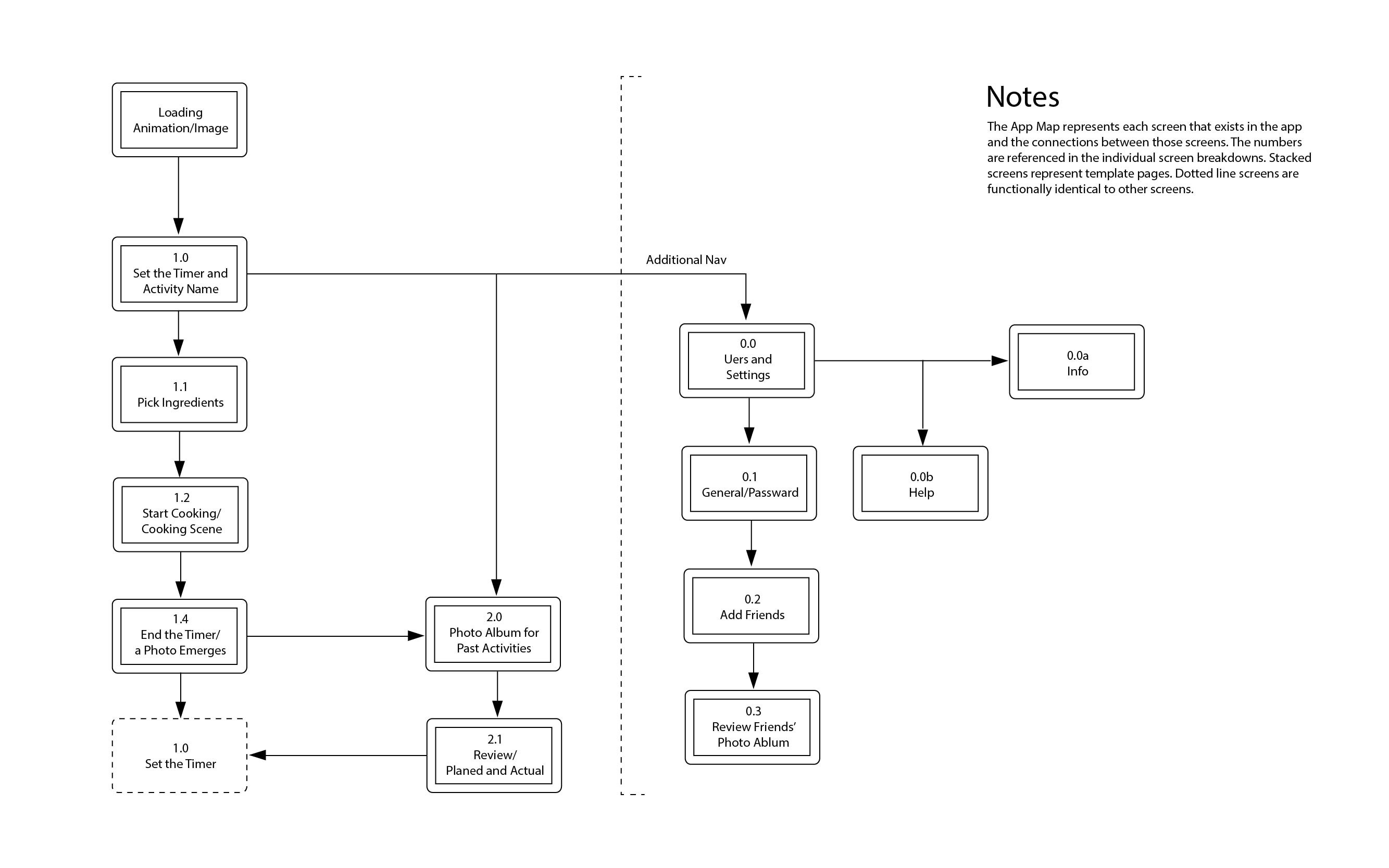
My idea is to make a timer app. Instead of rotating the hour and minute wheels, my timer is related to cooking. I think it’s better if I use an example to explain this idea:
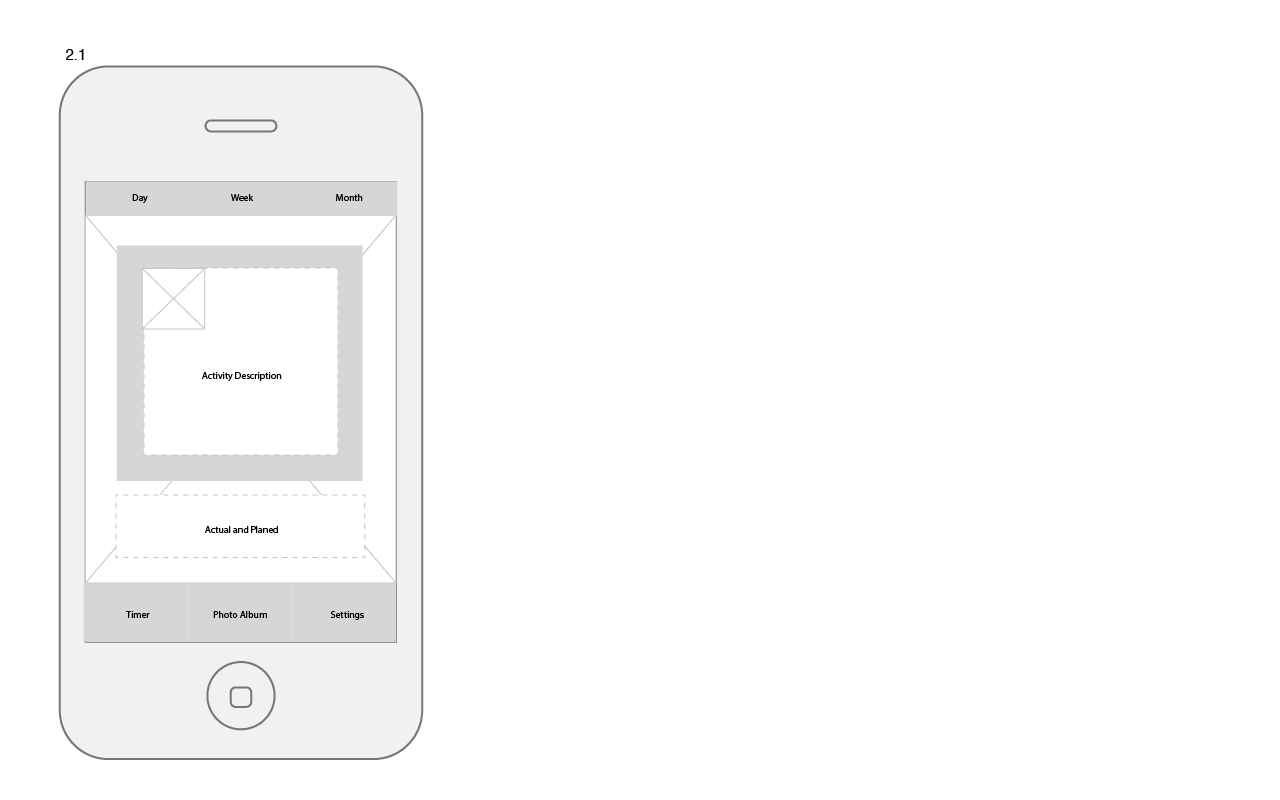
let’s say, I need to finish an assignment in 1 hour, so I use this app to set the ‘timer’ for 1 hour, and a list of ingredients will be shown on the screen, and all these ingredients can be ‘cooked perfectly’ within 1 hour. for example, I pick rice. so the rice will be automatically cooked in the app. during this one hour I’ll work on my assignment, the thing about this app is that I will not be informed or alarmed by this ‘timer app’, so I have to check the ‘timer’ after I’m done my paper. the rice will not be burnt if I get back to the app on time, if I’m late for checking the app, the rice will turn bad according to the time. I have to tap the ‘rice’ in order to get the dish i made into my collection.
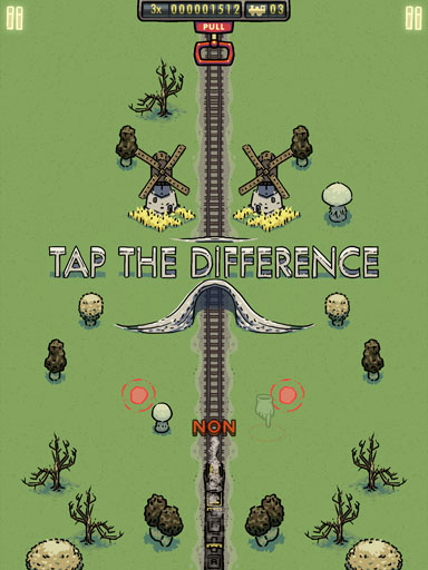
the second idea I have is to make a fun camera app to capture people’s laugh face. The app will automatically detect the smiling face (more likely, the teeth) in the camera and people who use it will be automatically filled with some food in their mouth, or on their teeth. so it can become a competition between friends to see what food they can get in their mouth. the food will be different depending on the size of the mouth. the goal of the app is to make people laugh more and having more fun.
I personally like fun apps, I want apps to be relaxing and fun when people are using it even though it might sound not as ‘useful’ as other apps that are existing.