#Thursday app || Frannie


Mug Life App

This app is using computer vision to animate a picture into videos or animated gifs. The users are able to export the gif and share it. Other than sharing the animated image with their friends, the users could also share their images within the app. There is also a trend function in the app that allows the users to see other people’s work. The users can either make the gif based on the template provided by the app or through the creative mode where they can change everything by an in-app purchasing.

I really like this app because you can get very realistic but funny results sometimes. I think the company did a good job of combining technology with real-life photos and provided the opportunity for the users to create something out of the original boring photo. For me, it is a playful app.

#thursdayapps || Frannie

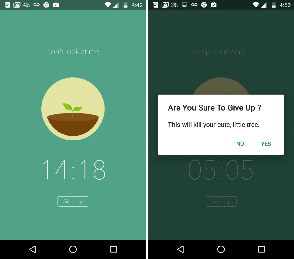
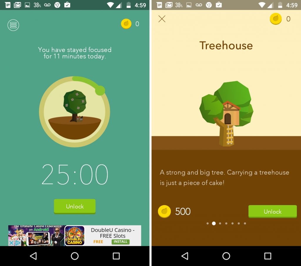
Forest is an app that is designed to help users to start an anti-mobile-phone lifestyle in order to focus on their real life. When the users turn on the app, they will have to stop using their phone for a preset amount of time in order to grow a tree. If the user left the app in middle of the preset period, the tree will die and they will have to start over. The final goal is to grow out a whole forest by growing trees one by one. It’s a great app to keep people focus on whatever they are doing in their real life, no matter it’s working, studying, or communicating.


The users will need to keep focus to get more coins in order to buy other types of tree. Other than that, Forest also work with an organization to grow out real trees in real life. The coins can then use to plant a tree in reality. It also has chrome extension now.

Week 6 || Frannie

Things I noticed about APPLE TV HIG:

  1. Users should be able to go backward through the menu button since it takes too many efforts to go from selected item to the top navigation.
  2. In this case, don’t waste space for back button since users already know the menu button can take them backward.
  3. It takes effort to type in the search bar, so it’s better to create filter rather than use typing in order to search content.


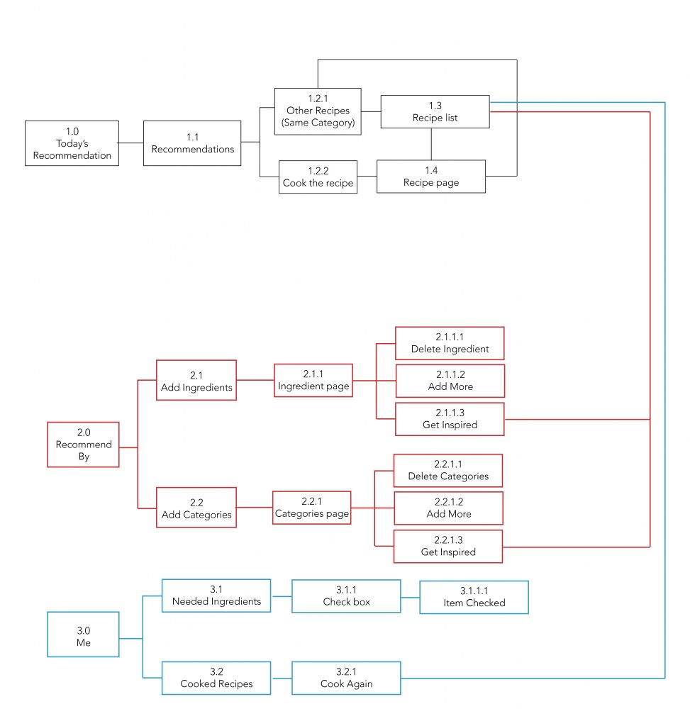
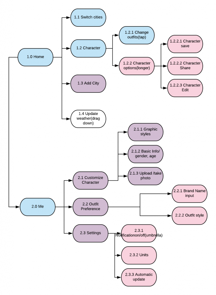
APP MAP:

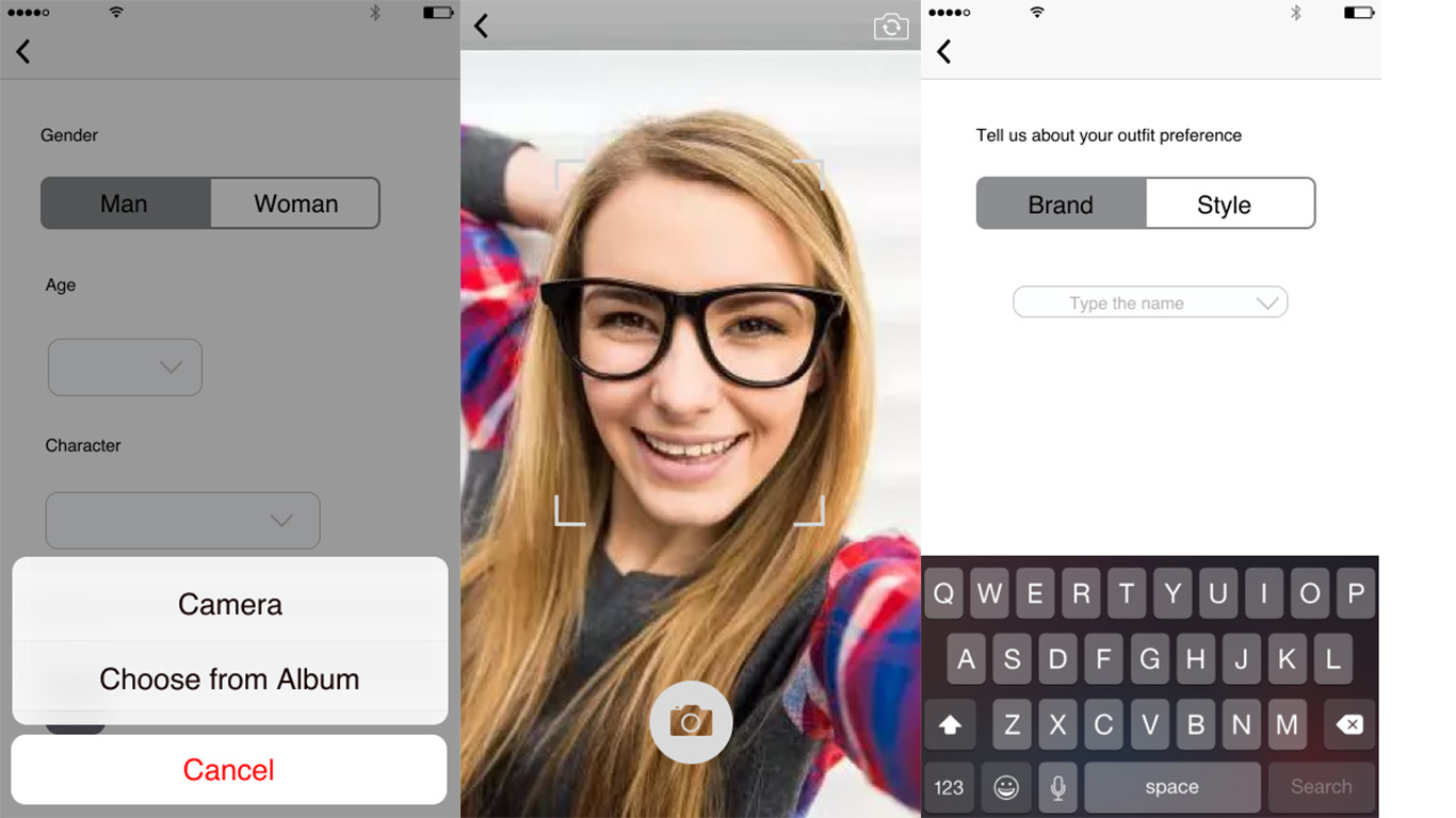
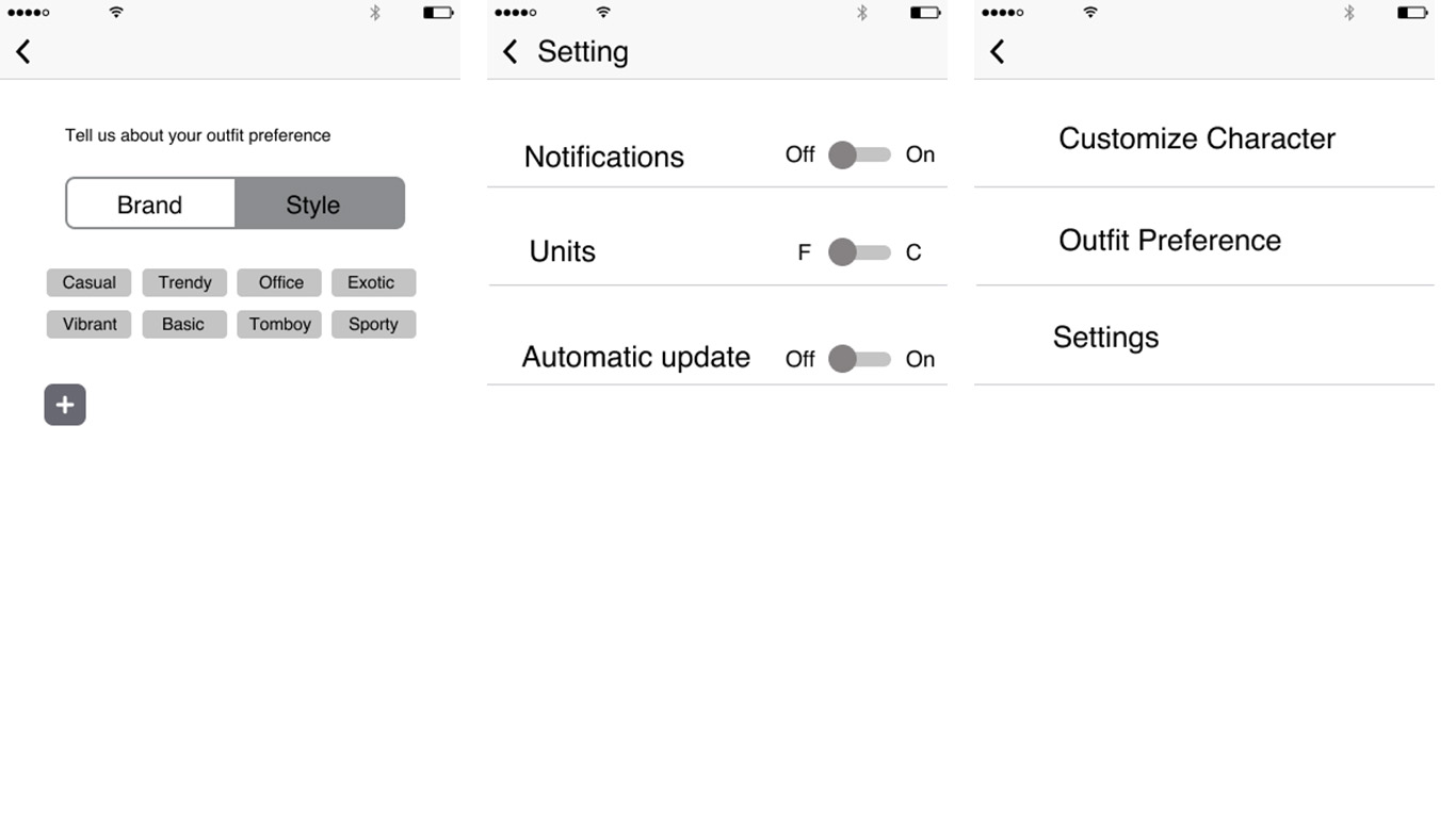
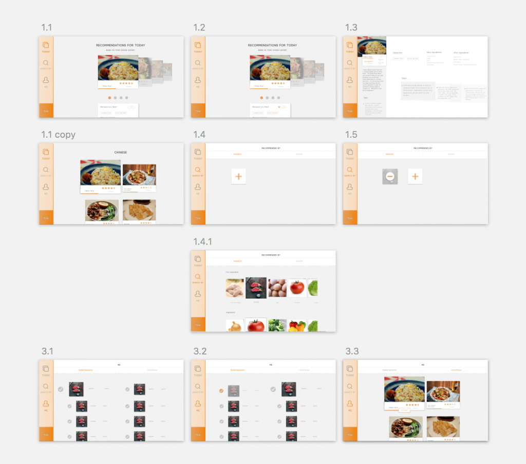
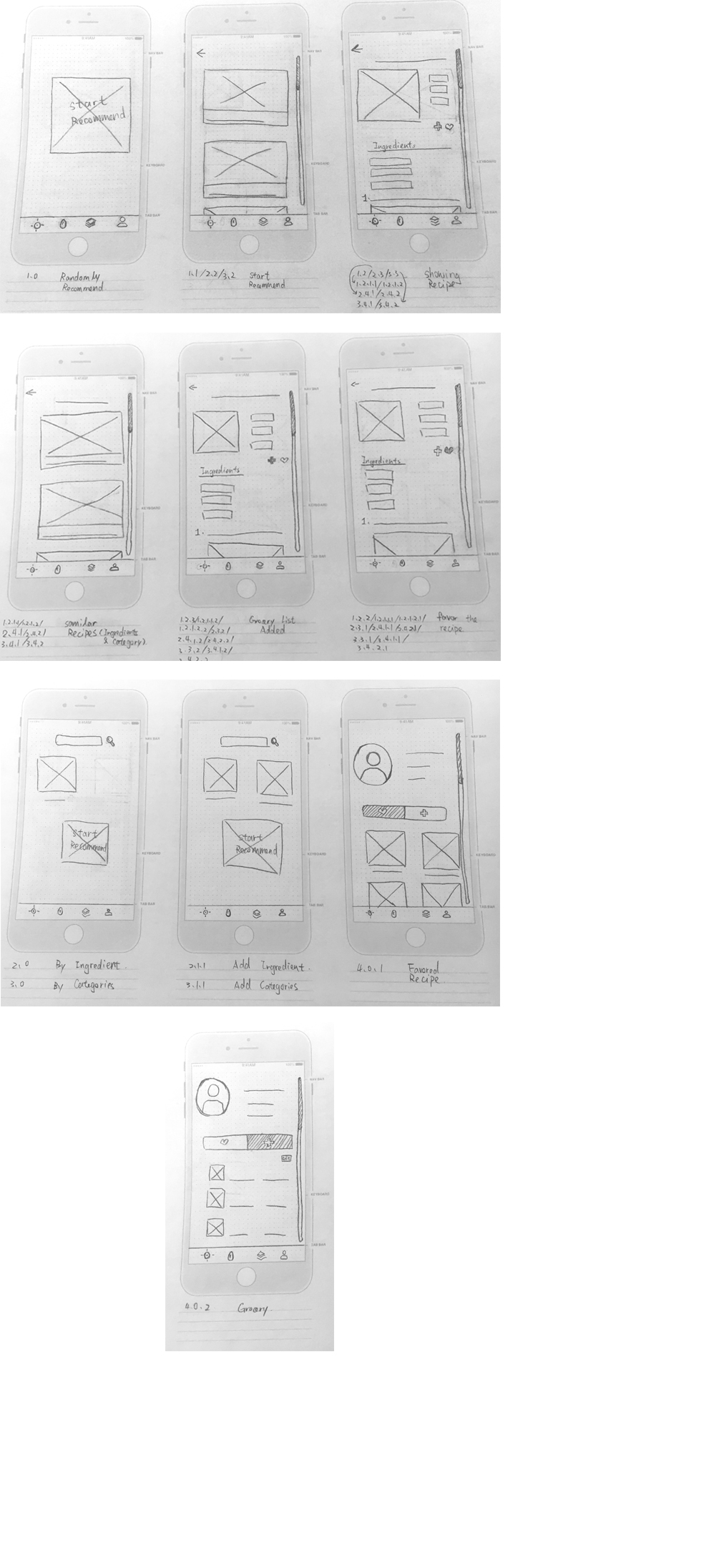
Wireframe:

Week 4 || Frannie

User test feedback:

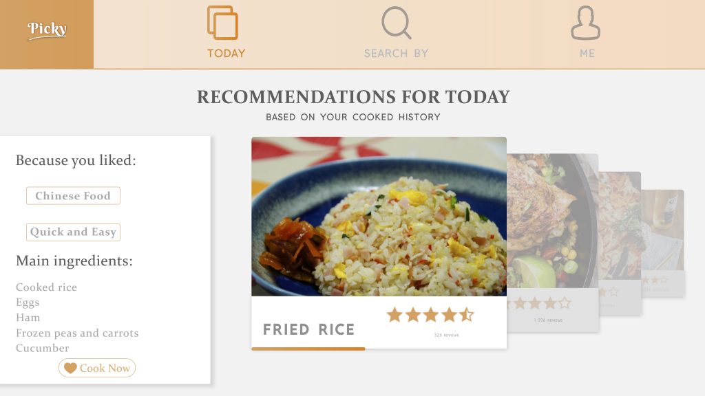
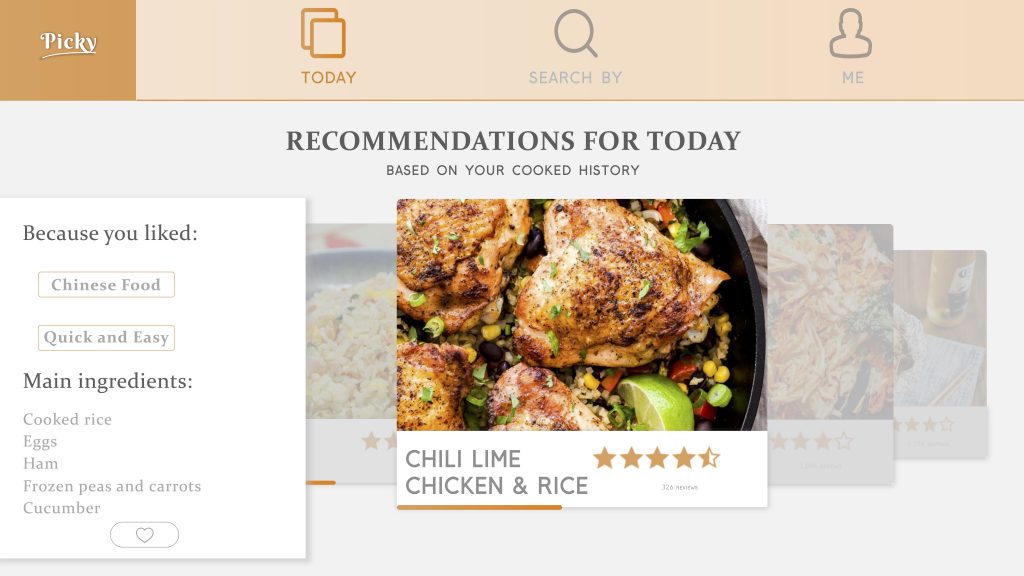
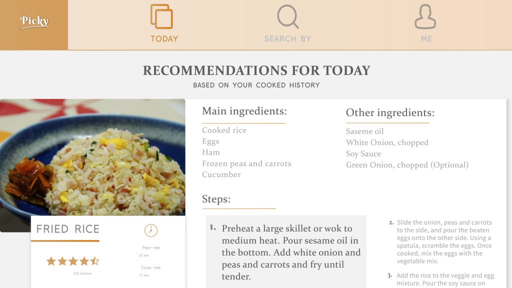
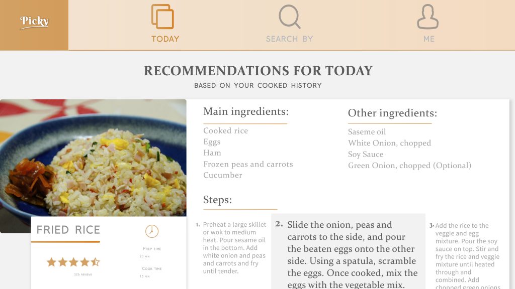
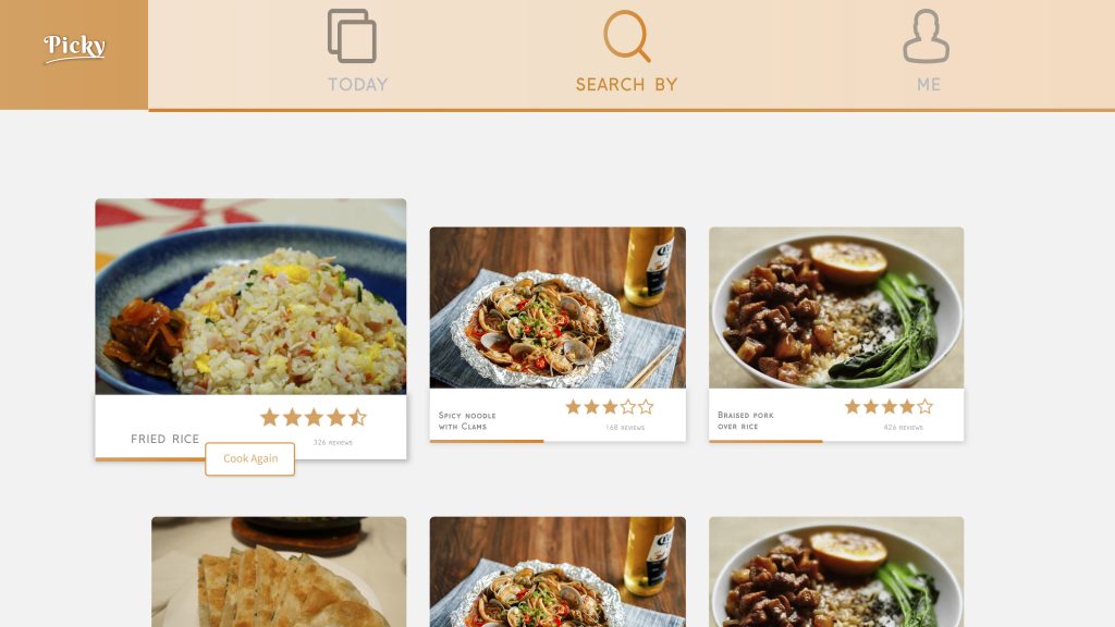
  1. The position of the recipe’s name was confusing, should be move either higher or lower in order to identify the recipe.
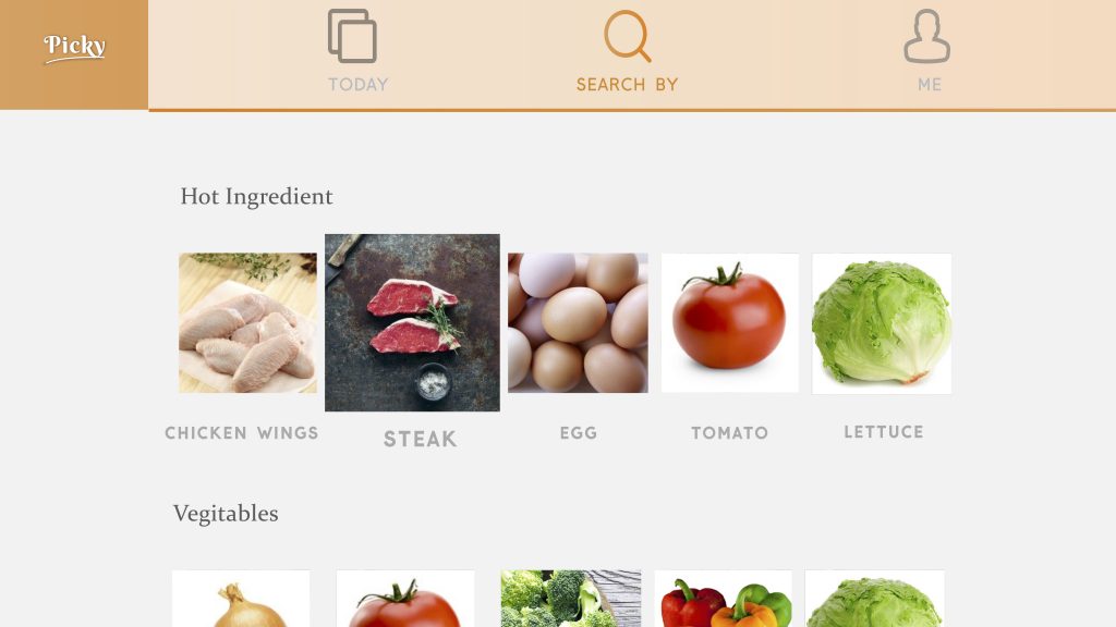
  2. What about ingredients like salt, and green onions in the recipe? Should there be recommendation for user based on these ingredients?
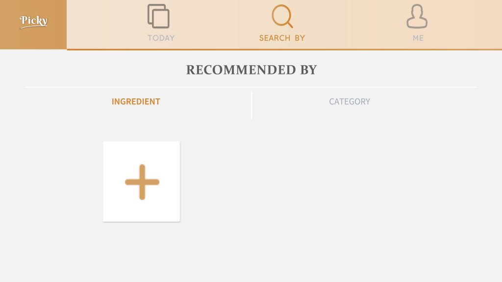
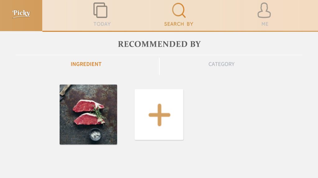
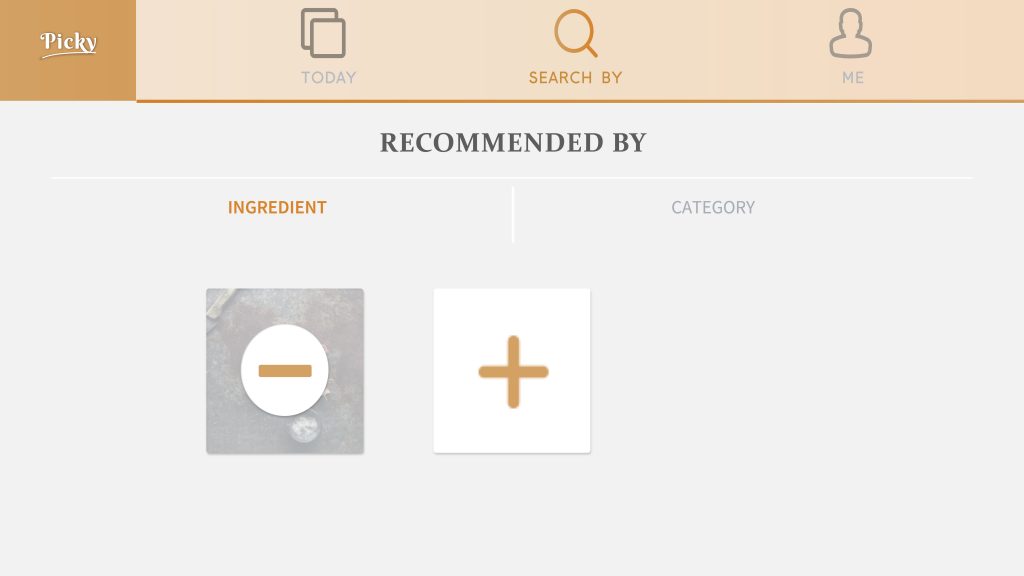
  3. There should be title for options in the recommend based on category/ingredient page.
  4. Text are too small.


Digital Prototype:

https://marvelapp.com/7hhb9jb/screen/38283493

WEEK 3 || Frannie Xiao

Learning From Paper Prototype:

  1. The app should be learning from user’s behavior, and try to recommend dishes based on their preference and cooked recipes.
  2. The “favor the recipe” tab and “add to grocery list” tab are similar and seems a little bit repetitive for user to tap on both of them since most of time they will tap on both tabs. The two tabs could be combined together and directly store the recipe into a local account.

Digital Prototype:

https://marvelapp.com/7hhb9jb/screen/38247859

WEEK 1 || Frannie Xiao

Hi! My name is Yiying Xiao and you can call me Frannie. I came from Beijing, China. And I defined myself as an artist, creative producer, experience designer, and interaction designer.


Things I didn’t know about Apple HIG:


[Feedback]

I didn’t realize before that there are subtle indicators for user to subconsciously know what’s going on with the APP. But it does give the user a hint on the feedbacks that are very subtle that works better than a grand gesture of status changing.

[Consistency]

I actually noticed that most used apps for me has similar icons which are designed visually similar to the Apple system icons. But I didn’t realize the reason of this action is to keep the app consistent with the system so user would feel familiar with what’s happening in the app.

[Color & Branding]

The part that encourage designers to stick with the color palette which coordinate with the logo and overall brand vibes are very inspired since I’ve always only thought about how the color palette would effects user’s emotions rather than the way they perceives the brand.


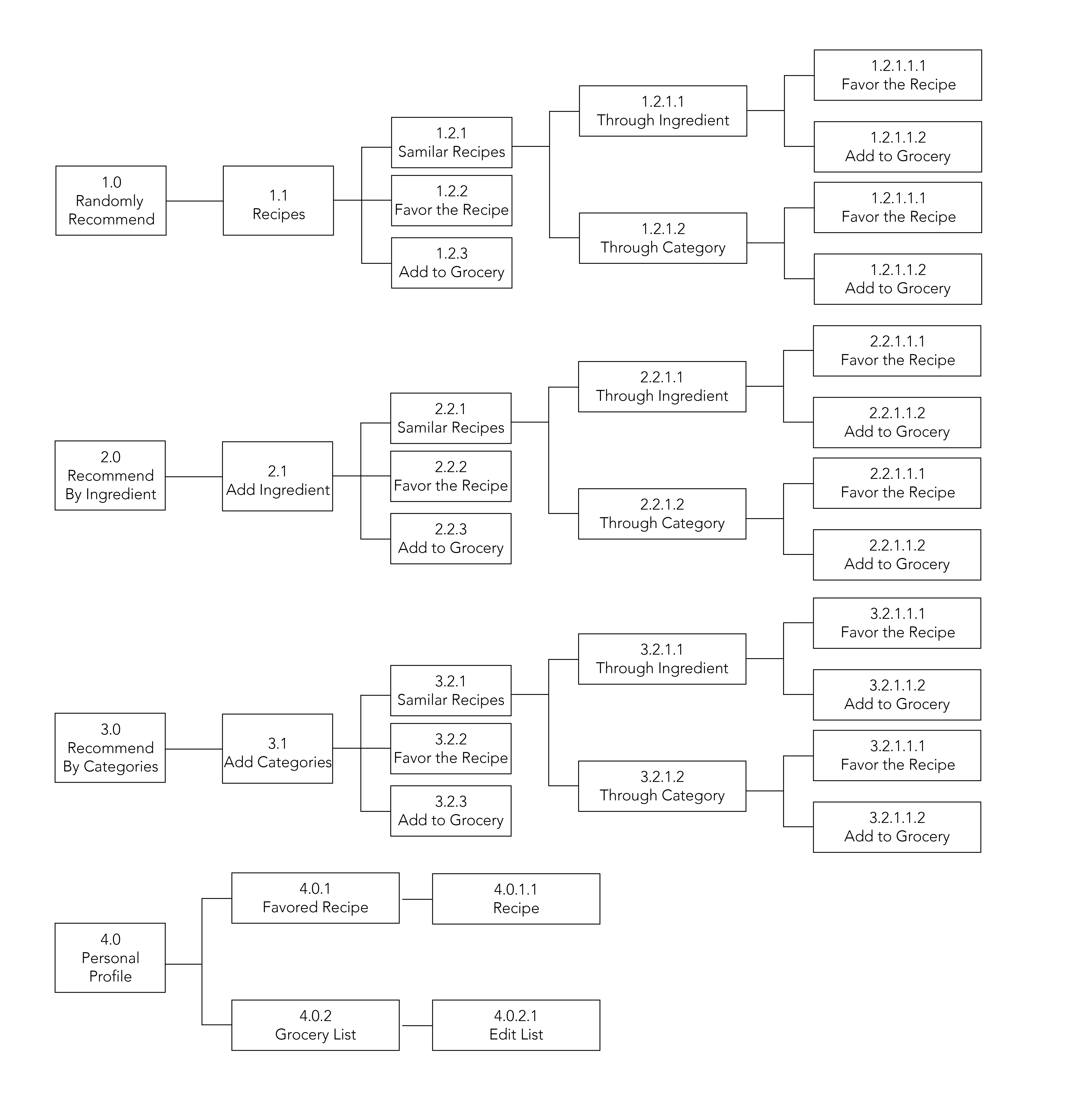
APP MAP


WIREFRAME