Weather Pals | ISO & WatchOS | Final


These are our final iterations. From our last critique we had received feedback on the main IOS view. The time slider needs to have a reset button so the user can easily get back to the current time. Also we need to find a system to continue to reward the users, because over time we will run out of ideas to reward the users. Overall this was a great opportunity to hack away at our previous iterations.

Apple Watch | Three Things I Learned | Brandon Palmer

Three things I learned from our WatchOS critique. First the color of the background needs to be changed from white to black. WatchOS uses black as the default background because it takes up less power. Second, achievements are a huge part of our app. We need to add proper notifications in order for the user to experience their rewards. Third, fantastical uses a method where it sends your upcoming appointments through notifications. We would like to adopt this method, so it give the user the incentive to glance at their “look” view while tracking their appointments.

Brandon Palmer | Three Things Learned | 2nd Iteration | Weather App

Three things I learned from our second Iteration of our weather/calendar app is that the swipe functionality doesn’t work.

Swiping Error:
When we swipe down our initial intention was to display our calendar and weather view. The issue with this is the top bar. It displays the date without transitioning from the main view.

Solution:
The Solution would consist of developing an animated bar to appear, or to readjust our nav.

Temperature or Time? Error
Our main view consisted of a transitional bar that allows the user to scale between day and night. Indicating the weather on a timely basis. The problem that the user becomes confused with the colors. The specific colors we chose were blue and orange, they need to be changed.

The Navigation
The third error we stubbled upon was the navigation. Our main Tab Bar would take the user to an identical view as if they were scrolling down to our weather/calendar.

Solution:
Remove the Tab Bar, or change the view. This was a repetitive problem that was addressed above, yet it is an ongoing problem that creates dysfunctionality multiple sections.


#Thursday App | King Rabbit | Brandon Palmer

Image result for king rabbit

King Rabbit is an IOS game developed by RareSloth. This game uses puzzle based mechanics in order to complete each stage. Although the mechanics are similar to Frogger, which makes the game attractive. The usability for this app is complicated. The menu view is confusing to get around, the icons don’t symbolize their functionality, and the payment system is scattered. Overall I enjoy playing this game because I am into puzzle games. But there is much work that needs to be addressed to further develop this game.

Brandon Palmer | Three Things I learned from the critique | Weather & Calendar App

Problem 1 | Calendar Events

The first thing our group learned from this weeks critique was that our app needs to connect the calendar events to the reward system. There is a major loop hole in which users can easily check off their events to gain points. (Not Good)

Problem 2 | Animations

The second problem that needs iteration pertains to the functionality of our animated character. When the user interacts with the time dial. The sequential transition of the character stays the same as the local weather. Creating misalignment with the modified times.

Problem 3 | Achievements

The main hook of our application that separates it from competitors are the unique characters. The user can be rewarded for new accessories that can either treat or torture your weather buddy.

Main focus

Overall our main objective is to connect the characters to the calendar events giving the users the incentive to complete their daily goals.


Brandon Palmer | TVOS FINAL | Things I learned from critique feedback

Concept: Superb TVOS is an alternative meal preparation app in addition to the IOS variation. Superb TVOS focuses on video content and meal browsing as its own identity. After presenting my final iterations, I have gained various feedback. First off, Superb TVOS doesn’t allow users to purchase meals. Instead it allows users to view existing meals and favorite them. Which directly sends data to the ISO version, allowing users to purchase from the ISO cart. The TVOS version also allows the user to sign up for a membership service in order to receive video content.

Error: TVOS should only focus on video content and membership services instead of mixing favoriting. This conclusively simplifies functionality while making the experience separate from the ISO version.

Error: Filtering video content and favoriting specific videos would be beneficial for users to further interact with the apps functionality. It makes sense for individuals to have complete control over their membership services.

Error: The content on the top portion of the meal screen should direct the users to view all of the video content. Instead the meal screen focuses on both favoriting meals and videos. And there is no way to view all of the meal options, which is a problem. Further implementations would be to remove meal viewing, and focus primarily on video content.

Brandon Palmer | Paper Prototype | Week 1

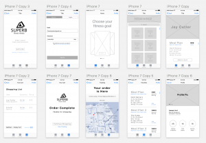
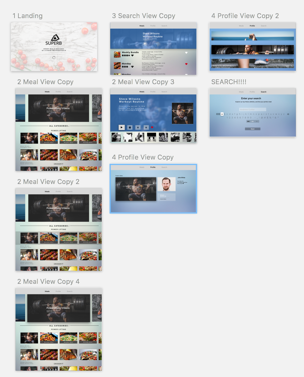
Three Things I learned | Note there are many problems with the first prototype. These are the Top 3 errors found from user feedback

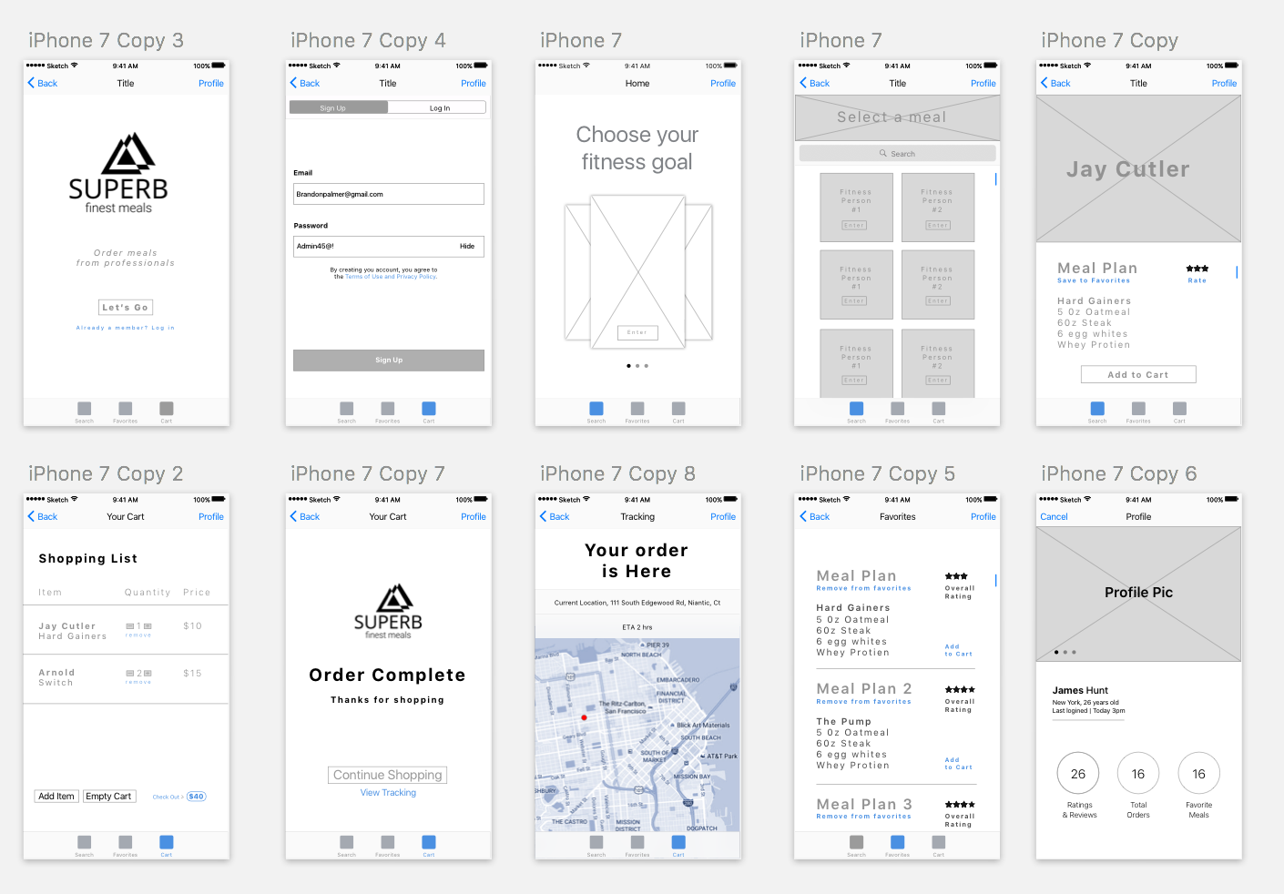
Main View | Display errors
After presenting my first iteration for Superb, I quickly found out from user feedback that the home view was to complex. The display consisted of three main divs in the center of the screen. Each div was intended to function as a carousel to scroll through and choose different options. The user thought that the carousel was an advertisement, and took around 5 seconds to realize its function.

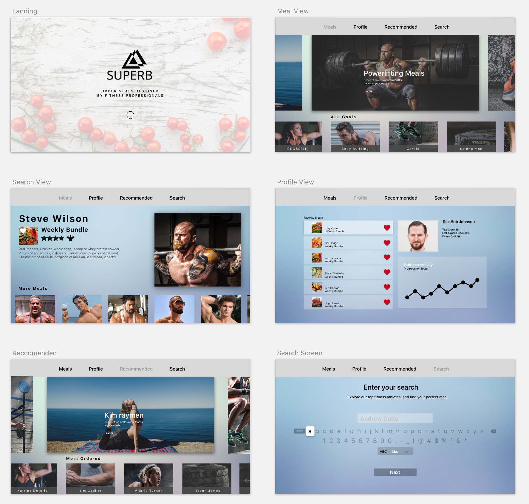
Solution: 
Make the home view show possible options to choose from, without stacking each element. (Simpler the better).

Meal Selection View | Layout and usability
As the user continued onto the next view, they suddenly became distracted with the disorganization of each display element. All of the fitness star names were on this page, without images of food. Causing the user to become aggravated with the choice selection. Ultimately making the user choose a random person without knowing which meals they were going to review.

Solution: Create a system that displays each category with some of the top meal options in the view, As selectable.

Profile view | Functionality
The profile consisted of three main elements. One section for Rating & Reviews, another for Total orders, and Favorite Meals. Now the user instantly questioned the reasoning behind this page. Since the elements had been designed for information and nothing more. The profile had no use. So my main feedback was for the user to be able to go back into the profile and reorder the previous meals.

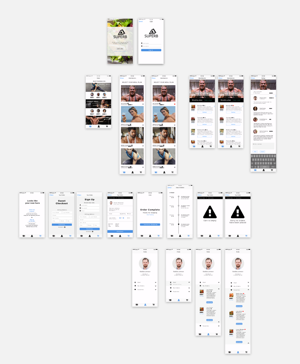
Solution: Give the Profile Functionality, or take it out completely. Developing an ordering system that operates as a simple checkout could be a nice touch to bring back users.

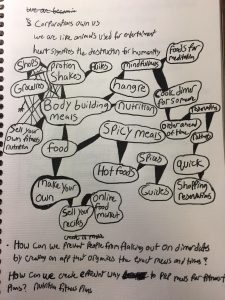
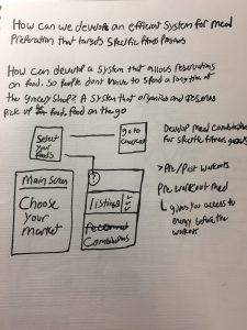
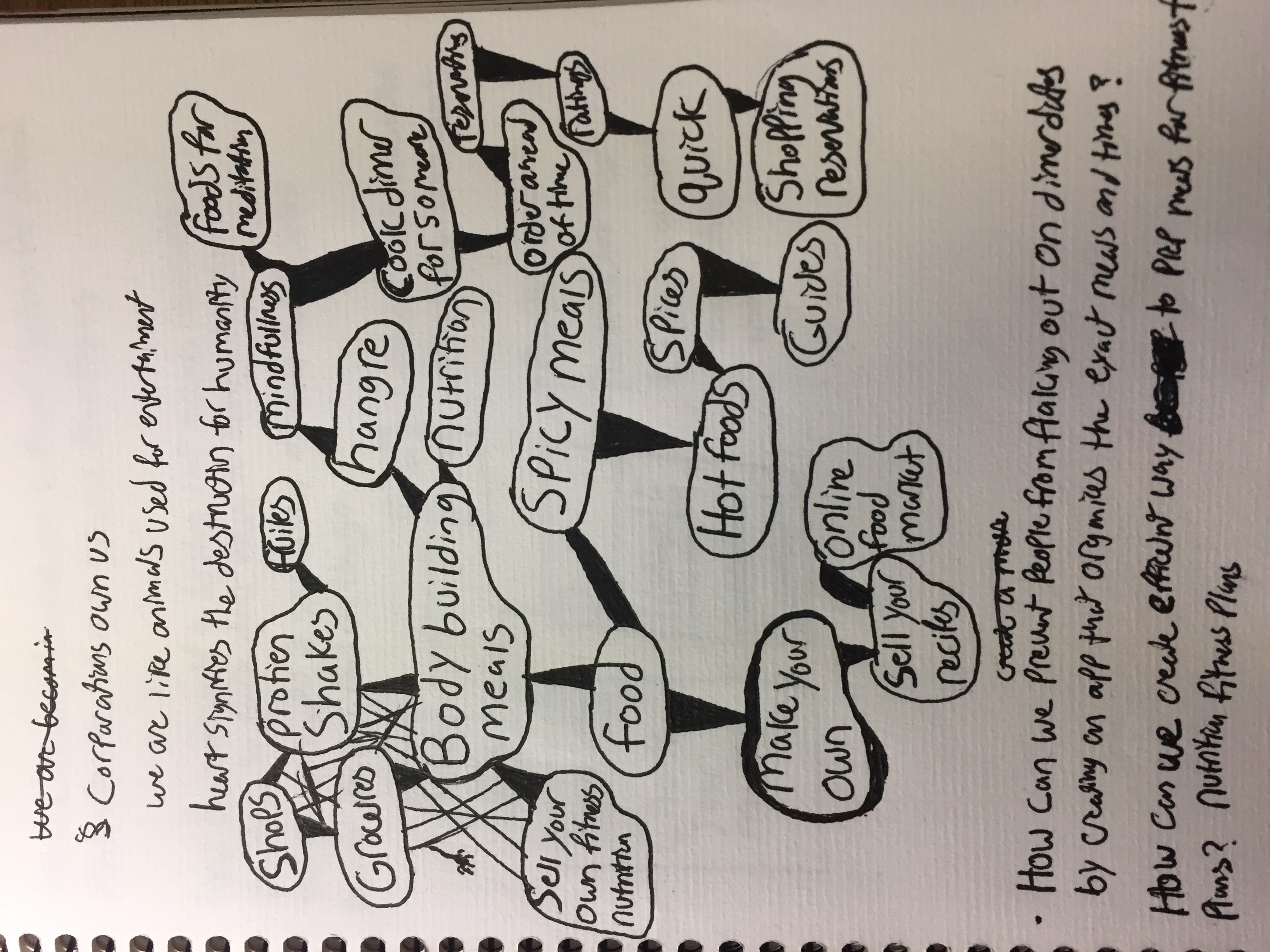
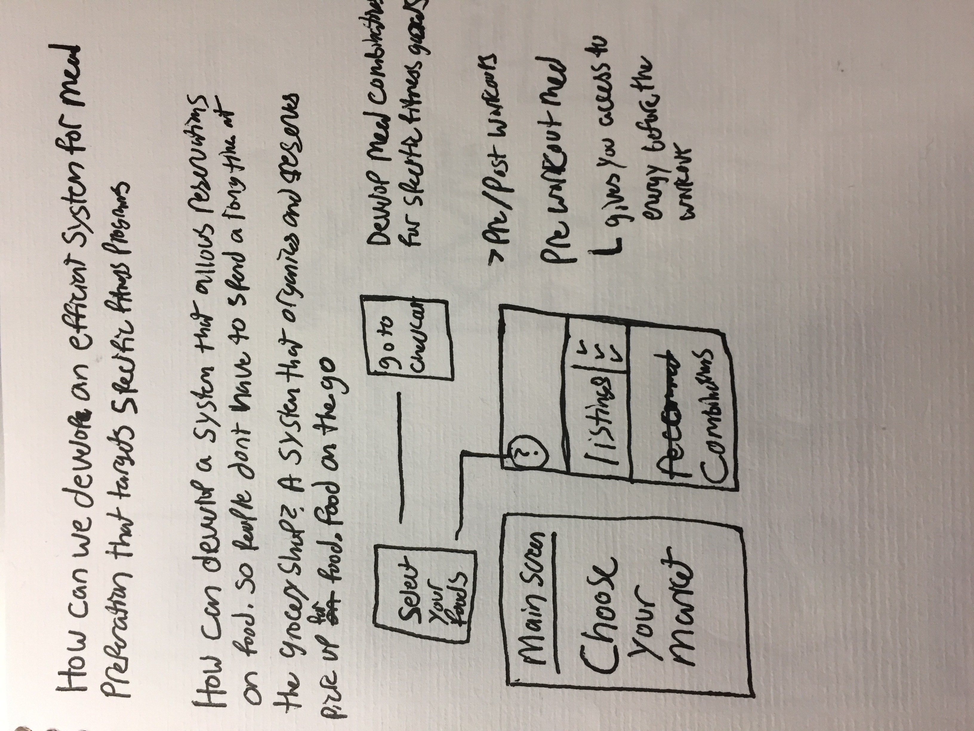
Paper Prototype | Notes


#Thursdayapp | Alto’s Adventure | Brandon Palmer

Alto’s Adventure: IOS Game, Android, & Kindle

After hearing many positive reviews about Alto’s Adventure I ended up buying it. The plot takes place on top of a mountain, where you as the player glides down the mountain on a snowboard to rescue runaway llama. Personally I found this game beautiful in all aspects. Not just the interface but the precedents that Alto’s Adventure used as references. Such as Tony Hawks Pro Skater 2, Monument Valley, and Journey. The core mechanics of Alto’s Adventure 2d Platformer  consists of collecting points that your obtain by landing tricks and retrieving coins as you make your way down the endless slope.
Overall I had a great experience and appreciation for playing this game because the color pallet, functionality and setting creates a relaxing experience for the user. I highly recommend this game.