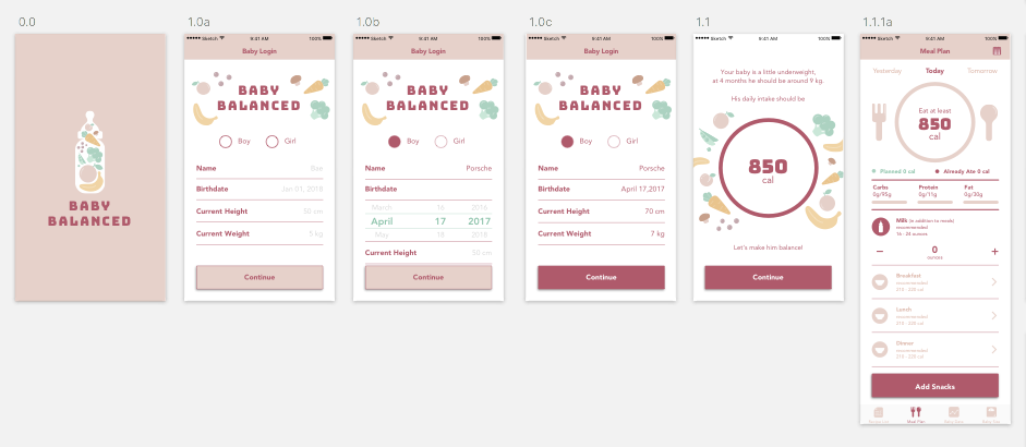
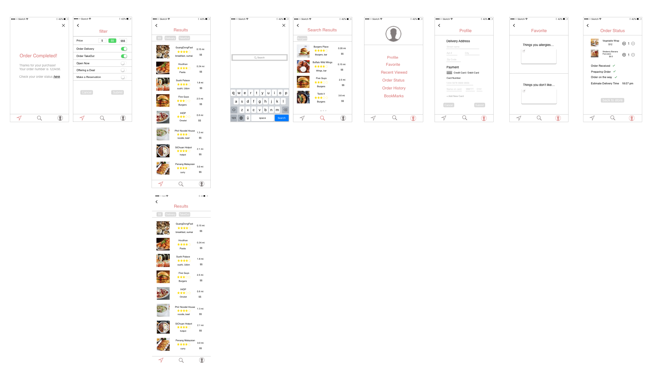
1.Since the health data is important, don’t use reminder page( at most time, users just ignore it). The first time the user uses this app, fill the health data view should be the first thing come out. refer to the baby food app.
2.in the dish details page, the user is likely to don’t know the meaning of the green background. Just repeat the recommended might be helpful.
3.in the health data tab, is the calendar necessary? simplify it. lists
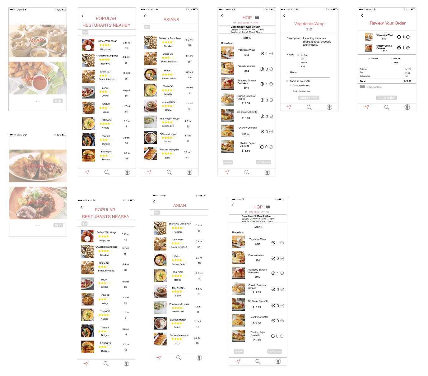
1. From the user test, people told me for busy people; maybe they do not need time filter specifically. They aim to make food quick. Think about another filter which can be helpful for them.
2. And people asked me “Is there any popular recipe or recommendation recipe?”
3. Think about the menu. (No need drink, dessert, or appetizer for this app.)
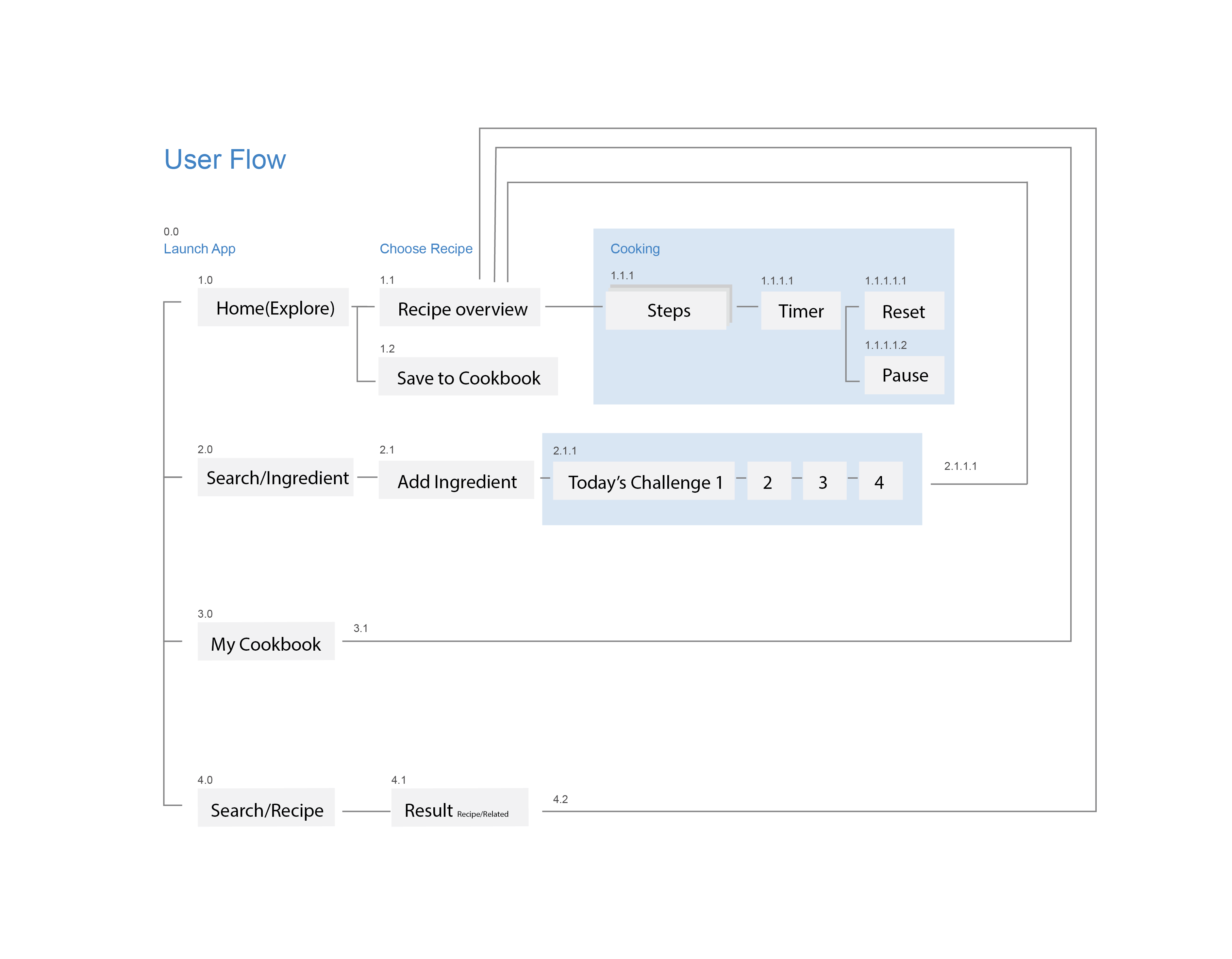
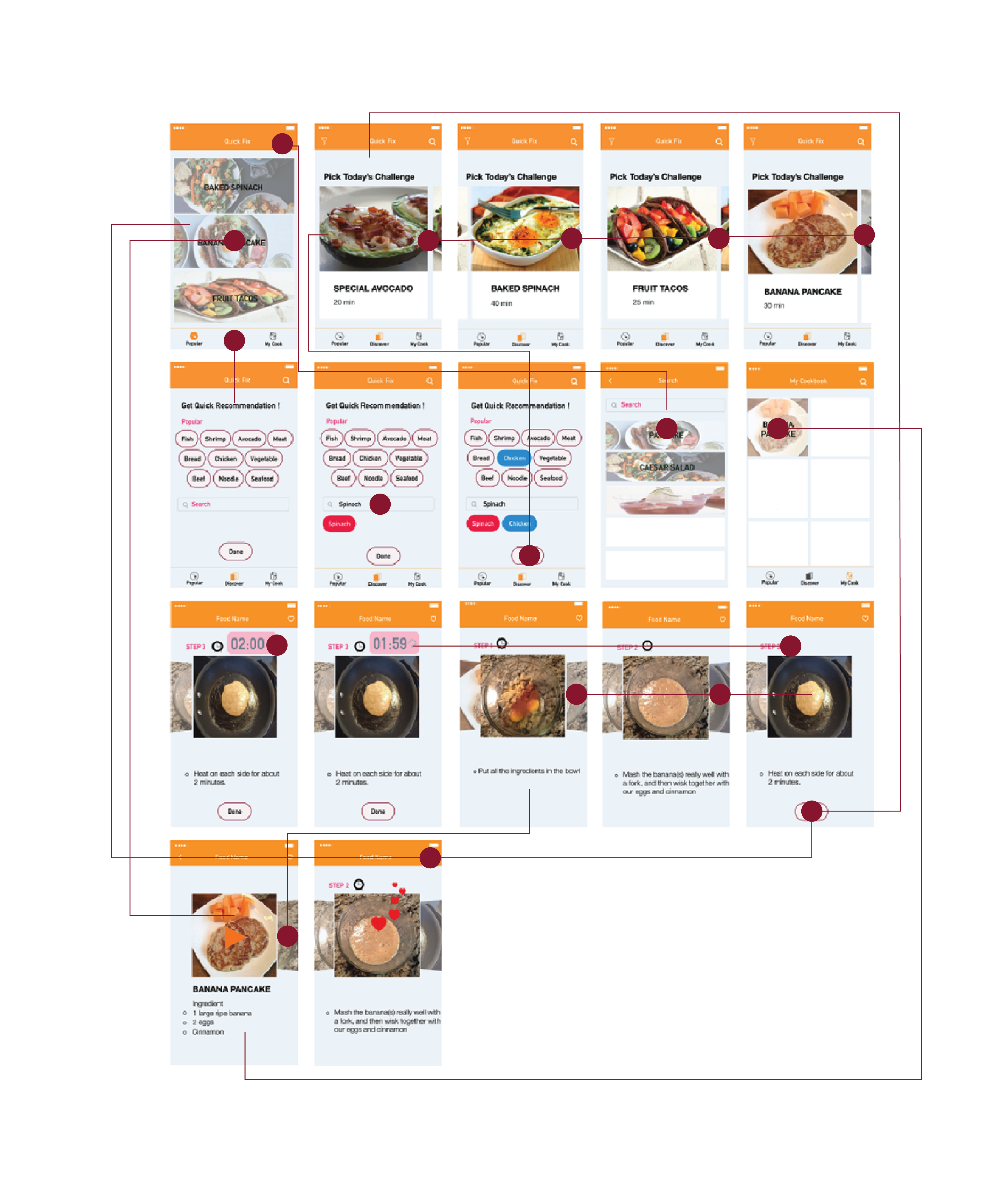
During my research, I found out that there are not many recipes that only takes 5minutes or 10minutes so, I decided to provide a recipe, which takes less than 40minutes. And I made a new filter that users can put the ingredients they have at home, or they want to eat. After their inputs, the app will recommend four recipes based on ingredients they choose.
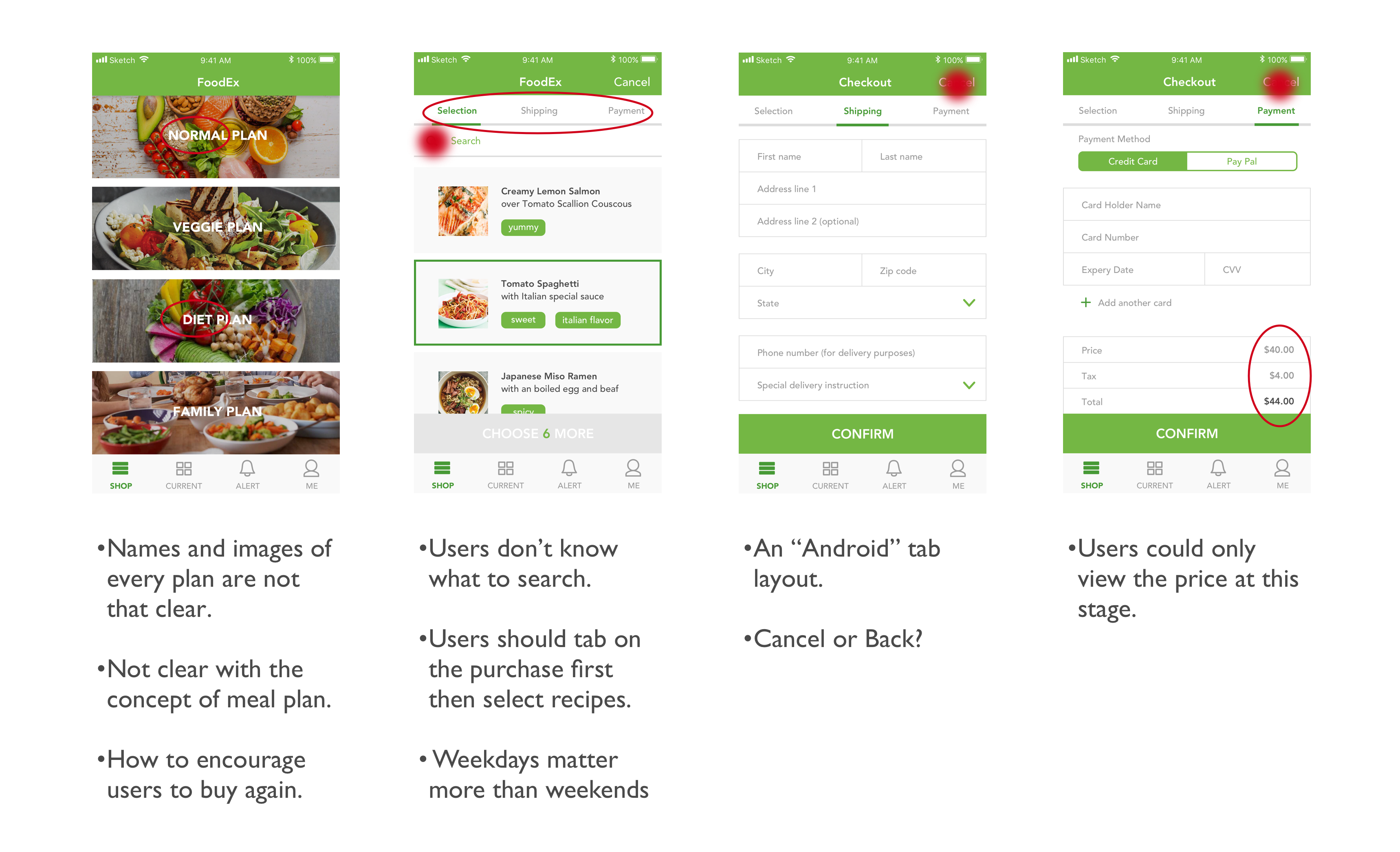
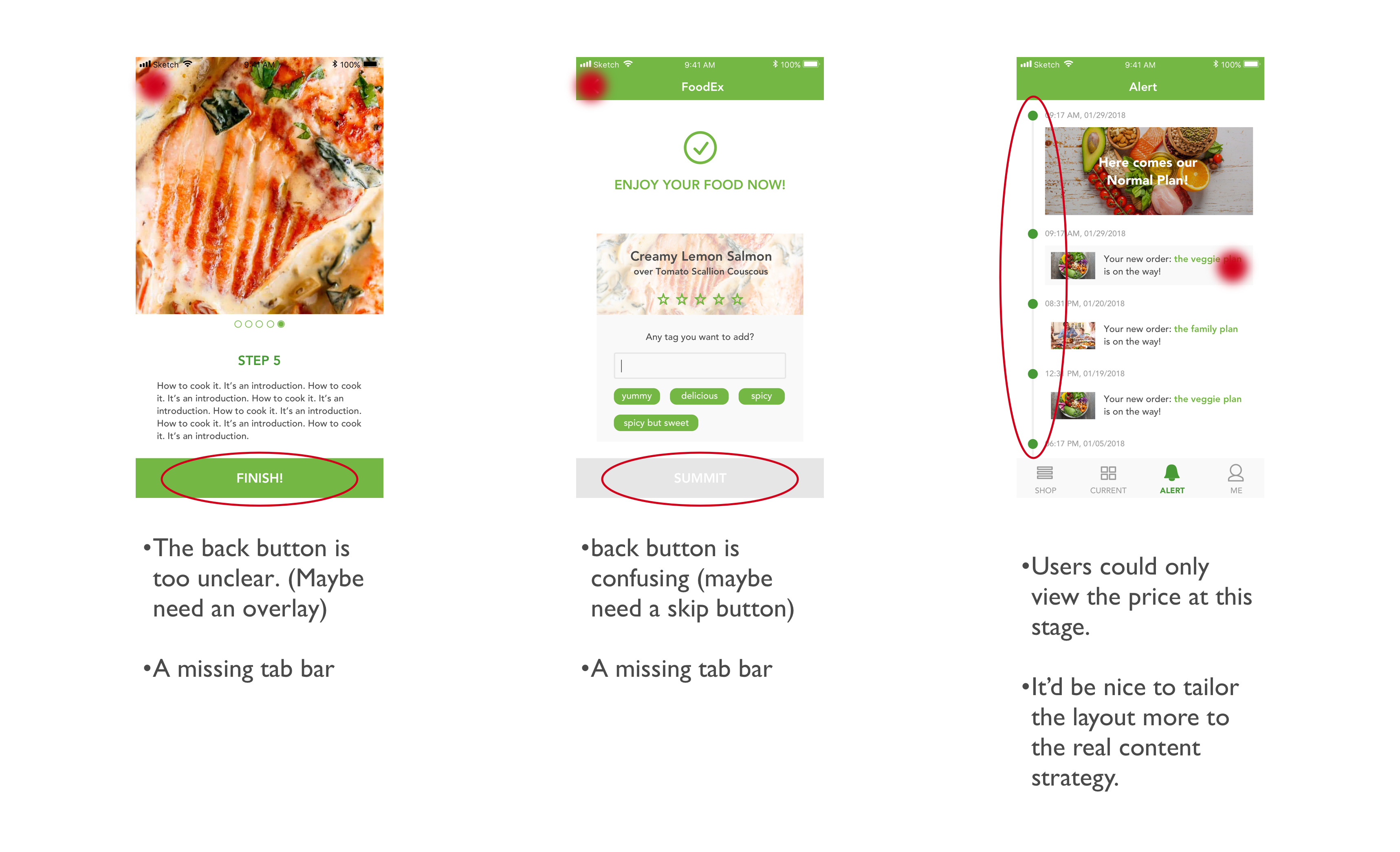
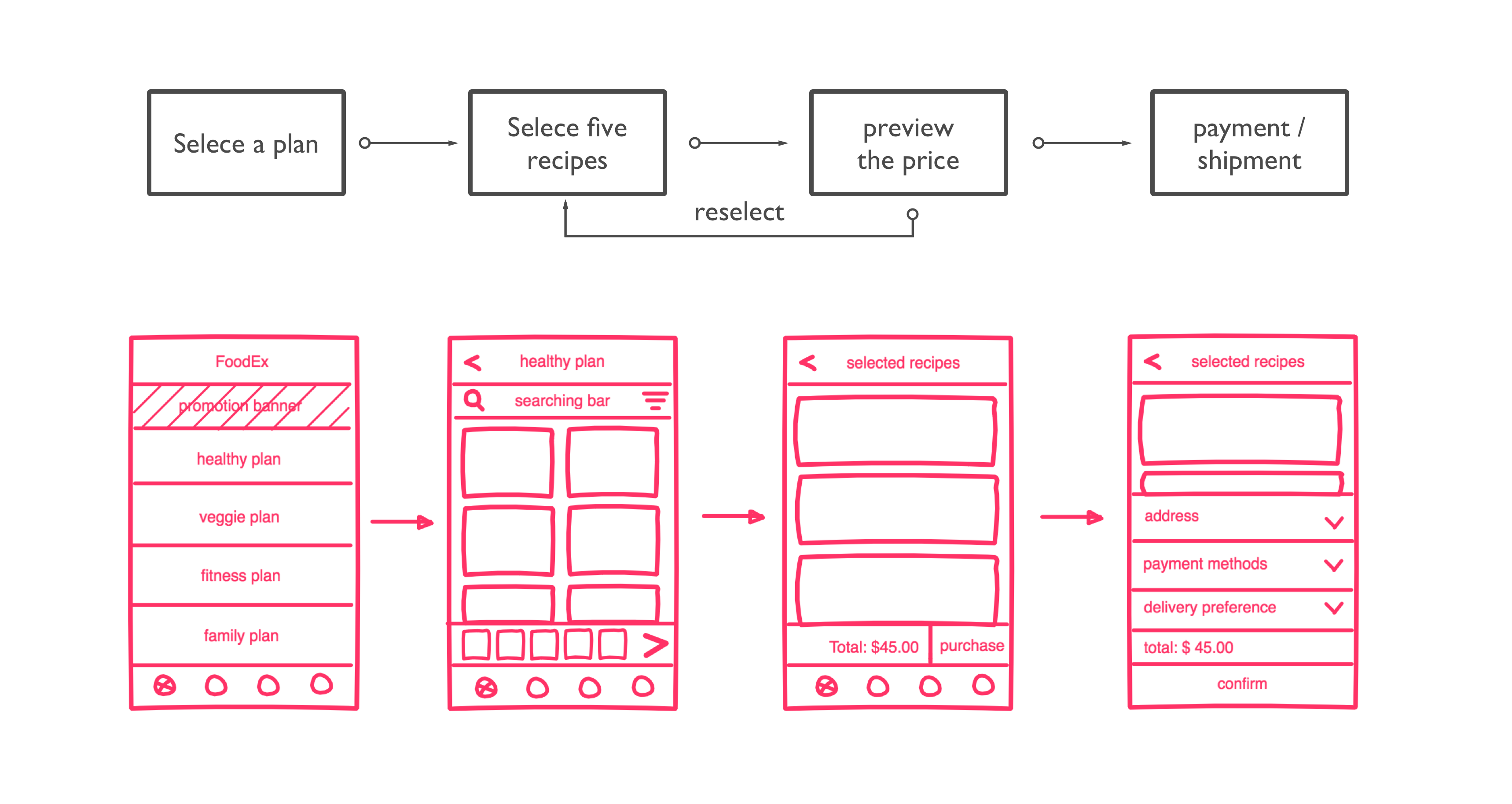
Among all the feedback, what tangled me most was the process of how users select and buy a weekly plan in the app. Initially, I just considered it as a normal buying process, however, during the user tests, I noticed that there are many other factors which should be taken in my consideration. For instance, how to encourage people to buy again? Or how to differentiate various plans with each other? Therefore, I did a redesign of Order-A-Plan.
Structure
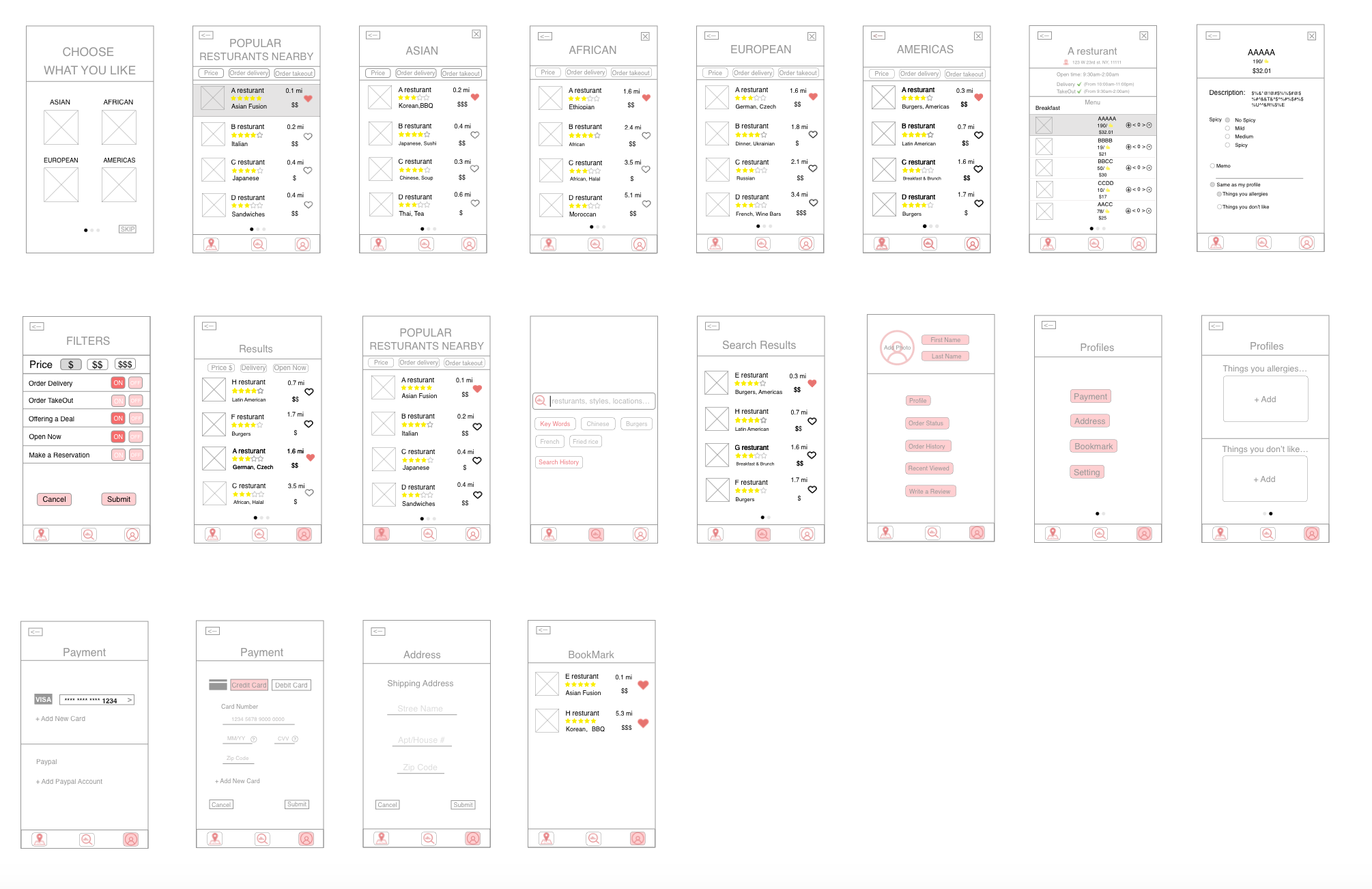
1.Two floating buttons are weird. Need to decide whether search or saved item is more important to have an individual tab. In this case, search seems more important; I decide to keep saved item in the profile tab.
2.News tab > Inspairation
3.Missing sub-category page.
4.In the Profile tab, the food preference tags seem unnecessary.
5.Pantone color smoothie: kept only the “Brightness” slider to restrict users picking from yellow, orange, green, and purple color scheme (because not all the colors can be made by smoothies.)
Design 1.The background color for tabs shouldn’t be the same color as the app background, and the highlight color pink is unclear.
2.In the full recipe page, steps instructions in the bottom change to slide show, following step by steps by swiping left.
3.Bigger bigger bigger!
4.The plus sign next to products in shop tab are confusing.
5.Remove the cart logo and show “4 items in cart” with text on the upper right corner.
.png)