Wireframes:
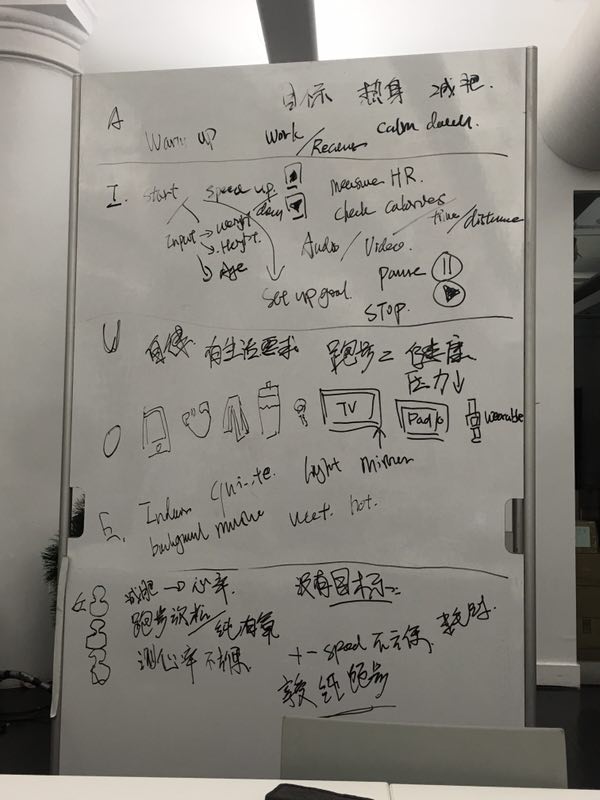
We did the AEIOU research and then based on that we come up with the first draft of wireframes.
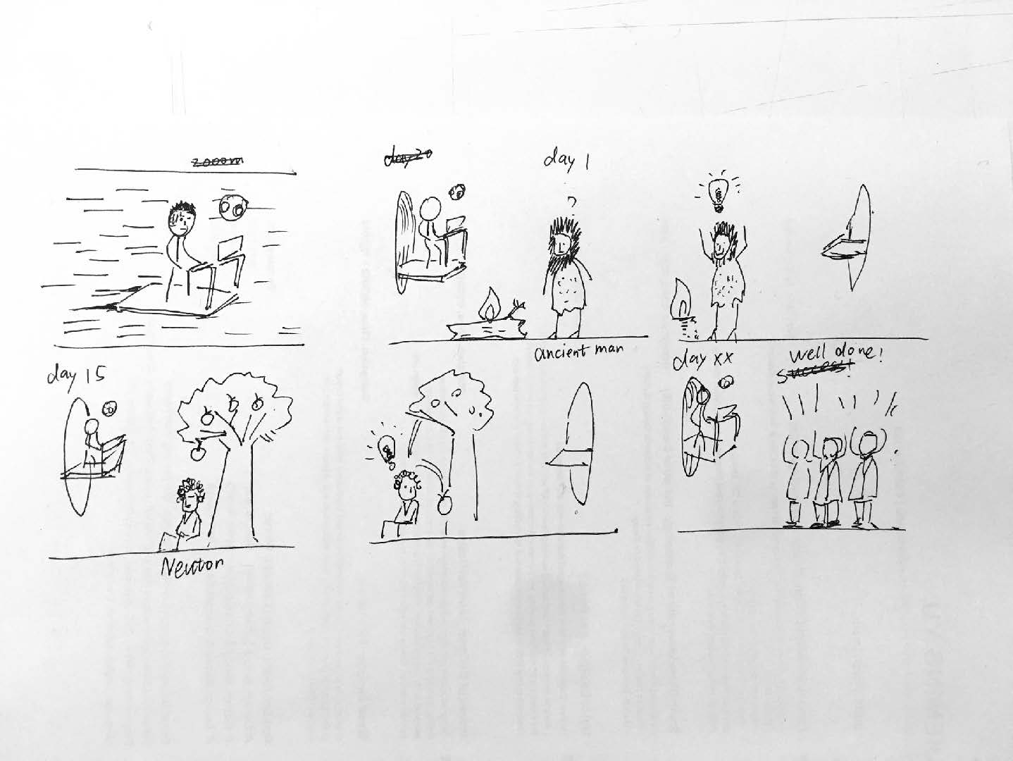

Wireframes:
We did the AEIOU research and then based on that we come up with the first draft of wireframes.
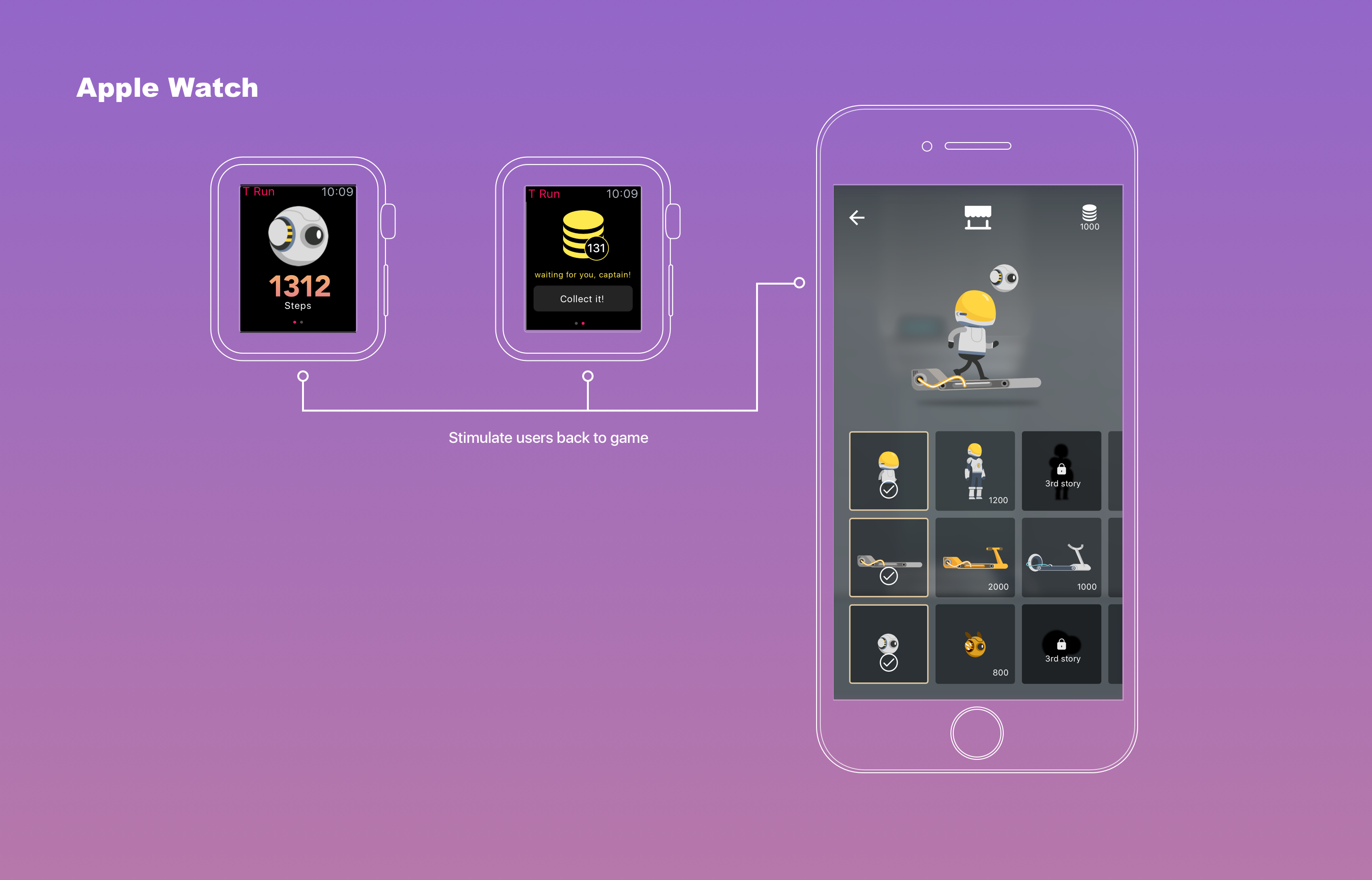
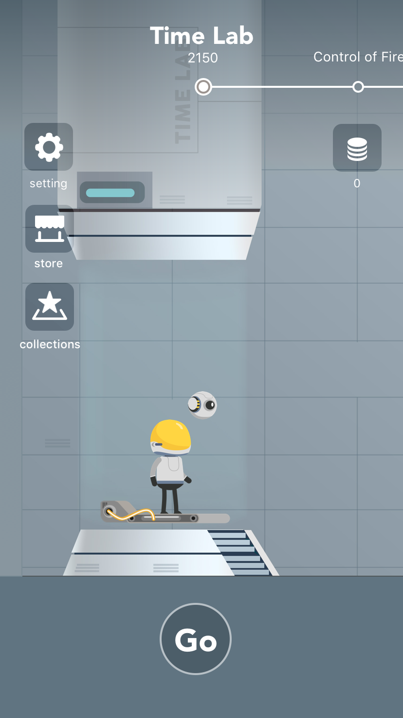
TRun on Apple Watch can track the user’s daily walking step and turn it into points that can be used in the store on iPhone, encouraging the user to go back to the phone app.
Final Iteration:
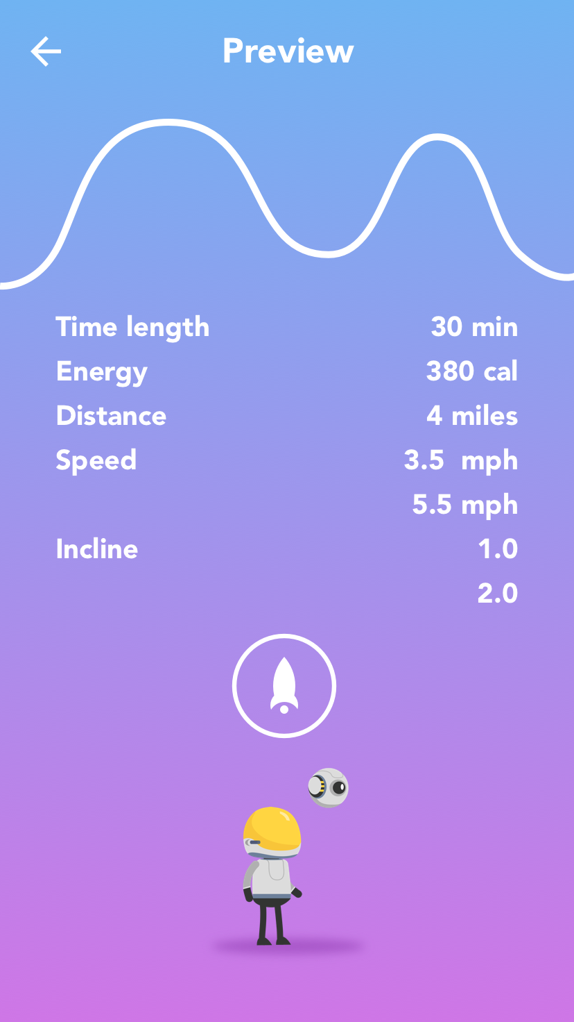
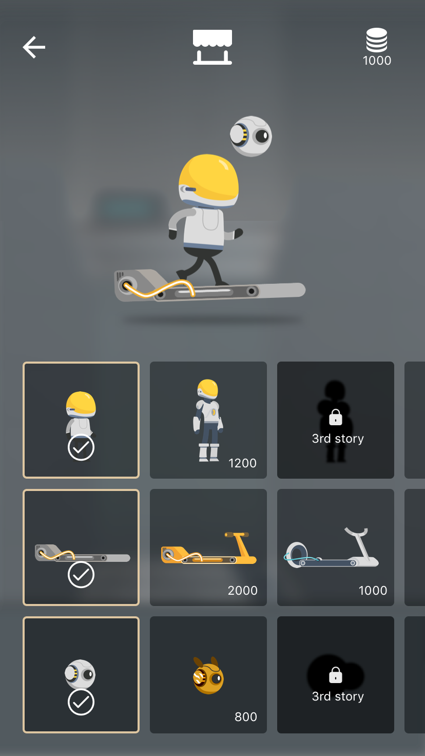
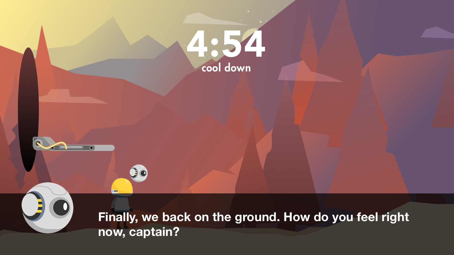
Link to documentation: https://www.behance.net/gallery/52573333/T-Run-the-first-storytelling-treadmill-game
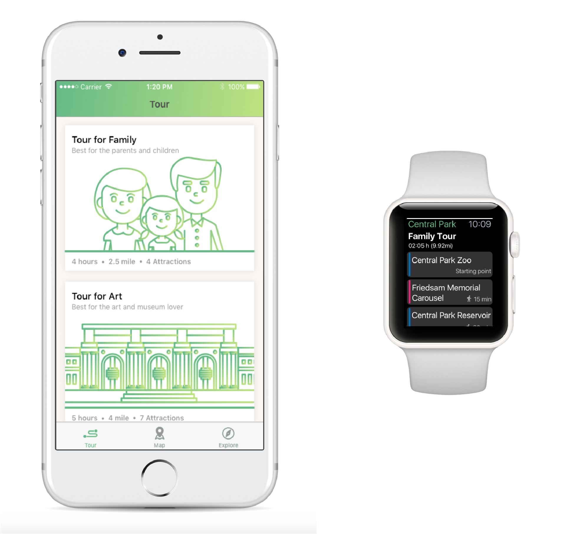
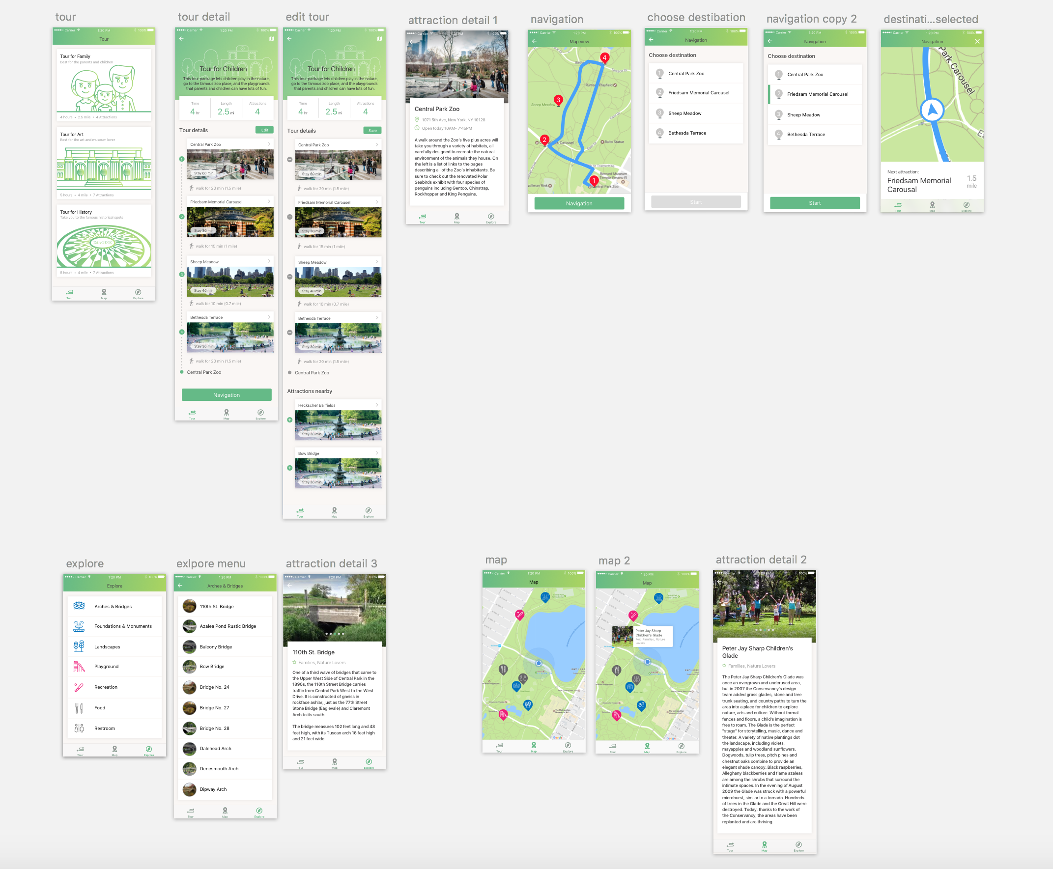
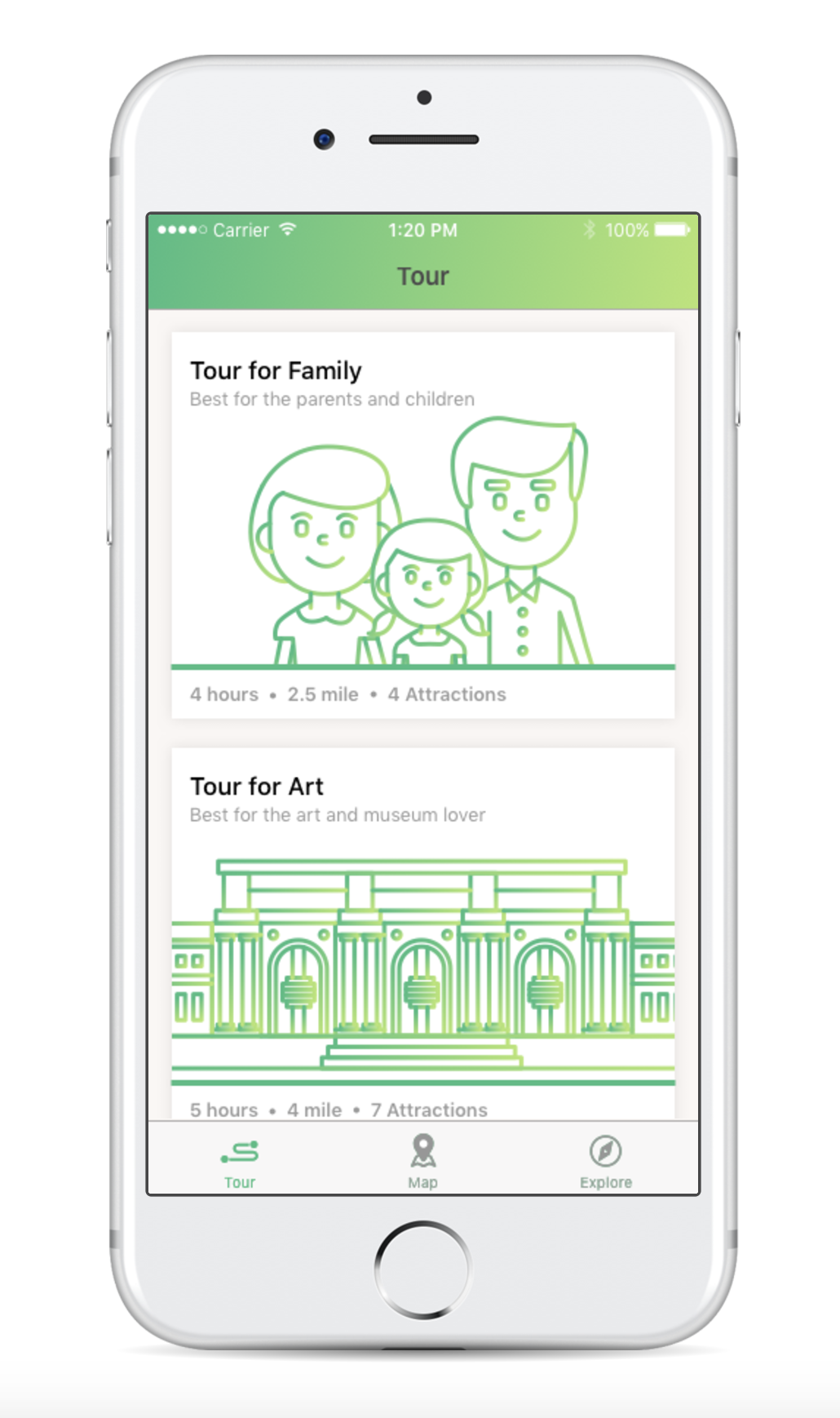
Concept
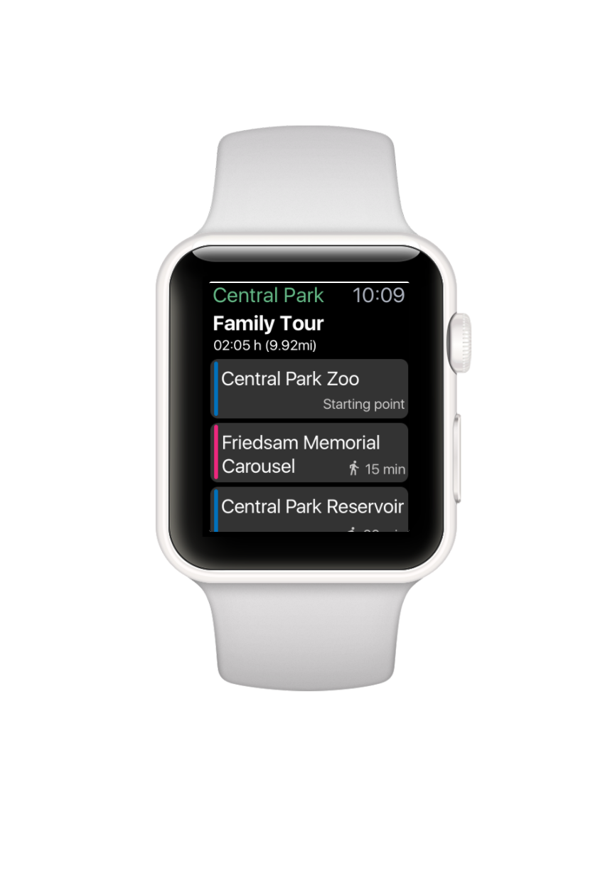
We are designing an app for Central Park which have the tour packages that can help people to explore the Central Park in different routes. For the app on iPhone, the three main pages are tour package page, explore page, and map page. On the other hand, for the apple watch add on, we focus on the function of navigation.
Main Functions
Scenario

Final Design
Three things we have changed:

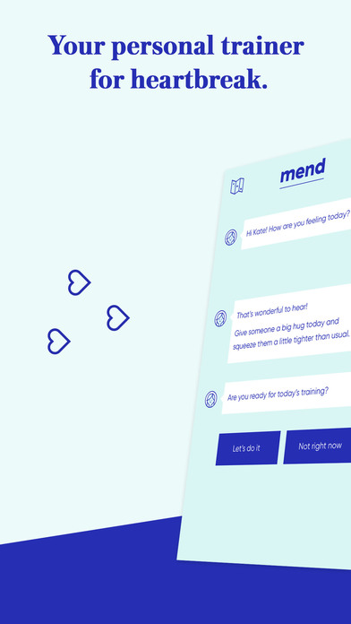
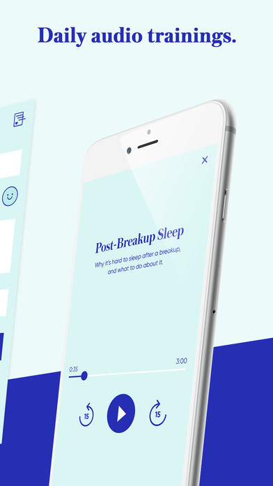
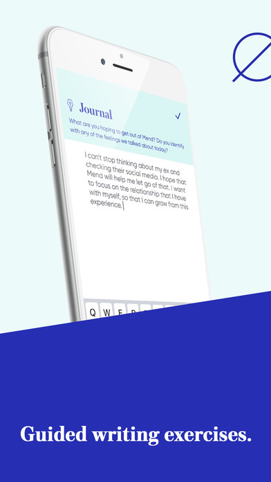
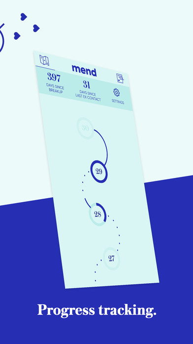
Mend-Breakup Trainer
Mend is an app targeting those who need help to recover from a breakup. It is creating an experience that feeling like a friend helping you through your breakup.


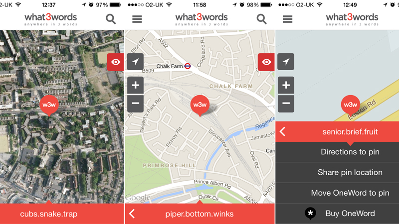
What3words is an ingenious map co-ordinate app for the iPhone that could put an end to post code. It divides the globe’s surface into almost 57 trillion 3x3m squares, and gives each one an easily memorable co-ordinate made up of three common words. It is supposedly more accurate than postcode.
Wireframe:

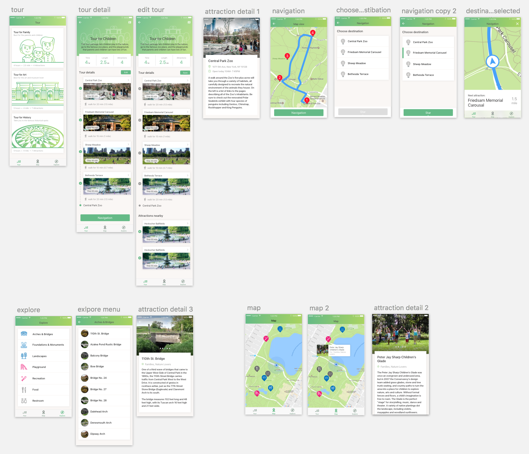
In this final presentation, we redesign the icons and the tour packages graphics to make our app more attractive and clear.
For the flow in iPhone, the most thing we have changed is make the hierarchy clear in the tour package. Clearly states the distance and time people would have spend in each tour.
Also, We get rid off the function of bike riding. We replaced it to the function of exploring the central park by categories. And what’s more, we have the function of map which can show where you are, and what are the things nearby.

For the flow in Apple Watch, we get rid of the order number of the graphics and add the next stop under the bottom of the map. Also, we made the navigation bar clearer in words.
Digital Prototype on iPhone: https://marvelapp.com/45jb5hi/screen/28042385
Digital Prototype on AppleWatch: https://marvelapp.com/1i452eh/screen/28042730
What we have learnt in the final presentation:
iPhone:
Apple Watch:
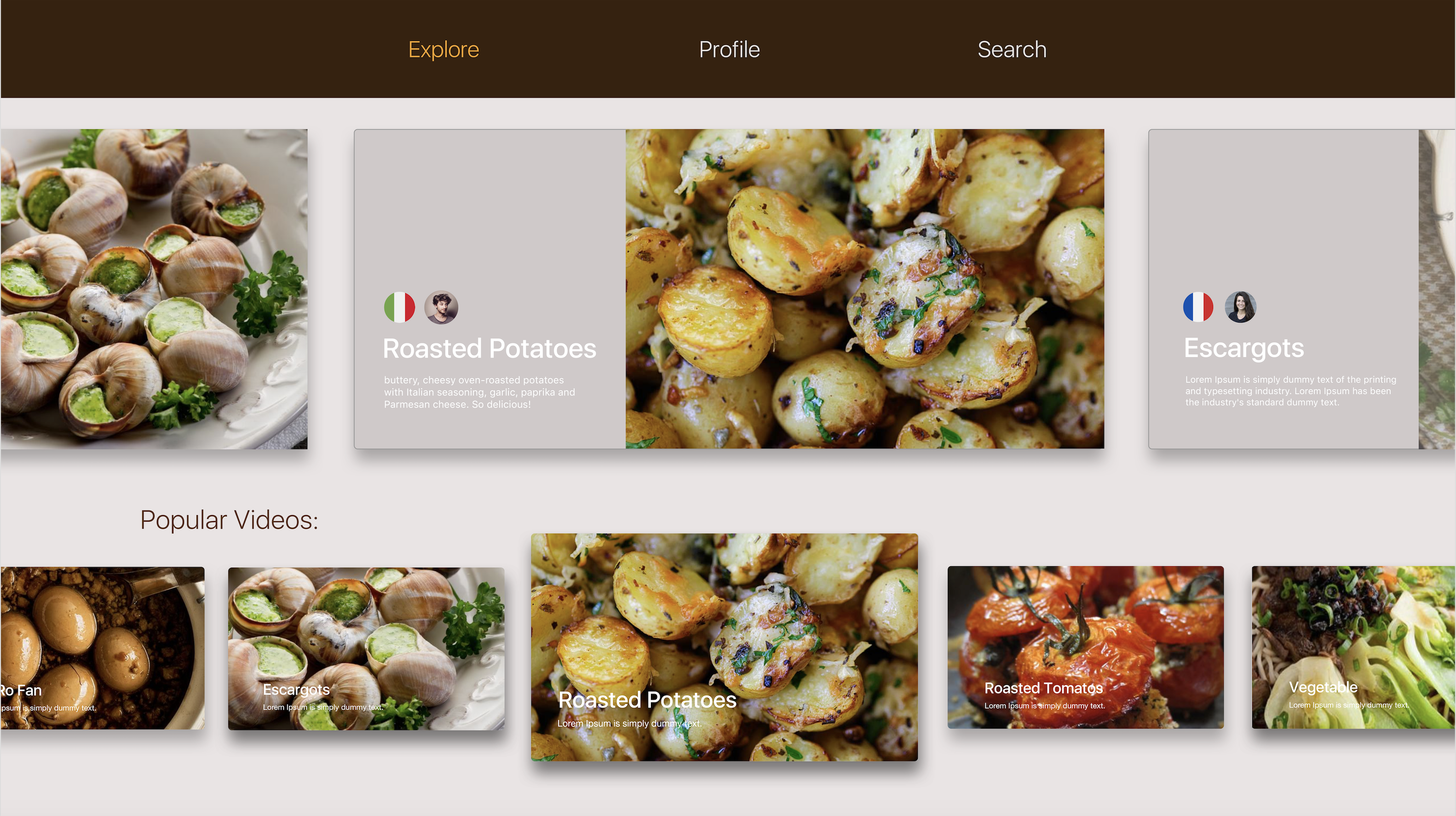
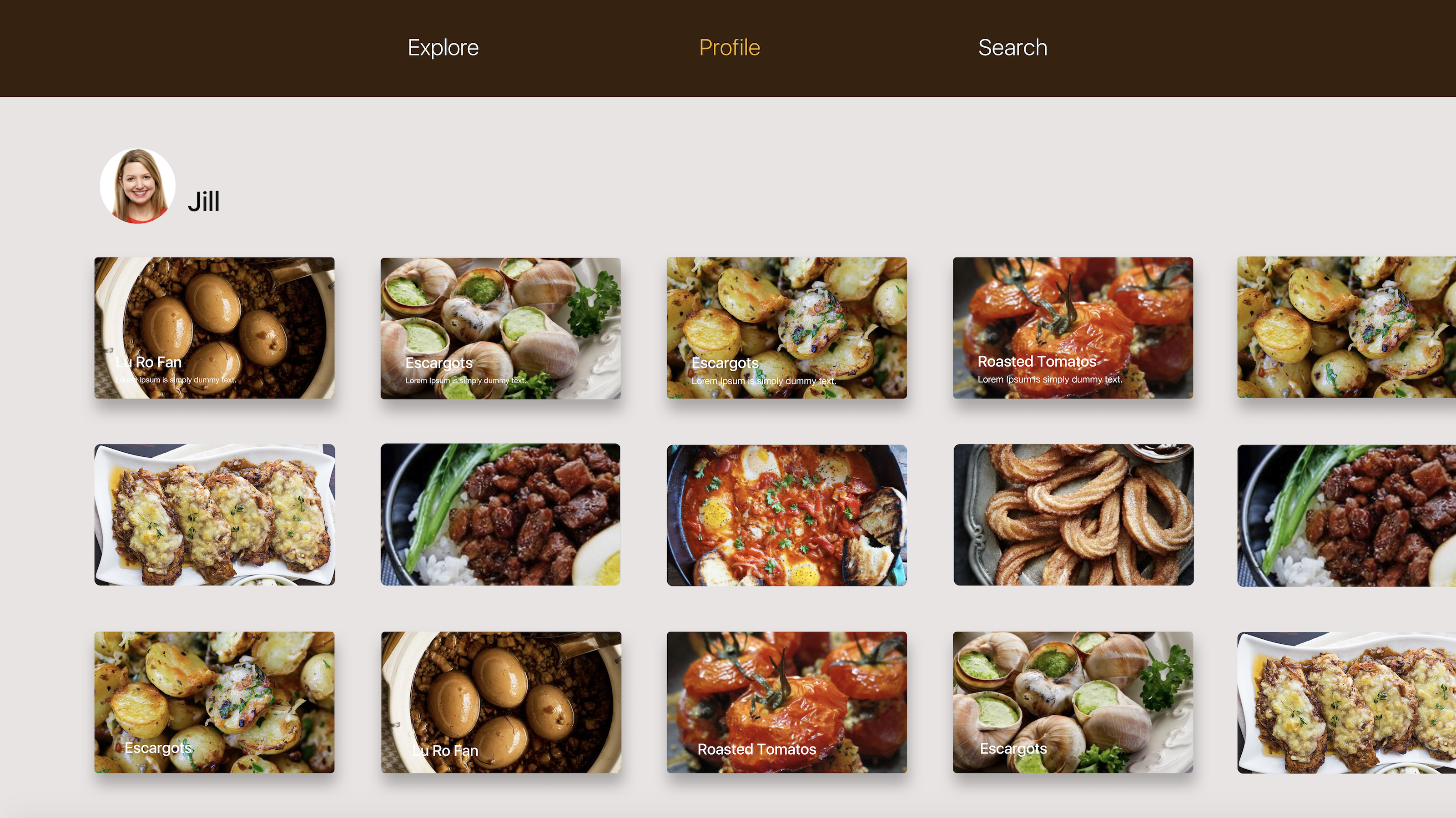
For the Apple TV version. I took off the function of “create” personals recipes. I want people to focus on the function of explore and their collections in the profile page.
The paper prototype I have done in class:
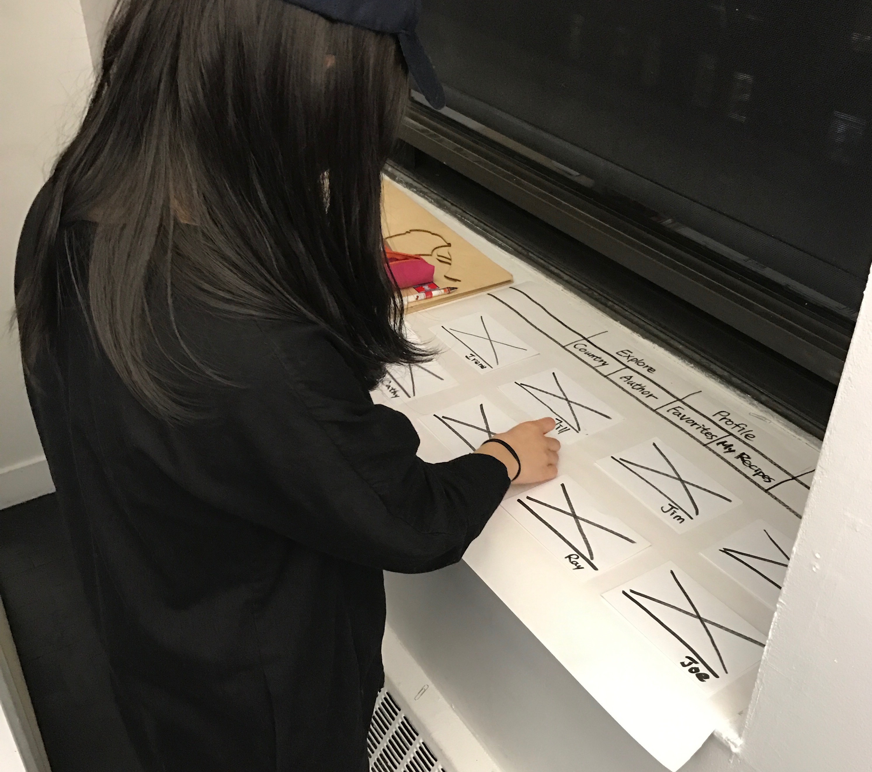
Users’ feedback:
The bar on the top cannot do the sublayer such as Country and Author layers under the Explore bar, and Favorites and My Recipes under the Profile bar.
The visual version:


Feedback from class:
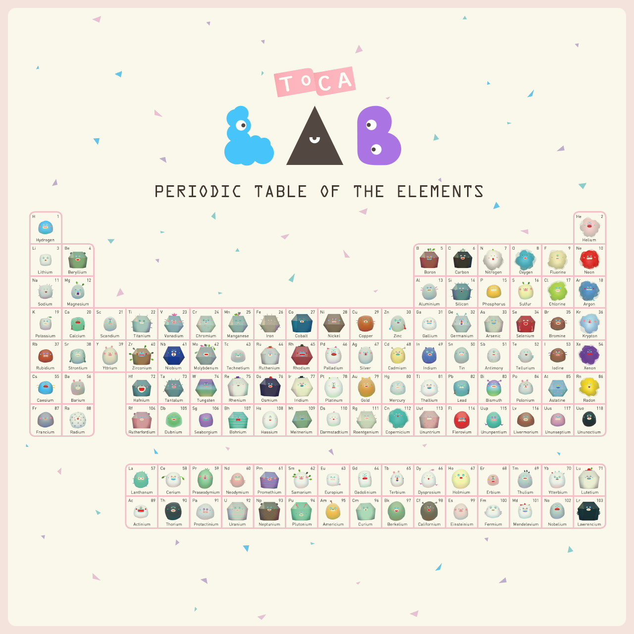
Toca Lab
![]()
Toca Lab is an playable app game for children. Also, it can cultivate children interest and knowledge in Chemistry.
The periodic table can encourage children to collect all of the 118 elements, by trying out the functions of heat, wheel, freeze, waves, and blend.
The app shows a great collaboration of artist, programmer, technical artist, and play designer.
The reason that I love this app a lot is because I am interested in children education. I think this app successfully help children who are afraid of chemistry by those cute and funny animations. Also, for those kids that haven’t start to learn chemistry, this app will help them build in many interests.
Website: https://tocaboca.com/app/toca-lab/
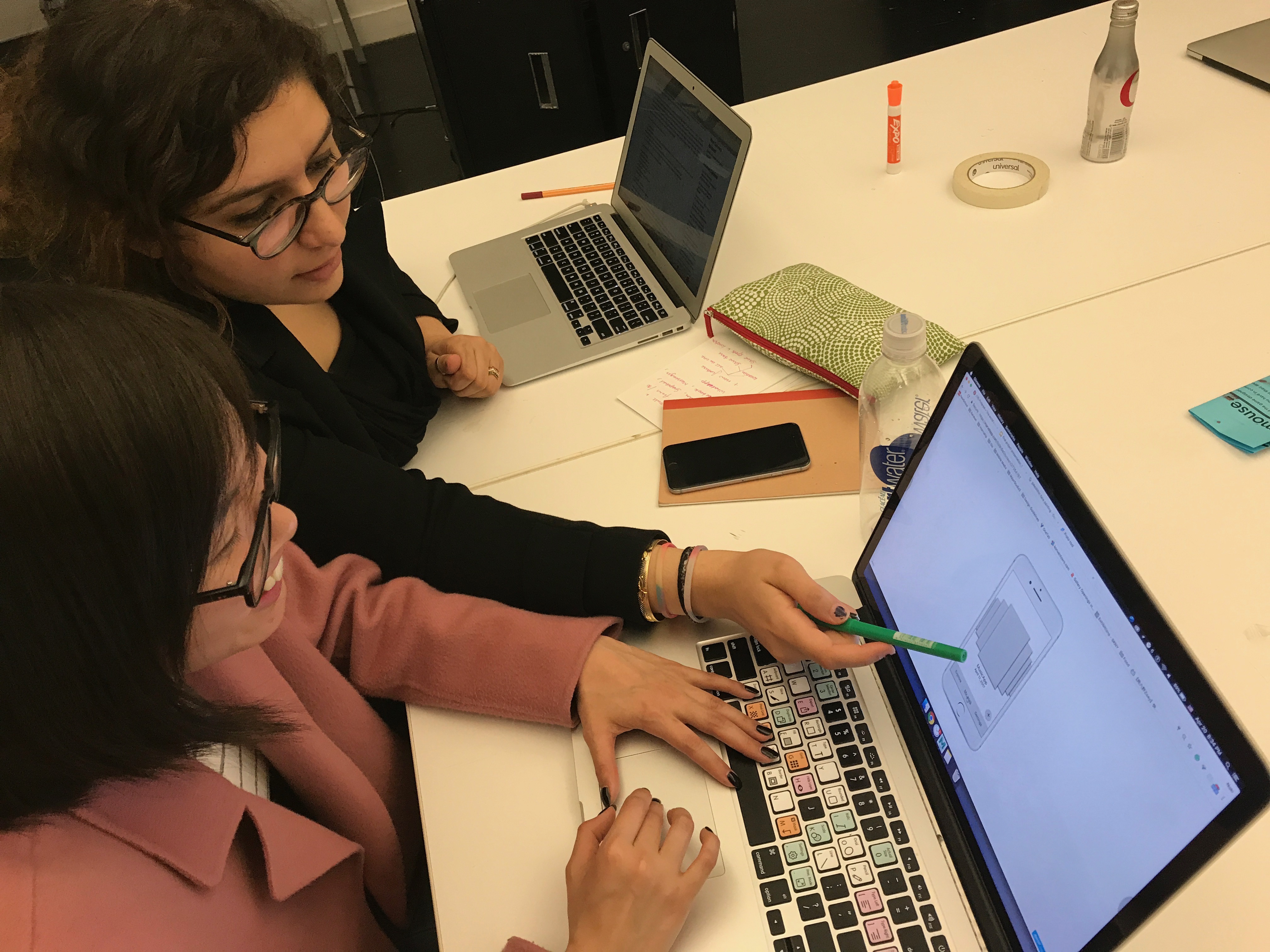
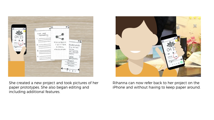
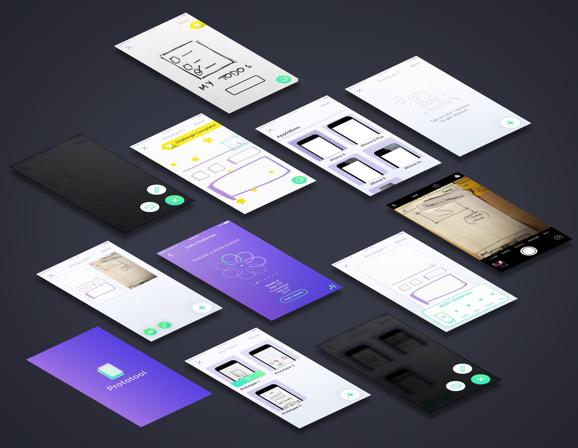
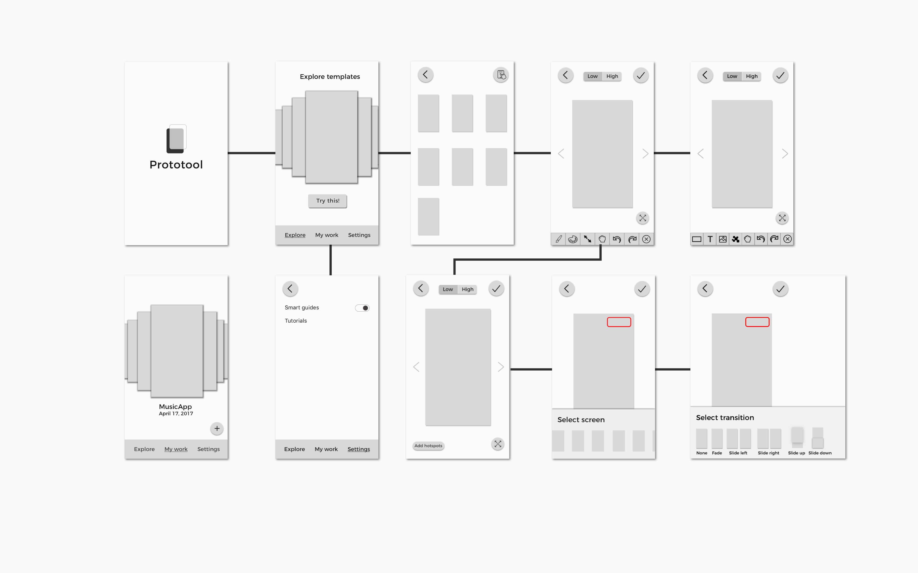
How might we build a mobile prototyping tool for designers to sketch & create rapid low fidelity prototypes to document and user-test?
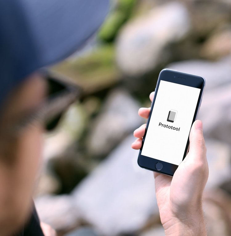
Proto-tool is a mobile application that allows UI/UX designers to quickly sketch and document low fidelity prototypes. It also encourages designers to continue improving and working on their work through daily challenges.
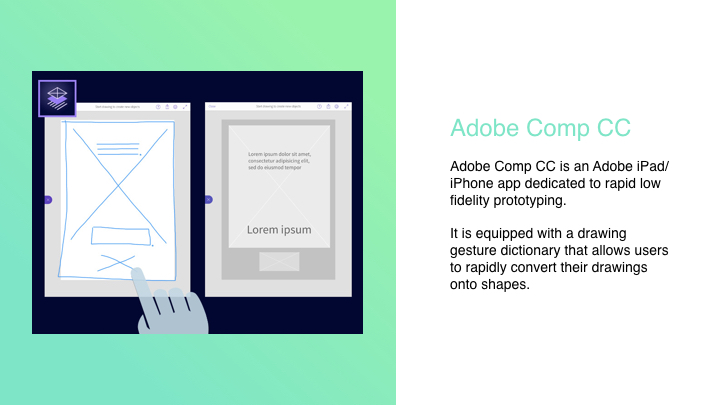
Adobe Comp CC and Google Autodraw – works with machine learning sketching and prototyping.
Quickly create prototypes and sketches on mobile to document process.
UI Challenges with everyday Challenges.
Our Target Audience are User Interface and User Experience designers who love to prototype on the go, on mobile or just paper prototype/take photos to document work.
(Made with Sketch, Framer, Principle and After Effects)
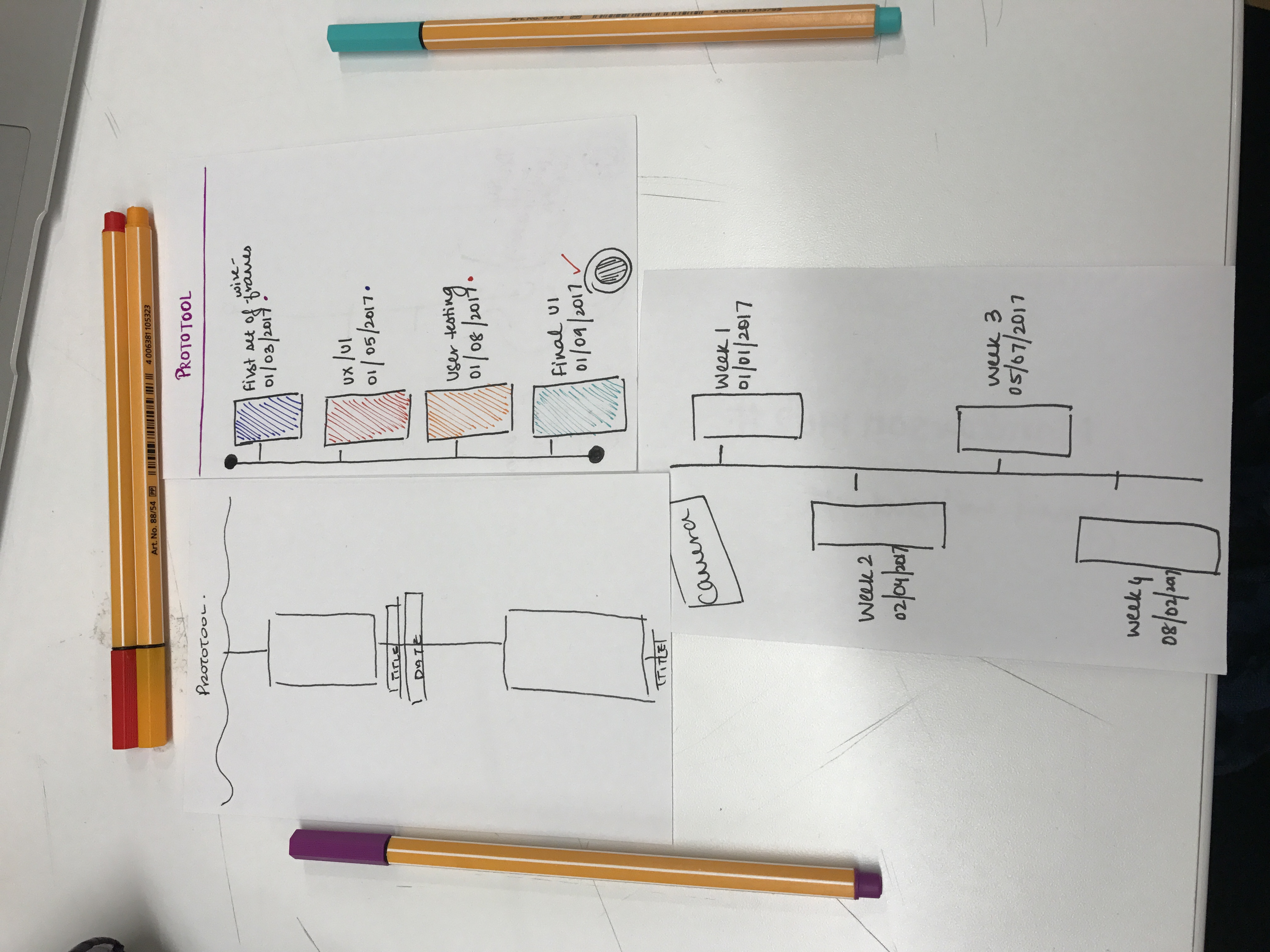
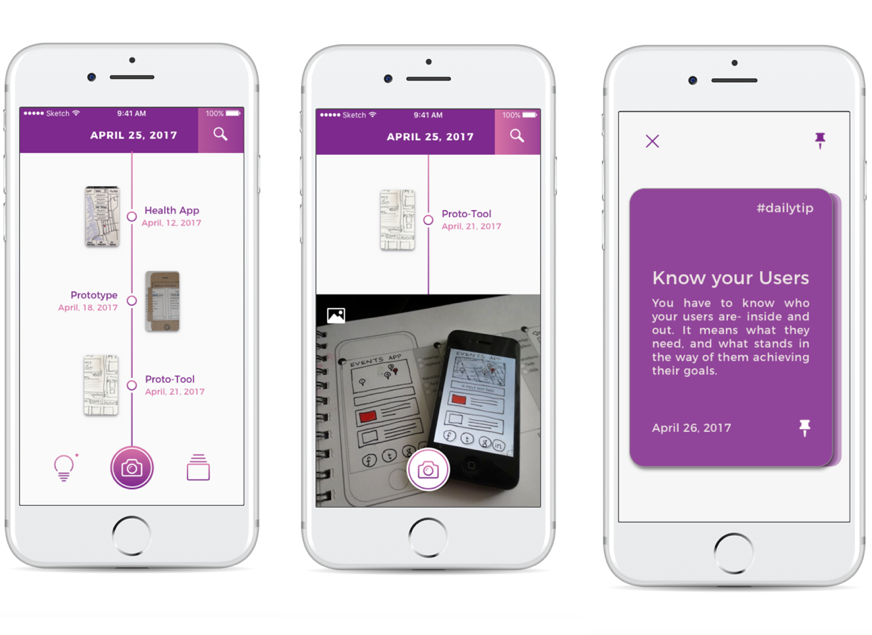
LATEST PROTOTYPE:
Click here to see our latest Prototype (Made with Marvel)
LATEST APP MAP:


3 THINGS WE LEARNED FROM DIGITAL PROTOTYPING: (to improve on our prototype)
3 THINGS WE LEARNED FROM PAPER PROTOTYPING:
Watch prototype:
https://marvelapp.com/22jg28j/screen/28043174
PRECEDENTS + DESCRIPTIONS
2. GOOGLE AUTODRAW

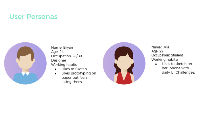
USER PERSONAS + INSTANCES
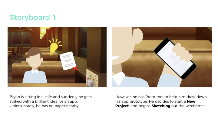
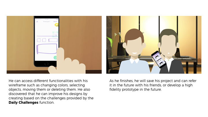
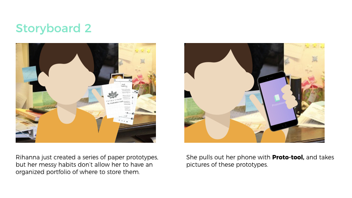
USER SCENARIO + STORYBOARD
App Interaction videos:
homepage from gunjan raheja on Vimeo.
delete from gunjan raheja on Vimeo.
daily UI PAGINATION from gunjan raheja on Vimeo.
daily ui challenges_1 (Converted) from gunjan raheja on Vimeo.
LATEST VISUAL DESIGN + HERO SCREENS:
VISUAL DESIGN 1:
User testing & Learnings:
POINTS WE NOTED DOWN AND CHANGED IN THIS STAGE:
TIMELINE – Design use, Main Navigation and Hierarchy, Date on Header and UI Tips to UI Challenges
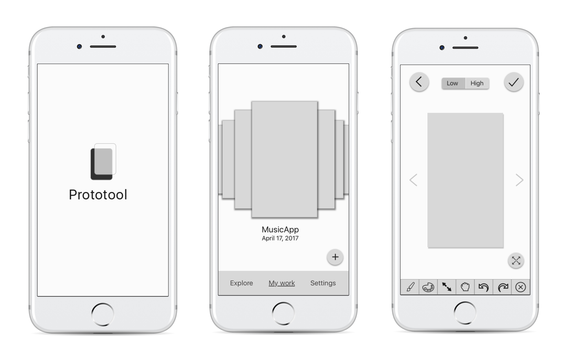
WIREFRAMES + FIRST PRESENTATION:
User testing & Learnings:
SCREENS:
Thank you 🙂