#thursdayapps | moodnotes | Hanyu Zhao

website

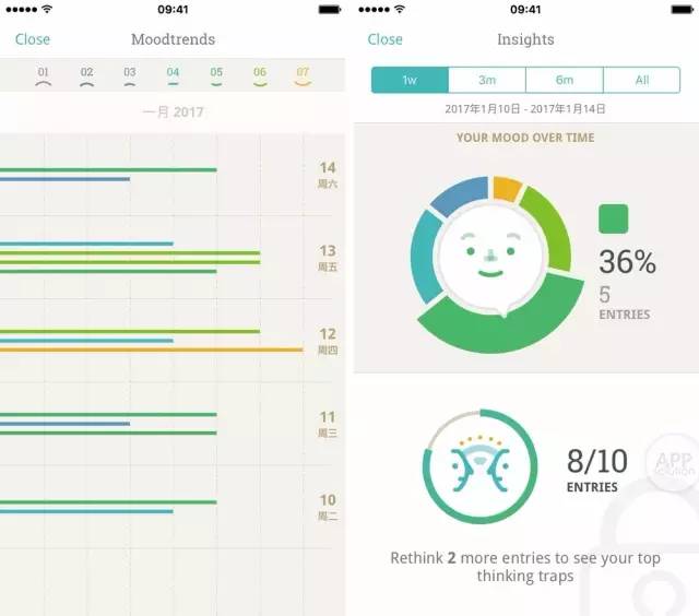
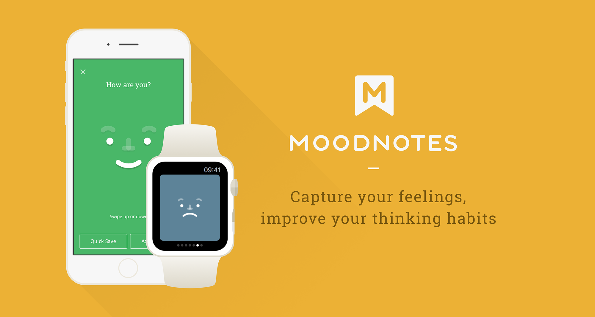
Moodnotes is an application that can capture your instant moods. By asking couples of questions, Moodnotes can analyze the users’ feelings in professional ways.  Moodnotes not only just records the users’ thoughts like a diary, it also will give the user a lot of solutions and suggestions to make their moods better. The part I like the best in Moodnotes is the way the user to select his/her mood. By using a finger to slide up or down, the user can create either a smiley face or a sad face. The whole animation is very smooth and attracts people keep using this application. Moodnotes is made by Ustwo studio who also designed Monument Valley, therefore, the visual design of Moodnotes is pleasing as well.  Since I always want to do something for Healthcare, I really like Moodnotes and think it is useful.


Litterati_Misung Kim & Nan Huang

Here is App visual design link:

https://marvelapp.com/88i246e

What we learned:

Design details
1. On the launch page(main page), take out the refresh button
2. Merge my profile & launch page: seems like my record is more important and intruging component.
3. On boarding: what if there is no trash-> add a copy saying that “If you cannot find any trash, you can ,,,”
4. In order to engage people -> need a reward system
5. Term changes: collection (in my page) -> “garbage bag on April 4”
6. When users finish taking photos, tagging-> Swiping (putting into the trash bin) the button should be there as the feedback as well like a ritual (in order to let users to show their action has finished.)
7. Keep consistency!->page for adding tags (apply the design that we’ve designed onboarding)
8. When the user finishes taking photos -> a term ‘Done’ might be confusing -> use proper word (maybe “upload”) -> so that we need to make it clear by showing certain feedback (swipe to the trash / copy: your (collected pieces of trash) impact has just added on the total impact… / you can add more tags in your profile page)

TV OS_Misung Kim & Nan Huang

TV OS (add on) file is here:

tvOS

TV OS: general environmental issues / raise awareness

There will be editors (content creation team) to create content every months

Documentaries (type of video)

TV OS: We should clarify ‘what to focus.’

On impact page: Take ‘X’ button out

App:

On my page: articulate why the user get ‘Superb’ badge (There should be reasons)

-May be we will put another layout for explaining what’s going to be the next badge (“if you get 100 more, you will get 000.”)

Launch page: Take blur out in order to have a live camera

+ Updated App design
Based on the last feedback, we have modified some of user interfaces.
Here is the link:
https://marvelapp.com/382fhjh

Hanyu Zhao & Chuyi Sun | IOS | Fuzzy | Wireframe

Research

Several articles reveal the fact that seeing fuzzy animals can cure people who are living in a stressful environment. However, according to the data, people between 25 to 50 years old rarely visit zoos. Since most of the zoos are located far away from cities, people find difficult to visit them too often. In the other side, zoos are also searching for a new solution for promoting themselves to attract more adults to visit zoos.

Concept

Fuzzy is an application that allows people who do not frequently visit zoos to have an opportunity to see wild animals on their phones wherever they are.


Interactive Prototype


Feedback

  1. The Main View has no difference to the Twitter View.
  2. It is better to automatically play random video in the Search View.
  3. If it is a Live Stream App, the layout for the Main View should be different than what we design now.

Stamp Stamp Apple TV wireframe Prototype 2

According to the feedbacks from prototype 1, I revised:

• I simplified the menu list and put it on the top. (the tap bar)

• I changed the videos’ position and made people easier to find.

• I  simplified the login function.

My paper prototype test:

Feedback:

• no need for login

• change the icon of the “like “

Stamp Stamp Apple TV wireframe Prototype 1

Stamp Stamp Apple TV version is focusing on introduction videos from each of the restaurants. In this apple TV app, you can watch how the restaurant cooks their meal, and what kinds of the food they are providing. These videos can be played at the restaurants as their ads or looping videos.  It also can be played at the home as the background videos.


The Feedback I got:

• It was wired if the menu list is on the left. Put the menu list on the tab bar.

• The videos were not that obvious. Becuase the videos was the main things in this app, so the videos should be put in the front.

• Search bar should change a place.

• Add more connection between your phone app. (for example, if you watch the restaurant videos in serval times, you can get an additional stamp.)