Apple Watch’s Paper Prototype – Pauline Hadad

Last week’s feedback was about:

– deleting the camera

– adding the “add entry” option to add a new date to an existing place

– make the rating system the exact same one as in the mobile app

– use dictation for comments

I took into account each of these comments to make this new iteration of my Watch app:

Wireframe 2

Things I learnt from paper and digital prototype

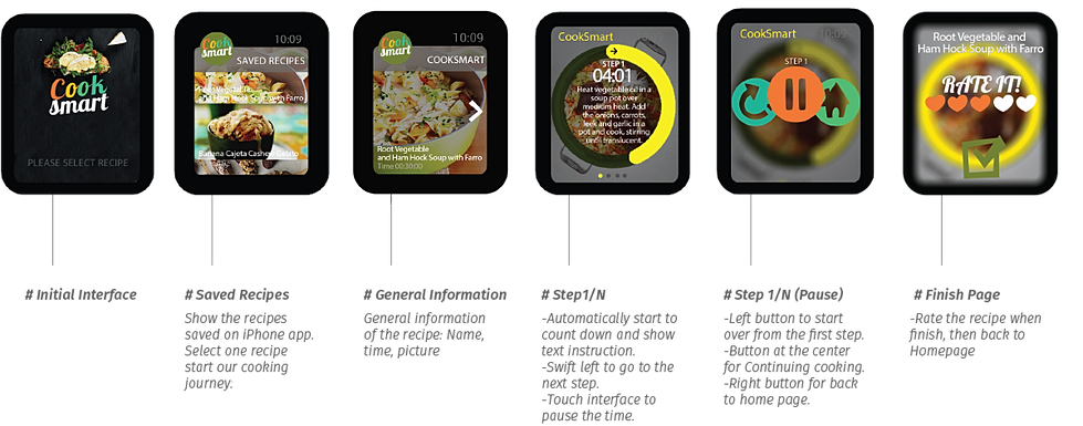
Paper prototype is really helpful, because it is easy to be done and very efficient. I did my first user test on the cutting paper prototype. I discovered that, some process is too complex, and my user can’t understand or misunderstand some functions of icons. Also, some information, such as time limit info is not obvious, so people can’t get this information easily as they want. The thing I also learnt is that the paper prototype needs to be well organized on the table, so that it can make your test more efficient; also, I wrote notices on paper prototype directly, so I can refine my design quickly.

About first digital prototype, people can easily get how this app works. After I showed my digital prototype, I realized that my core function “Midnight” in this app is not yet clear. So, in my previous digital prototype, I decided to limit time when users can use this app. Also, I made the time limitation information more noticeable than before. Meanwhile, I enhanced photo taking and viewing experience of this app. So now, users can take photos of their food making process step by step, and they can voice record to teach people how to cook food like they do at midnight. From this process, I learnt that we can clearly find whether does our solution works well to solve user’s problem with digital prototype, which looks very like our final product in the future.

Big Bite for Apple Watch_Feng

According to my Big Bite for iphone, this apple watch app is a recipe-quick-view app which allow people to make their favorite recipes to go.

Here is the my first digital prototype.

Since the flinto don’t have force tap, the upper part is regular tap ( to check the details of the recipes ) and the lower half is the force tap( come out the like and dislike button ).

I find I still have a lot confusion about the watch function. For example, 1. Is there a statue bar on the top of the screen just like what an iphone has? 2. About the force tap. Could we customize the button, such as the button label, button color and button size?

Big Bite for iphone_Feng (Refine)

This is the second digital prototype of Big Bite for iphone. Here is the link.

I change some graphic design. And another change I did in this version is removing a lot unnecessary buttons. The main functions in this app now are only What’s popular, My favorite, Add, and My recipes.

Since this app is not used for social net work, the user profile is also very simple. Only the user name and user image.

And also, I add two more categories in “add a new recipe” page. Therefore, now I have six kind of recipe adding flow: Truffle, Bar, Bakery, Cool Drink, Hot Drink and Candy. The name of the categories are still waiting better terms ( I am not sure for the Bar and Candy ).