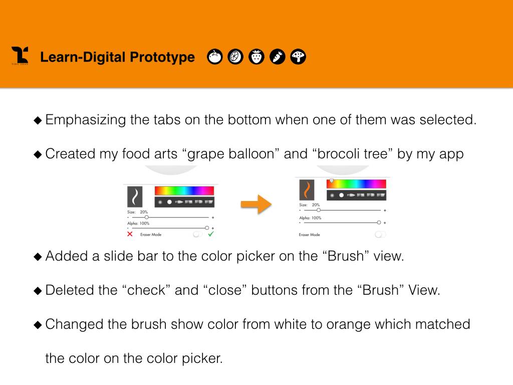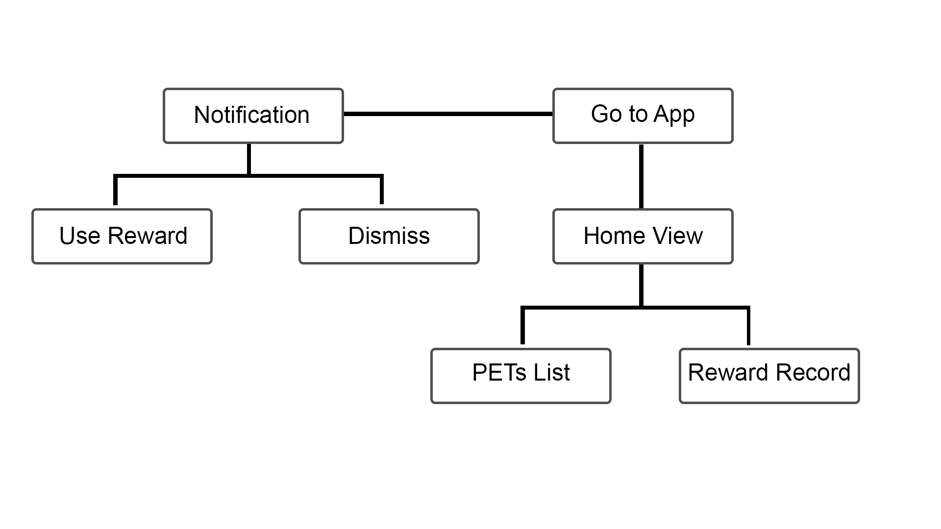
After reading about the Apple Watch HIG, I realized the limitation of Apple Watch, so I decide to only transfer partial functions from the iPhone App to the Watch app. Here are the list:
1. Push-Up Notification
2. Bottle lists
3. Rewards

After reading about the Apple Watch HIG, I realized the limitation of Apple Watch, so I decide to only transfer partial functions from the iPhone App to the Watch app. Here are the list:
1. Push-Up Notification
2. Bottle lists
3. Rewards
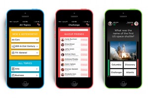 This week, I downloaded the game application called QuizUp where you can play against your friends or random people. I really like that there are so many themes available for the quizzes. The interface is very straight-forward. One thing that caught my attention is the “burger” menu, which is located on the top right of the screen. Usually, burger menus are on the top left.
There are also two options that are a bit confusing: “Messages” and “Discussions”. I think they should have made it clearer for the user what the difference is between the two (I still don’t know).
Other than that, it’s a great app! Very entertaining!
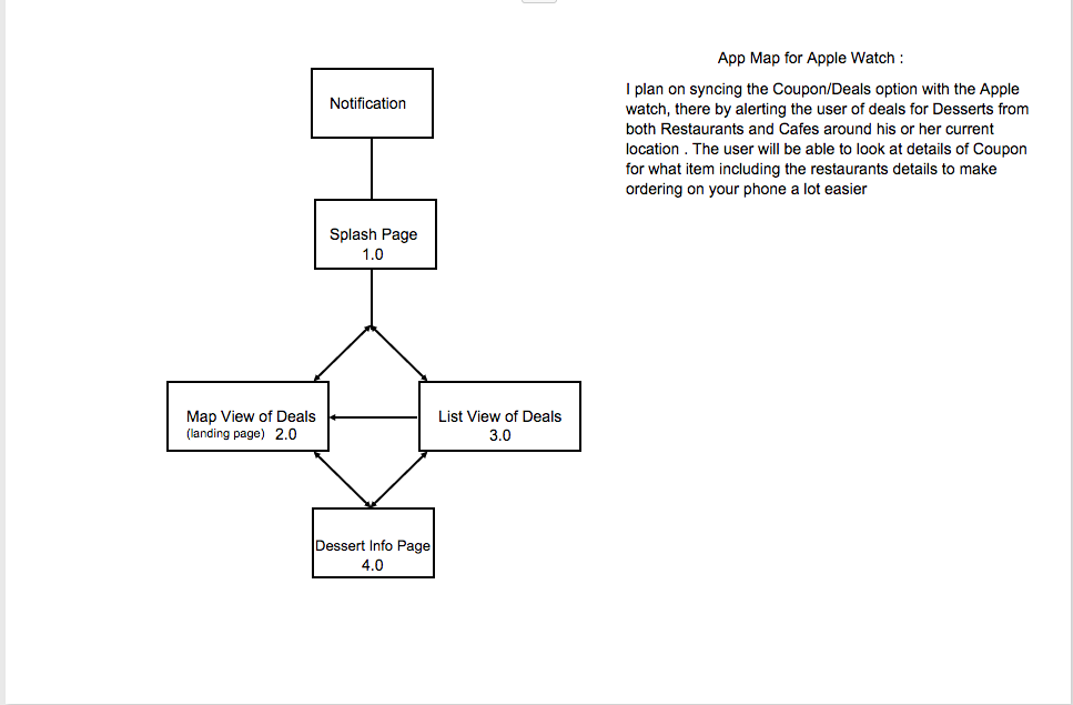
Map:
Wireframe:
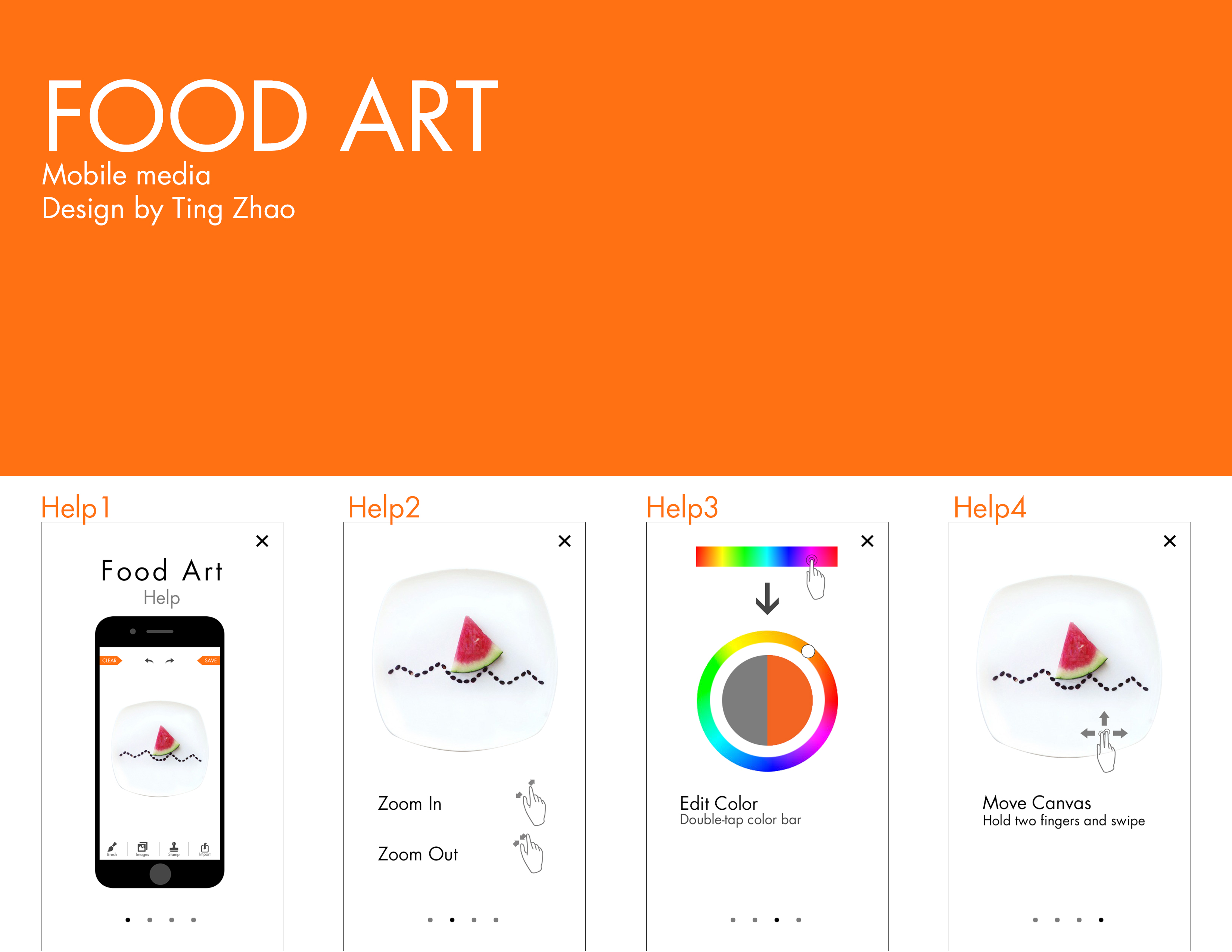
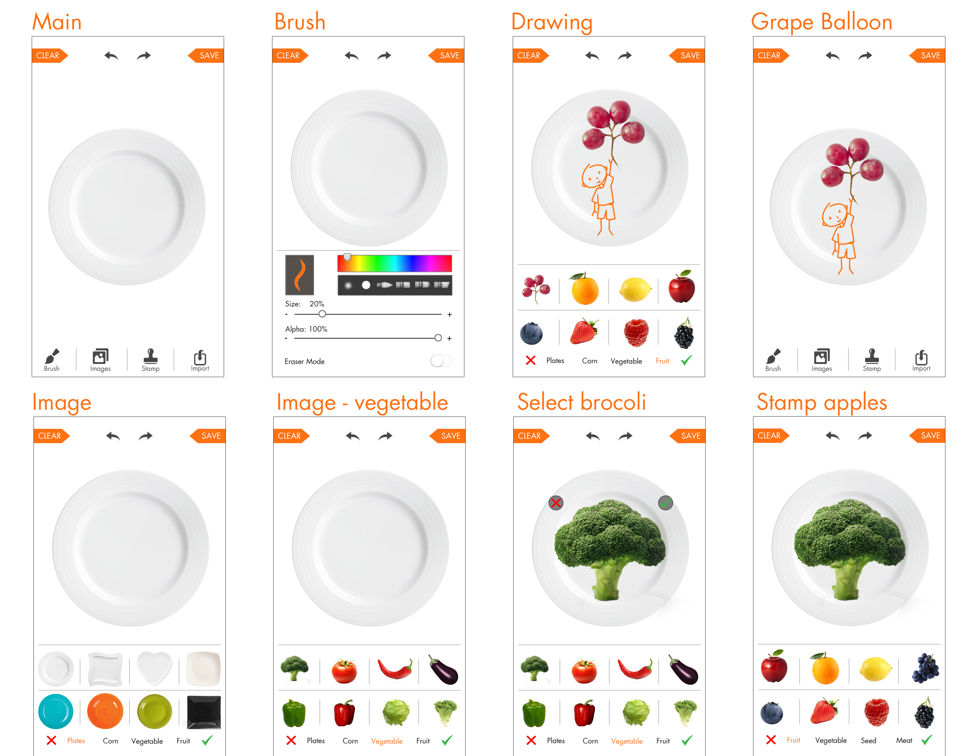
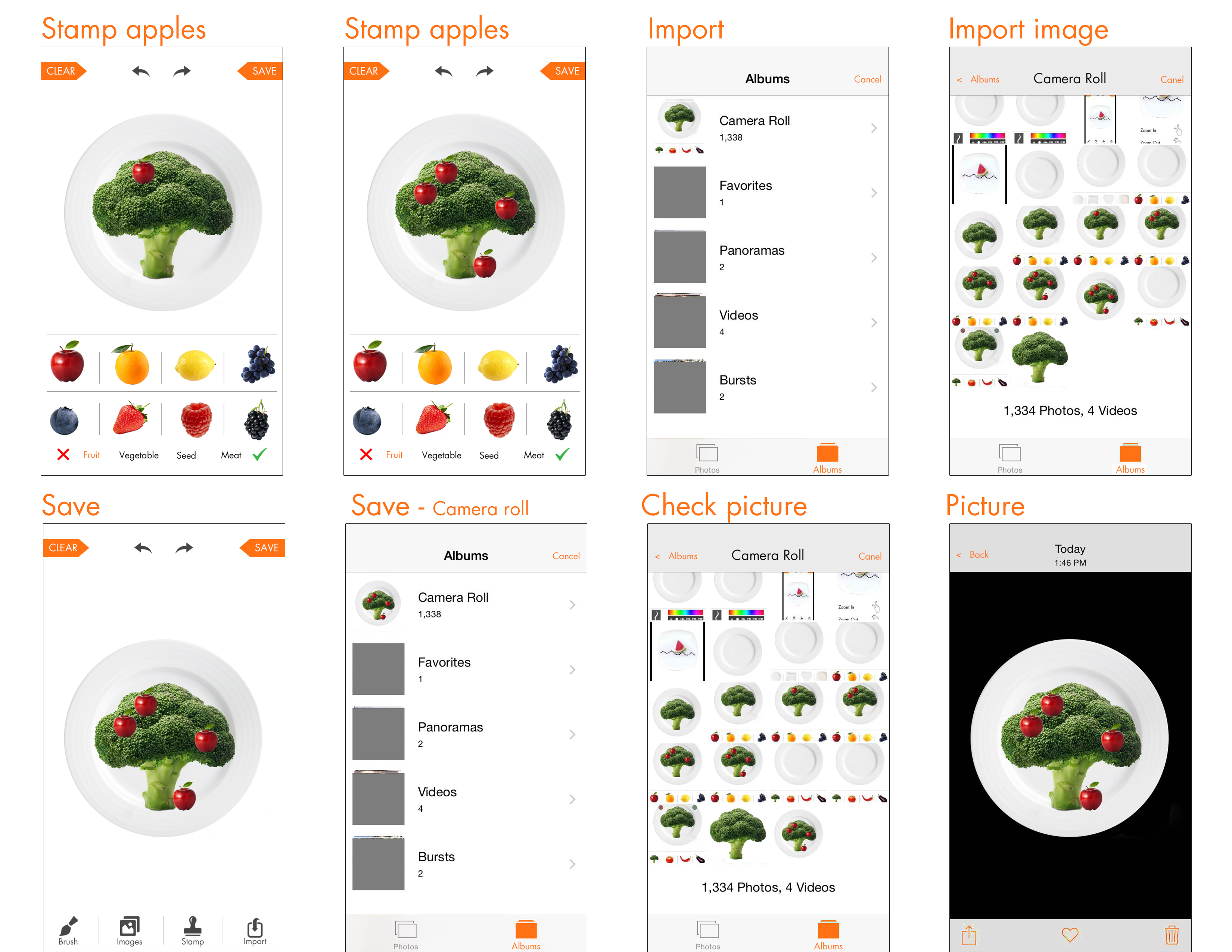
Digital Prototype
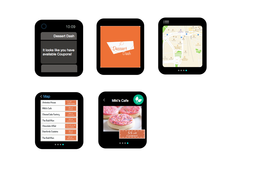
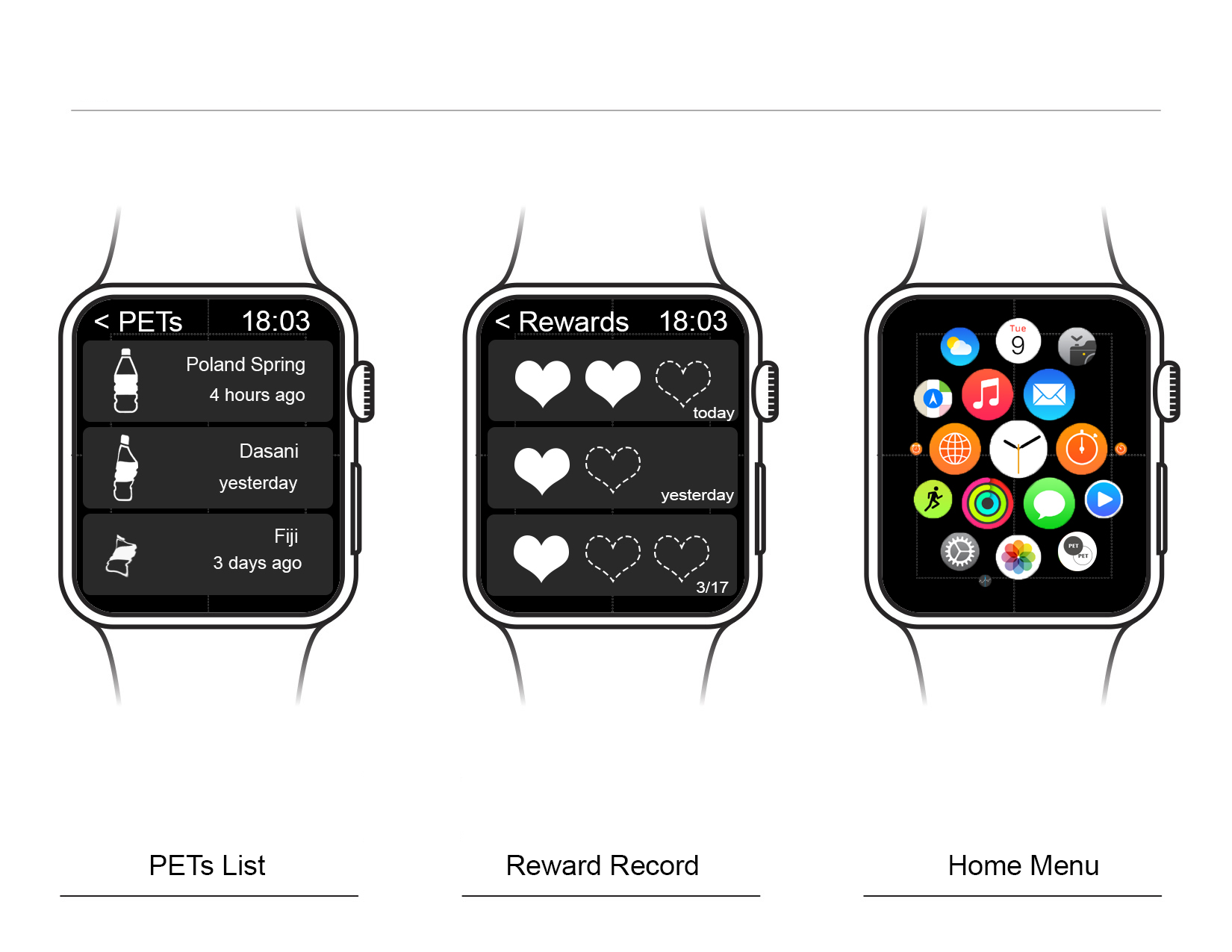
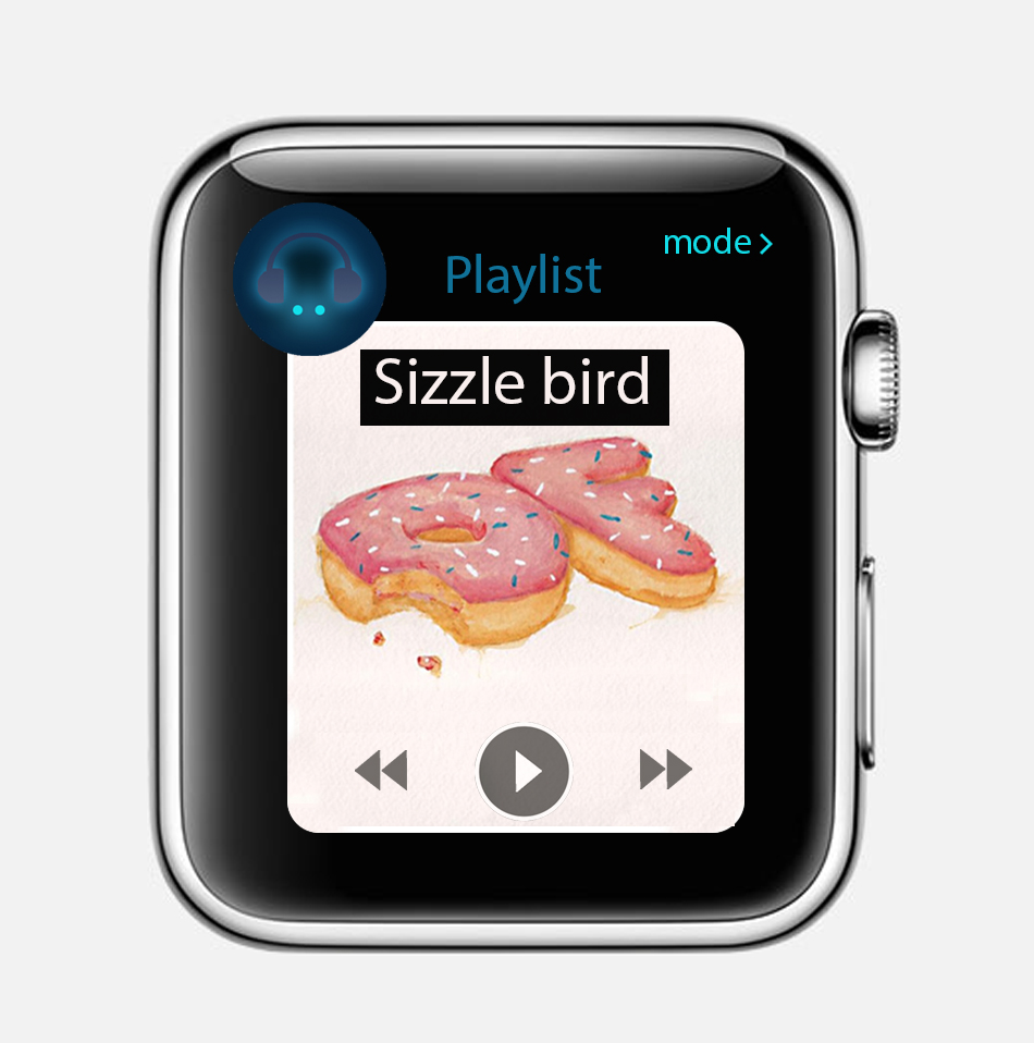
Apple watch app design:
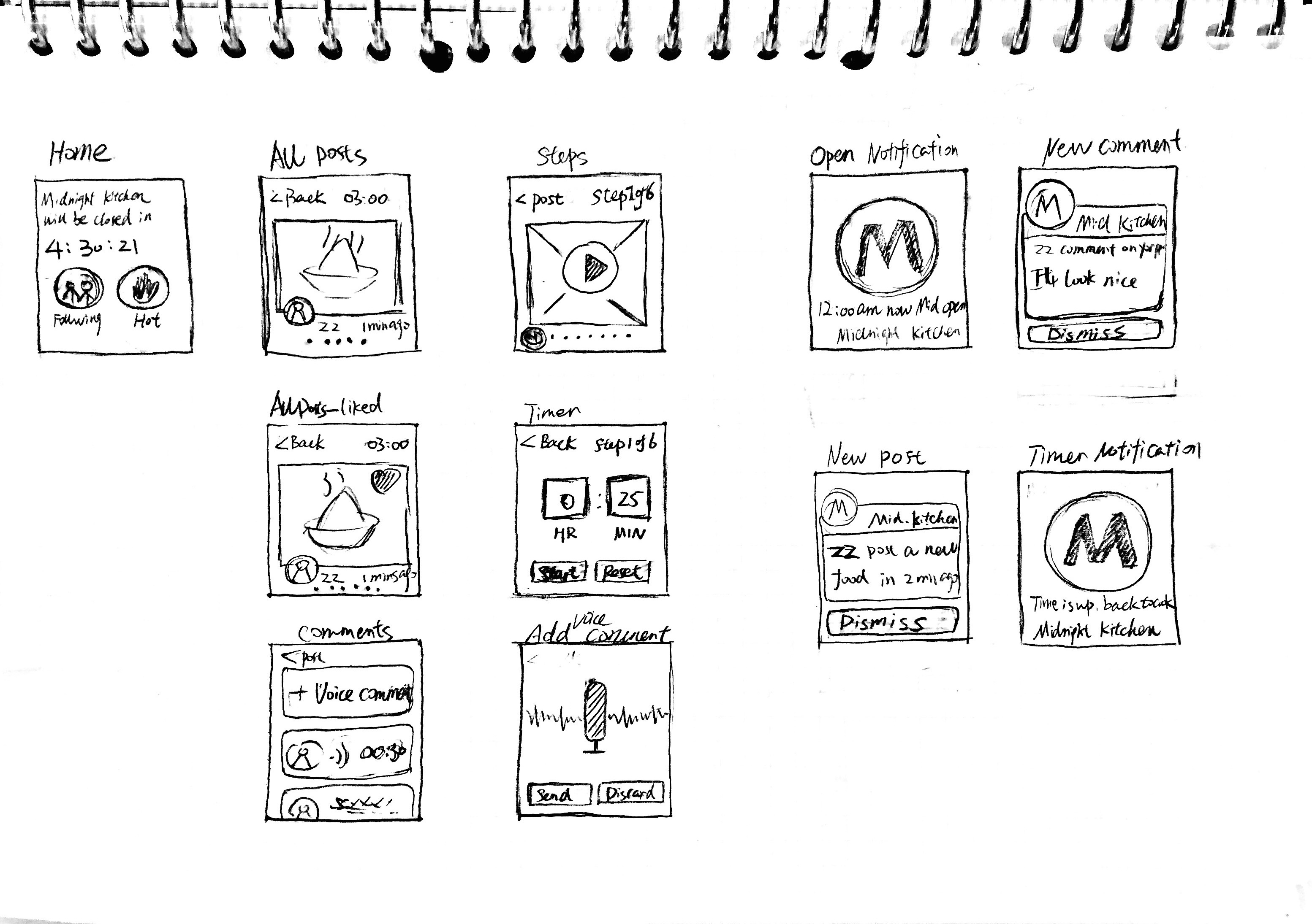
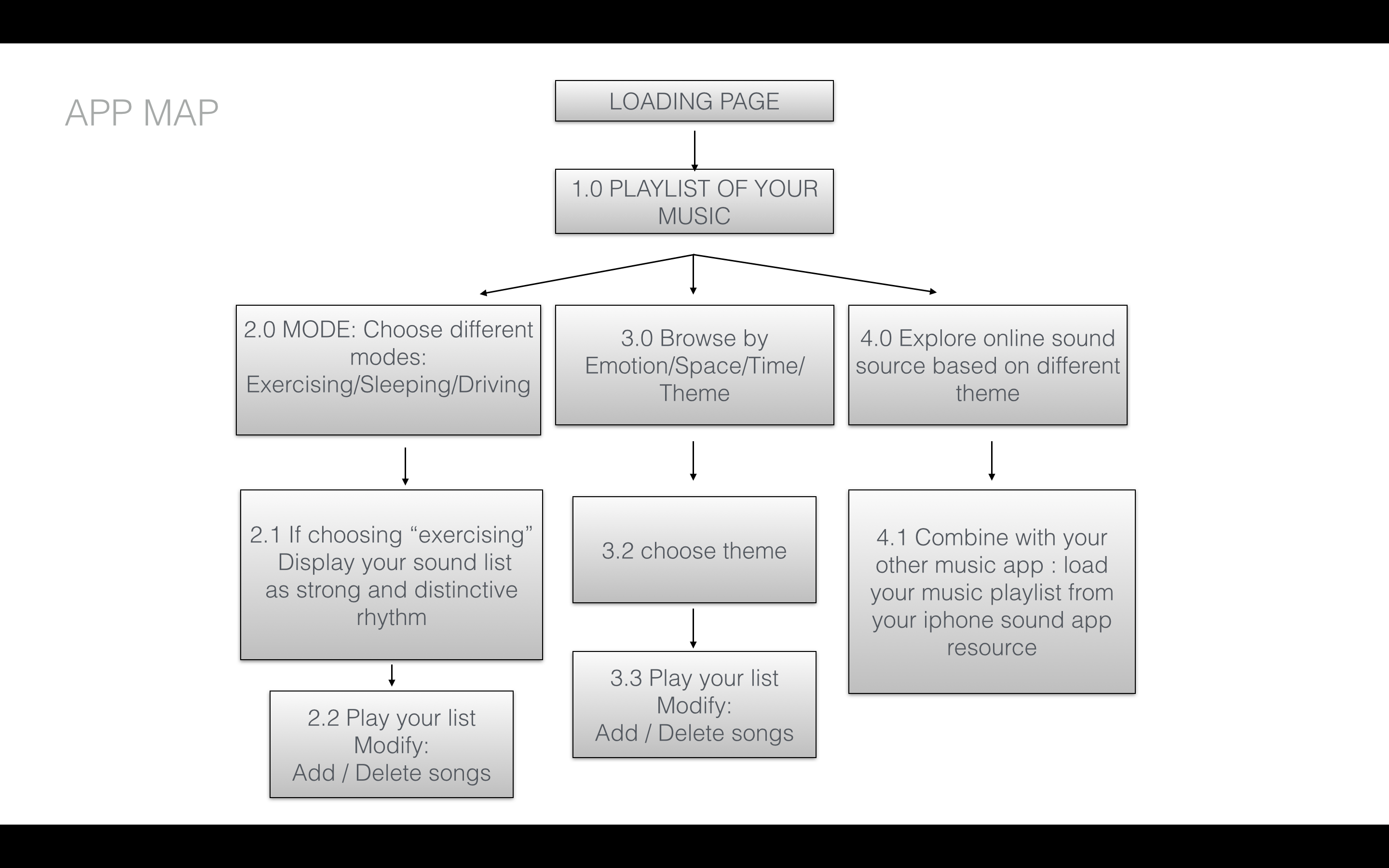
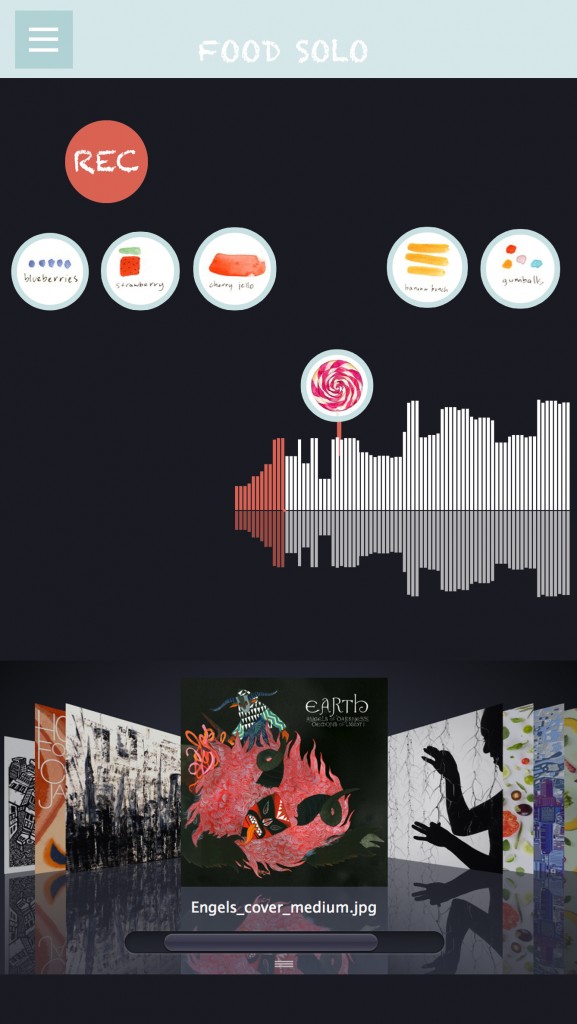
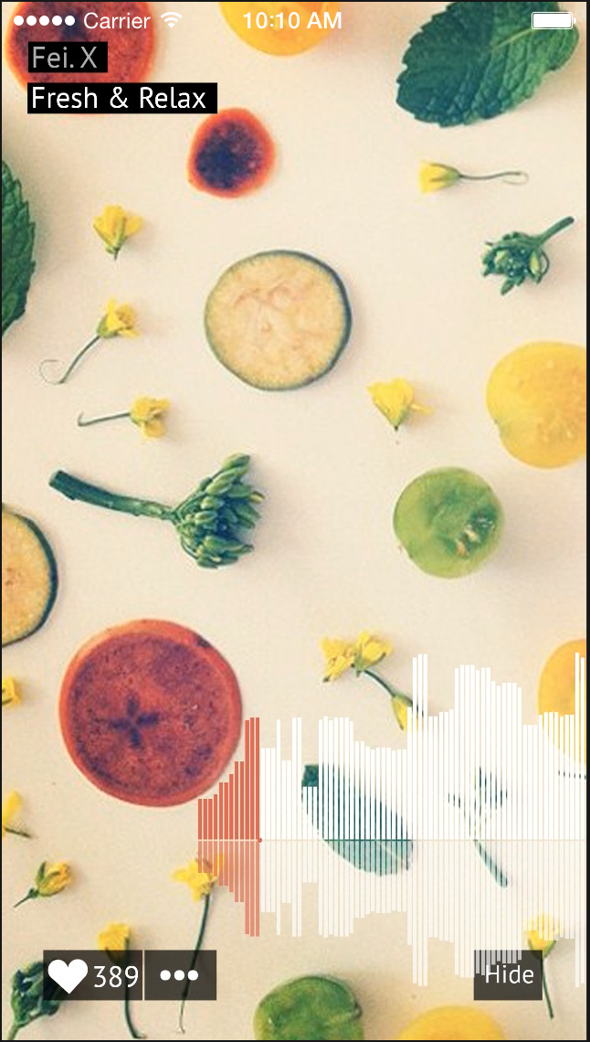
Through my first iPhone application design, I was focus on the the entertainment features of using food elements to design sound app. So when I start to thinking about the apple watch app, I want to continue thinking through the function point to improve my first app to design my UI to adapt to various devices and modes , such as apple watch. So that users can enjoy the app in as many contexts as possible.
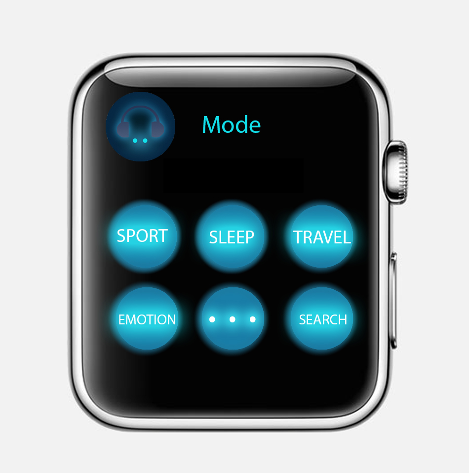
Concept: People usually listen to music when they are taking exercise. Connecting local music playlist to the sport app. Controlling your sound list by your running length or your heart beats. The new apple watch music app support different modes for people. For example, when you choose “sport” mode, your sound will be random choosing by intense and Cheerful sound, such as hip hop or rock.
If you are very calm down and peaceful, like sitting or sleeping, seems like you didn’t take any exercise, your heartbeats are as normal speed. Then you will get your playlist arrange as calm and charming sound, such as country music or indie environmental music or any soothing and calm music.
![]()
DIGITAL PROTOTYPE:

1. First play app : https://popapp.in/w/projects/54ef6f365cbda7bd3fcf2283/preview/54ef87a98c60e0633fb7c951
2. Modify play app:
https://www.flinto.com/p/627ef587
Through the prototype to the midterm final presentation, I have lots of chantings on my app design:
1. Switch sidebar icon from bottom to top:
2. As we discussed on the class, I get suggestions from Andrew to change the main page as sound list menu, which the is recent sound you already created or the sound which person you followed.
Main menu first prototype Main menu final effect
3. Add sound creating page for users. So that they can directly playing their sound on the sound track.
4. Separate “record” sound function and “play” sound function in different pages. Easily let users finding how to play this app and get content step by step.
Record page Play page
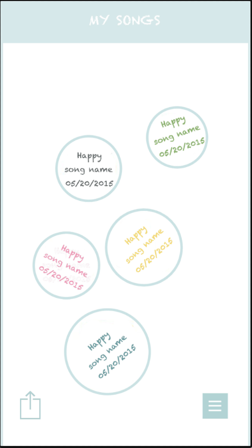
5. Changing the sound list lay out completely and clarity, showing as the song album with users’ name, song name and date. Instead of the last version prototype which was creating date and design emotion.
first version second version

https://docs.google.com/presentation/d/1e-jskhvmqThV1g0oblfGB50ues2_DTg_IFEZYCzm5_g/edit?usp=sharing
the feedback from the digital prototype,
1, Some tag is too small to tape.
2. It is unnecessary to add a advanced searching icon in the main menu.
3. hamburger icon at top which is the android style or navigation bar at the bottom(ios).
4. is it necessary to build a community inside a food app, or just offering professional cooking guidance.
5.The chose color is kind of misleading.
Learning from digital prototype:
concept:
When I first design some buttons in Ai, it is very easily to design it too large or too small, some basic principles in the UI design I should know.
Visual is not the only matter, designers should consider more about the user experience not just visual, for different system, there are different principles.
different using habits of users in different operating system.
When I test user behaviors on digital prototype, user behaviors is very unpredictable.
digital prototype is a very efficient way to find potential problems in your design, also, for a real project, google analysis is a good way to track your users behaviors on your app, which could be a guidance for the further design.
About the color in UI, designers should treat them more carefully, different color might represent different meanings in users’ vision. In conclusion, user experience is the core guidance, designers should design user interface from the users’ perspective.
1. Deference. icons simplify and clarify ornamentation
Clarity. Text is legible at every size, icons are precise and lucid, adornments are subtle and appropriate, and a sharpened focus on functionality motivates the design.
Depth. Visual layers and realistic motion impart vitality and heighten people’s delight and understanding.
The UI helps people understand and interact with the content, but never competes with it. For my understanding, as an interactive designer, our target of interface design can be also seen as to design a visual system or communication language between user and content. Through reading the rules of HIG design, I deeply thinking about why we choose icons simplify and clarify ornamentation in iOS system. And how to using design for helping people get the content, but not confuse them. The interface’s exist is servicing for user experience. That’s why as a UI designer our target is highlight the users to get content at first. And putting your personal design style as second place.
2. Continue thinking of how to make the most important content and functionality clear and easy to interact with. The IOS design system use plenty of negative space, let color simplify the UI, ensure legibility by using the system fonts and embrace borderless buttons. These details are telling us each single gesture design were creating through users perspective.
3. Another interesting point for me is about the iOS app includes a window. But—unlike a window in a computer app—an iOS window has no visible parts and it can’t be moved to another location on the display. Most iOS apps contain only one window; apps that support an external display can have more than one. Because users tend to experience an iOS app as a collection of screens. From this perspective, a screen generally corresponds to a distinct visual state or mode in an app. Through this point, I continue explore the object is becoming more important which is UIScreen design.