Category: Uncategorized
Delectable – App Review

Delectable is an app that recognize your wines when you take picture of the label in this app, and you can get reviews, recommendations, other comments about the wine.
I’m amazed by their humongous data base since I’m a sake lover and some of the brands can be less easy to find, however they have the information! And I also tried red wine and white wine – both work. And the response is fast, the information is clearly layout. The color palette is also not that generic – it comes with a feeling of natural, graceful and high quality of life.
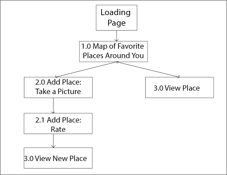
Apple Watch Map + Wireframe
For my Favor’Eat Apple Watch’s app, I plan on only displaying the map view, with the user’s favorite places around where the user is locating. The user can also use the option “Quick Add’ where he/she can take a picture, link it to a Yelp place (according to the map location) and then rate that place.
Application’s Map:
Application’s Wireframe:

Apple watch Digital wireframe

Apple watch app wireframe sketch
Woohoo~ Apple Watch!
Prototype 3
Accordingly, I made the following changes.(The product link: zeqinghong.com/simplejuice)
1.instead of dragging the icon into the calendar, now user only need to tap on the icons
2. eliminate the shaking gesture 3.change the sequence of the tap bar
Go Foodies! – Digital Prototype 2/2
Please find my second digital prototype at https://www.flinto.com/p/b74505c0.
There were a lot of valuable feedback I got based on the first digital prototype, and I made adjustments accordingly.
- It was suggested that it would be better to give users an option for searching restaurants by type of cuisine, so I added filters.
- The restaurant recommendation list on the first view was a bit long, so I reduced the quantity to 2, one for a restaurant that has a last spot very soon, the other for the most popular restaurant near a user’s current location.
- The use of warm colors in the app was suggested, and using one hue with different shades was said to be more relevant and focused for an app. So I dedicated the overall color theme of the app to shades of red. It is usually considered a color that easily works up people’s appetite.
- The consideration for color-blinded people was brought up, so I abandoned the previous design of having red button related to unavailability and green button for availability. In the newer version, an unavailable restaurant will not allow to make a reservation.
- I included a form for credit card information, as for certain restaurants, it was required to have that info when booking a table.
- The map on the first view was thought to be too zoomed-out, so I modified it to show only the range of all the participating restaurants.
Notes on final Prototype
Feedback from guest critiques:
*Loose the map view and miles
*Work on wording for the bottom tab bars
*have the tab bars constant and fixed through out the process
*re-iterate on the cart option, more indication that something has been added to the cart
Big Bite_Feng
Project Motivation: The idea comes from my personal experience. As a cook lover and recipes app user, I always face a issue: the existing recipes from other users are lack of logical and orderly organization.
Project Concept: In this project, I try to make an app which contain a recipe creating flow. By going through the flow I provide, users could easily come out a logical and orderly recipe.
Project Target Audience: This app is for the people who love making chocolate and chocolate dessert. It is for people who like to create and record their cooking steps. It is also for those people who would like to share and exchange their own cooking experience with others.
My App Map and Wireframe version 1
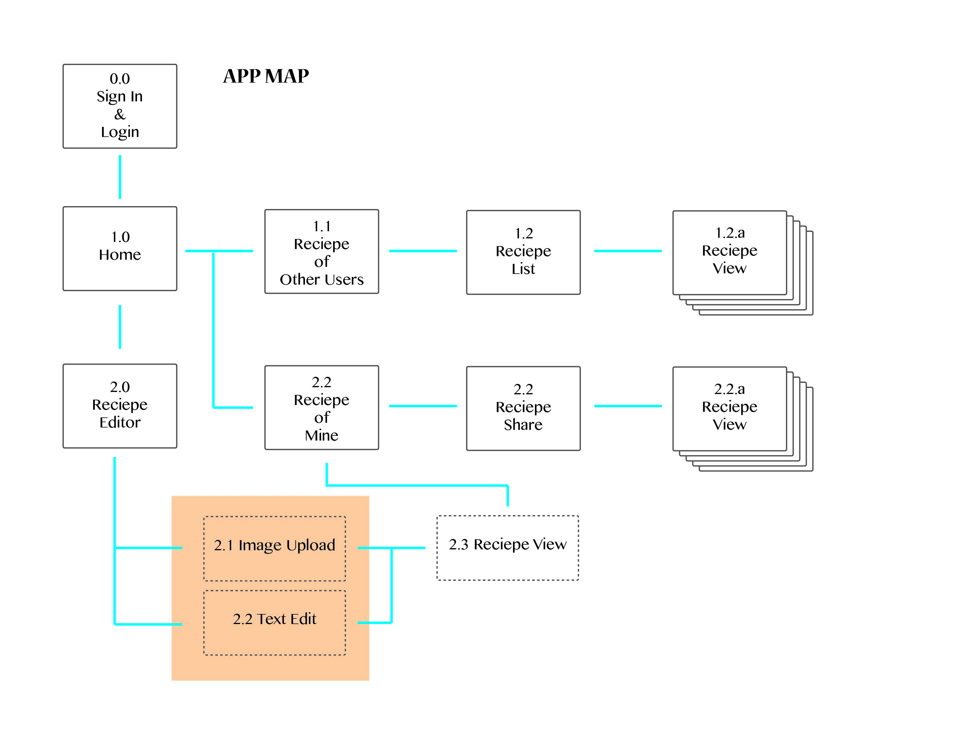
Here is the map about the recipe editing function.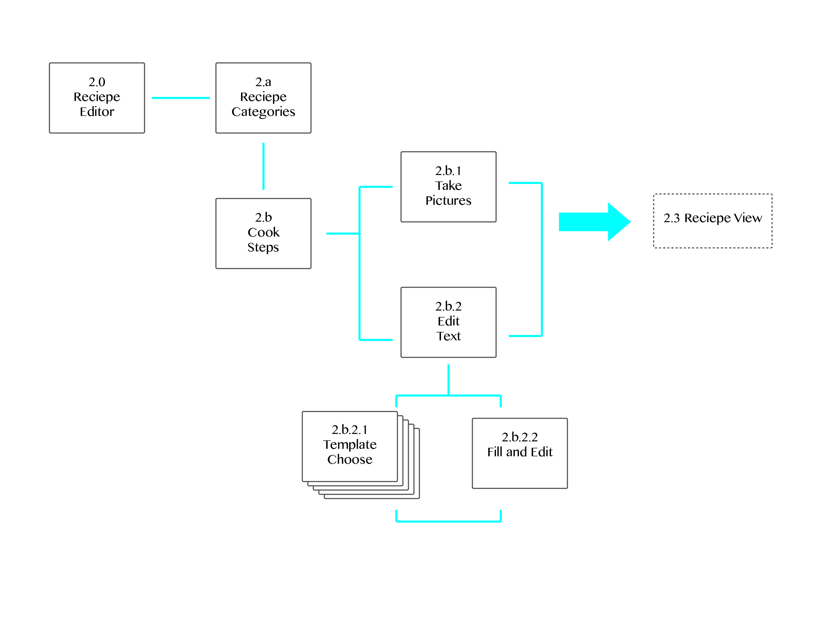
Here is my wireframe
Feedback for the app map and wireframe version 1: The main feedback I get from the 1th version is about the template sentence. In this prototype, people have to keep choose which template sentence to use. That actually wastes a lot of time and losses the fun of text editing. Instead of selecting template sentences, a clear and concise flow could be more help them to organize their cooking steps.
And then, I come out my second version of app map and wireframe.
My second version of app map
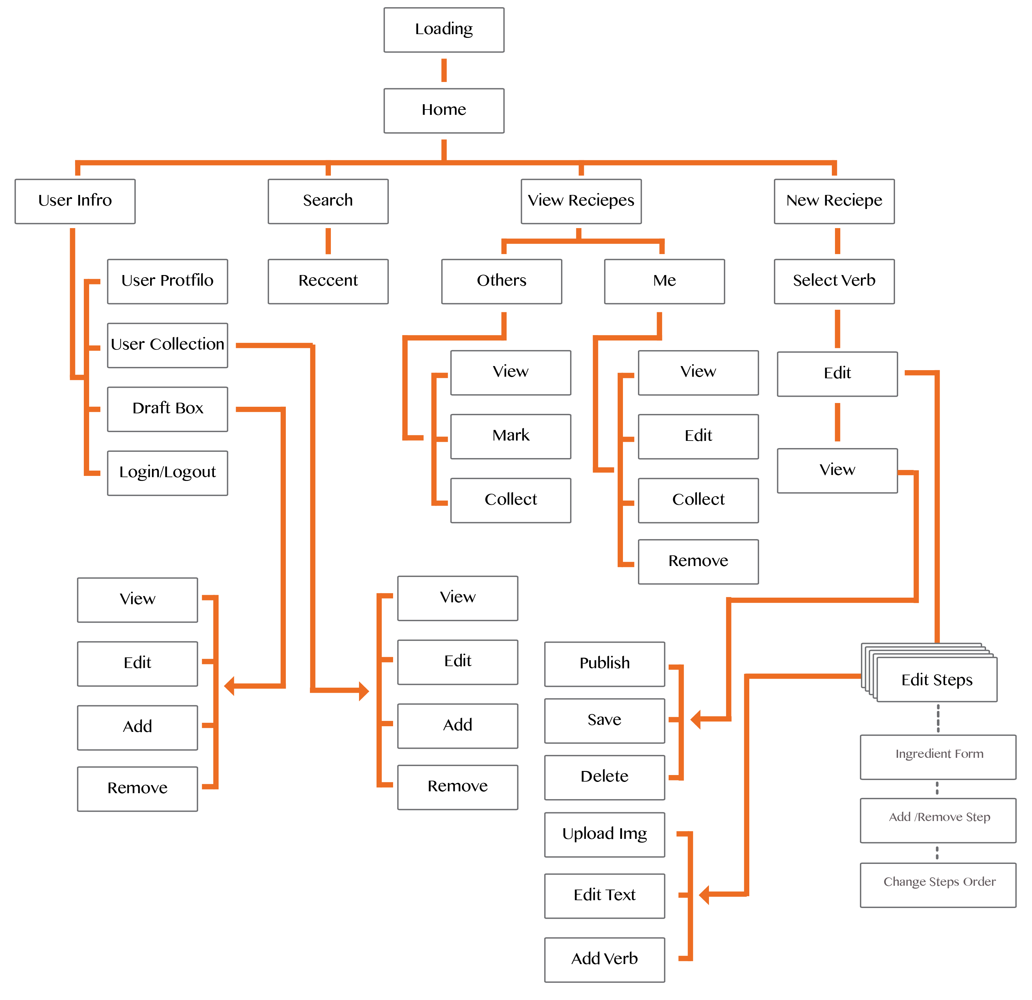
In this version, I make more detail about how this app work. The recipe creating flow is based on the different verbs in the process of cooking, for example “Wash”, “Cut”,”Melt” and so on. According those verbs, users could generate their own STEPS. This could help they organize the detail directions in different steps.
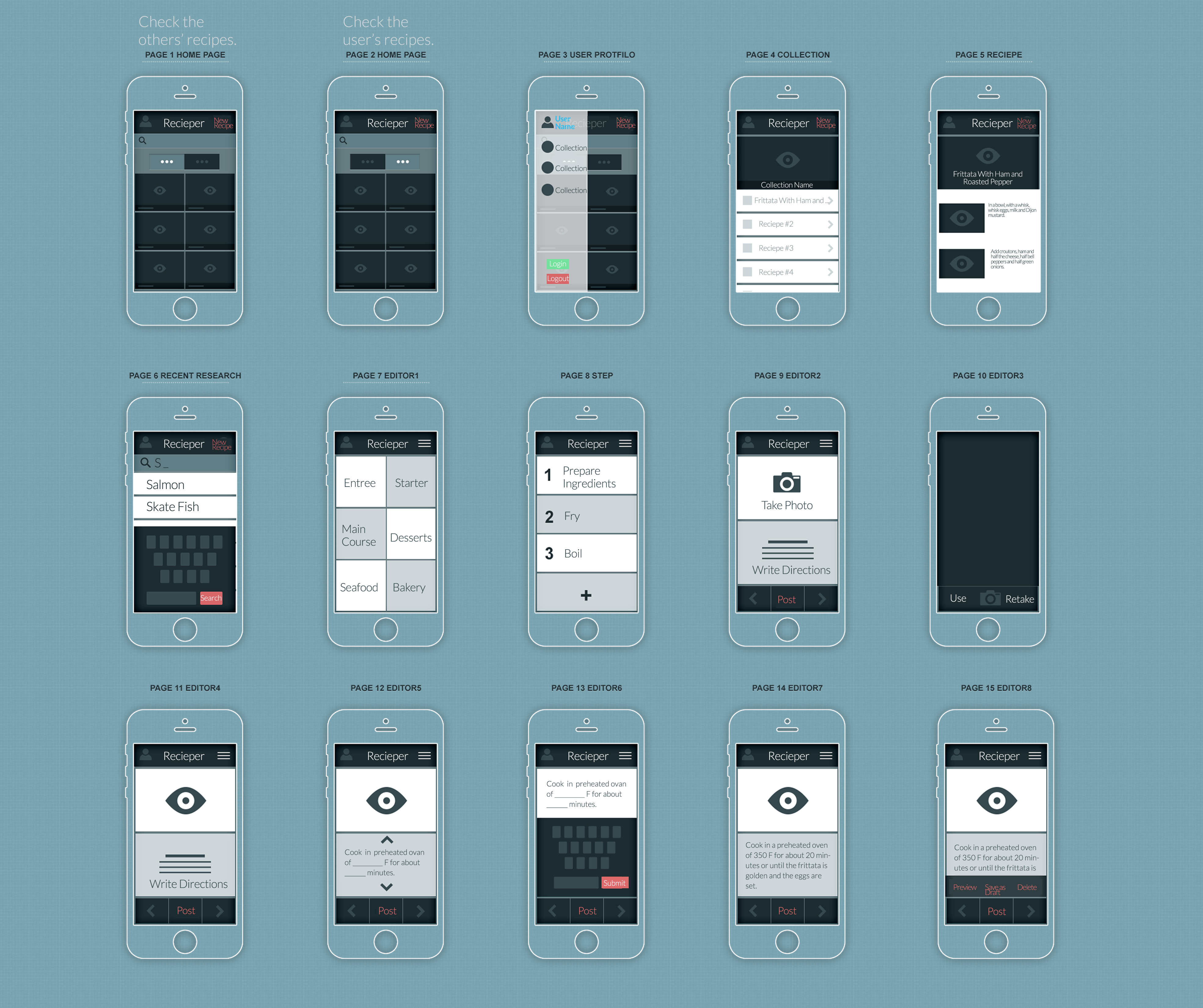
Here is my digital prototype.
Feedback from digital prototype:
1. As a iphone app, each page of my app provide users too many function and options. I need to simplify the functions and buttons.
2. The “Preview”, ‘Add More’,”Next” button make people confused. Sometimes, users don’t need those functions, so they shouldn’t appear.
3. The “Create New Recipe” page should belong to be part of the flow. When they edit a recipe, they should have the possibility to go back and change the name and descriptions.