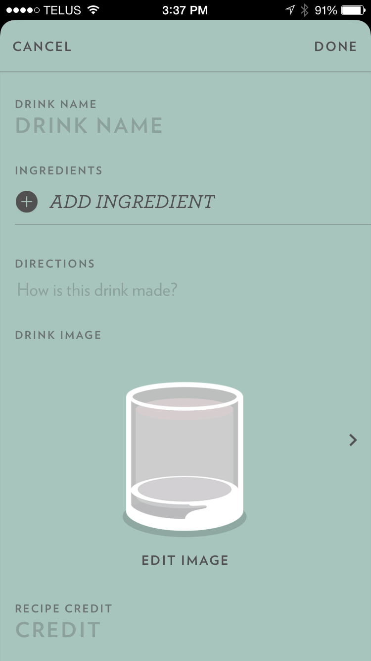
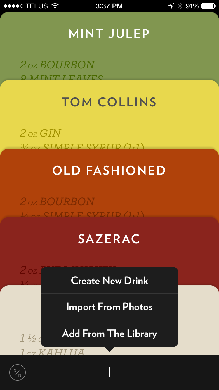
Here is the link for the iPhone food app:
Category: Uncategorized
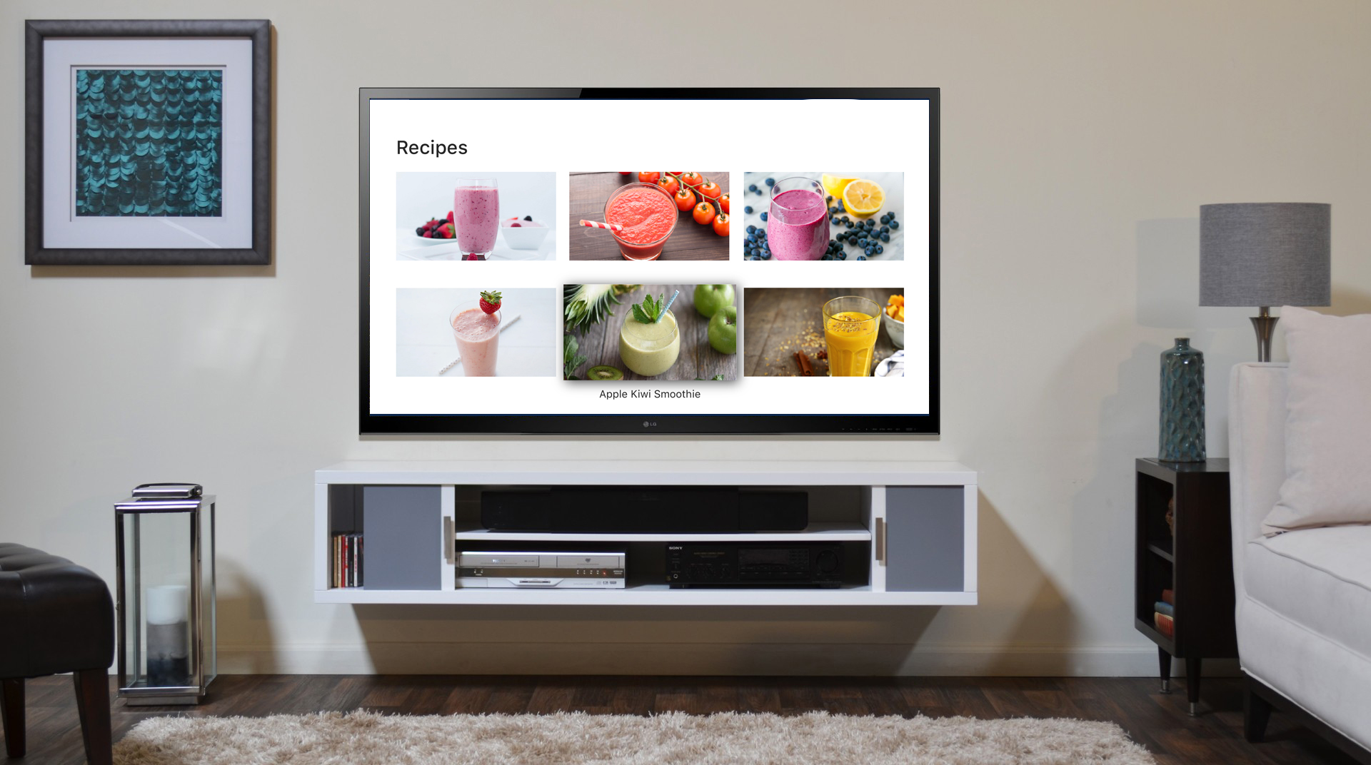
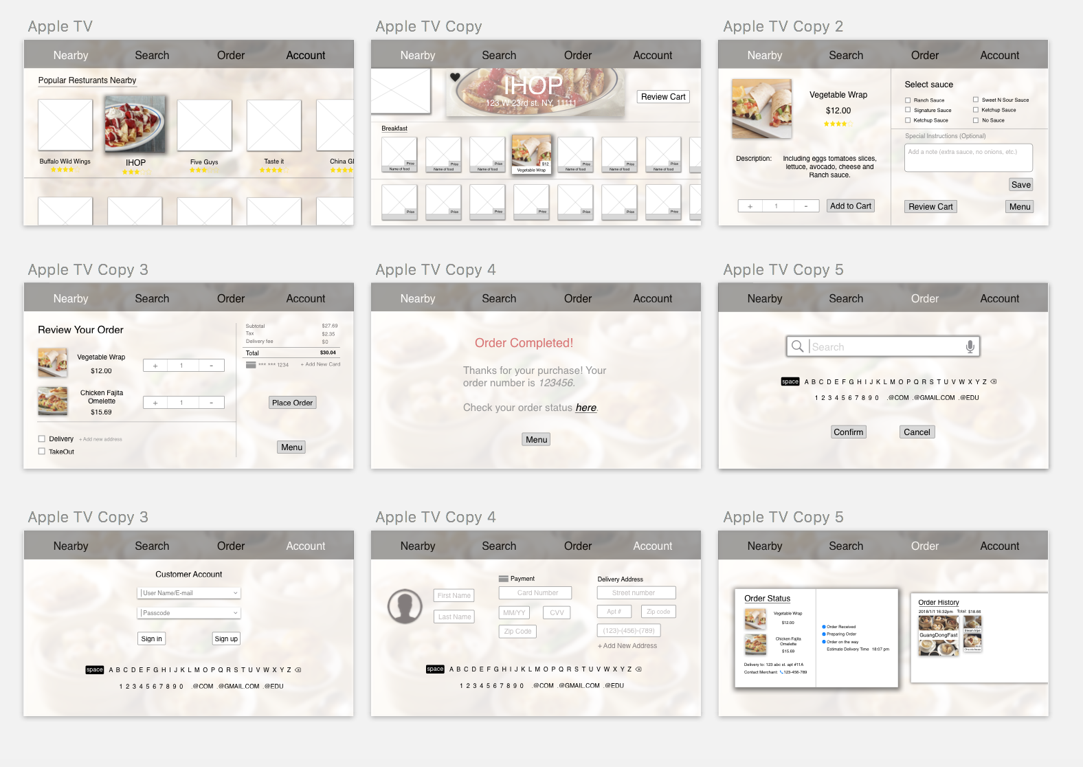
Week 9(?): AppleTV final design Jason Chen
User insights:
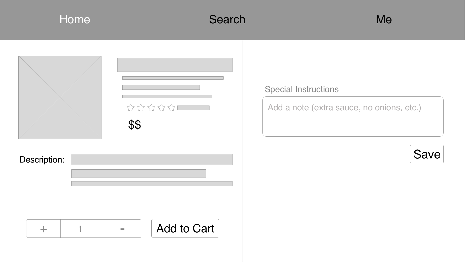
1. The save function too small to find (focus).
2. The hierarchy of ingredient page is wrong.
3. The delete button in the cart page should be on the same level of the item.
Final design:

Week8
User Test
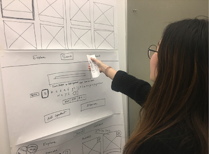
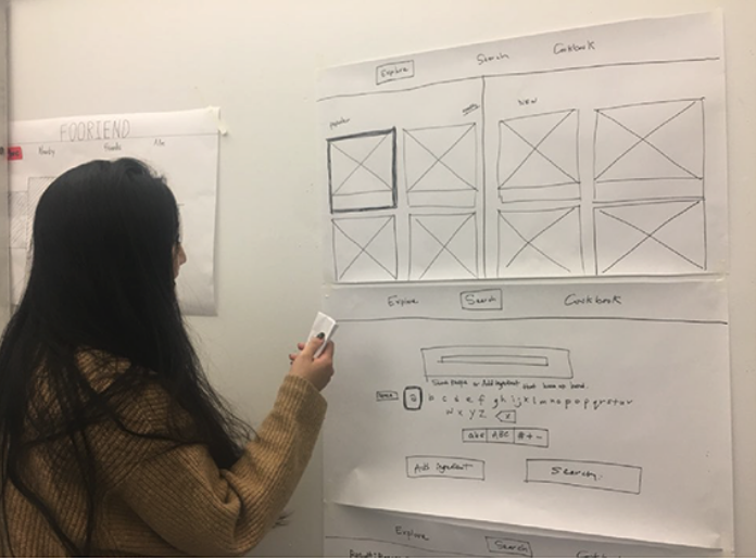
User Testing Insight
- Don’t need closing icon – Apple TV has a back button.
- Remove the first search screen – make people tap the search keyboard right away.
- What screen do people see when people type in many different types of ingredients? — So I designed another version of the interface.
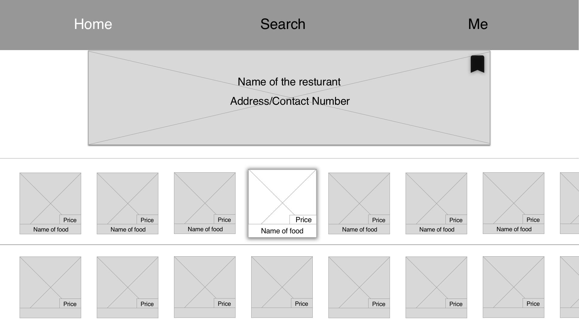
- For the bookmarking the cookbook, the icon should be outside of the recipe photo because Apple TV cannot focus on inside. — I took out the icon outside of the recipe photo, so people can focus on the icon separately.
- Consider the interface when there is many ingredients or steps descriptions. – So I made squares surrounding the step descriptions, so people can scroll down by square to square.
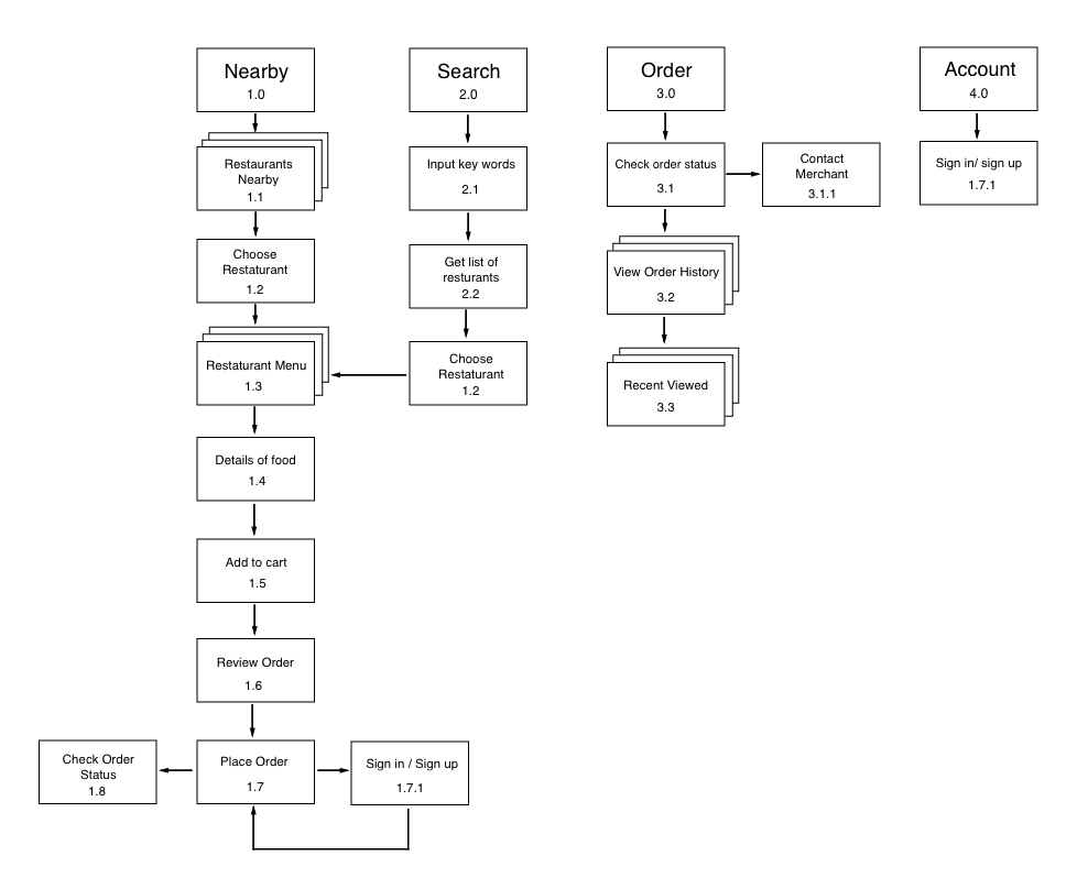
Final User Flow / Wireframe

Final UI
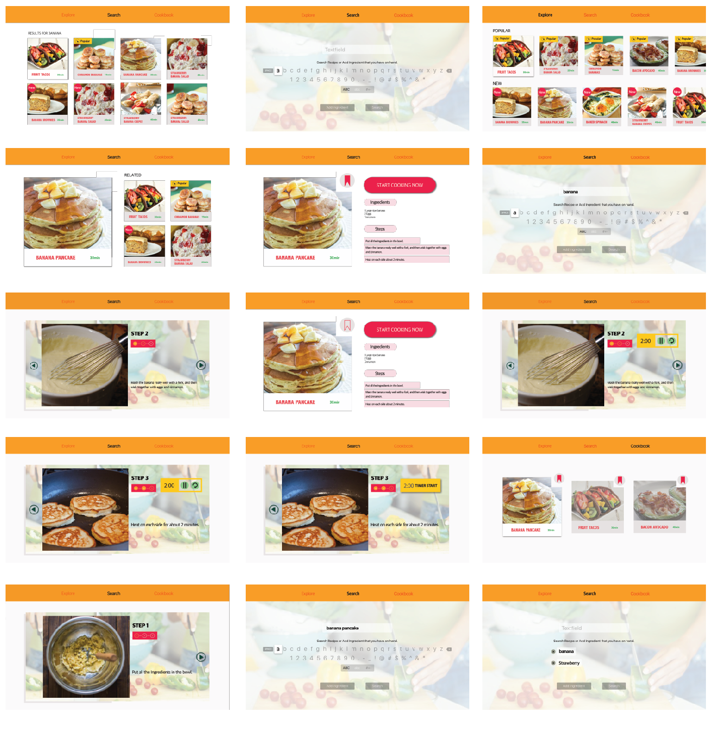
Final Prototype
Yao – WK7 refine Apple tv wireframe
Improvements:
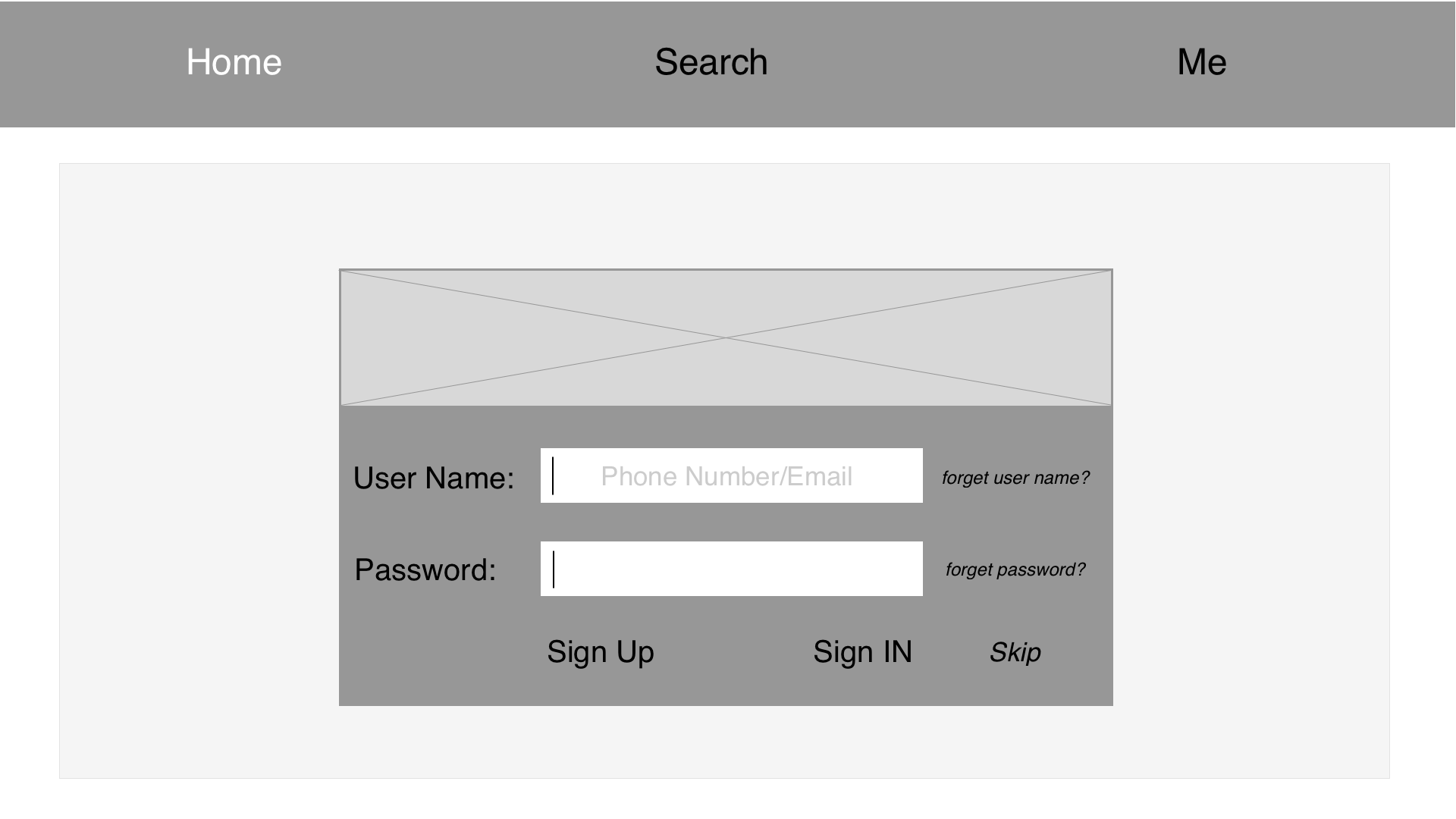
Delay sign-in as long as possible. The previous wireframe, I put the login page at first and I realized that would let users to abandon this app.
I put the “Like” button inside of the image.
Yao–WK6 Thursday App
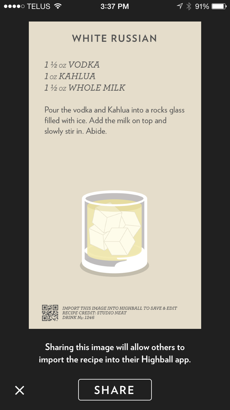
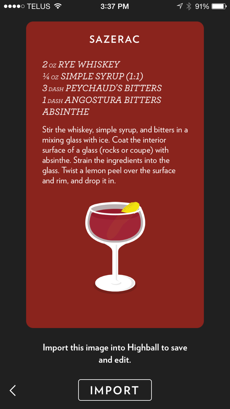
Highball
Highball is a well-designed app for those who enjoy a well-made alcoholic beverage. It allows users to discover new recipes from a series of downloadable cards. This way, you can explain the intricate steps involved with making the crafty beverage when that attractive stranger at the bar asks you what you’re drinking.
https://www.studioneat.com/blogs/main/17985764-introducing-highball
Three things I learned from Apple HIG
- Parallax. Parallax is a subtle visual effect used throughout the system to convey depth and dynamism when an element is in focus. Through image layering, transparency, scaling, and motion, parallax produces a 3D effect with a sense of realism and vitality. Image layering to support the parallax effect is a requirement for your app icon and is supported for dynamic top shelf content on the Home screen. Image layering is strongly encouraged anywhere that focusable, image-based content resides in your app.
- Delay sign-in as long as possible. Since some of apps would force users to sign in then continue to use the apps that makes users to abandon apps. So delay sign-in as long as possible is to give more time for users to explore the apps, which means to let users to see what you have in this app but not force them to sign-in.
- The “back” button do not need to show.
Apple Tv App Map:
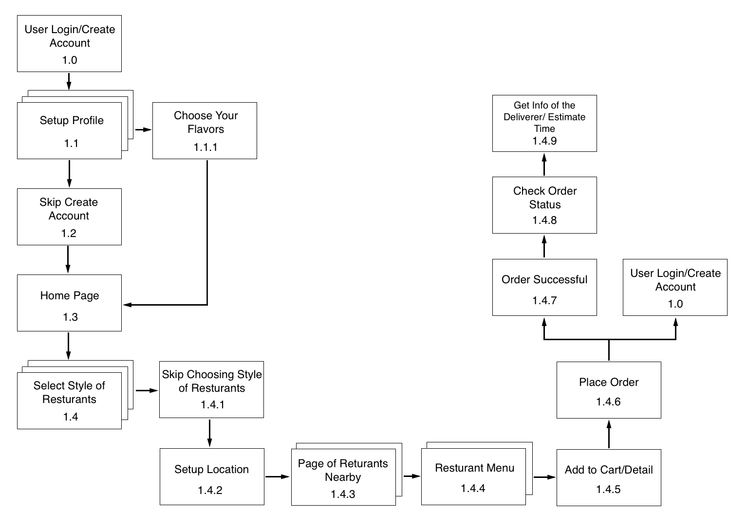
Apple Tv Wireframe:
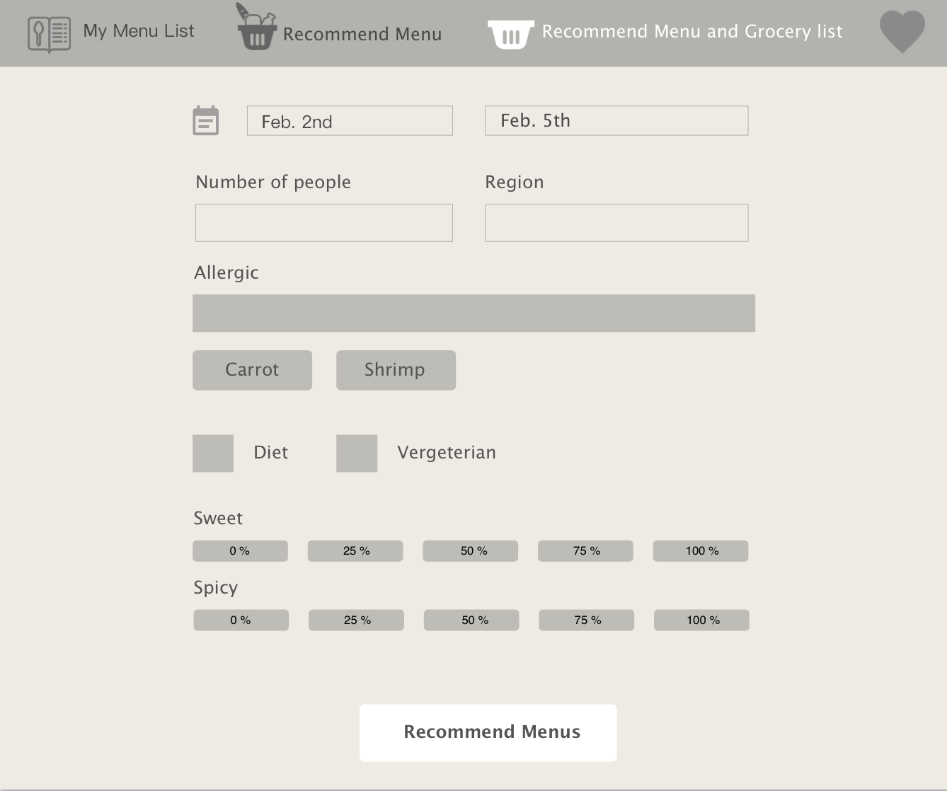
Week9- Kelsey (Yue Yu) Refine Apple TV Wireframe
Improvements:
1: choose the degree of spiciness and sweetness: change the slider to buttons to
2: Redesign “the rest of Food ingredient” section, move it from the bottom to top as a button.
3: Improve LogIn page

Thursday App
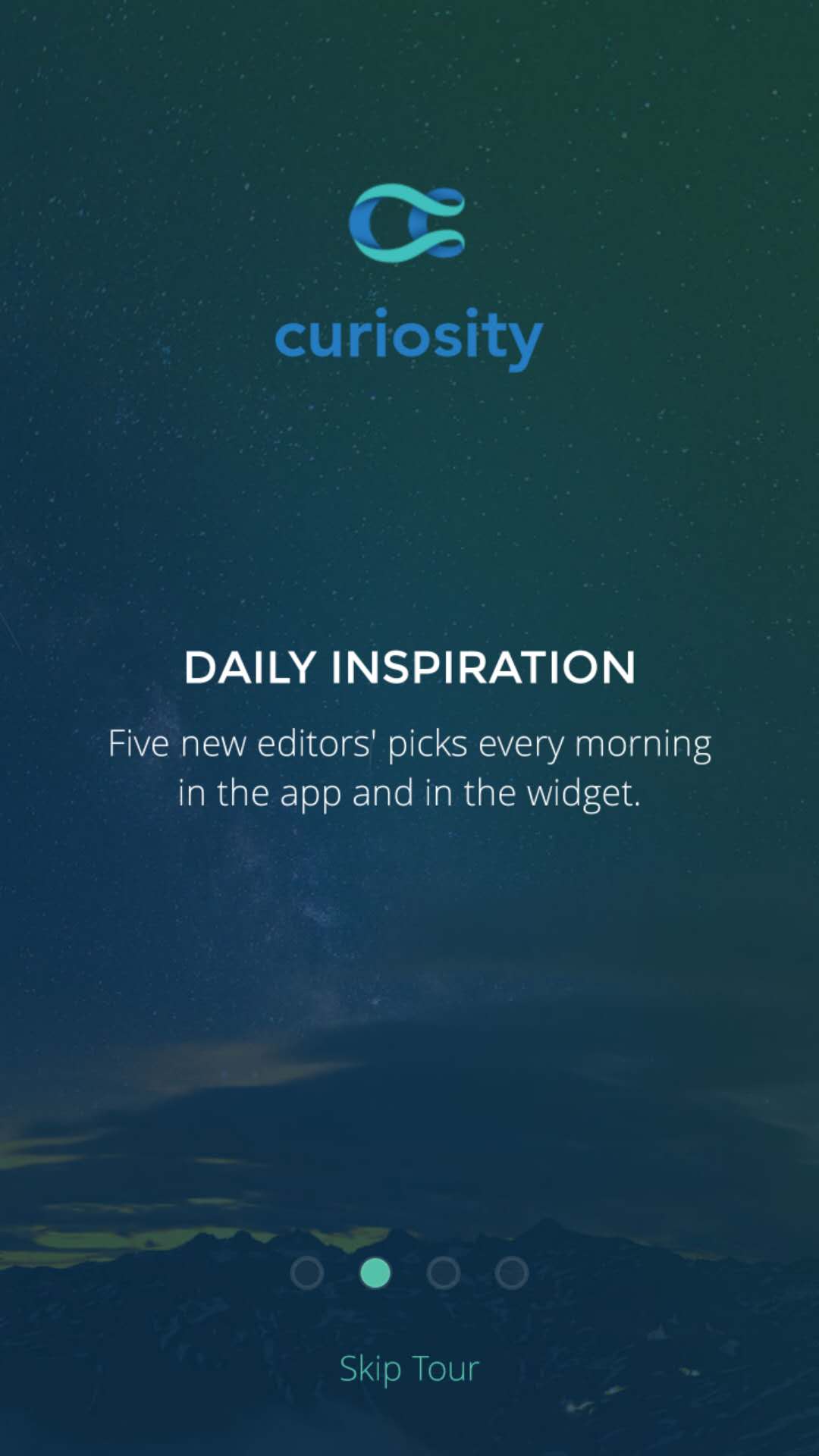
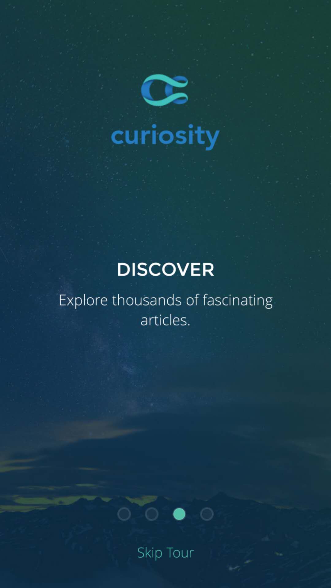
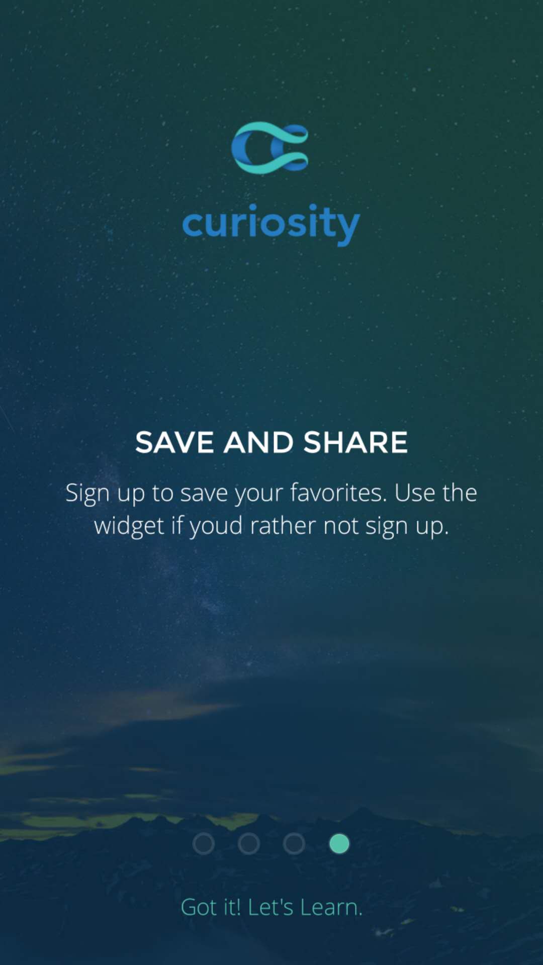
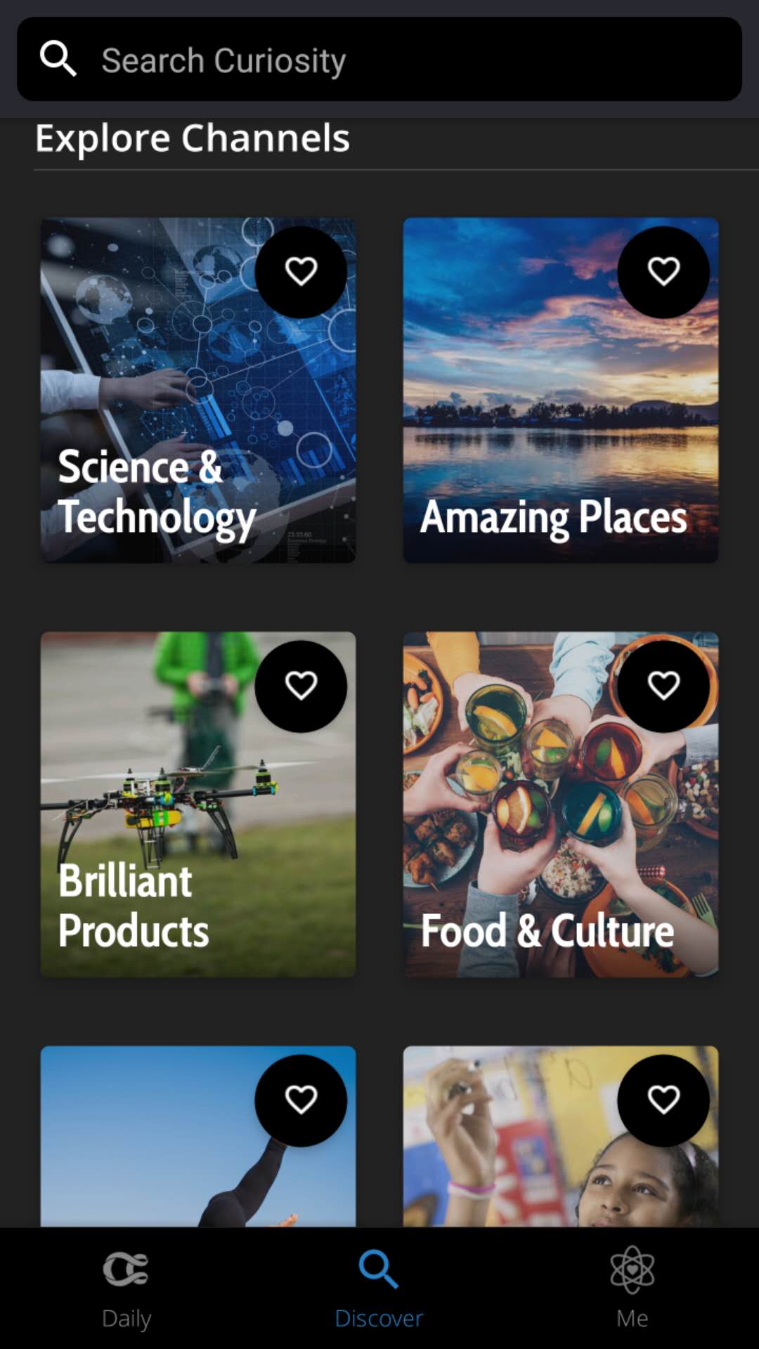
Curiosity
This app is a good place to kill boring time while on waiting or on the train. First of all the graphic style and layout is kind of attractive for me to read and explore in the app. The other thing I like a lot about this app is that you can select your own interested topics or categories you are curious about, and keep reading fun articles. More than thousands of subjects in the discover page that will keep you digging in this app.


Week 6_Apple TV app
3 things I learned from Apple TV HIG:
1. Text size:
| Style | Weight | Size (Points) | Leading (Points) | Tracking (1/1000em) |
|---|---|---|---|---|
| Title 1 | Regular | 76 | 96 | +11 |
| Title 2 | Medium | 57 | 66 | +13 |
| Title 3 | Medium | 48 | 56 | +15 |
| Headline | Medium | 38 | 46 | -26 |
| Callout | Medium | 31 | 38 | -16 |
| Body | Medium | 29 | 36 | -13 |
| Subhead | Medium | 29 | 36 | -13 |
| Footnote | Regular | 29 | 36 | -13 |
| Caption 1 | Regular | 25 | 32 | -3 |
| Caption 2 | Medium | 23 | 30 | +3 |
2. Some remote gestures:
- Press the Home button once to return to the Home screen from anywhere.
- Press the Home button twice quickly to bring up the App Switcher, which displays all apps open. Swipe up on the Siri Remote’s touch surface to force close an app.
- Press the Home button three times quickly to access VoiceOver.
- Press the Menu button once to go back.
- Tap is for moving focus point, not same with clicking.
3. Layout
• Include appropriate padding between focusable elements. The element gets bigger when it comes into focus. Consider how elements look when they’re focused, and make sure they don’t unintentionally overlap important information.

• Allude to hidden content by partially displaying offscreen elements. In large collections where content doesn’t fit on a single screen, hint at the additional content by showing portions of the offscreen items.

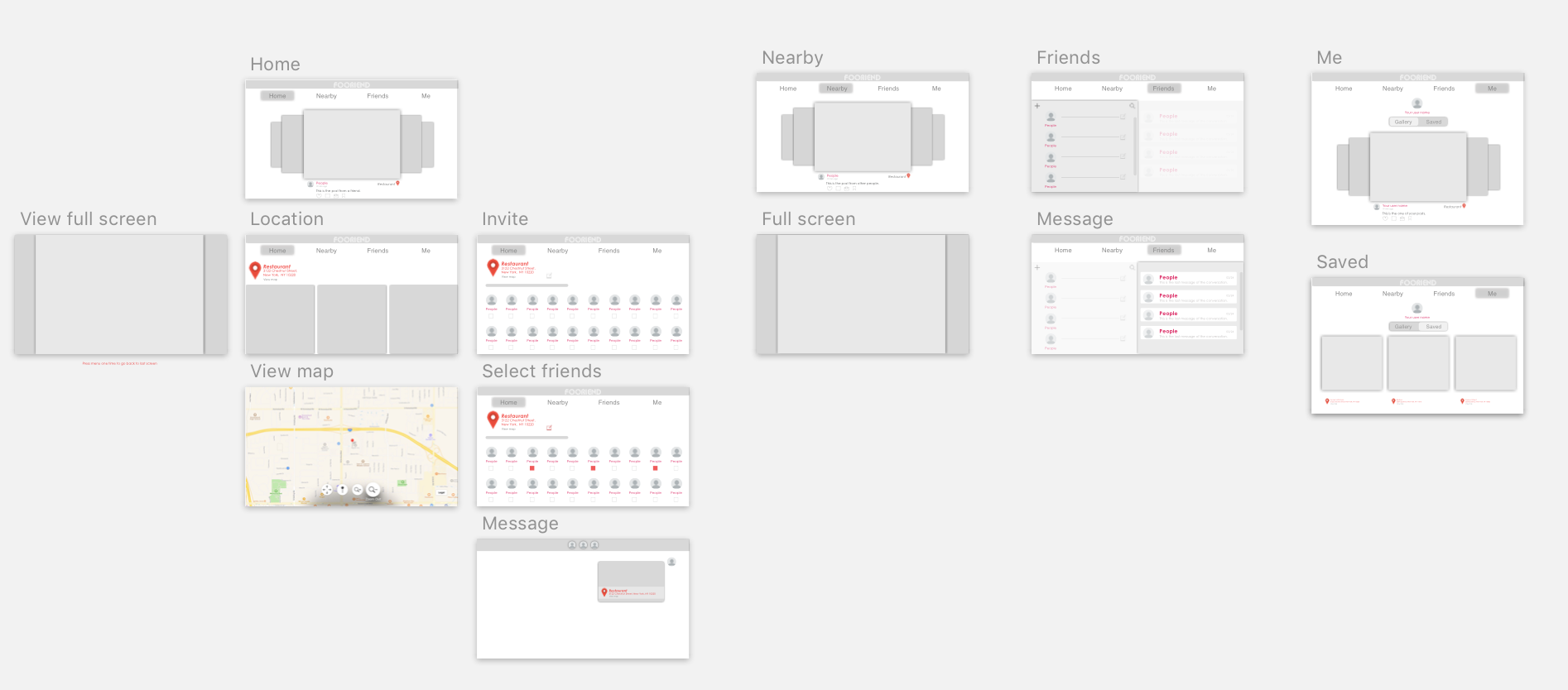
My apple tv food app
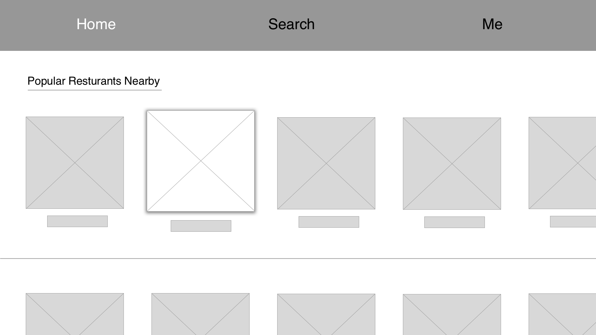
Considering my food app as a social media platform that heavily based on images and which the interaction between friends involved mostly are comments and message. I decided to cut down some functions. So on the tv, the app will only have four tabs: Home(feeds), Nearby, Friends, Me.
Week 5
Final version test link: https://marvelapp.com/40gh5ai/screen/39121224
Week 4
Digital Prototype: https://marvelapp.com/2cdi1hf/screen/38293516
User test feedbacks:
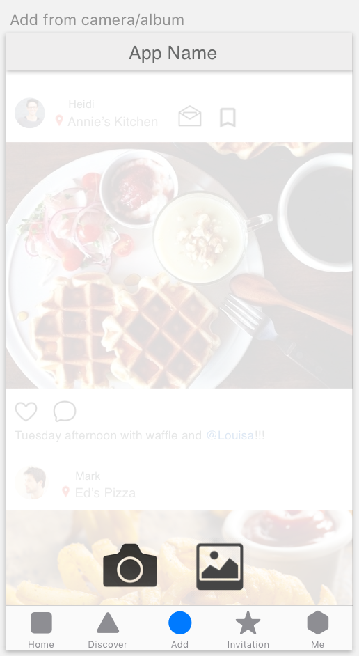
- When the user tap “Add” button, it can directly show the camera instead of giving options of add from camera or photo album.

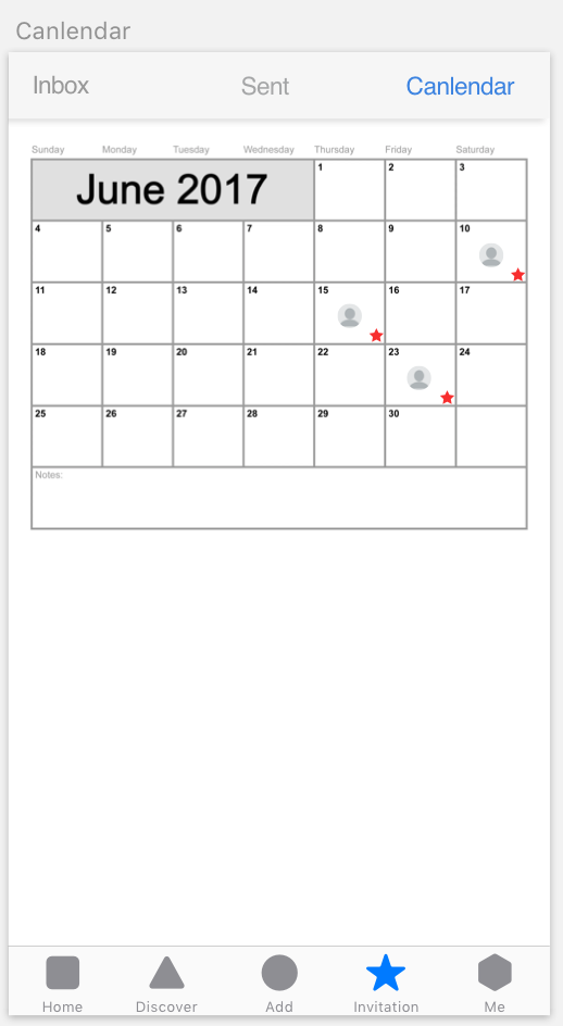
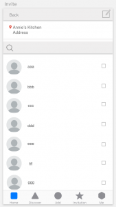
- The “calendar” screen that under “Invitation” tab is not necessary, the user can mark the date by using their calendar app.
- User can invite their friends to go eat together through text message, email, or other message apps. Reconsider the utility of the in-app message function.
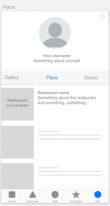
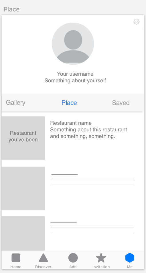
- The “Gallery” and “Place” that under “Me” tab can be combined into one screen.