Next week, March 23, is Spring Break!
For March 30:
- Iterate on your Apple TV app wireframes
- We will create paper prototypes in class based on your wireframes. No need to do these ahead of time!
Next week, March 23, is Spring Break!
For March 30:
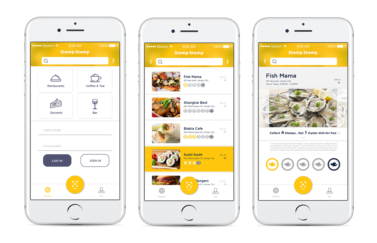
According to the feedbacks from prototype 2, I revised:
• Enlarge Text and test on the phone
• Add logout button on profile page
• Add a special icon for some restaurants which have special offers to help users get information easily.
• When you finish the all the stamps collection, all the stamps will be shining.
• Change “Sign in” to “Create an account”.
• Delete language bar.
• Simplified tap bar to be more efficient to access on QR scanning.
• Add more restaurants sample in my prototype.
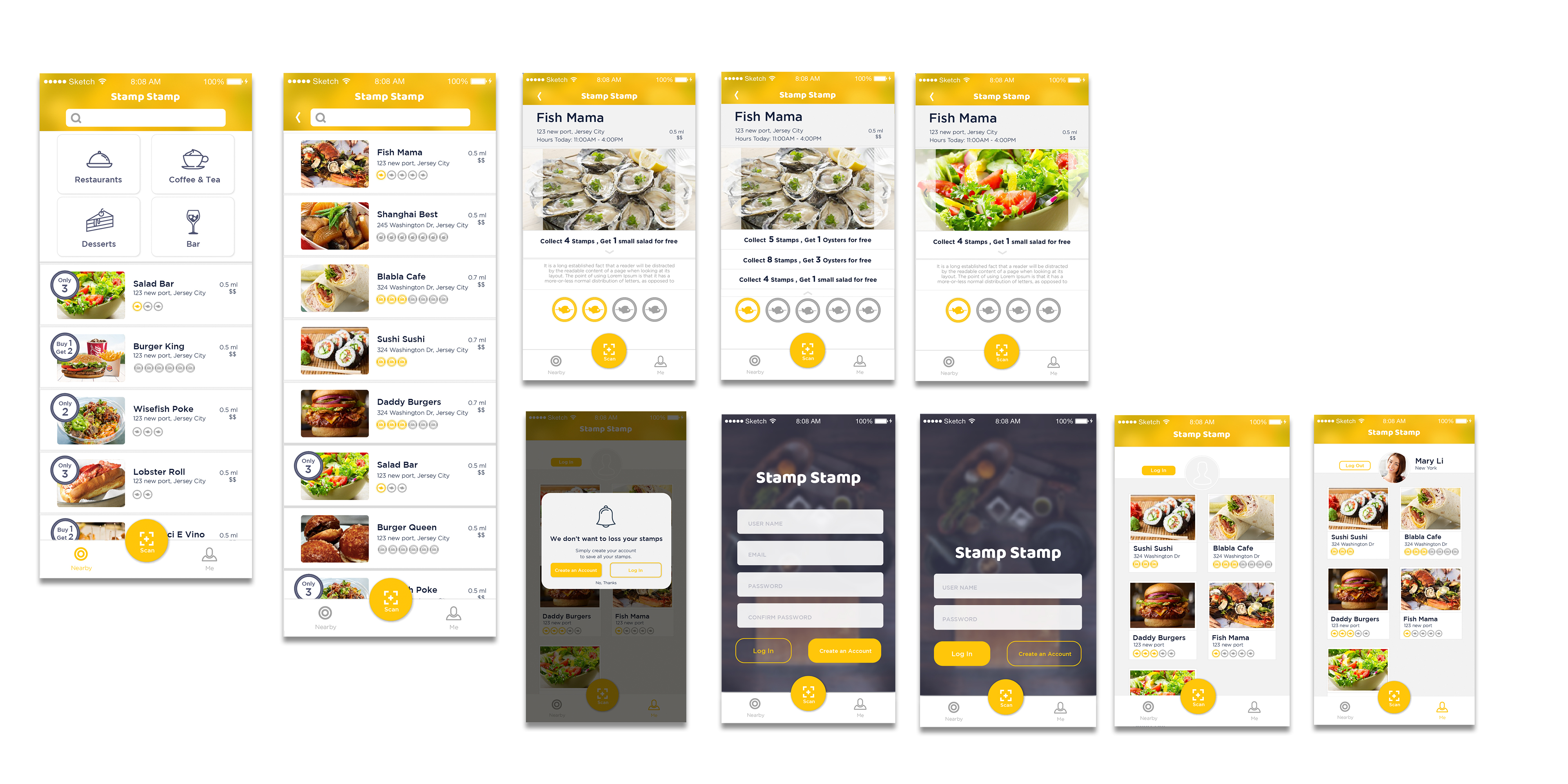
Marvel prototype: https://marvelapp.com/55104ch

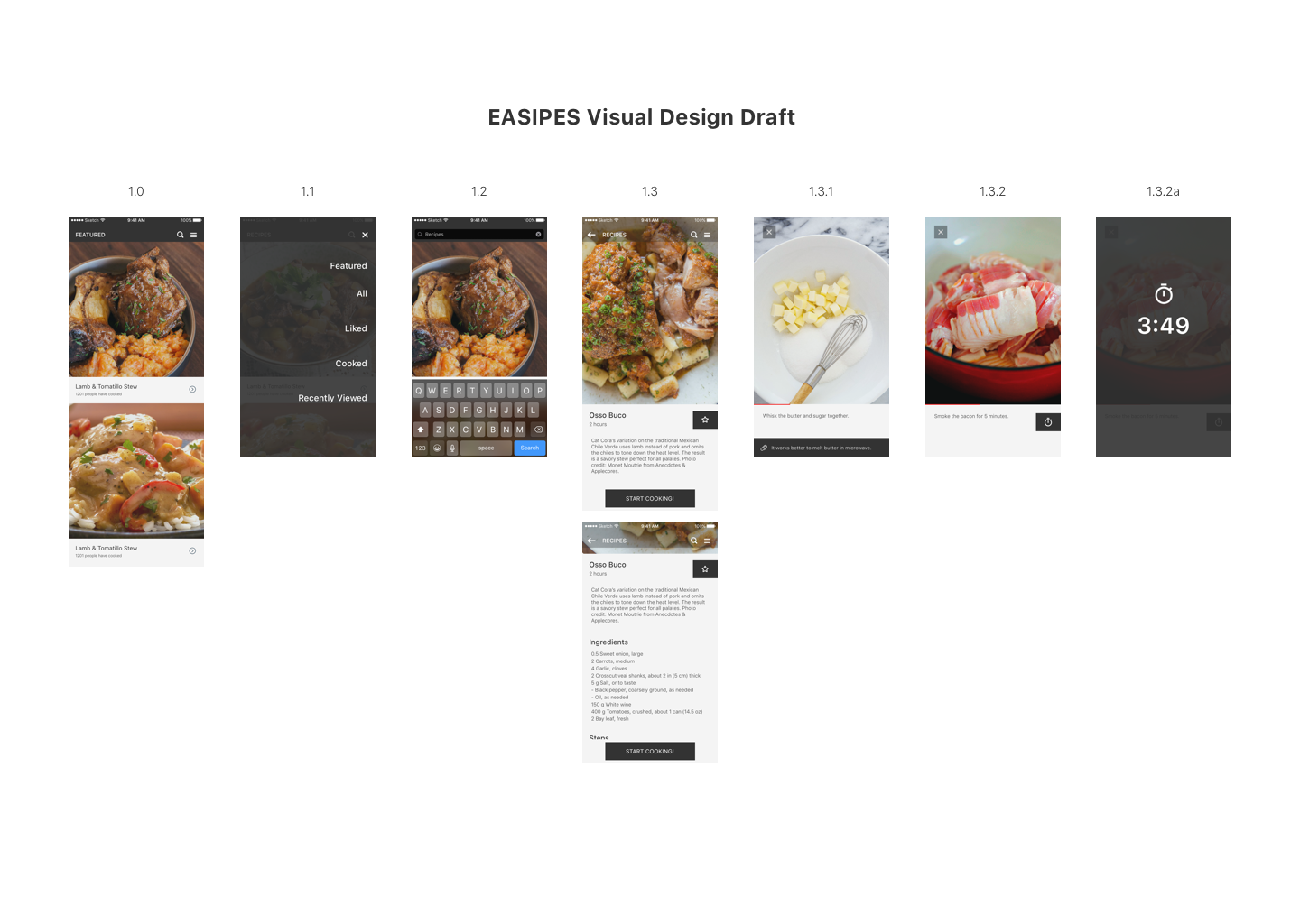
Concept:
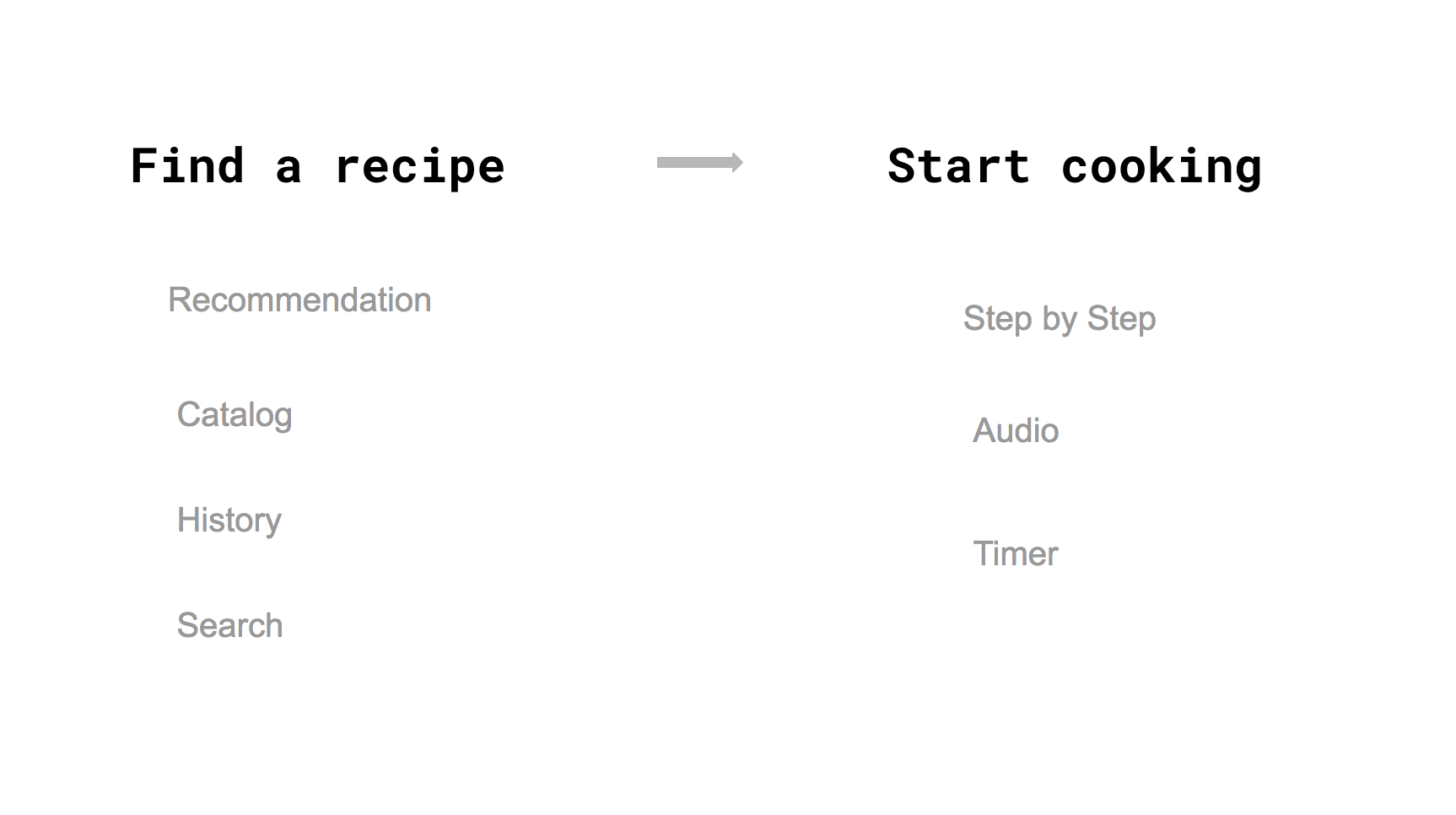
I am creating an app to help cooking lovers easily access high-quality recipes, and making an engaging, easy and fun? cooking experience for them.
LINK to Digital Prototype
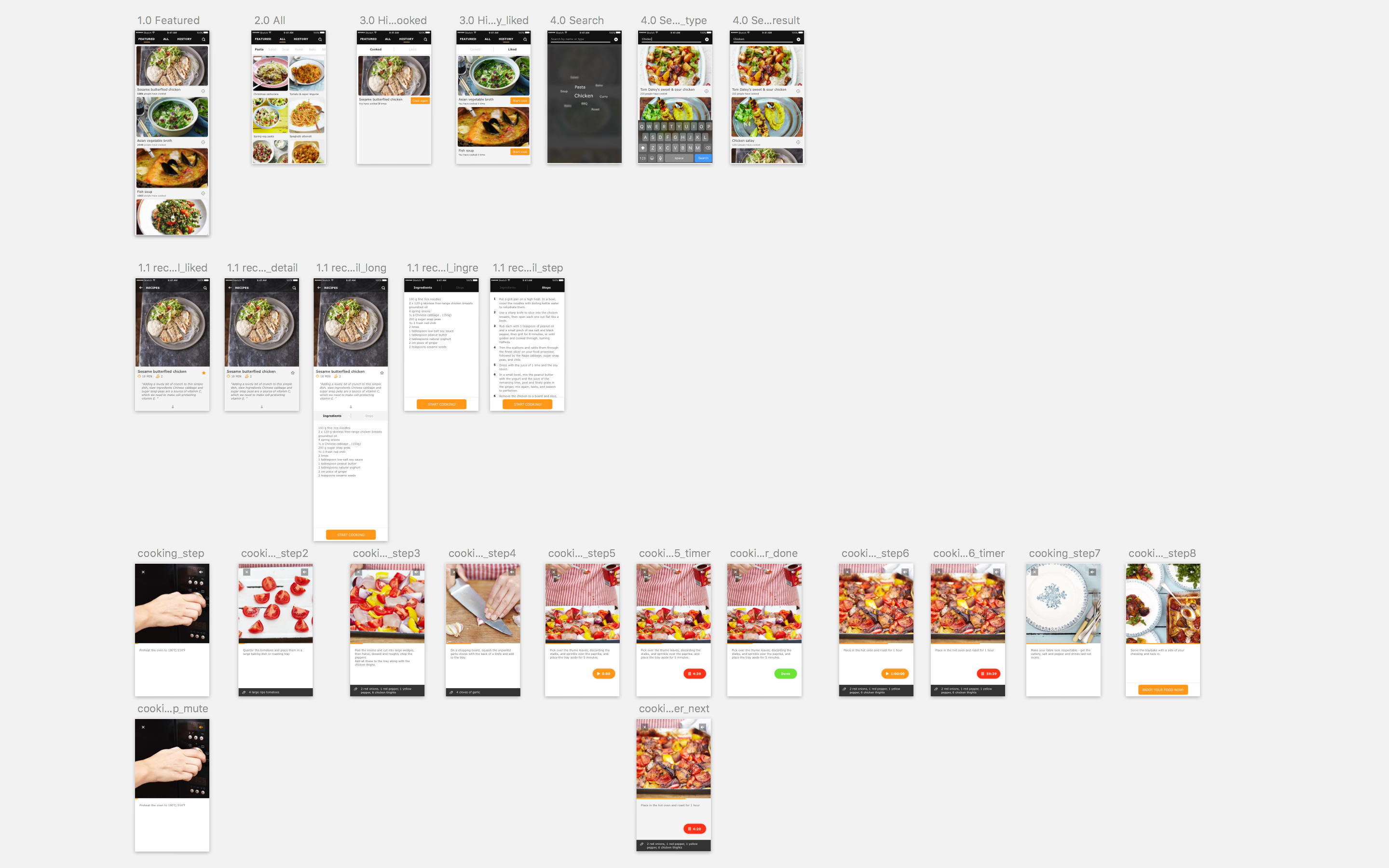
Iteration:
-Polished the visual
-Restructured the menu, changed into the form of Tab
-Redesigned the layout of Recipe detailed page
-Switched the interaction of Timer function
-Added audio elements
-Used a real example to make complete experience

Marvel prototype: https://marvelapp.com/24bcg1a
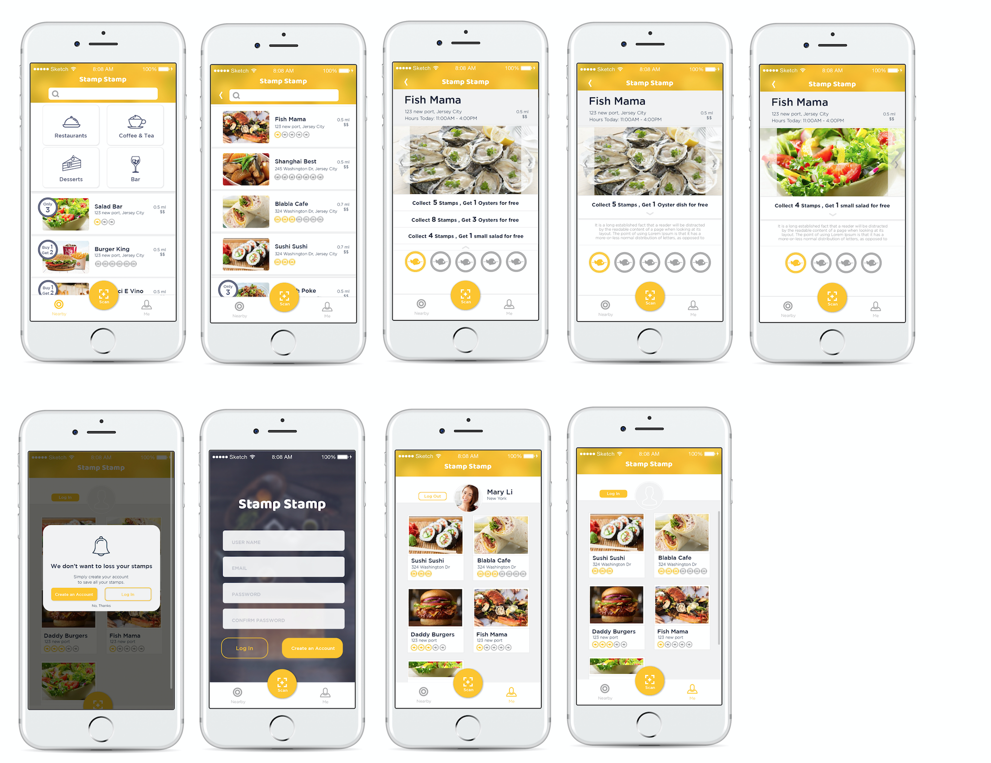
• The context text is really small.
• There is no logout button on the user profile.
• Show something special marks some restaurants which have special offers to help users get information easily.
• Change another visual symbolization to symbolize when you finish collecting the stamps. The yellow color I used before looks more like a tap respond.
• Change “Sign in” to “Create an account”. It may help users to understand easily.
• No need for language bar, because iPhone has its own language system.
• Make QR scan button more easily to access.
• Test what happened if there are more restaurants.
LINK to Digital Prototype
-Used real content, and adjusted the ratio of the pictures
-Changed the title “RECIPES” into “FEATURED”
-Changed the layout of navigation bar, moved the menu icon to the right side so that users can access menu page even in the recipe detailed page
Here is the link to my final documentation
First digital prototype: here
Final digital prototype: here
Three things I learned from the digital prototype.(Visual Elements will look & feel totally different on the screen with the paper prototype.)
My name is Chuyi Sun. I am from China. Currently, I am the first year MFADT student. I graduated from the University of California, San Diego as a studio art major student. After one-year internship experience in graphic design, I am trying to transfer to be an UI/UX designer. I am a big fan of comic, game and music apps.
iPhone provides the widgets for people to quickly and easily to view the useful information from an app without the need to open it. It not only provide a more efficient way for users to get notice but also use a creative way to attract users to open the app. Because if the widget shows some interesting notices or information about the app, the user will open the app to check that.
The Siri is one of the artificial intelligence that applies on iPhone for assisting users to finish their tasks easily by using voice commands. Currently, the voice recognition of Siri can recognize different languages. The Siri interface also provides another easy access for users get useful information quickly. It reminds me when we design the app, don’t forget to provide a concise notice or information widget for Siri interface.
The expanded notification allows users to press their notification or swipe the notification down on an unlocked device. It also provides users a connivence to take immediate action without leaving their current context. It is really useful when we need to do multi-tasks. It provides more possibilities for users to finish their tasks quickly and efficiently.
Findings after user tests with digital prototype:
1. Users were confused about the search icon on the navigation bar because of the quantity of contents are not enough to search. It can give users a bad experience if they cannot find result they expected.
2. Users were curious how they can order multiple dishes at the same time. There was no cart function.
3. Users preferred choosing date and time for order separately to selecting a button including both of them.
Changes / Iterations:
1. Removed search icon on the navigation bar and replace it with a cart icon to allow users to order multiple dishes.
This is because, considering time and capacity limits, sorts of dishes that one granny chef can cook per day will be around three to four at max.
Therefore, people still can access all foods on the main page.
2. Reformed the order option which users get when they tap the add to cart button on the detail page.
Users will select available date first and then select time afterwards.
Of course they can edit them on the cart page.
3. Added a popup page that asks users to allow their current location being tracked -> Based on user’s current location, the list of foods is filtered.
Feedback from last week’s critique
1. In UX wise, it looks appropriate to put the sign up page in the back and focus on enticing users first by showing them the contents first.
Considering user engagement, it would be better to show few menus on top and enable the rest of contents and ask users to sign up if they want to browse more
2. Managing hierarchy between ‘Granny chef’s profile’ and ‘Food detail pages’ looks a bit complicated.
3. If the main color including icons and fonts alters according to a food’s color, it can ruin the consistency.
Marvel Prototype Link: https://marvelapp.com/2caccjg/screen/25722004
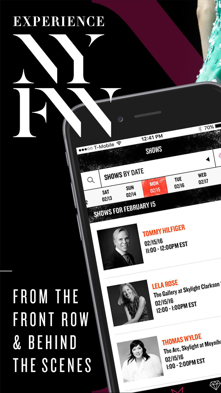
HEED is an app that helps user to get informed about fashion trends. With HEED, the user can follow the latest fashion trends and style advice, the user can catch streams of runways shows from around the world. The user can also upload a selfie and get personalized styling tips, then participate in the style challenge for a chance to win beauty products from top stylists. It is easy and intuitive to use.