3 Things I learned from Apple’s HIG — Jackie

1. Deference. icons simplify and clarify ornamentation

Clarity. Text is legible at every size, icons are precise and lucid, adornments are subtle and appropriate, and a sharpened focus on functionality motivates the design.

Depth. Visual layers and realistic motion impart vitality and heighten people’s delight and understanding.

The UI helps people understand and interact with the content, but never competes with it. For my understanding, as an interactive designer, our target of interface design can be also seen as to design a visual system or communication language between user and content. Through reading the rules of HIG design, I deeply thinking about why we choose icons simplify and clarify ornamentation in iOS system. And how to using design for helping people get the content, but not confuse them. The interface’s exist is servicing for user experience. That’s why as a UI designer our target is highlight the users to get content at first. And putting your personal design style as second place.

2. Continue thinking of how to make the most important content and functionality clear and easy to interact with. The IOS design system use plenty of negative space, let color simplify the UI, ensure legibility by using the system fonts and embrace borderless buttons. These details are telling us each single gesture design were creating through users perspective.

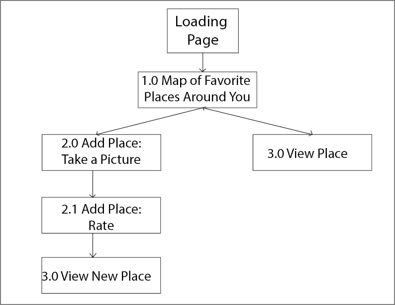
3. Another interesting point for me is about the iOS app includes a window. But—unlike a window in a computer app—an iOS window has no visible parts and it can’t be moved to another location on the display. Most iOS apps contain only one window; apps that support an external display can have more than one. Because users tend to experience an iOS app as a collection of screens. From this perspective, a screen generally corresponds to a distinct visual state or mode in an app. Through this point, I continue explore the object is becoming more important which is UIScreen design.

Delectable – App Review

Screen Shot 2015-03-19 at 下午7.10.40

https://delectable.com/

Delectable is an app that recognize your wines when you take picture of the label in this app, and you can get reviews, recommendations, other comments about the wine.

I’m amazed by their humongous data base since I’m a sake lover and some of the brands can be less easy to find, however they have the information! And I also tried red wine and white wine – both work. And the response is fast, the information is clearly layout. The color palette is also not that generic  – it comes with a feeling of natural, graceful and high quality of life.

Apple Watch Map + Wireframe

For my Favor’Eat Apple Watch’s app, I plan on only displaying the map view, with the user’s favorite places around where the user is locating. The user can also use the option “Quick Add’ where he/she can take a picture, link it to a Yelp place (according to the map location) and then rate that place.

Application’s Map:

App Map


Application’s Wireframe:

Favor'Eat Watch Wireframe

Go Foodies! – Digital Prototype 2/2

Please find my second digital prototype at https://www.flinto.com/p/b74505c0.

There were a lot of valuable feedback I got based on the first digital prototype, and I made adjustments accordingly.

  • It was suggested that it would be better to give users an option for searching restaurants by type of cuisine, so I added filters.
  • The restaurant recommendation list on the first view was a bit long, so I reduced the quantity to 2, one for a restaurant that has a last spot very soon, the other for the most popular restaurant near a user’s current location.
  • The use of warm colors in the app was suggested, and using one hue with different shades was said to be more relevant and focused for an app. So I dedicated the overall color theme of the app to shades of red. It is usually considered a color that easily works up people’s appetite.
  • The consideration for color-blinded people was brought up, so I abandoned the previous design of having red button related to unavailability and green button for availability. In the newer version, an unavailable restaurant will not allow to make a reservation.
  • I included a form for credit card information, as for certain restaurants, it was required to have that info when booking a table.
  • The map on the first view was thought to be too zoomed-out, so I modified it to show only the range of all the participating restaurants.