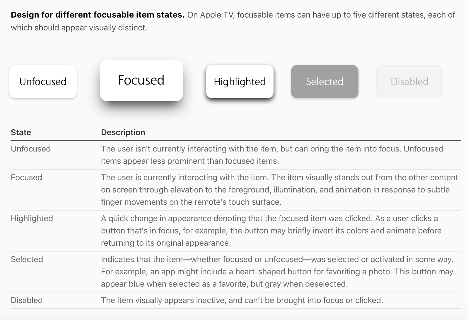
3 Things learned about Apple TV
1: Parallax:
a subtle visual effect used throughout the system to convey depth and dynamism when an element is in focus. Through image layering, transparency, scaling, and motion, parallax produces a 3D effect with a sense of realism and vitality.
2: Split Views
A split view manages the presentation of two side-by-side panes of content, each of which can contain any variety of elements, including tables, collections, images, and custom views.
3: Include closed captions and audio descriptions.
Closed captions allow the deaf and hard-of-hearing to perceive spoken dialogue and other audible content in videos. Audio descriptions provide spoken narration of important video content for the visually impaired.
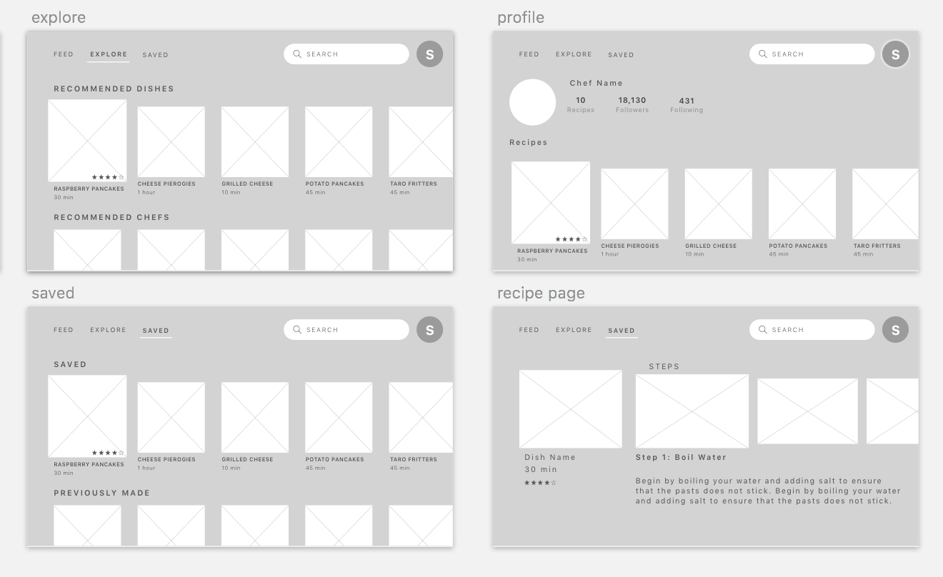
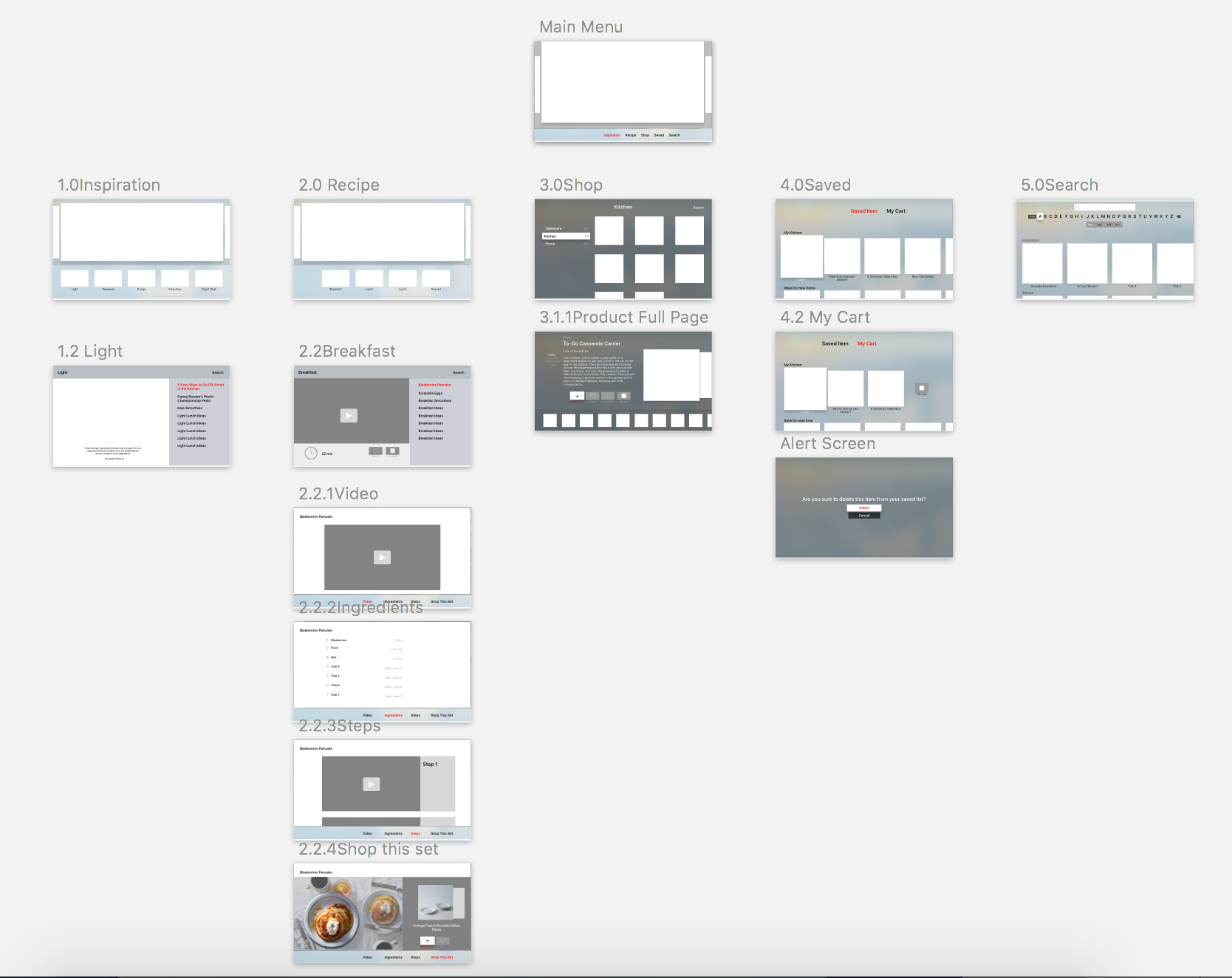
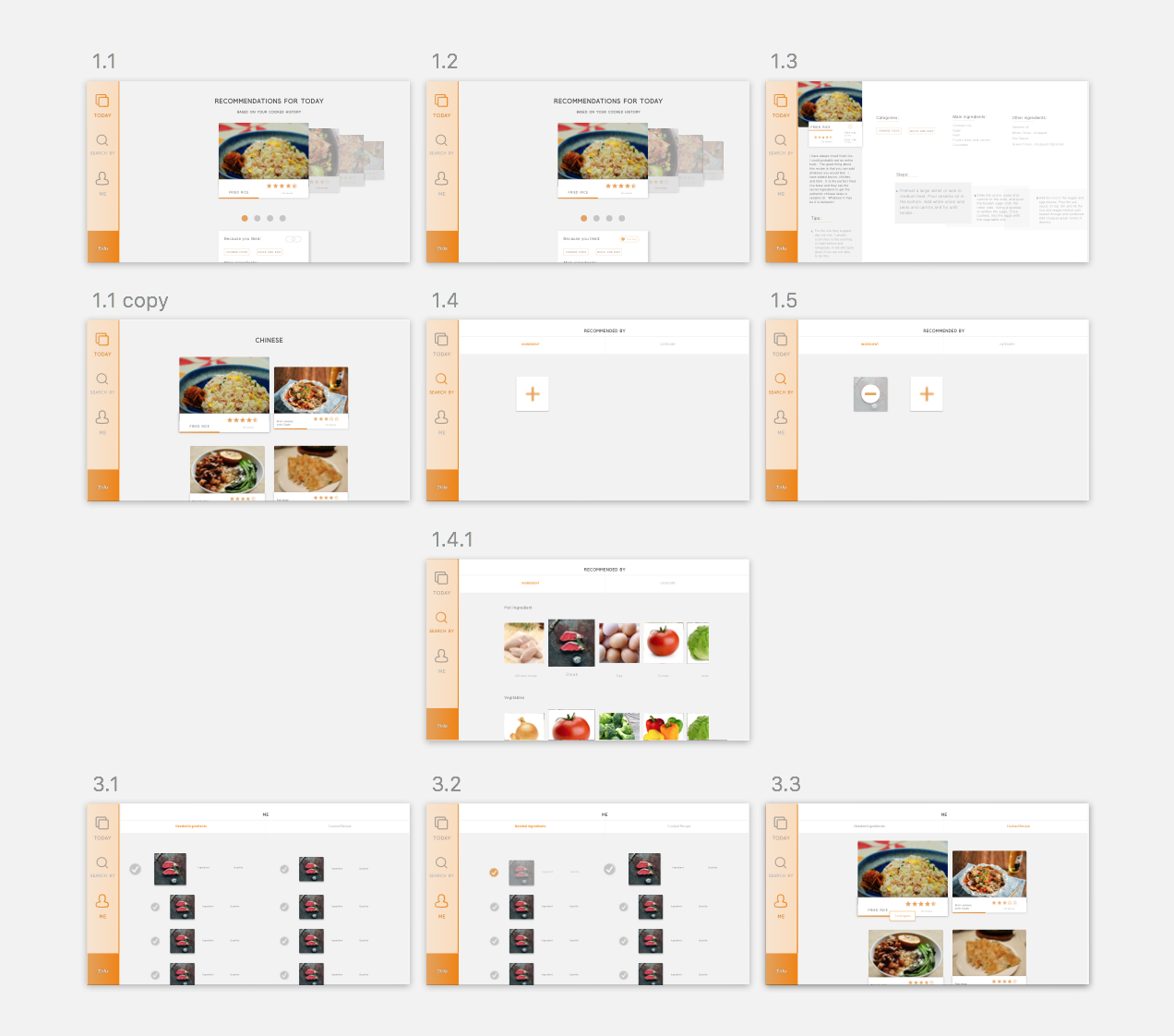
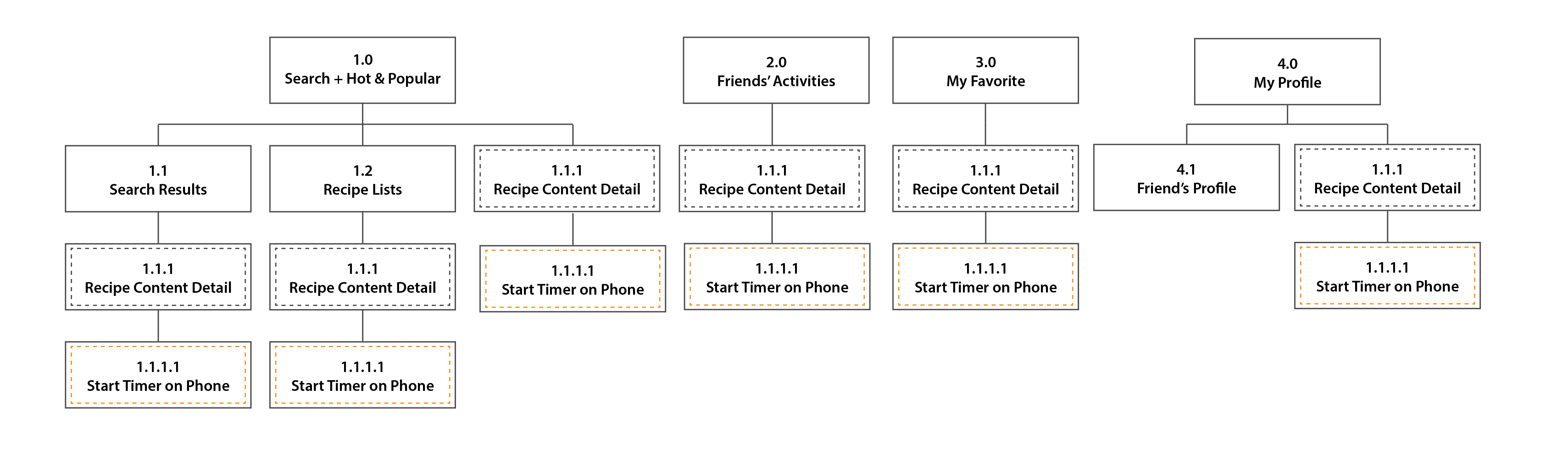
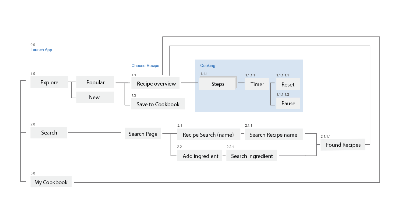
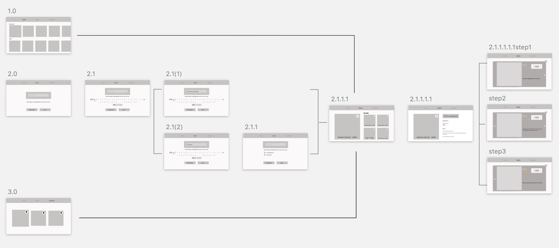
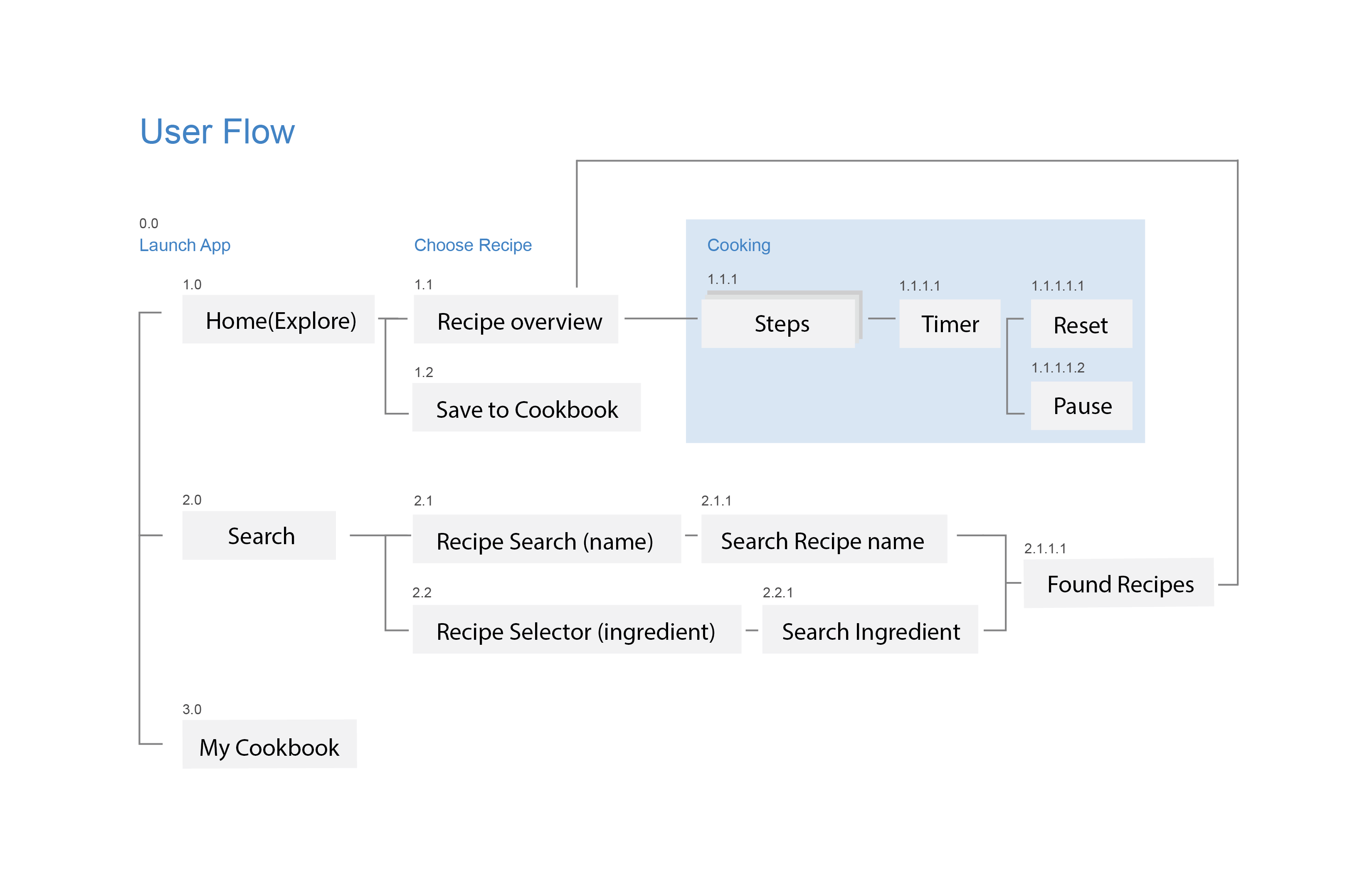
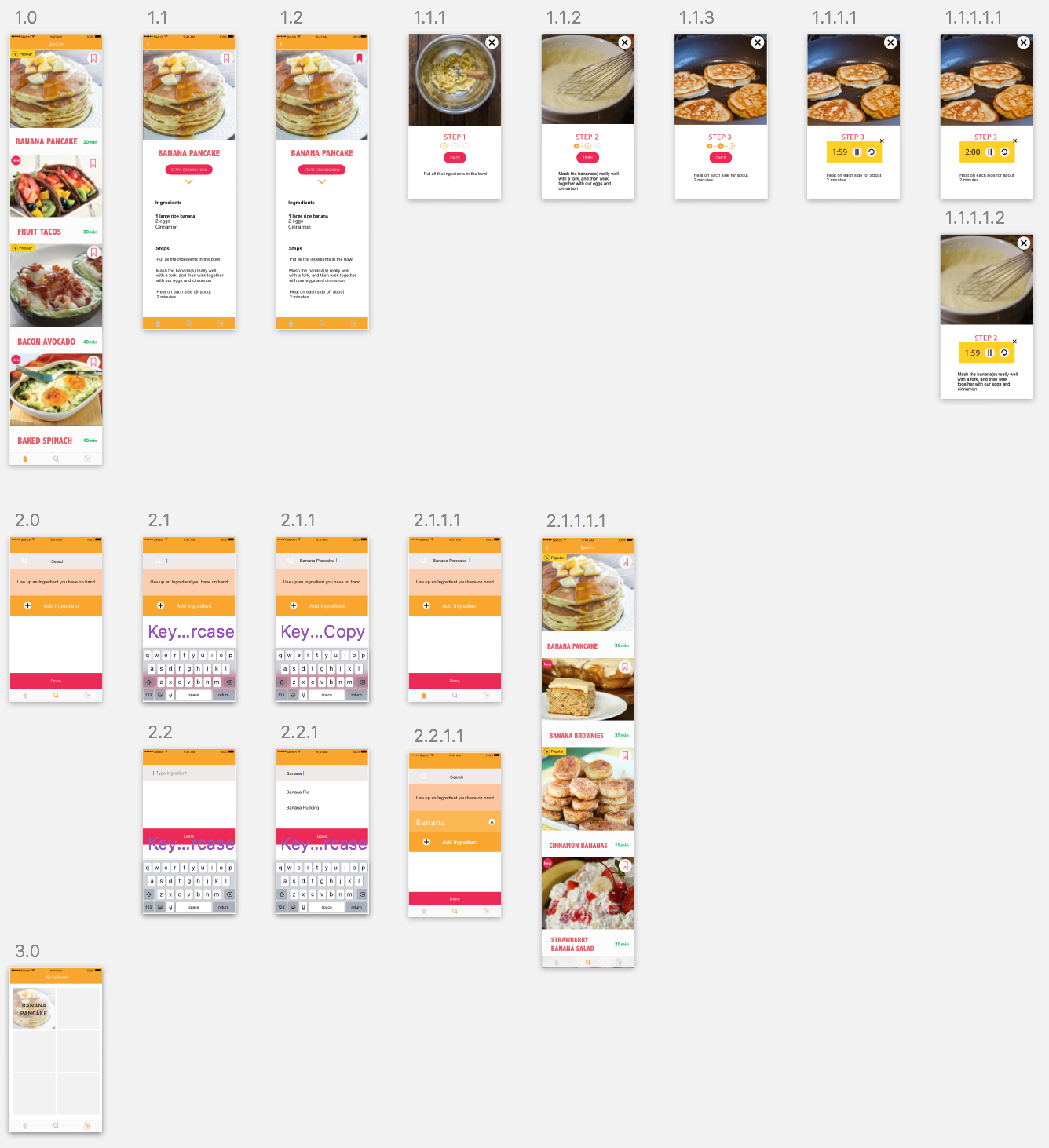
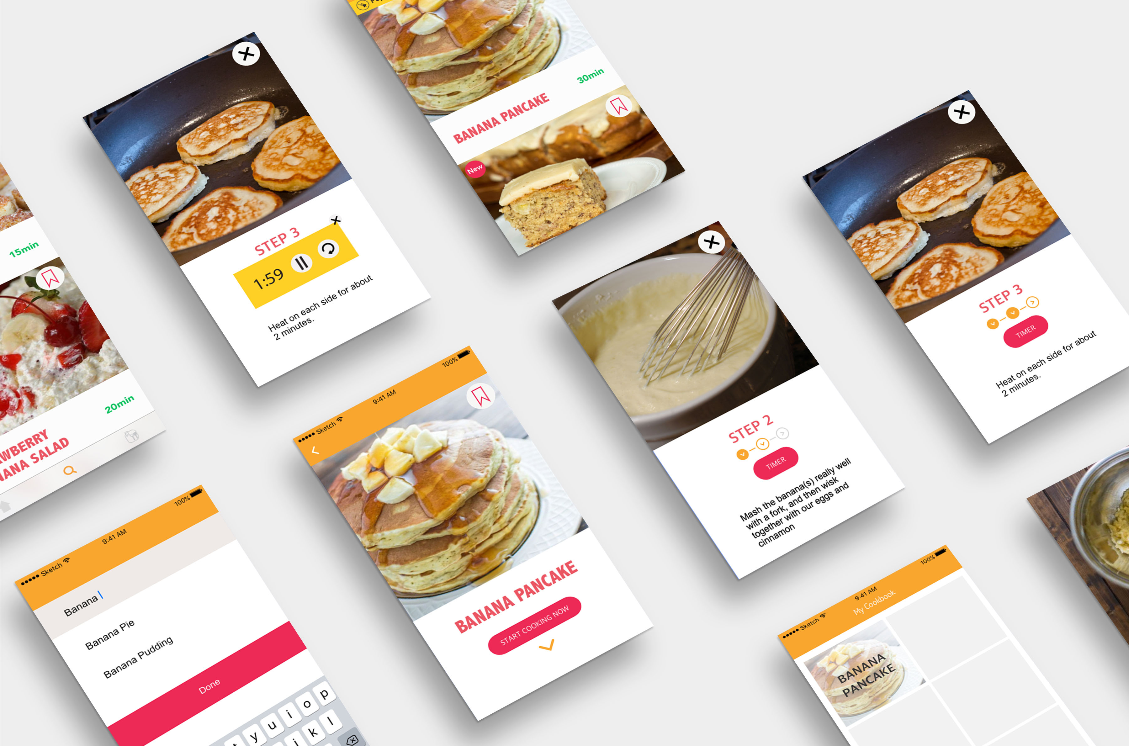
Wireframe:
project2 apple Tv pdf
Thursday App
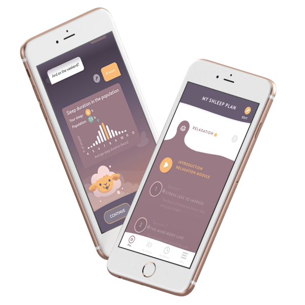
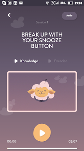
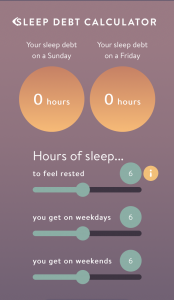
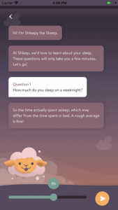
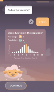
Shleep:
https://www.shleep.com/shleep-for-my-company/
Shleep app coaches your employees to sleep better.
This personalized sleep assistant understands the users’ sleep needs and focuses on behavioral coaching. Use it to scale the sleep program across the whole company.