Project #1: Food Guardian – Final Iteration & Presentation

  • User Insights from last user testing

    1. Typo problem or choice of words:
      Bad choice of words or typo might mislead your users. It is important to check every text to prevent from misunderstanding.
    2. Color code:
      Good use of color helps users to understand the information directly and makes your app more intuitively. Also it makes the experience comfortable.
  • Feedback from Critics

    1. Food waste is good concept and also is a problem today.
    2. If there is a technology can analyze a photo with lots of groceries and see what kinds of food are they, which can make everything efficient.
    3. Good color code that makes information clearer and more understandable.
  • Final Iteration

Marvelapp

  • Final Presentation Slides

Project01-Food Guardian Final Presentation

#thursdayplays – Logos Quiz


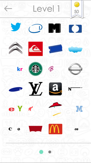
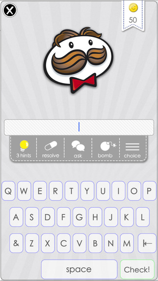
Logo quiz is a game that where players guess the logos of popular brands. It has a really simple concept – erase part of the logos that people are familiar with and let players guess the name of the brand through a partially shown logo. This concept makes players naturally stick on this game because players will think they really know the name of the brand, but it’s on the tip of their tongue (or rather, fingertips)! And when players finally recall the name, it brings a great sense of accomplishment.

Because of the simpleness of its core concept, it is easy to learn playing this game. The more logos players answered, the more levels will be unlocked. It became a really popular game even though the UI is not very exquisite.

It has in-app purchases of hints, game coins etc. But as a quiz-type game ended by “correct answers”, instead of paying money, players can easily google and get those answers because lots of people were discussing it and posting answers.


Final Prototype and User Insights for Teller

User Insights from previous prototype:

Tester 1:

  • discover icon is not recognizable (take out the telescope and use something else)
  • change search, also not recognizable, make it a tab bar icon

Tester 2:

  • taking the picture is the most important aspect- make that clear somehow
  • feeling of luxury
  • 11 font minimum

Presentation feedback:

  • try to get a simulation of camera view working
  • make the places tab in “my likes” more about restaurants not just random places
  • make your like button more obvious, it’s currently very ambiguous how you like
  • think about making it possible to add more masks

I wasn’t able to show how to add more masks in the prototype but basically if you want to add more you just click on the circle or square multiple times and it’ll keep adding masks to your camera view so that you can position them and size them however you want.

final prototype:

see previous prototype at: http://www.rahaghassemi.com/#/teller/


Food app – ingredipedia

ingredipedia

User insights

  • Would you add some features of search saving or something like bookmark?
  • Search is only for nutrition and ingredient? What if you can offer some information of popular brand, such as Starbucks?
  • For those information you provide, I think some of those terms should go even simpler that everyone  can understand easily.
  • If some of those information can be shared via text message or social media?

Presentation (pdf)  // marvelapp