Presentation with new app map & wireframe/paper prototype + User Insights
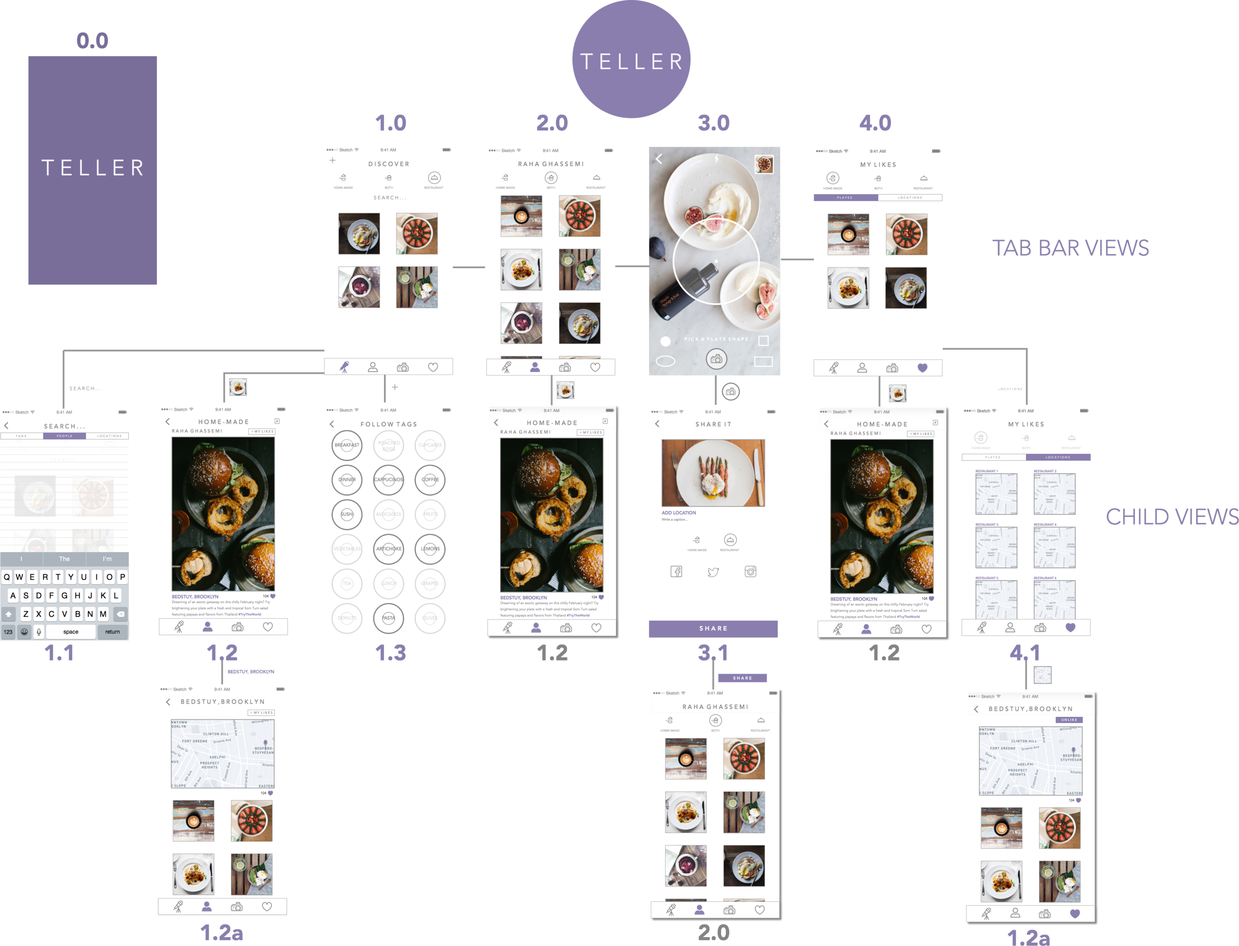
Teller App: New App Map and Features
After user testing I added a few new things:
- a more prominent like button in the detail view (1.2)
- the ability to like and save locations and view other plates from those locations (1.2a + 4.1), the my likes view (4.0) now includes a segmented control of “plates” and “locations”. In the locations segment (4.1), the filter of home-cooked, restaurant, or both is disabled as it doesn’t apply to locations.
- I added a search view which filters searches using a segmented control of “people”, “tags”, and “locations” (1.1)
- I created a loading screen
#ThursdayApps – Push For Pizza
When I saw the ad for Push For Pizza, I thought the idea was genius. I’ve never tried the app until now. As expected, it is almost as easy as a push of a button!
I love the ability to change to my preferred pizza restaurant in the checkout, without interfering with my experience of pushing for pizza. Plus, when I browse for another restaurant, I am informed of what toppings are unavailable in restaurants instead of listing a long, adventurous ingredients list.
After exploring the app, I realized how be great it would be to add a topping option for cheese and how less frustrating it would be if the remove button was larger. I had to tap a few times before it responded.
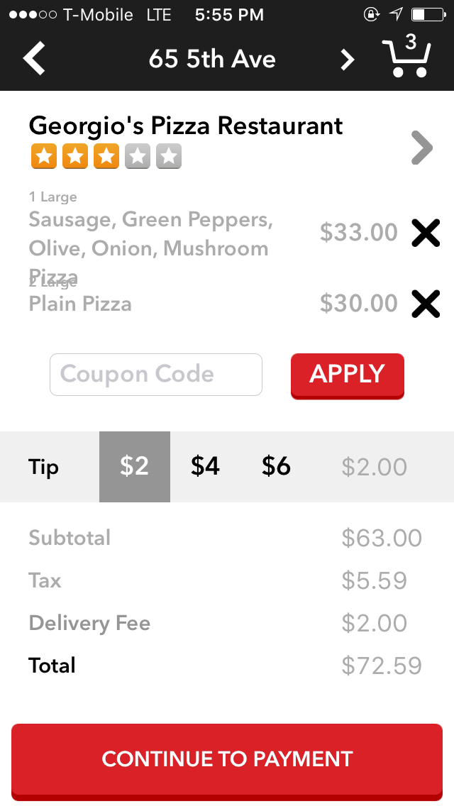
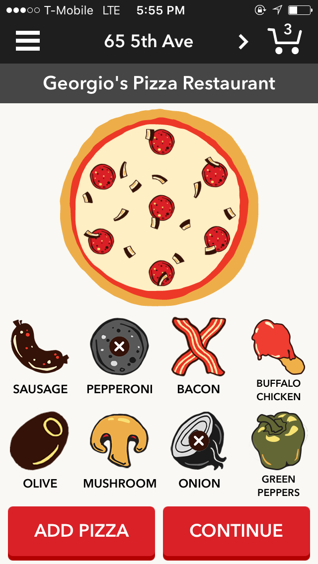
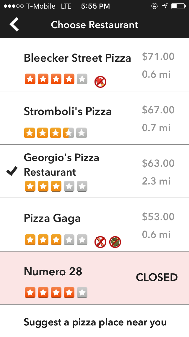
I chose to examine this app for #ThursdayApps as research for the Go!Curry app to discover ways to engage with users through “personality” and fun and examine how apps simplify their UX to design a flow that ensures my purchase in the checkout!
Furu_Iteration3
Three Things learned from user testing:
(1). While doing user testing, give user a specific task to complete
(2). Prompt user with followup questions: “why are you doing this?” “Why would you do X instead of Y”
(3). Test with multiple users and find patterns (if one user suggests something but others don’t, that one specific user might be an outlier, so should cater to the majority of the audience)
Prototype: https://marvelapp.com/f7i75a
For February 25
- Take your learnings from your wireframes and create a design for your app (and/or iterate from your digital prototyping)
- In your presentation and in your blog post, identify 2-3 user insights that you learned from paper prototyping.
- Create a Marvel prototype of your app (http://marvelapp.com)
- Group 2 will present their designs next week
- Everyone will have time to prototype
#Thursday Play – Who’s In?
Sometimes the simplest apps are the best and Who’s In? tackles one of the biggest problems in making plans with friends / family. A simple who’s in? text notification can be sent to friends and you are either “in” or you’re “out” and its as simple as that.


My initial reaction to this app is that it is beautifully designed and very simple without being simplistic. I think the ability to declare immediately that you are “in” or “out” of going to attend an invitation should be handled as such without the need for any complications. And for that reason I give this app a thumbs up.
ProjectOne_“Restline”_Version2
Based on the feedback I got from previous presentation and user tests, I improved my wireframe a little bit, and made the function more specific for users.
RESTLINE: a waiting line tracking app.
(It only focuses on the restaurants that accept this system.)
- Appmap+Wireframes (version2)
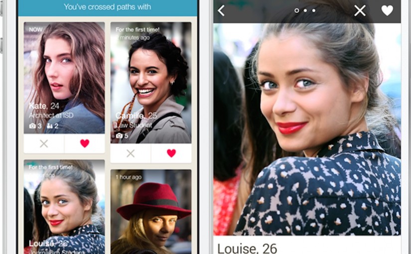
#ThursdayPlay – Happn
I just ran across a “radically new dating app” this last week called Happn.
Happn is a new type of dating app that pairs you with people you pass by everyday. As they put it:
“Find the people you’ve crossed paths with. Walking down the street, at a cafe, at work, at a party… Discover the people you’ve crossed paths with, the people like you, the people you’d like to find again.”
Project #1: Food Guardian – 1st Presentation & User Insights
-
App Map / Wireframe Presentation Slides
-
User Insights
- Make the input process easier and faster:
If user has a lot of groceries to record, it will take too long to finish inputting data. User would be tired of using the app while the experience is annoying and redundant. Try to find out a faster way to input, like scanning barcode or auto-categorizing by analyzing photos.
– - Add “How much food have you wasted so far” function:
In order to make the app more effective, letting user know how much foo have been wasted is not only useful but interesting. User will be aware of their groceries more and try to keep them from going bad.
– - Expired Date v.s Purchased Date:
It is a little confused between expired date and purchased date. User does not understand the difference and necessity of input purchased date. It would be better use clearer term of titles or have instruction tags to clarify the confusion.
- Make the input process easier and faster:
ProjectOne_“Restline”_Feedback
Feedback after Presentation:
- Need an app map.
- Define what’s this app doing for user. (KEY ELEMENT)
- (What problem you’re solving?)
- Consumer buy in / get restaurant buy in?
- Remove reservation function?
- Explore the app first, then let user to sign up.
- Require to sign up(or not), when they need to wait for a certain restaurant.
- Too much options under the filter, which are hard to tap.
- (Filter->Map/List) maybe
- Too much features under the profile. (is it necessary?)
UserInsights (feedback after user testing):
- In first “Log In” view, after users logged in through social media, their name and e-mail/phone number should pop up automatically, so they don’t need to fill that up one more time.
- In “Search” view, users wish to see what’s the distance from the current location to each ideal restaurant.
- Also, either in “Search” view or “Restaurant Info” view, there is no visual to show how many people are waiting in front of you, which makes users hard to make decision to pick a restaurant.
- General question about the app, is the “Restline” function designed to people online (who’s using this app), or people in-store, or people who have got the restaurant already?