Design Prototype (Apple Watch) – Pauline Hadad

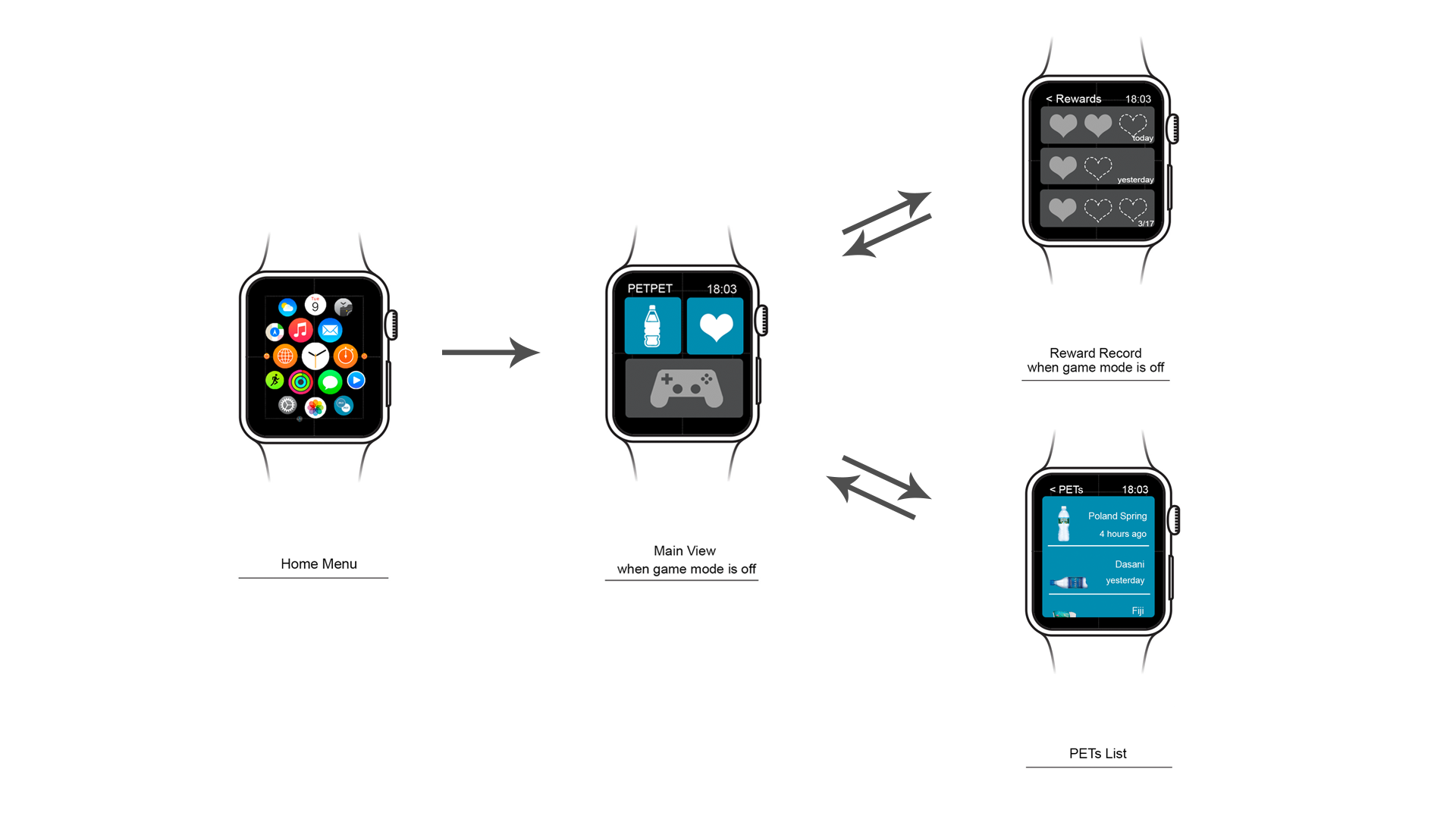
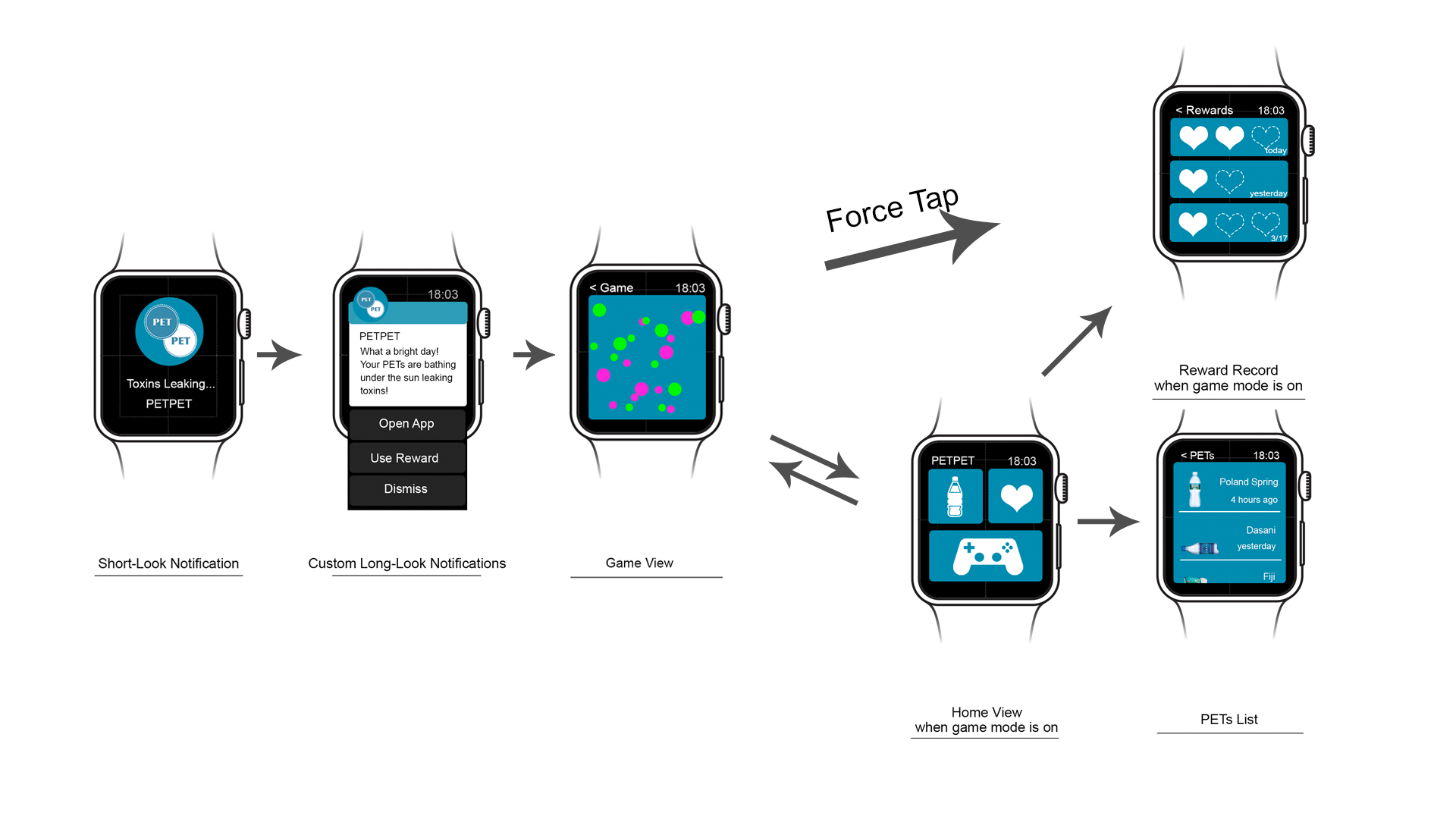
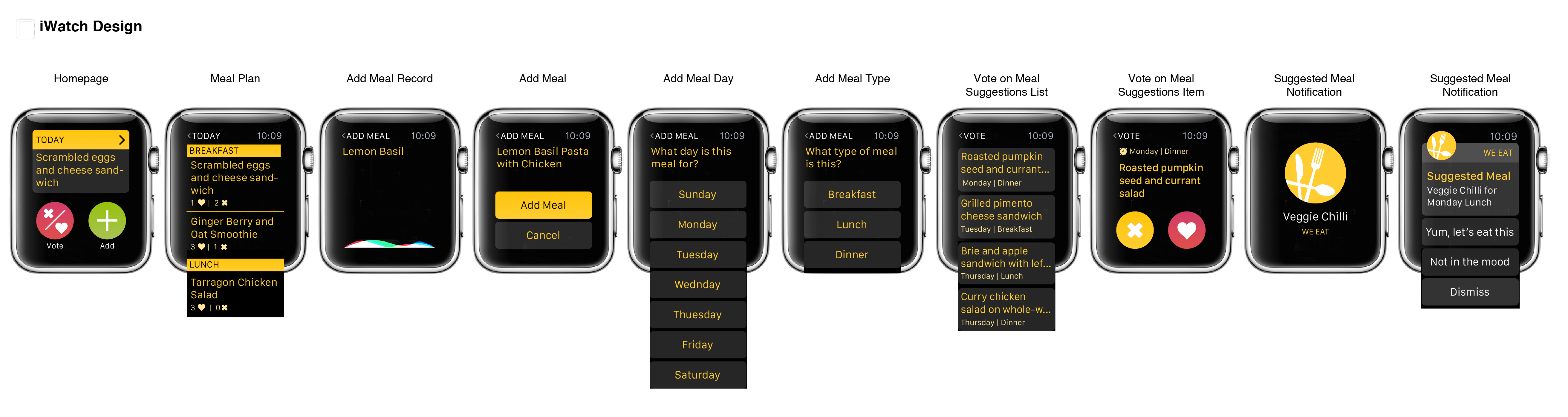
Here is my Design prototype on Flinto: https://www.flinto.com/p/483837bb

From prototyping last week, I learned and changed:

– the map view is replaced with a list view (the watch doesn’t allow its user to play with the map)

– I deleted the “edit” option, replacing it with the “add entry” option, where the user can add a new entry on a new date for an existing place

– The view for a given place is modified: the title and rating stays still while we can scroll through the dates for different entries


PETPET Apple Watch Design refine -Ning Sui


NewWatchWire


After testing with peers,  I made some design changes:

1. Seperate the App to 2 mode: game mode on/ game mode off

2. Grey out the game button in main view when game mode is off

3. Grey out the availability of using reward in reward view when game mode is off.

4. USE lines between bottle list in record view instead of button look blocks.


NewWatchWire2 NewWatchWire1


5. Show the game view directly when tapping “Go to App” in long-look notification.

6. Use short cut: Force Tap in game view to open up the reward view.

This paper prototype is very special for me. Since there is no existing prototyping software supporting Apple Watch frames, and no one has a real Apple Watch now, I decide to make it a paper prototype and cut the paper with watch belts. The result is pretty cool, and my peers can pretend wearing a watch more natural than putting a phone on their carpus. I think no matter paper or digital, a good prototype should mimic the real context as close as possible in order to get natural feedbacks.

Apple Watch App UI

Feedback from last week:

  • Pay is not available currently
  • Make phone calls is not available, show number instead so that user can take out phone and dial
  • Force tap will only trigger the four button view, so should change it
  • The horizontal swipe is not allowed inside the app where the scrolling is enabled at the same screen
  • purse is specially for ladies, should change the category name to ‘wallet’
  • the distance of the restaurant shown on the detail page is not indicated clearly

All in all, it is so fun testing on the wrist.


https://www.flinto.com/p/5418b5c4

I also found this templets are helpful! Share with us: https://designcode.io/watch


Food solo watch app prototype2 -Jackie

Screen Shot 2015-03-16 at 12.36.13 AM

watch logo

Main page: Simply Provide 4modes you can choose to control your playlist songs. Different modes will show different categories of song, The list will lay out as strength of  Audio frequency:

Feature analysis and extraction are the foundation of audio automatic classification. Means to divide audio streams into five classes: silence, noise, pure speech, speech over background sound and music. So based on this I designed four modes.

Sport :  Alternative Rock, Ambient, dance& EDM,dancehall, disco,Drum bass, dubstep hip hop &rap, Metal, techno, Trip Hop,

Sleep : classical, country, deep house, house,Indie,Jazz Blues,Piano,  R&BSoul, soundtrack

Travel : folk & singer-songwriter, Latin,reggae, country, world, trip Hop,trance

Search :connect to iTunes / web

watch 2


2. Playlist


watch 3

3. Choose song

watch 4-2

4. slide down check information

watch 4-1

5. “Tap” screen : control sound 

watch 4-4

6. Pressure on screen : Share/like/ delete

watch 4-3

7. Share function: rotate the crown to choose share platform

watch 5


Food solo Prototype revise

I got feedback from the first I show how my app works on watch:

So I make some changes of it through last week:

1. Remove the app icon in each page. Only show it in the first page

2. Clearly two functions on this app, which are to control the playlist based on four different modes and then you can share the songs you like in other activities.

3. Since the platform is Apple watch, I found some resources about apple watch http://time.com/3813524/apple-watch-why-buy/ I really recommend and  The Invisible Design Behind the Apple Watch’s Many Faces http://www.wired.com/2015/04/apple-watch-design/. Based on these researches I enriched the specific function of watch using in my app.

Using “pressure” function and rotate digital crown to choosing multiple options lay out in one page on the watch.

Paper Prototyping Feedback

Alter logos/Remove – confused as buttons

 swipe or arrow feature

start with the cheapest desserts work your way down

Add +1 to the cart icon

Add “get it with the coupon”

With the cart title, include number of items

Add a shopping cart to all dessert pages/ Reduce the number of desserts that day

vibration as an indicator that deal has ended

no need for splash page

Add status or order

issue with back button

have a buy button with the coupon

Have a close button on the last page

Learnings from Paper Prototyping

Things I learned from user testing the paper prototype apple watch app of “We Eat”

  1. When first looking at the home screen, users were unclear that this is a “menu” and were not sure what the + icon does. Once tapping any of the menu items, all testers said “ahh” and understood right away that the homepage is a menu and what to expect in each section. While this was not entirely clear on first glass, I feel that this is a short learning curve that is worth the effort. A suggestion I received to help make this more clear was to add a small ‘>’ on the top bar of the “Today”.
  2. In the “Today” section on the home screen- as meals names can be longer than the space, cut the name with “…” to limit.
  3. The add a meal is missing information of the day and meal (breakfast, lunch, dinner) it will be added to. This should be added in an additional two screens- one for each action.
  4. In the vote on meal- add the day and meal (breakfast, lunch, dinner), maybe with a dash and meal icons or a color scheme?
  5. In the inner view of the vote on meal, perhaps the title is not necessary and can allow for more space to present the information in a clearer way emphasizing the day and meal  (breakfast, lunch, dinner)