Big Bite for Apple Watch_Feng

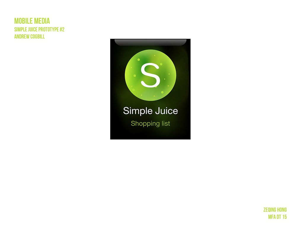
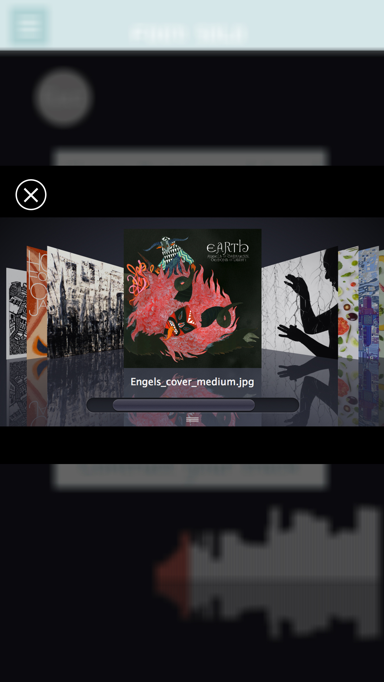
According to my Big Bite for iphone, this apple watch app is a recipe-quick-view app which allow people to make their favorite recipes to go.

Here is the my first digital prototype.

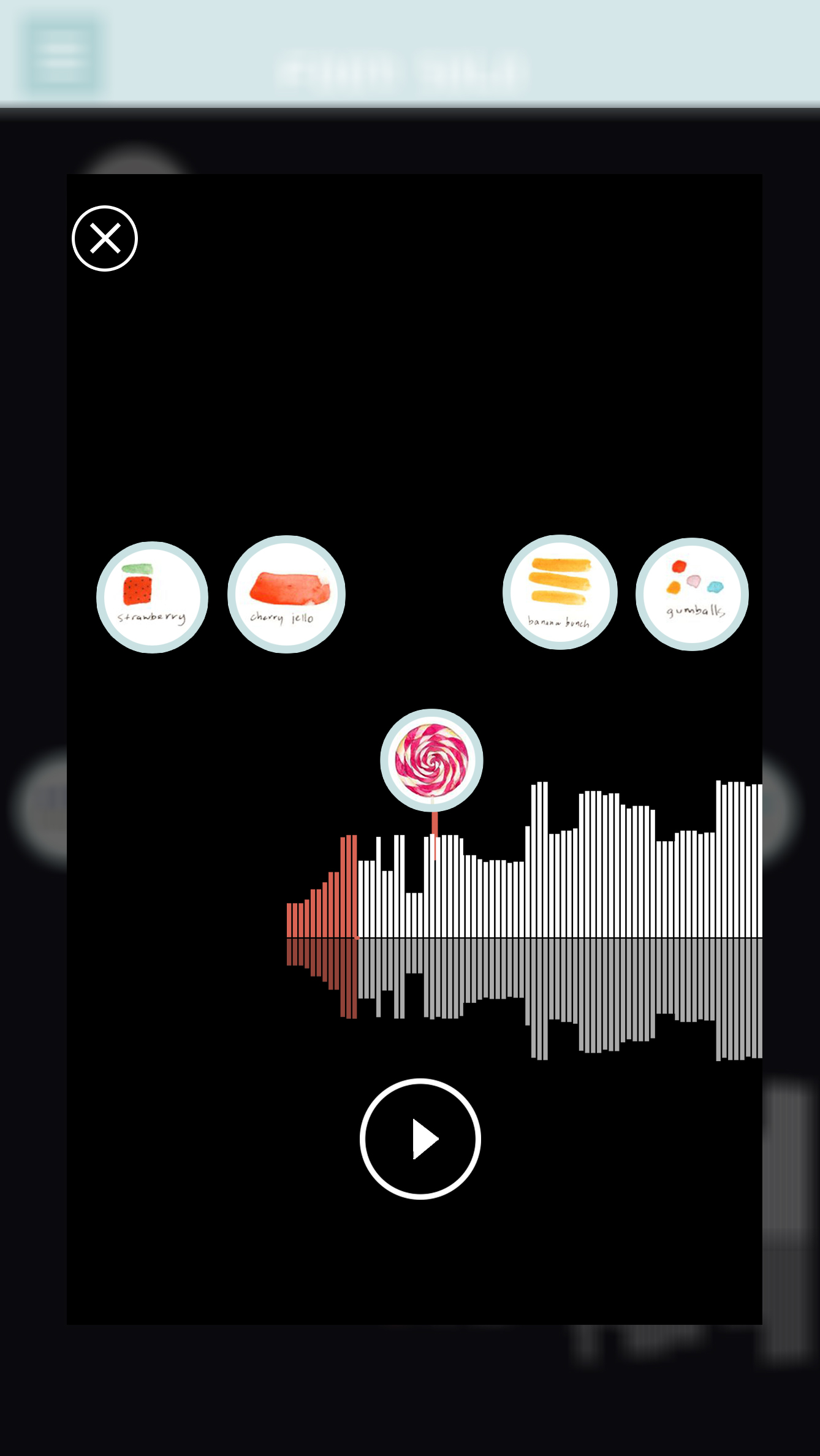
Since the flinto don’t have force tap, the upper part is regular tap ( to check the details of the recipes ) and the lower half is the force tap( come out the like and dislike button ).

I find I still have a lot confusion about the watch function. For example, 1. Is there a statue bar on the top of the screen just like what an iphone has? 2. About the force tap. Could we customize the button, such as the button label, button color and button size?

Big Bite for iphone_Feng (Refine)

This is the second digital prototype of Big Bite for iphone. Here is the link.

I change some graphic design. And another change I did in this version is removing a lot unnecessary buttons. The main functions in this app now are only What’s popular, My favorite, Add, and My recipes.

Since this app is not used for social net work, the user profile is also very simple. Only the user name and user image.

And also, I add two more categories in “add a new recipe” page. Therefore, now I have six kind of recipe adding flow: Truffle, Bar, Bakery, Cool Drink, Hot Drink and Candy. The name of the categories are still waiting better terms ( I am not sure for the Bar and Candy ).


Learnings Digital Prototyping

Digital prototyping helped me not only to test the flows thoroughly, but also to comprehend the app as a whole. Many continuity issues inbetween those thought-through user flows became visible, i.e. “how do i get back from here?” and “what do I do next?”.

Also Flinto’s limitations in terms of transition animation really emphasized the importance of meaningful transitions in UX for me.

After feedback through midterm review-redesign of project 1 -FOOD SOLO-Jackie

I attached my redesign play app link here: https://www.flinto.com/p/627ef587

Through last week feedback of my first application design. I did some switches and improve parts.

1. Import “add new song” page: Create one page for users can review their song which link to the side bar of “my songs”, where I can see my list of songs in the world:

my songs2

2. Removed the hamburger menu

3. Redesign the tag of my sidebar, change the lay out to :

-Sign in

-new: with the main feed of all new songs in the world

-my songs: where I can see my list of the songs in the world and also design a “+” button to add a new track

-background tracks: show background sound options

MAIN PAGE2

4. Create 3 pages for ” add new song ” function:


At first , in the design song page, I provide three tags, which is :” Choose a  background track”, “Choose rhythm tracks” and ” Construct your tract”. Then if you tag each bars your will see three different browsers pop out:

DESIGN PAGE

A. Browser1: Background track pages, slide to choose the background song

DESIGN PAGE1

B. Browser2: Choose food  rhythm elements for your songs

DESIGN PAGE2

C. Browser3: Create your song, control and play the rhythm mix with the songs.

DESIGN PAGE33


Attractive app recommendation

VSCO cam

http://vsco.co

Screen Shot 2015-03-26 at 1.01.45 AM