jamba juice app – design
My Jamba Juice app – design in progress
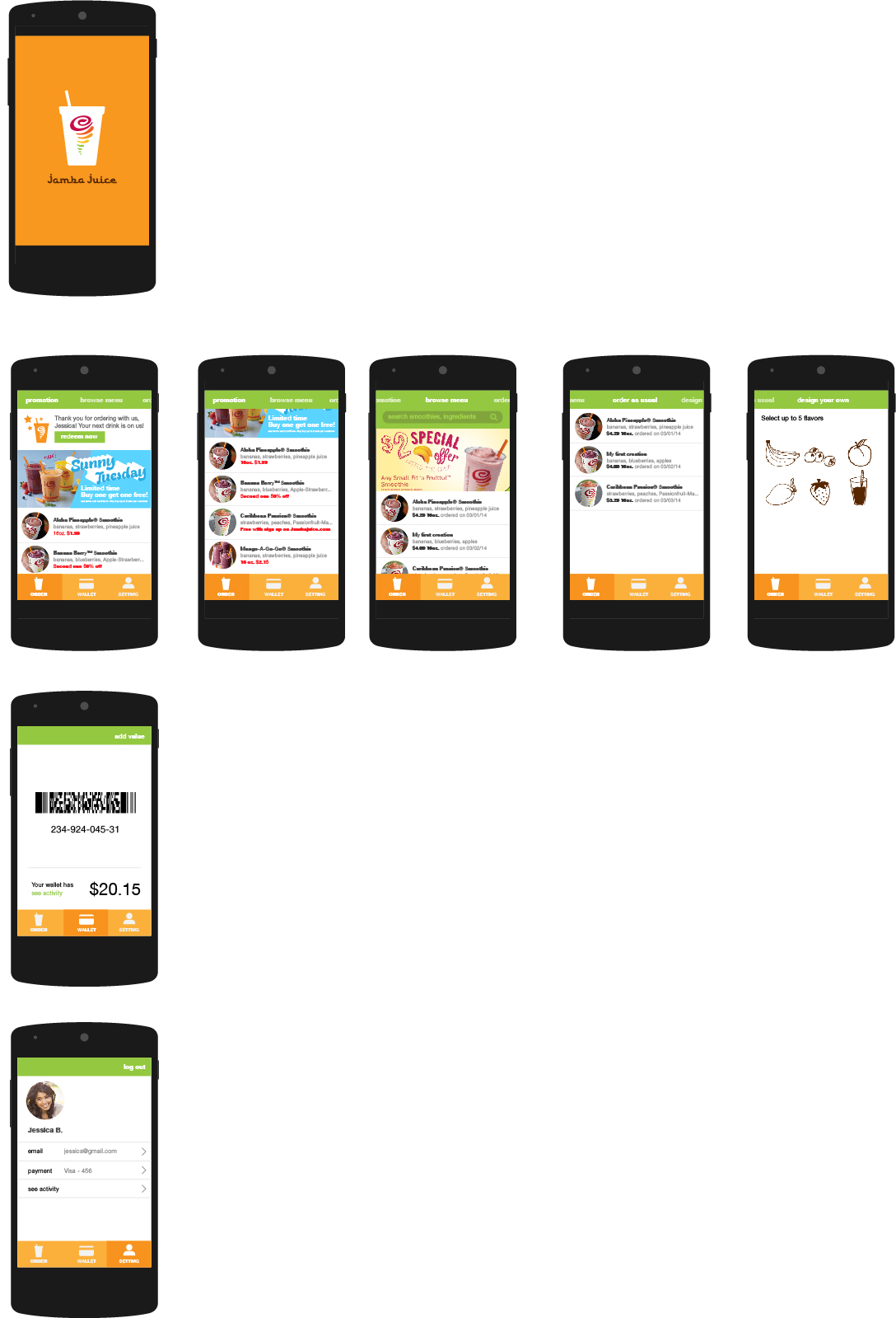
updated wireframe
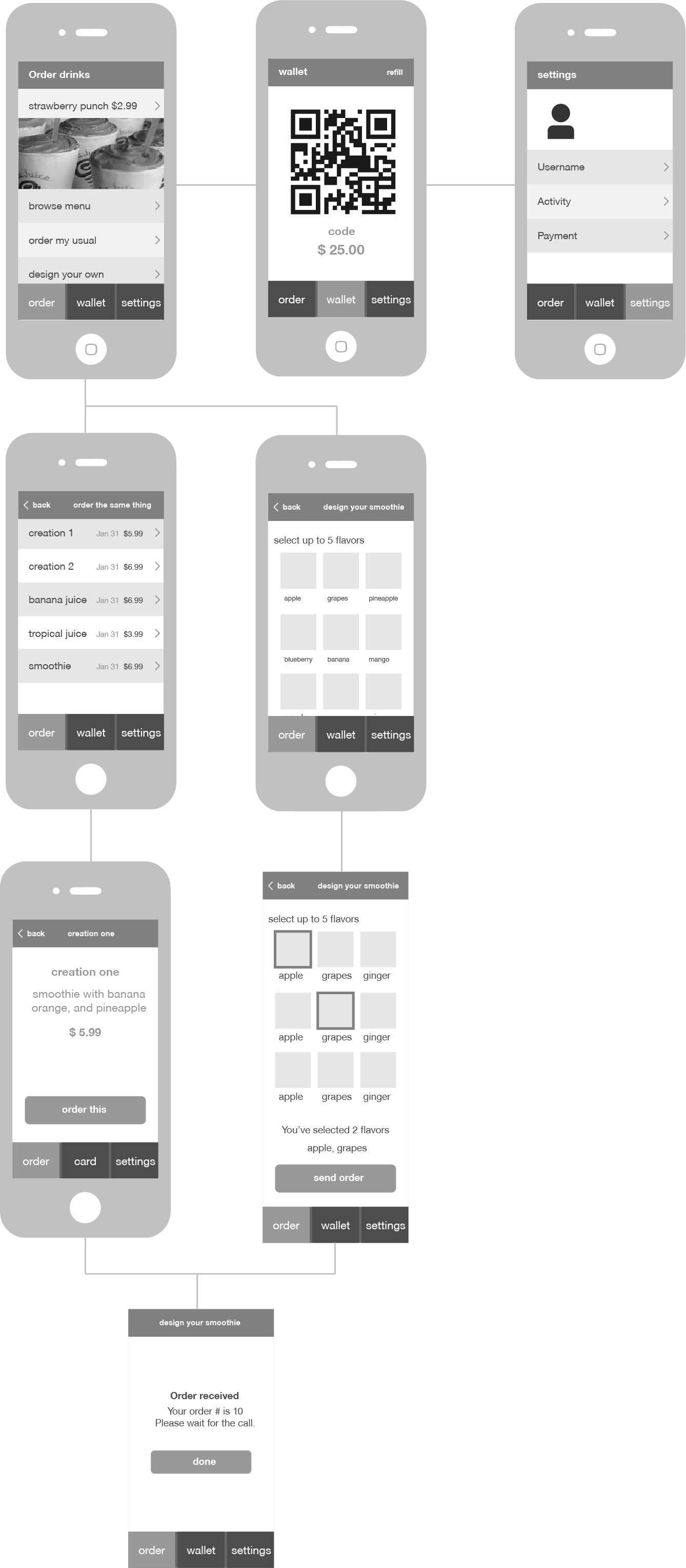
timer app (updated version)
here is the link for the new version
Feedbacks from last week:
1) remove description bar
2) activity bar should be expanded out (e.g.: calendar for ios7)
3) meanings of ” most productive day”
4) ” tasks for today” goes first
5) hard to find the “next” button on the Timer view
User Testing
1st User Testing: Drew, Carrol, and Decho
1. connect each menu together. so user can follow the story
2. from ingredients view, links to the shopping section.
3. more information about the child labor
4. home view, (main page) the most important menu is donation part. stand out donation part and the personal information is unnecessary.
what I applied
CONSISTENCY – size of lists, and position of images
CALL TO ACTION –let user to donate easily
CONNECTION – connect between three menus
INFORMATION HIERARCHY – from the most important to less important.
2nd User Testing and Feedback
LEGIBILITY: less opacity UI: share button,consistency USER could be broader
UI: share button,consistency USER could be broader
USER could be broader. not only parents and kids
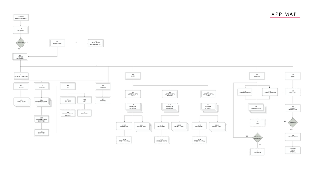
This is new site map and I worked on app map again based on feedback.
Visual Design Iteration2
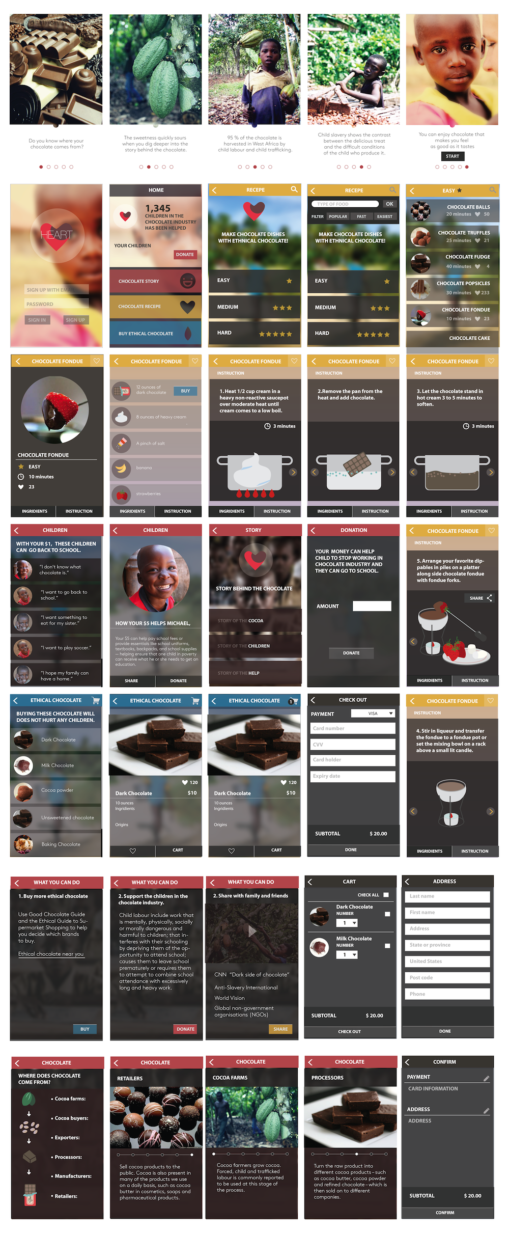
Susan- App design
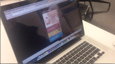
Here is the PDF: app design
Look it up on Pop: https://popapp.in/w#!/projects/5318892587a0d898320ecfa2/preview
What I learned from last week is very helpful. People suggested me:
1. Bigger font size!
2. Use the default icon.
3. More information about the dish, like favor.
App Economics Presentation
Here’s the appecon lecture from last week.
#thursdayapps – RoadMovies
RoadMovies

The application is about making movie short film with simple process. Firstly, users choose one of template mode – 1s X 24shots, 2s X 12 shots, and 3s X 8 shots. The users will shoot their story in a short shots and after shooting all frames, they can make it more fancy by selecting a filter effect. Lastly, they can choose background music and export it as a video file in their mobile library and also post on Facebook.
[Joo-Hee] App Design
wooof_design pdf here.
While testing my prototype in the class I found people weren’t 100% comfortable with how the menu works, so it was helpful to find out what was not working well. I also got some feedback such as adding professional’s recommendation, switching order of elements on review page, switching priority(?) option if user has more than 1 dog.
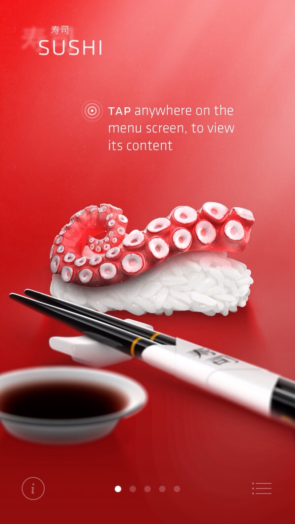
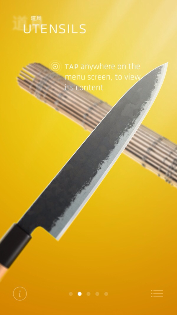
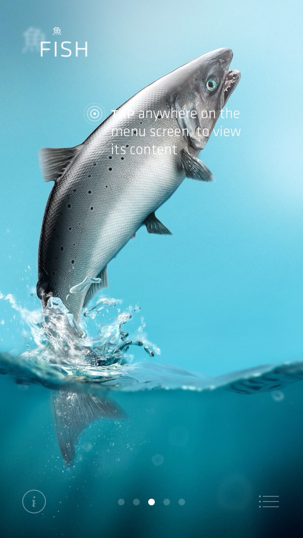
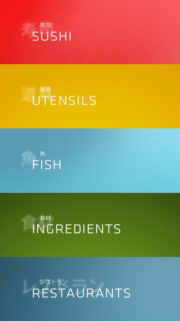
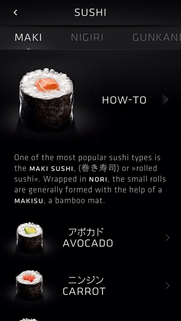
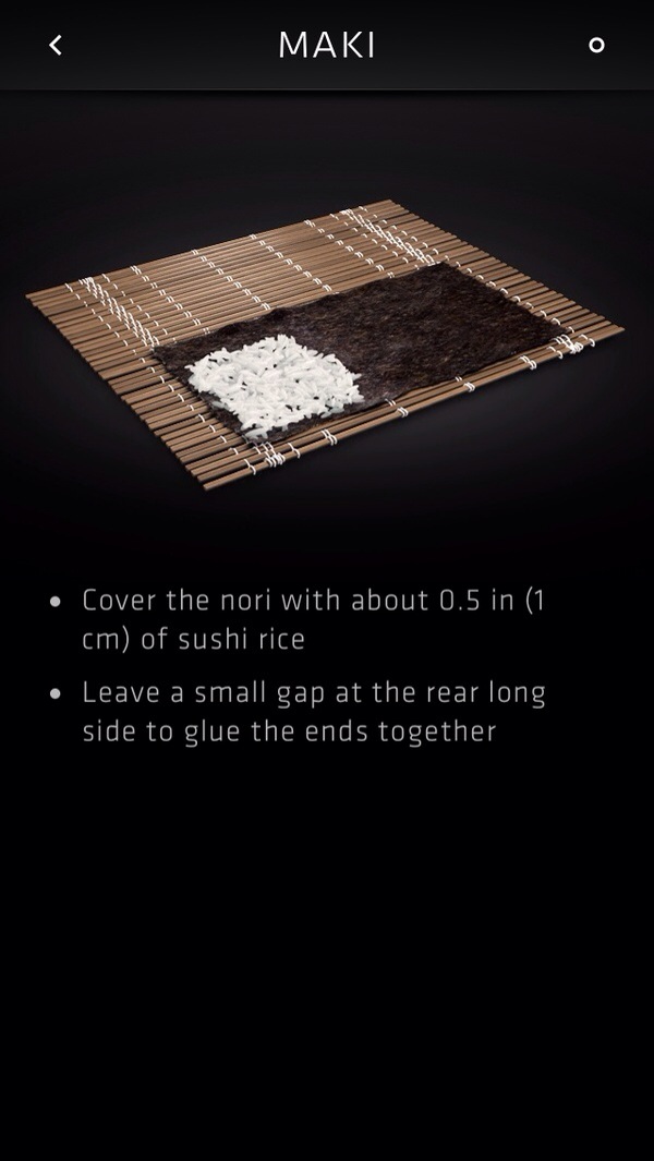
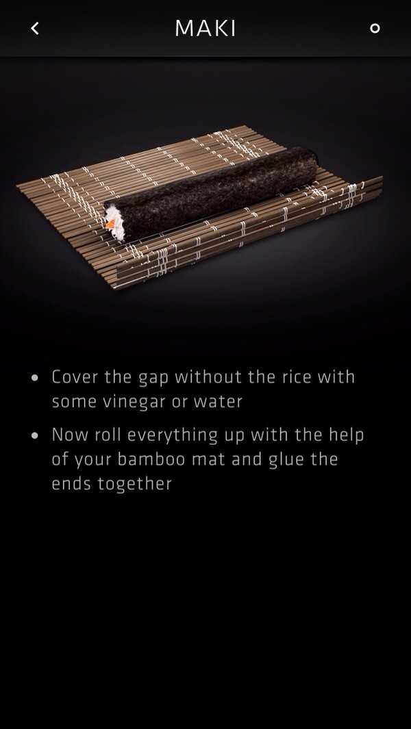
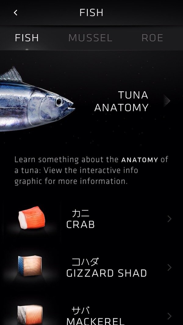
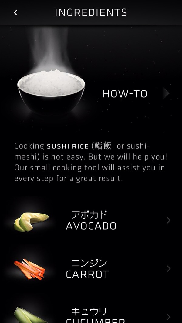
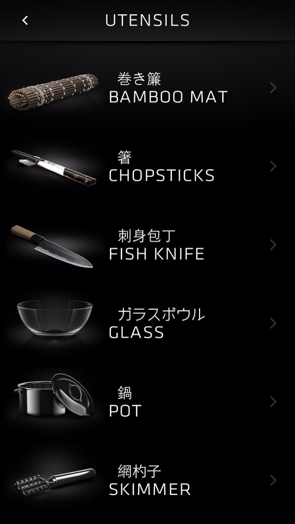
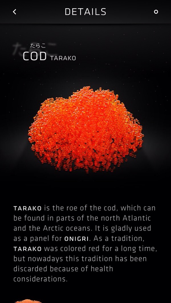
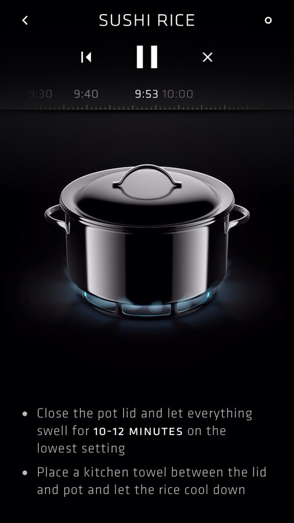
#thursdayapps – Sooshi
This app offer you tons of information about what sushi is, how to prepare sushi and where to find the best sushi places.
Here is the website of Sooshi: http://www.getsooshi.com/
The 70% reason I like this app because of visual design, the rest of reasons are about the parallax effects which fit for iOS 7’s new experience design, it use a simple and clean way to express how to use, not only offer the information, most important is expressing the culture of Japan.


6.Design iteration- Food manager 3.0
This is My prototype!
Through this assignment, i learned 3 things:
1. How to simplify the structure of App?
2. How to think about the logic of the structure?
3. How to set out idea in simple prototype?