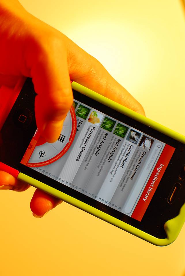
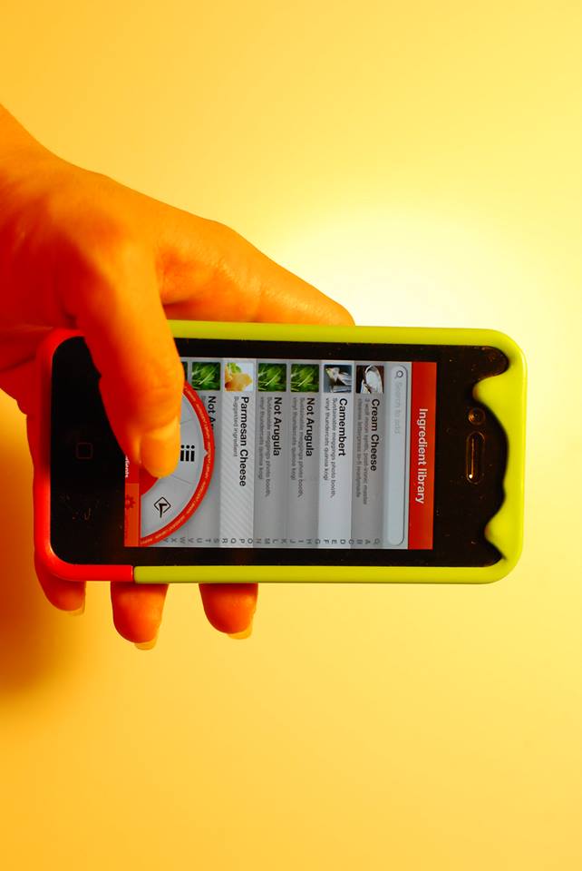
Testing the “uberfilter” presented complex challenges of prototyping using pre-made prototyping tools, which eventually force me to “remote” prototype using Skala preview and send the right images that corresponds to the user actions. // that is the same reason why i have so many images of the app.
The test was applied to 5 testers based on the following premise: “You want to cook something with cheese”, the following conclusions were made after observing the interactions.
- The “uberfilter” needs to be bigger and more prominent in the interface // maybe a more engaging color
- While the “uberfilter” apparently works very well as a filter device, is not as strong as a navigation between the 2 main sections of the app. // going back to tabs
- Is necessary to add thumbnails of the recipes on the list view
- The search function is poorly implemented as part of the “uberfilter”, it should be permanent and context aware.
- A more clear form of labeling sections needs to be developed.