
Hi! My name is Yiying Xiao and you can call me Frannie. I came from Beijing, China. And I defined myself as an artist, creative producer, experience designer, and interaction designer.
Things I didn’t know about Apple HIG:
[Feedback]
I didn’t realize before that there are subtle indicators for user to subconsciously know what’s going on with the APP. But it does give the user a hint on the feedbacks that are very subtle that works better than a grand gesture of status changing.
[Consistency]
I actually noticed that most used apps for me has similar icons which are designed visually similar to the Apple system icons. But I didn’t realize the reason of this action is to keep the app consistent with the system so user would feel familiar with what’s happening in the app.
[Color & Branding]
The part that encourage designers to stick with the color palette which coordinate with the logo and overall brand vibes are very inspired since I’ve always only thought about how the color palette would effects user’s emotions rather than the way they perceives the brand.
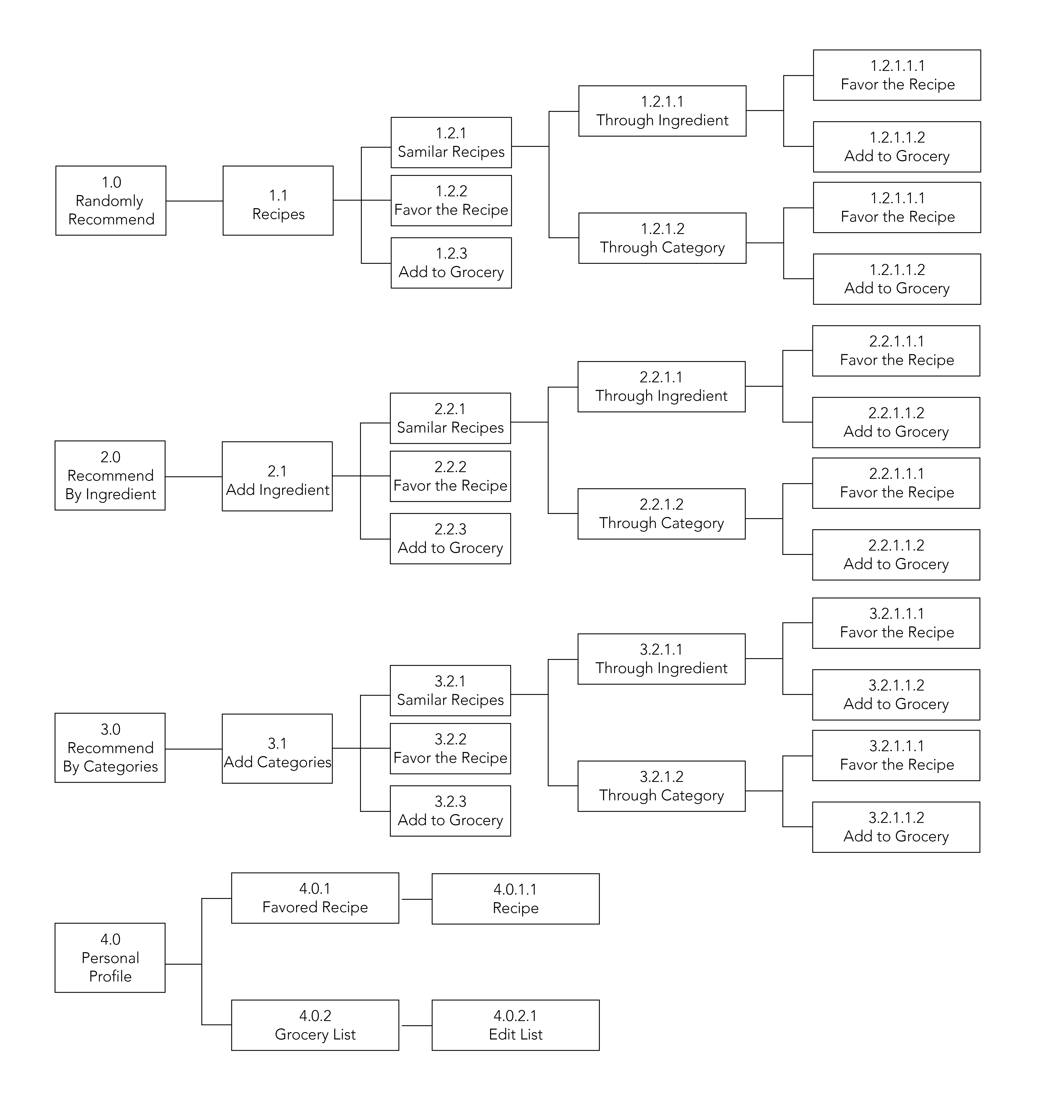
APP MAP
WIREFRAME
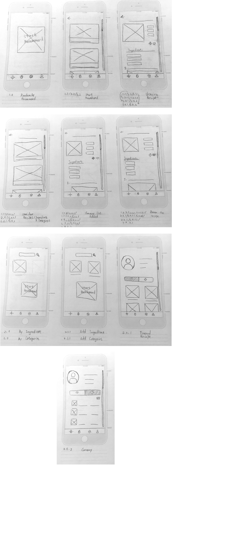
We talked about this in class, but step back for a minute and make sure that your concept is really achieving your user’s needs. Can you imagine using this app if you were asking what should I make for dinner tonight or what should I make for dinner next Tuesday?
It’d be nice to see what view that we’re on, even on the hand drawn sketches.
Having the different paths separated out by tab feel cumbersome. Perhaps I can access all the options from one filter and there is one main view of featured or all recipes that can be filtered.