App design for smart cars
+++ Group work with Yin Hu +++
Insights from user test on Apr 5th
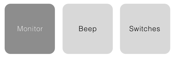
1 – The button patterns are kind of messed up. Currently, there’re 3 kinds of buttons: Navigation buttons, re-action(functional) buttons and function buttons. Some of them share the same shapes while some of them are differentiated in colors. A clearer rule should be designed for the better understanding of the operation.
![]()
![]()
2 – The two circles on the index page are not friendly to operate, especially due to their close distance which may cause mistouch.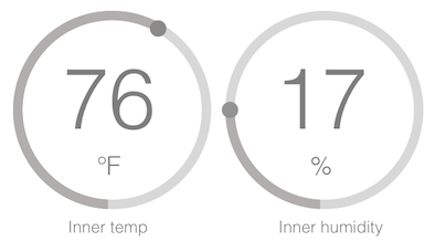
3 – Detail problems like the hard understanding of seat operation, too many texts on a singer button, confusions of auto settings and manual settings… The detailed problems are shown on the corrected wireframe.

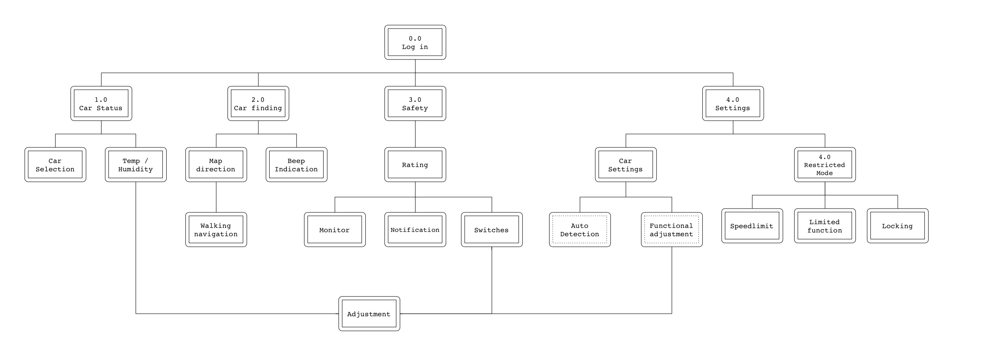
Updated app map: