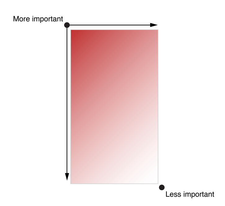
The overall design of an app’s interface needs to distinguish content’s importance by placing them differently. The most important content would usually be placed on the top left corner, whereas the less important content would be placed on the bottom right corner.
“As much as possible, avoid displaying a splash screen or other startup experience”. Users would expect to be able to use the app immediately after they launch the application. Any kind of information or introduction to the app’s features need to be added with caution; because this might lose users’ interests, and prevent them from exploring more.
If an “onboarding experience” must be added to the app, then use animation or interactivity to improve users’ engagement, or be sure to design a way to exit or dismiss this part.
If certain tasks require a hierarchy of modal view, make sure the “Done” button does what users would expect it to do.
When design an app interface, be sure to consider color blindness when using colors as visual cues.