Hey everyone!
I present to you Project 2: Go!Curry. Go! Go! Go!
I’m super stoked about this project as designing for the TV is a new experience for me. I used the Apple TV seldom times in Jakarta for watching YouTube videos with family, so it was refreshing to hold the remote and test it out in class. It not only gave me insight to potential users, but also really helped me envision contexts in which users would use this Go!Curry app.
For instance, I could imagine my family or friends sitting on the couch watching TV and wanting to order food because everyone was hangry. With that thought, I considered a feature that I want to continue exploring, (which I also encountered in the Chipotle iOS app), which is the ability to name your orders to ease the customer experience once the food arrives (“Don’t be hangry any longer! This is yours!”)
Although Venmo has made it much easier for us to split the bill, I would say that this scenario seems to be a hassle:
- You’re in your apartment with seven other friends, hangry and wanting to order food.
- “Let’s order food! What do you want?”
- You all order food on your app. You’re responsibile for asking your friend what they want. “Hey, do you want brown rice or white rice…? Chicken teriyaki, salmon teriyaki, sushi etc.? Anyone else?”
- A big sum is charged under your account.
- “We’ll Venmo you. Don’t worry”
- Open the venmo app to notify everyone that they owe you money.
- Delivery man comes in and hands your bags of food.
- It gets a bit messy trying to figure out who’s food belongs to which person. “Ok guys, is this yours? Wait… I think I ate someone else’s sushi. This is yours.”
- You’re too busy eating, time passes and everyone forgets to Venmo you.
- The next day, you text them saying, “Hey… remember… ?”
- Process is delayed.
Attached is my first attempt at two quick wire framing directions for translating my Go!Curry app into an Apple tvOS app.
Many preferred the simplicity of the first direction with regards to user flow. With the second direction, I was inspired by viewing my classmate, Sumi’s work. I was explored the functionality and how users would engage with the content on the screen, as also a viewing experience.
Next steps include:
- Explore a direction further in depth
- Utilizing design to indicate the user experience (highlighting what is in focus and what is not in focus)
- I assumed that one day we could use ApplePay to pay for our meal. Another option would be syncing that account information from your phone.
03.10.16_mobilemedia_appletvOSapp
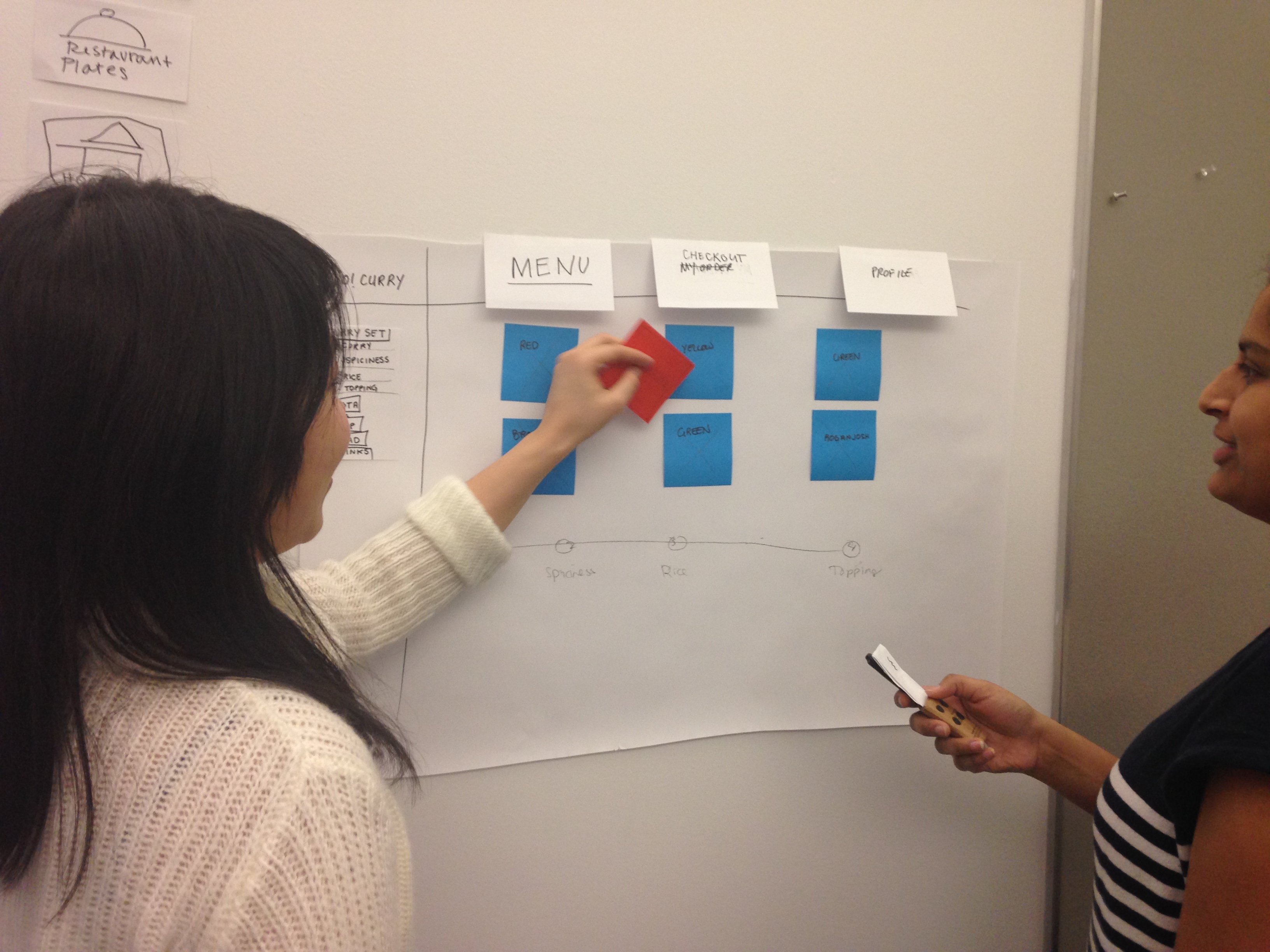
After the paper prototyping exercise, I learned that:
- I want an Apple TV!
- A more efficient way of paper prototyping for the TV is preparing all the individual TV screen views that you can flip up, as the user navigates through it, rather than only using sticky notes. Things become less sticky after several user testings! Ha!
Notes: To be continued in next post along with updates….
Getting the hang of paper prototyping for Apple tvOS!