Week 2_Jean

User Insight/ first paper prototype


  1. Should allow the users to select each ingredient before they add it to the shopping list, just in case they already got that ingredient.
  2. In the “Shopping list” page, it should have “add” button, just in case the user wants to add some other ingredients to there shopping list. Also, the “done” button can be added, for them to use after they have finished all the shopping.
  3. The “method” part is confused because it does not show full method at the beginning. It should provide a full method in the main recipe page.
  4. About the timing in the “Full Screen Recipe” part, a timer should pop-up in that page after the user tap on the word. In order for the user to see when the time is running.
  5. The recipe page and the restaurant page are the same, should do something to differentiate this two page. Instead of showing the time/price/calories in the restaurant page, it can be the brief description of the restaurant.


Second Wireframe

WK3&WK4_YIN HU

Insights from WK3 prototyping

Dishes tab:

(1) If the user wants to take dishes from the Not Recommended category, perhaps there is a reminder.

(2) Change the pattern of the changing the dish’s number’s button.

Me tab:

(1)Think about reorder function, such as reminding the user to reorder it, or setting to reorder it automatically

(2)What’s in the setting?

(3)Scanning medical records, the confirm button is not necessary

Others:

Since dishes of the homepage is sorted by health records, it might be better to remind users to update their health records.

Visual Design 3.0

the digital prototype


Week 4 – Franky Wang

User insights for the digital prototype on Feb 15th

1 – In the post page of dish categories, there is no need to separate posts into two parts of “all” and “following”. Because in the 3rd level page, users do not tend to figure out the differences according to their specific interests on uploaders. In this case, it is reasonable to list all the posts.

2 – Detail problems:

(A) The back button and edit button in the post preview page are repetitive, so I deleted the back button.

(B) The restaurant page will be more helpful if includes more information, like opening time, reservation status, etc.


3 – If possible, try to figure out more intelligent functions like employing automatic recommendations (according to previous searches), photo recognizing (for filling out information automatically) using AI or big data technology.

Week 3 and Week 4

Then on week 4, I created a digital prototype:

https://marvelapp.com/3ii0b8f/screen/38231618

Insights from week 3 paper prototyping, presentation, week 4 digital prototyping:

  • When meals are already chosen how do you go back to edit them
  • The differences between planning and eating the meals
  • Looks like a Clinics app, because it’s a baby’s food app it can look warmer
  • Milk intake measurements is still confusing
  • If the user has more than one child
  • The weight goal of the baby can be in the Baby data
  • When creating project in Marvel should make it clickable throughout and not a linear journey

Week 2

Insights 

  • Add icon doesn’t make sense
  • Got confused about Baby size edit in the Meal Plan and the Baby Data
  • Got confused with the wording “Your Recipe”
  • Measurements don’t apply well to baby recipe when creating your own recipe
  • Don’t really understand the process of creating your own recipe


#Thursdayapp 01 – Franky Wang

Moment

“Moment” is an invisible app that helps users to stay conscious of how much time they spend on their phones.

By giving its permission on detecting actions, positions and sending notifications, the APP automatically tracks the time user operates the phone. If users spend too much time on their phones, they can set daily limits on themselves and be notified when they go over. That becomes a good way to force themselves off the device when they are over their limits.

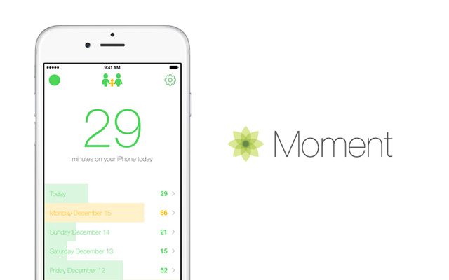
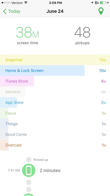
There are 3 main features of the APP. A big in-your-face number shows how much time you’ve spent on your phone today in terms of hours and minutes. This is what mainly gets measured and shows your focus. And the record part is differentiated by colors, which gives a rough impression on the level of using phones. Also, the Moment can collect data from other APPs, showing the time the user spent on different APPs, which gives them a clear awareness of them.

“moment app”的图片搜索结果     


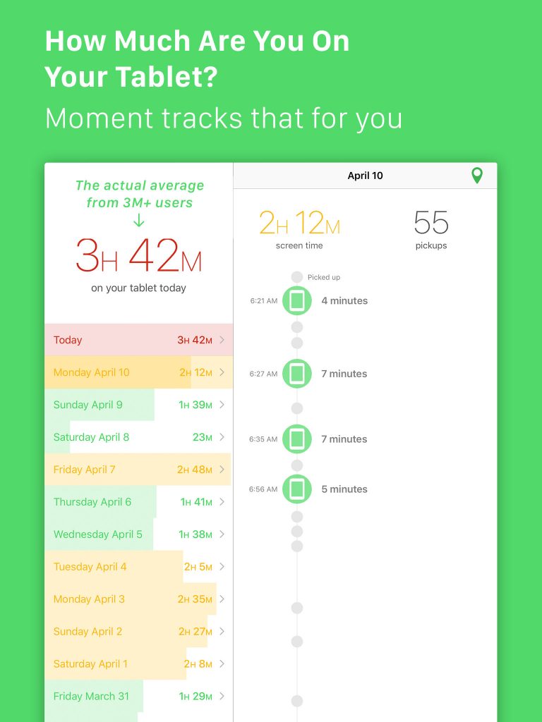
Instead of judging user behaviors, the APP just simply shows the “truth”, that is, the exact how much time users are spending on their phones. Most people would be shocked by the statistic and records because they truly underestimated their time wasted on phones.

In this case, the APP “Moment” gives users a chance to rethink their relations with their mobile devices. It has a two-week course to fix the habits called “Phone Bootcamp”, and reform the way of using phones. Also, it has a function called “Daily Limits” which can be set as a hard limit. For users failed to hit the limit, they would be booted off.

Week4- Kelsey (Yue Yu)

What I learned:

1: Move navigation to the bottom

— {Existing Menu Plan,

Menu for people who have food ingredients,

Menu guide people to buy food ingredients and cooking,

Shopping List}

2:IphoneX has a home button at the bottom. Save space for the home button.

3: No LogIn page; No time periods on existing menu plan page.

4: Allow users to choose to past/future time period.

5: Give the presentation and introduce menu details from the existing menu page(homepage).

6: Add a cancel icon to allow users to remove allergic information.

7: Adjust the layout of text.

8: Design a full-page size calendar.


Improved Design:

https://marvelapp.com/2d9fcgg/screen/38850386