Project 3 concept:
A weather app. Based on the weather condition and outfit preference, AI is generating illustrative character which recommends what to wear each day.
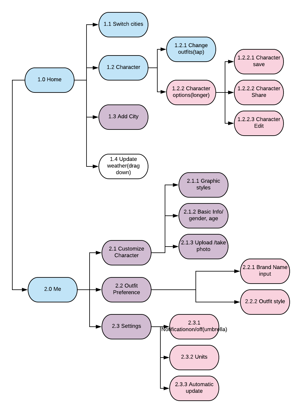
App Map
Wireframe
A weather app. Based on the weather condition and outfit preference, AI is generating illustrative character which recommends what to wear each day.

The feedback we got from digital prototyping
Notes for apple watch human interface guideline
navigation: hierarchical/ page-based. Avoid creating hierarchies deeper than 2-3 levels.
Do not use long-press gestures in interfaces that have Force Touch menus.
The system font specifically omits the ultra light and thin weights below 20 points because they are not legible at small sizes.
Always include a Cancel button.
Do not use black for your icon’s background.
Prefer buttons that span the width of the screen.
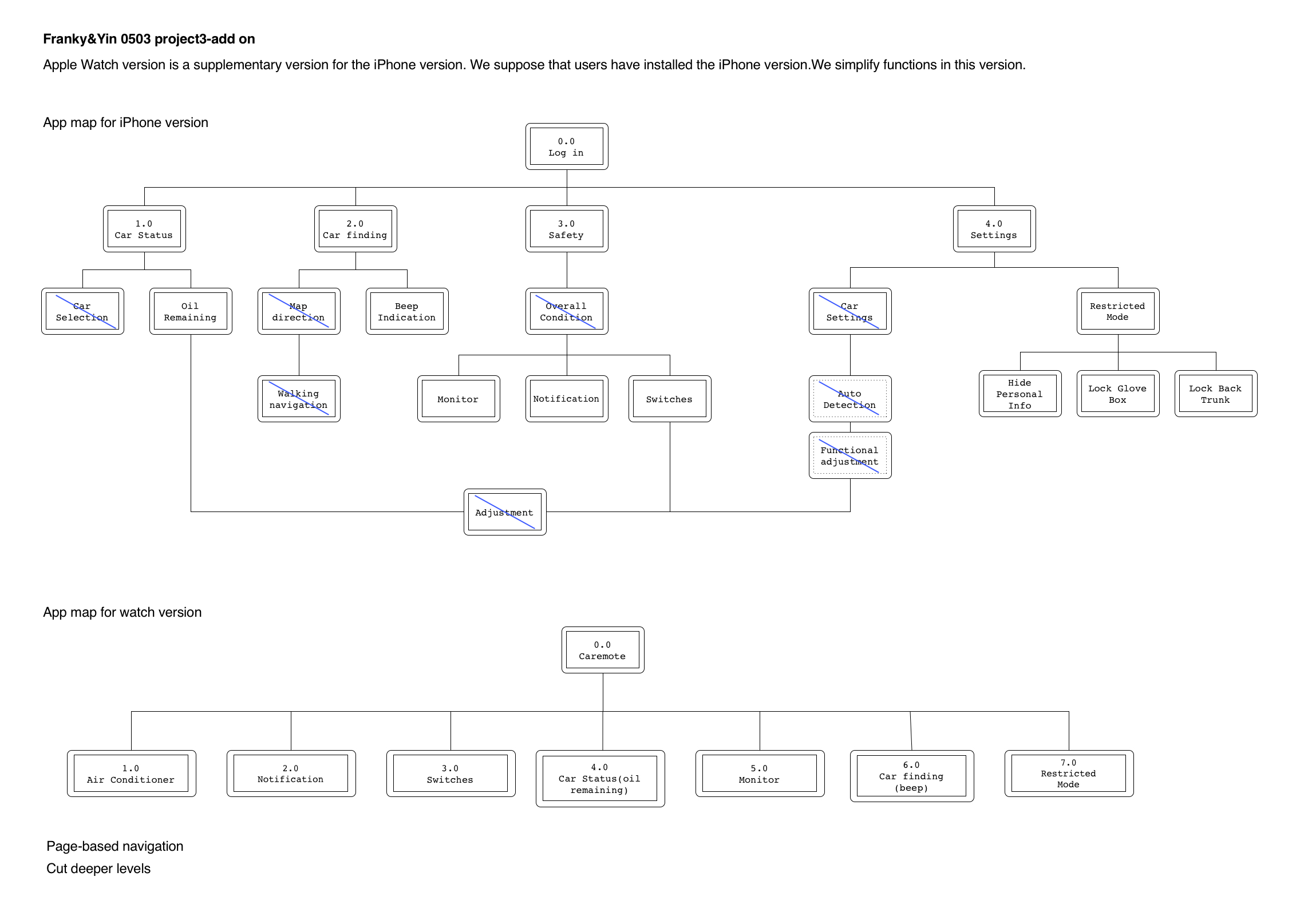
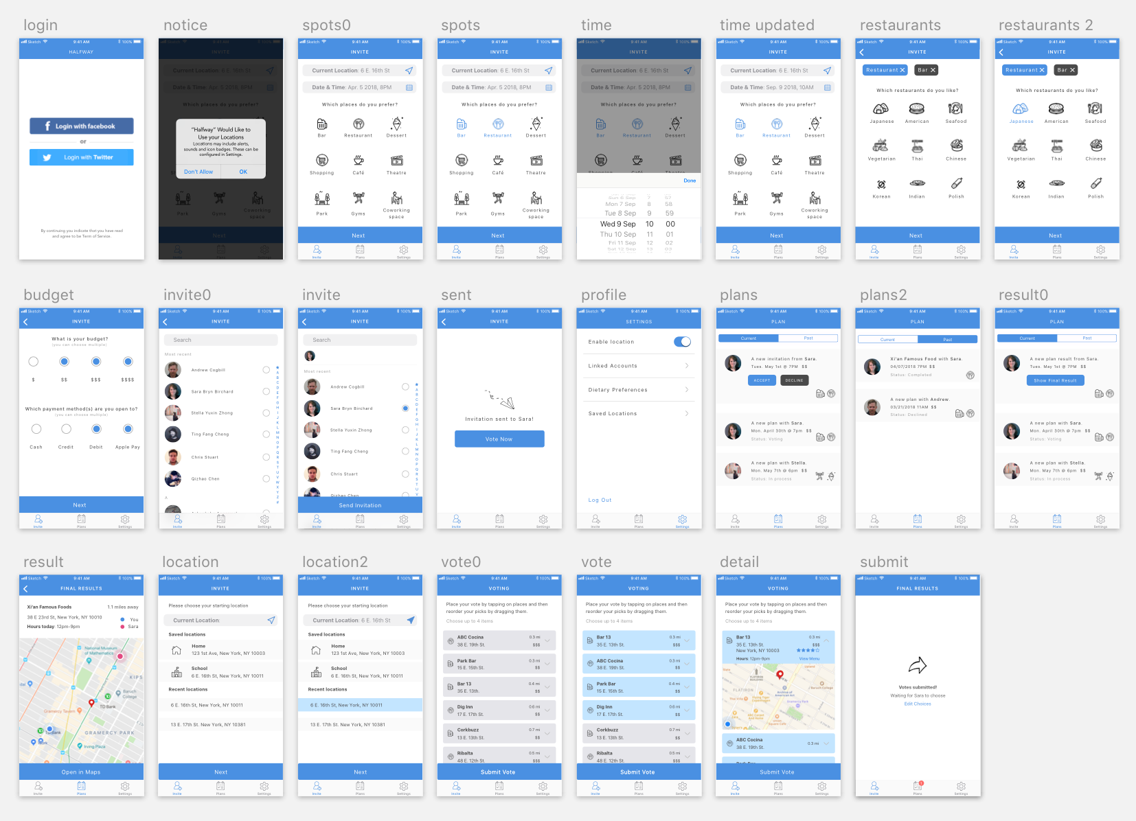
App map
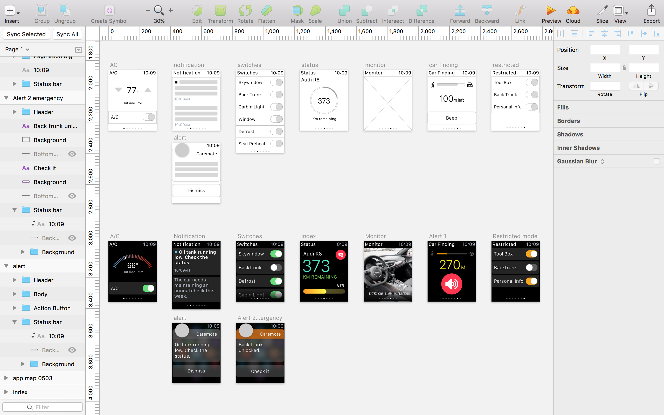
Wireframe and Visual design
+++ Group work with Yin Hu +++
The updated version of the app on Apr 26th
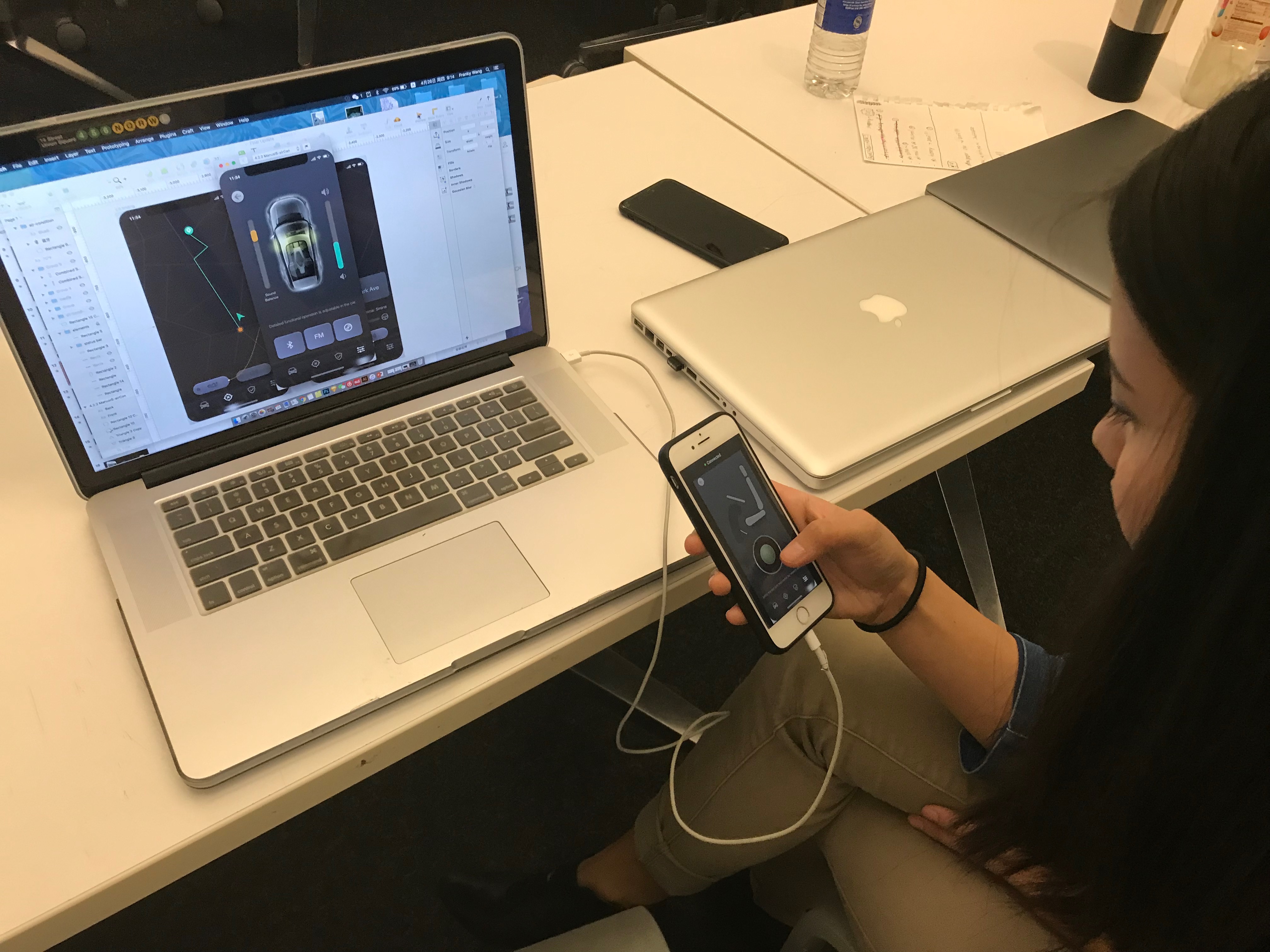
+++User testing on digital prototype+++
In this week, we made the following updates:
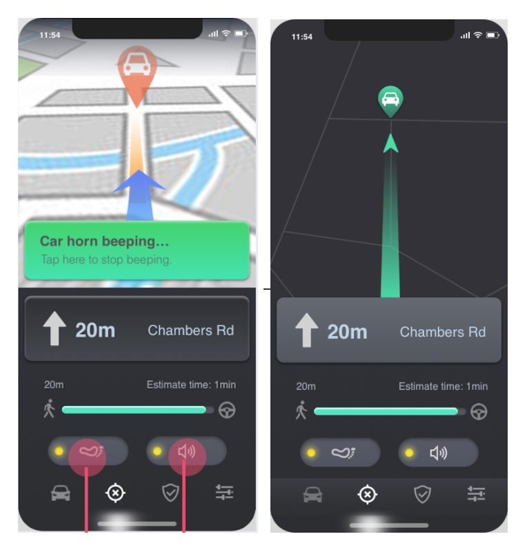
Changed visual style of the map and deleted the text indication for car beep.
What we changed:
Visual Design:

WhatTheFont is an app that allows you take a picture of any font (on-screen or printed) and find similar fonts. It is meant to identify the exact font but from my experience, I find that this is almost never the case. However, I still find it useful for when I see a font style that I like and want to match in my own work. The UI is very simple: all you have to do is take a picture of the font you want to identify and the app will automatically detect any text in the image. If it does not detect the word that you want to identify, there is also the option of manually selecting it. The app will then generate a list of similar fonts- usually, it will have the same word as photographed for a direct comparison but if it cannot identify the word then it will use “the quick brown fox.”
Feedback from last week:
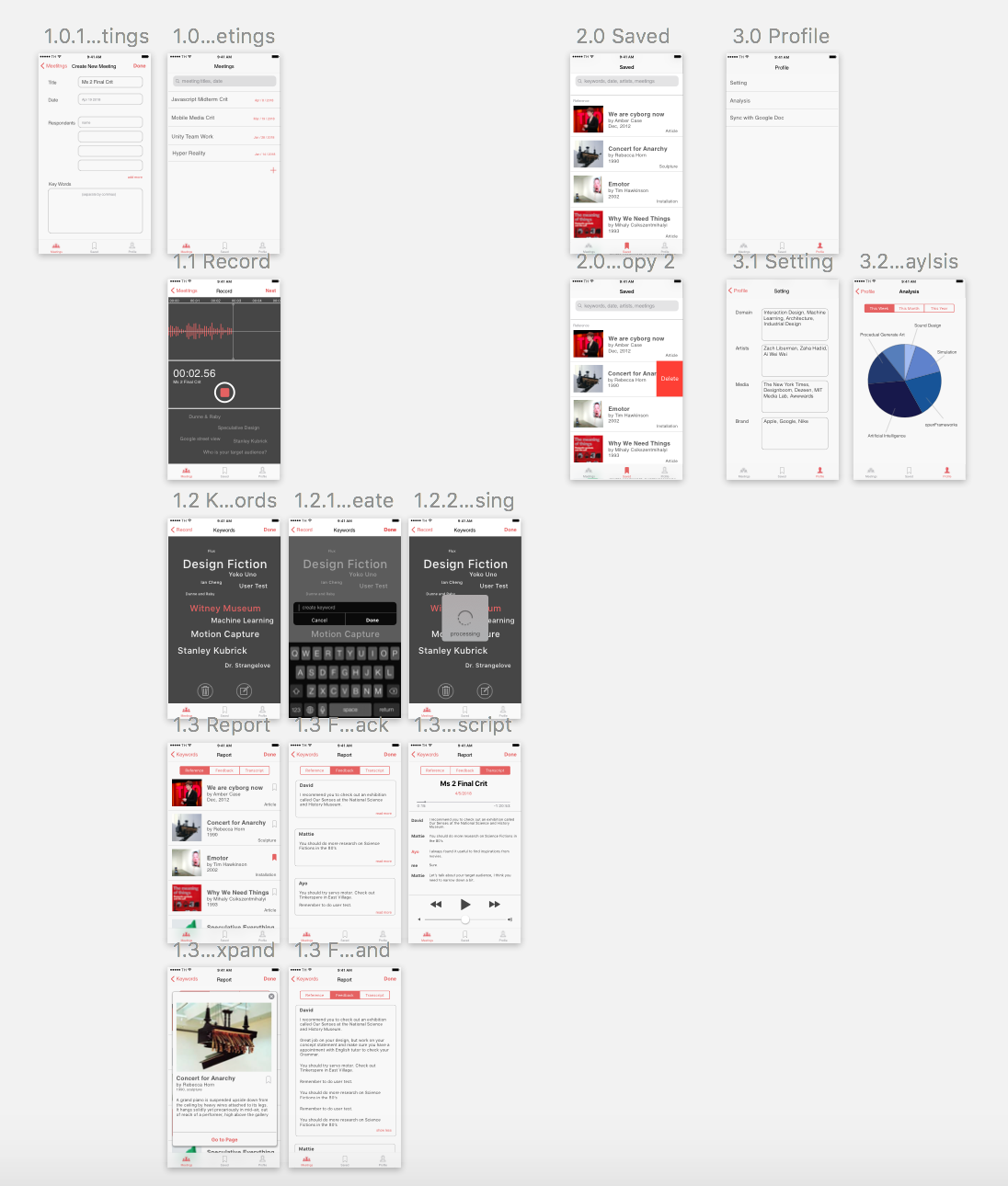
1.Two tabs are super weird. There should be a more convenient way for users to search all the archive.
>We redesign the tabs into Meetings / Saved / Profile.
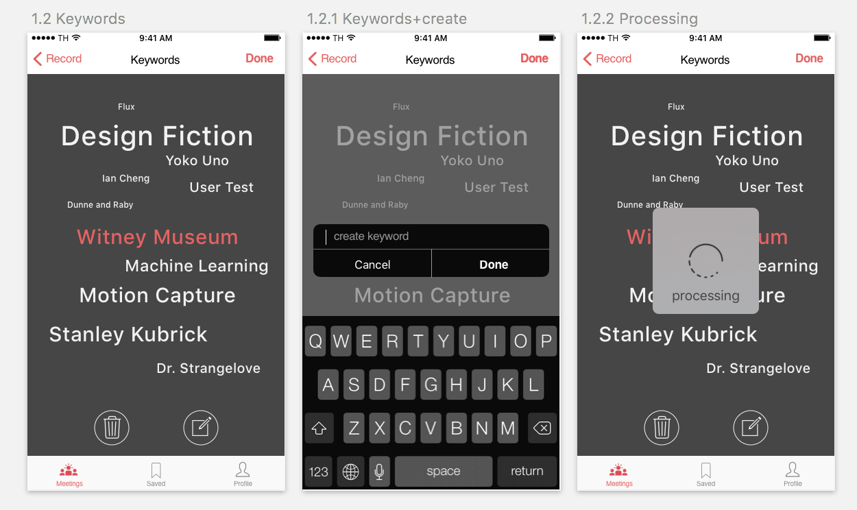
2.The keyword tracking feedback on the record page looks like a tabbable link.
>Moving texts floating from the bottom to imply the users that the machine is listening.
3.Users should be able to customize the keyword. Scale the text when it is important, delete it when it is irrelevant, and type in keywords machine did not get.
> When hold on the text, it turned into pink and then enter the edit mode.
++++ This is a group project with Yao Huang++++
https://marvelapp.com/6952656/screen/41727836
Improvements:
1: remove the total balance section into different cryptocurrencies detail view.
2: Redesign the infographic for different cryptocurrencies.
3: Add an AI transaction history view.
4: Replace bank accounts with bank cards.
5: Add unread messages button in the “send money view” and “request money view”.

