The feedback we got from digital prototyping
- different button systems!! consistency!!
- index page, “distance remaining”
- car finding page, a. beep button pop back automatically. b. the arrow at the map, the street name? gear icon and car icon?
- safety tab, add the window in the switch
- think about the condition to trigger different states / the technique support
- Add text under the icon in the fixed bottom tab, the icon of setting looks like filter
- preference page, add more text to explain detecting process
- restricted mode, the button is not necessary?
- air-conditioner, hierarchy issue, adjust by seats,
- media, the sound balance, research
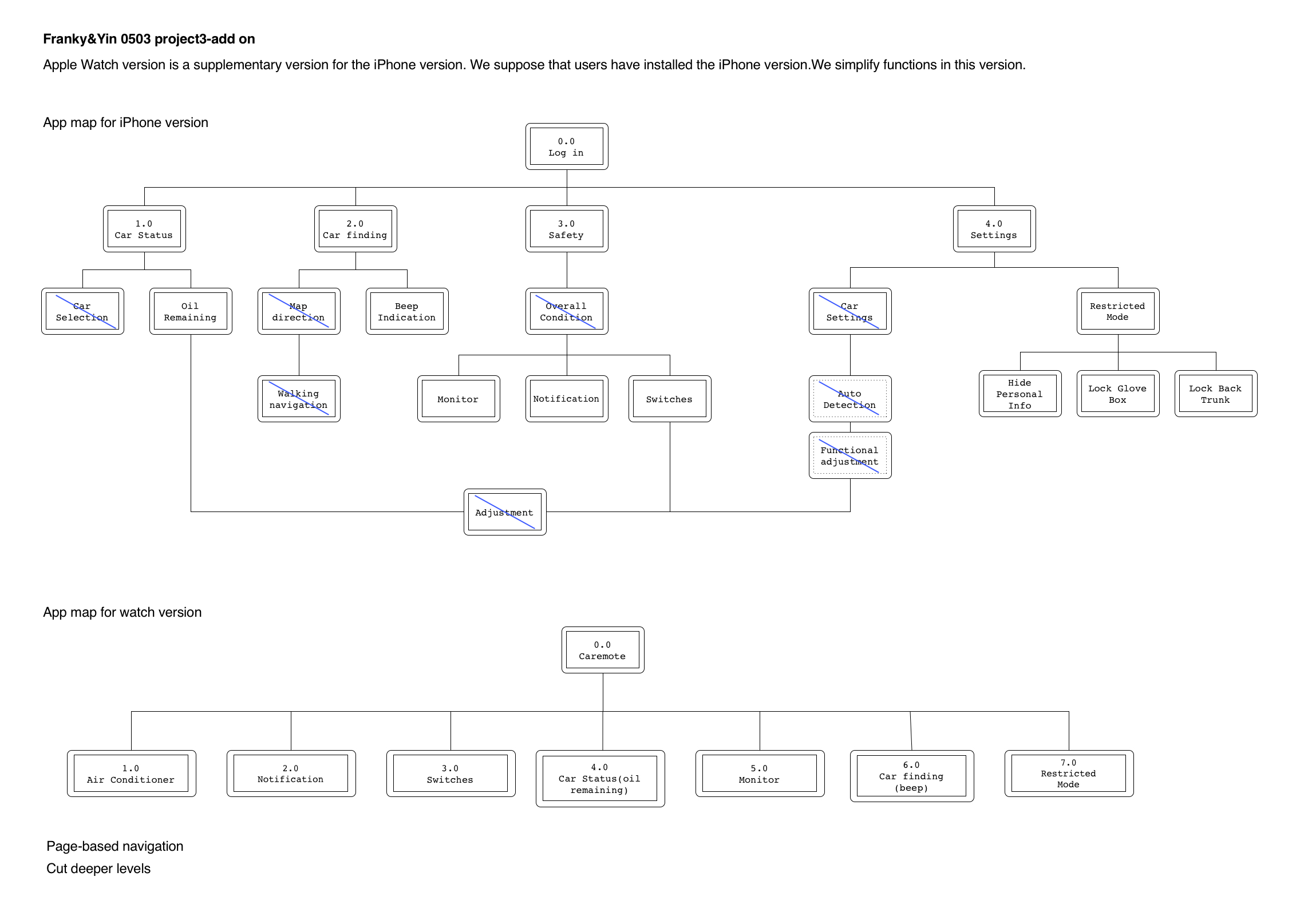
Project3 Add-on Apple Watch
Notes for apple watch human interface guideline
navigation: hierarchical/ page-based. Avoid creating hierarchies deeper than 2-3 levels.
Do not use long-press gestures in interfaces that have Force Touch menus.
The system font specifically omits the ultra light and thin weights below 20 points because they are not legible at small sizes.
Always include a Cancel button.
Do not use black for your icon’s background.
Prefer buttons that span the width of the screen.
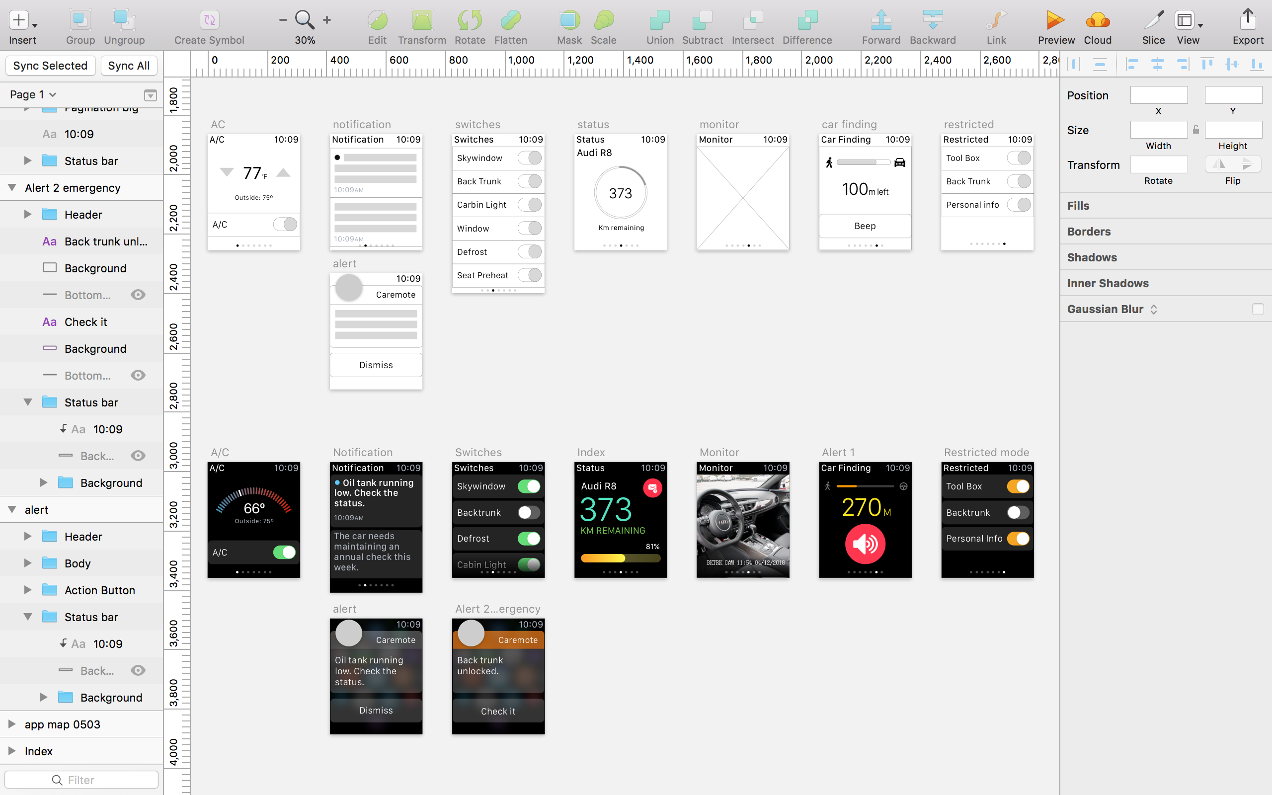
App map
Wireframe and Visual design