Completed Prototype for play testing
Month: February 2015
First Design Prototype
Slight changes i made from from the wireframe based on feedback:
- Merge the splash screen and landing page – Also upon opening the app, it will automatically show the dessert restaurants around you by random order
- Leave out Desserts as a tab option & incorporate it as a search bar
- Reduce the amount of text on your DASH cart page
Here’s just a layout design of the main pages.

2nd Wireframe
sorry for the delay, but here is the re-worked .pdf Wire frame from the first feed back i got for the app
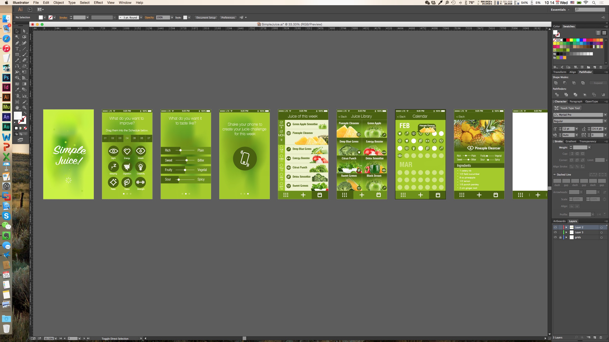
Prototype 2
The link to the prototype (Even the home bottom is tappable )
Sorry I cannot be in class tomorrow so any kind of feedback on this prototype would be appreciated.

zeqinghong.com/simplejuice
Changes from last version:
1. in the 3step screen, the size of the calendar is optimized for touch and the icons now are accompanied with titles
2. add more space to the flavor screen
3. on the list screen, check boxes are added next to calendar
4. tap bar now has four functions
5.comfirmation page is added when user taps on add a new one
6. customize the drink by swipe left on the list screen
Developer Economics 2014 Report
VisionMobile has published their Developer Economics 2014 Report, which some of you may find interesting.
Digital Prototype on little kitchen
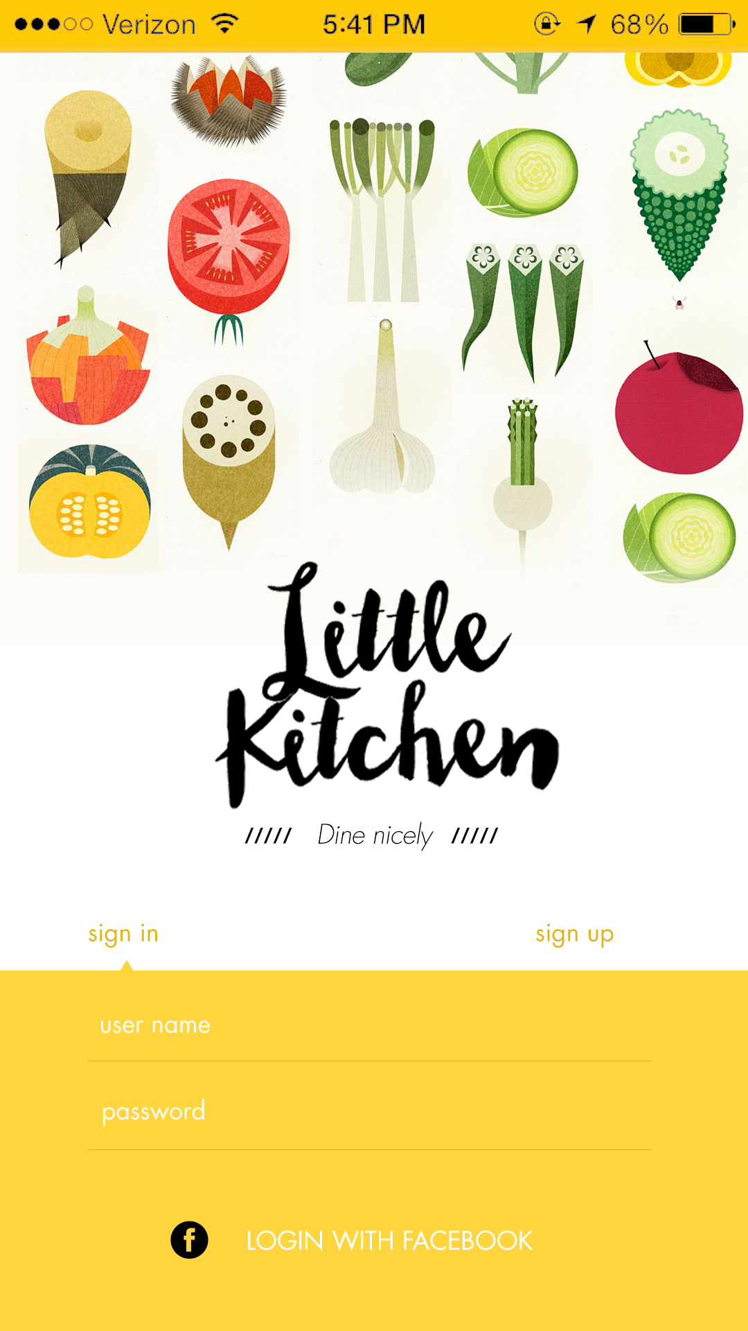
https://www.flinto.com/prototypes/158315
What I learned from paper prototyping
My initial idea of this kitchen is an app designed for two kinds of users – foodies and cooks, which is too ambitious and it turned out to be odd while testing. The users get confused when they were playing with the paper wireframes. Without the explanation, it’s not that clear for first time users.
That’s why in the flinto prototype, I removed the functions for cooks and refined the whole apps. Now it will only serve users who are trying new food at new places.
Vote1,2,3
Criteria
- A simple voting system for restaurant food review
- Users will see the current top 3 dishes in a restaurant
- if searching for a specific type of food, users will be shown the current top 3 restaurants with the food near them.
- Encourage users to vote with the rewarding system
Target Audience
Someone who wants to make the right order but doesn’t have time to go through all positive and negative reviews on restaurant apps like Yelp
Precedents
Foodspotting, Dish.fm, Yelp
Crossy Road – App Review
I didn’t notice that this app has been so popular that the vide review has been played for over 1,000,000 hits. I like the aesthetics, it reminds me of one of my favorite games – Minecraft. Each character is nicely designed and looks every appealing. The according map they design is funny and perfectly fits the character. And they hide nice details in the process when playing the game. The ad added there is acceptable too.
The UI is pixelated, pure colored and simple enough to play with. The gaming is simple too. I personally are not a big player but I play it now and then without any notification from the app. So I think this is a success.