DuoLingo is the #1 language learning app on Apple Store. Users can choose the language(s) and their desired study goal(s) for each language. DuoLingo taps into humans’ intrinsic motivation to complete goals by inviting users to set the goals for their intended languages at their own pace; every time when uses feeling the itch that they have left tasks unfinished, they would return to DuoLingo. DuoLingo also sends external trigger – task/goal reminder; these external triggers are owned triggers, meaning users can turn them on/off as they wish. If users keep missing their daily goals, instead of constantly sending reminders, DuoLingo would send out an email reminder, which is less invasive. Users accumulate “experience points” as they learn languages by gaining one point for a correct answer and losing one point for an error. The “experience points” could be considered as variable rewards because users could potentially lose points. The more interesting design of DuoLingo in my opinion is that users would have to complete the easier courses in order to advance and unlock more difficult course, which invites users to invest and store values in their apps, and makes it less desirable for users to switch into other language learning apps.



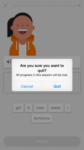


View1 shows what happens when users open the app. A banner pops up at the bottom that reminds users of their daily goals, and the banner disappears after a few seconds, revealing View2. View2 shows a clean and clear interface where the primary button is distinctive, and system buttons in the navigation bar have a key blue color that implies interactivity. The contents on View2 are minimized to heighten the core functionality; no unnecessary texts/images or annoying ads. The app uses visual layers to express depth. When users tap into each course, they can swipe between different lessons or views within each course, shown in View3. View4 shows that an alert pops out when users try to quit in the middle of a lesson; the alert message is short and precise, clearly stating the action and the consequence. Users can also access in-app purchases (View5) and user profile (View6) from the navigation bar on View2. Overall, the app follows the principles of deference, clarity and depth.