Paper prototyping for Food Scout on Apple TV was pretty useful. User testing in class, I realized I can enhance the interaction with the video. I wanted the information to show about the food item when the user pauses the video. But this step did not seem intuitive and instead, some information that fade out when the video starts playing could be an indication that there’s an interaction when paused. I will have to user test this aspect as well.
Month: March 2016
#thursdayplay / Cooking Dash
Cooking Dash is a game that I started playing recently. It would be really enjoyable for foodies or anyone who gets excited about cooking or eating in general. The goal of the game is to cook and serve all customers at a chosen restaurant. Each level is time based and has a goal to make a specific number of money. When all the levels are completed the user can open a new restaurant. I enjoyed playing the game for a while and got pretty hooked even though it can get a bit stressful. But later on it seemed that it is impossible to do upgrades without purchasing coins because the ones collected just from playing are not enough. Sometimes each level gives the player a certain recipe with instructions. The instructions never show again, so if the player forgets the recipe it is almost impossible to remember without going online.
Furu_TVOS_Iteration2
Updated AppMap:
Findings from user testings:
- Instead of having a “trash can” delete button, use a filled heart button that users can tap to unfavorite – consistent UI/interactions
- There can be only one thing in focus – so if there is one item highlighted in red, there cannot be another item highlighted
- Do not need “go to favorites” link – not necessary; users can just swipe down to view the tab bar and go straight to the “favorites”
- Need to find some other Icons for the pin on the map, and the pin shouldn’t be in red – again, only one item can be in focus
- There need to be some indicators that indicates the pictures below are from other restaurants/other types of cuisine
- A hierarchy under hierarchy is confusing
- Redundant filter page
Design:
Apple tvOS Go!Curry App
Hey everyone!
I present to you Project 2: Go!Curry. Go! Go! Go!
I’m super stoked about this project as designing for the TV is a new experience for me. I used the Apple TV seldom times in Jakarta for watching YouTube videos with family, so it was refreshing to hold the remote and test it out in class. It not only gave me insight to potential users, but also really helped me envision contexts in which users would use this Go!Curry app.
For instance, I could imagine my family or friends sitting on the couch watching TV and wanting to order food because everyone was hangry. With that thought, I considered a feature that I want to continue exploring, (which I also encountered in the Chipotle iOS app), which is the ability to name your orders to ease the customer experience once the food arrives (“Don’t be hangry any longer! This is yours!”)
Although Venmo has made it much easier for us to split the bill, I would say that this scenario seems to be a hassle:
- You’re in your apartment with seven other friends, hangry and wanting to order food.
- “Let’s order food! What do you want?”
- You all order food on your app. You’re responsibile for asking your friend what they want. “Hey, do you want brown rice or white rice…? Chicken teriyaki, salmon teriyaki, sushi etc.? Anyone else?”
- A big sum is charged under your account.
- “We’ll Venmo you. Don’t worry”
- Open the venmo app to notify everyone that they owe you money.
- Delivery man comes in and hands your bags of food.
- It gets a bit messy trying to figure out who’s food belongs to which person. “Ok guys, is this yours? Wait… I think I ate someone else’s sushi. This is yours.”
- You’re too busy eating, time passes and everyone forgets to Venmo you.
- The next day, you text them saying, “Hey… remember… ?”
- Process is delayed.
Attached is my first attempt at two quick wire framing directions for translating my Go!Curry app into an Apple tvOS app.
Many preferred the simplicity of the first direction with regards to user flow. With the second direction, I was inspired by viewing my classmate, Sumi’s work. I was explored the functionality and how users would engage with the content on the screen, as also a viewing experience.
Next steps include:
- Explore a direction further in depth
- Utilizing design to indicate the user experience (highlighting what is in focus and what is not in focus)
- I assumed that one day we could use ApplePay to pay for our meal. Another option would be syncing that account information from your phone.
03.10.16_mobilemedia_appletvOSapp
After the paper prototyping exercise, I learned that:
- I want an Apple TV!
- A more efficient way of paper prototyping for the TV is preparing all the individual TV screen views that you can flip up, as the user navigates through it, rather than only using sticky notes. Things become less sticky after several user testings! Ha!
Notes: To be continued in next post along with updates….
Getting the hang of paper prototyping for Apple tvOS!
Boil Monitor (TVOS) – Slides, Wireframe
Here’s my slides of wireframe:
Project 2 : All Recipes Video Cookbook
Here is the 2nd Iteration of the All recipes app for apple TVOS and also the paper prototyping in class.
Project #2: Food Guardian on Apple TV – App Map & Wireframes
-
Introduction
Although I only use the older Apple TV, I don’t like doing complex things with the small remote such as typing. So I remove all the input functions for iOS app and only keep deletion. Users now can only view what they have from their iOS Food Guardian on Apple TV and use the item is “already used up” function, which is a deletion basically. Thus, it makes the app simpler and easier to use.
-
App Map for tvOS
-
Wireframes
3/17 Apple Tv revise
For March 31
- Take your learnings from paper prototyping and critique and create a design for your AppleTV app.
- Show your designs at scale on the TV. Marvel claim they will have an AppleTV app coming out this week. I’m going to bring in my AppleTV, so if the Marvel AppleTV app comes out and you want to use it, you can. (UPDATE: marvel for AppleTV is out http://blog.marvelapp.com/view-your-designs-on-the-apple-tv/)
- Post 2-3 user insights from paper prototyping when you post your designs on the blog. If you didn’t attend class last week, you’ll need to run your own prototyping and post user insights learned.
Midterms will be coming this week. Contact me with any questions.
#ThursdayPlays Today
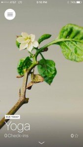
I’m trying out a habit tracker app mostly because the interface is pretty, but also because I want to see if this kind of thing would actually work for me. The interaction is really great I think so I could see myself continuing to do yoga and ab workouts regularly because of it.
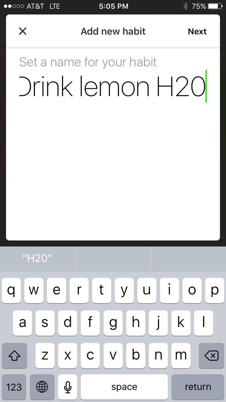
To start, you add a habit by first setting a name for it- let’s say: drink lemon water
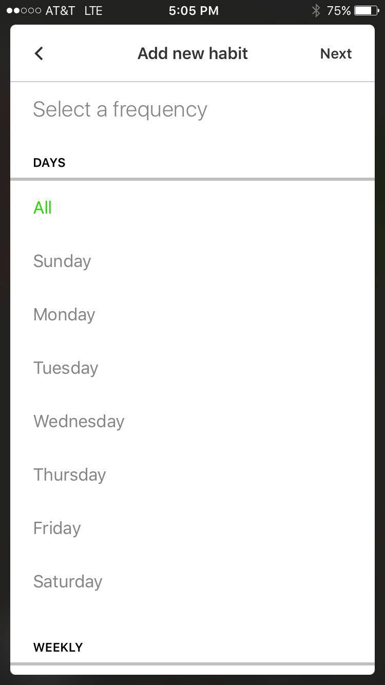
Then, you can add the frequency: aka which days of the week you want to be reminded or how many times a week
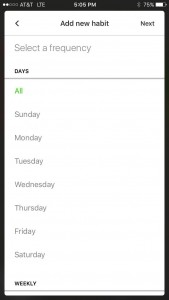
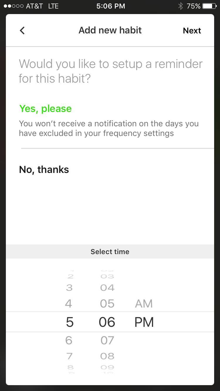
It then asks you if you’d like to set up a reminder for the habit, and to select a time for that reminder
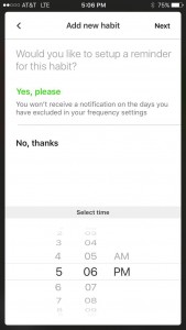
You can also choose a specific day to start this habit
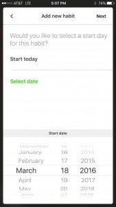
choose a background cover
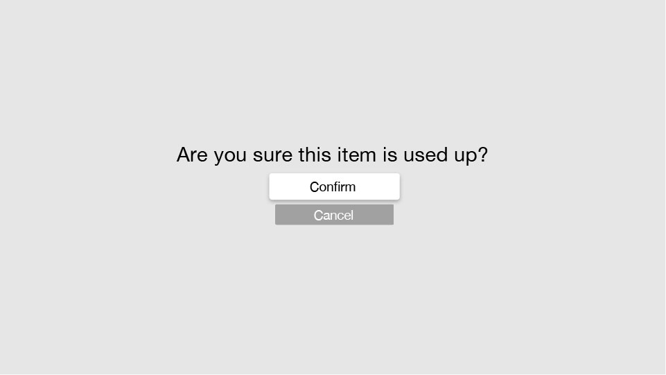
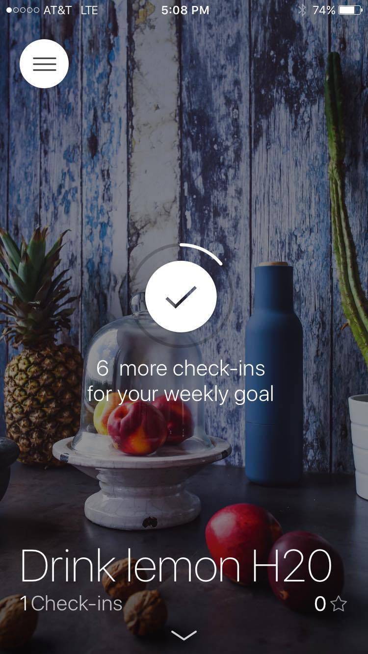
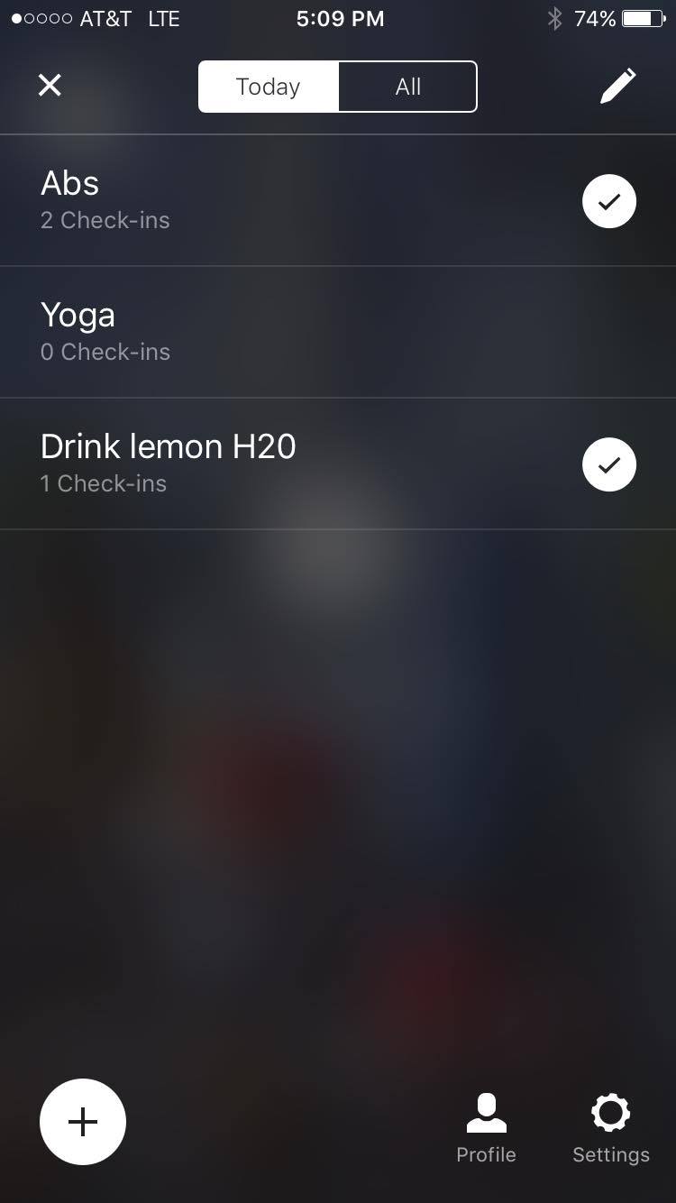
to check-in and show that you’ve accomplished the task, just double tap on the screen for that habit! each habit has a separate screen that you get to by unfortunately pressing the hamburger icon, but i think since there’s so few elements to tap on it’s OK…I’d still prefer something different though.
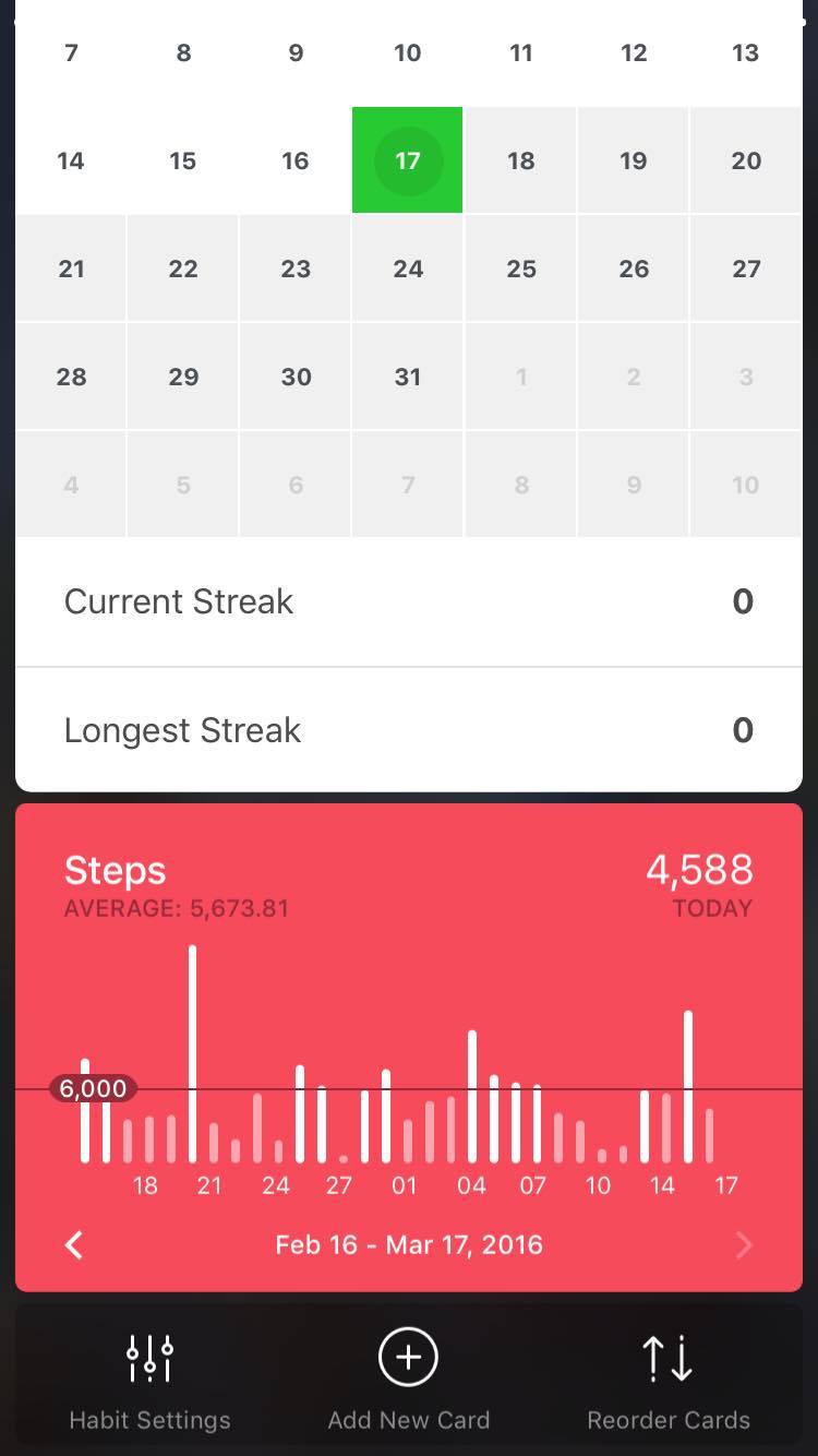
to see your check-in streak on a calendar, just swipe down
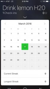
you can add widgets with other health data in-app, from the apple health chart, or inputting your own info about things like body fat percentage
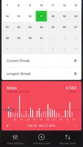
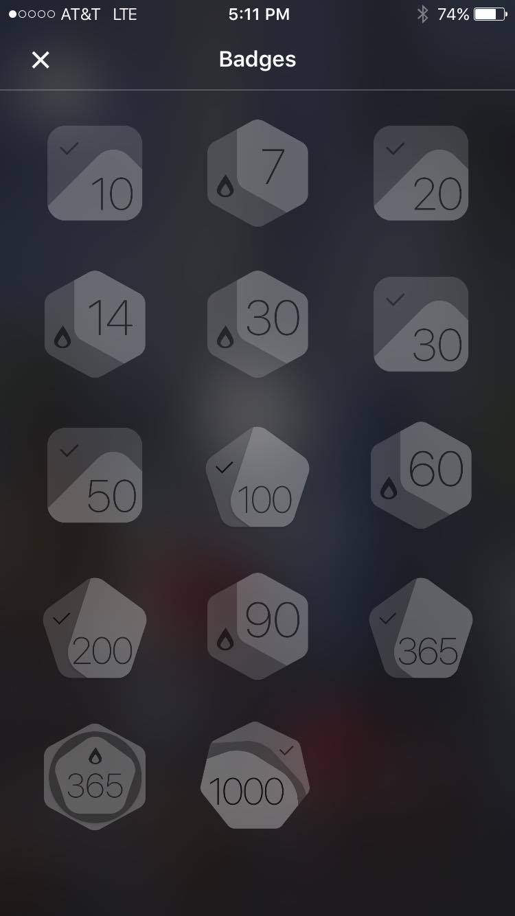
you can also achieve badges for reaching certain streaks
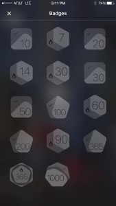
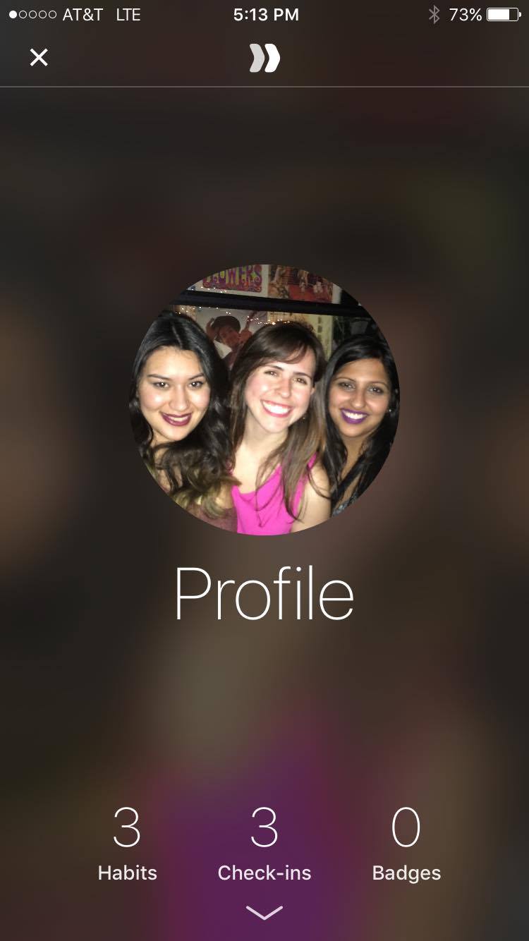
the profile page is super simple and nice as well
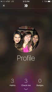
I really like this app, i think the one thing I would change is the hamburger icon, instead I would play along with the swipe interaction they have on the habit view and use an up arrow icon to reveal the other habits so that you can swipe up to change the habit view and swipe down to see your calendar streak, i don’t think the hamburger icon is necessary.