Insights after presentation
- Baby data page is confusing. Don’t know how to move to places, should be an easier and faster way to move in the screen
- There should be a scale on the side of the Data visualization
- In the recipe detail page, there should be a section for ingredients and a section for instructions because if not it may be difficult to navigate when there is more content
- For the meal plan, needs to really check if the interaction makes sense or not
Insights after the paper prototype

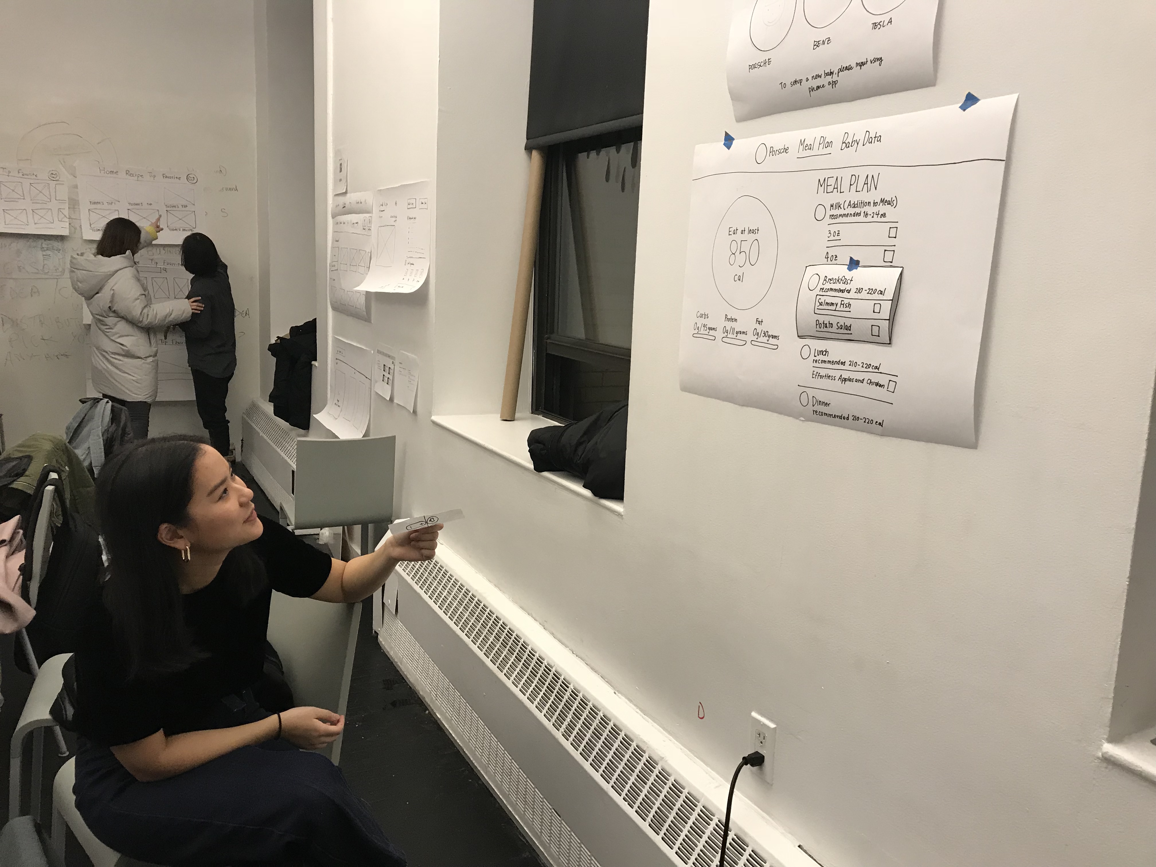
- It’s hard to understand that you can move from menu to checkbox
- The graph in the meal plan looks too important when the user can not even interact with it