One of the most important note I took from my initial user testing is that people do not read introduction text. Besides a number of users have limited ability in reading English, native English speakers also found reading irritating when operating a mobile application.
Pin-pointing the challenge, I removed all text instructions and introduction screens. Instead, I experimented with a few different visual hierarchy to encourage swipe gestures. At the end, I have discovered that laying screen on the edge of the screen while using shadow to indicate the depth appears to be the best solution.

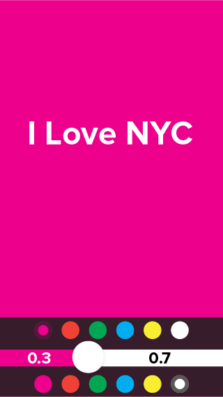

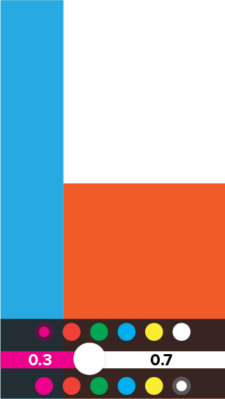
The least confusing part is the color selectors for both air writer and screen flasher. Therefore I have kept the design.

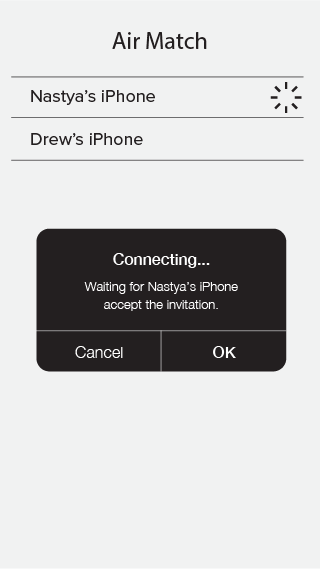
One of the debatable visual element is if the layering design should remain when a user has entered the flashing screen. My decision is to break the consistency due to the fact the flashing screen must take up the entire screen to work properly – especially when using air writer.

Therefore users must be experimental in order to discover ways to go back to the previous screens or entering the air match mode one they have entered the flash screen. The test result shown that they are able to do so based on the fact they have previously educated by the gesture control environment.