One thought on “Go Foodies! – App Map and Wireframe”
When presenting it’s helpful to start with your app map. It gives people an architectural overview of your app and gives you a chance to outline the major features of the app. It’d also be helpful if you labelled your each wireframe page view. I got a little lost about what view I was looking at, and that would help fix that.
Your presentation had a really nice justification why this app was necessary instead of using Open Table.
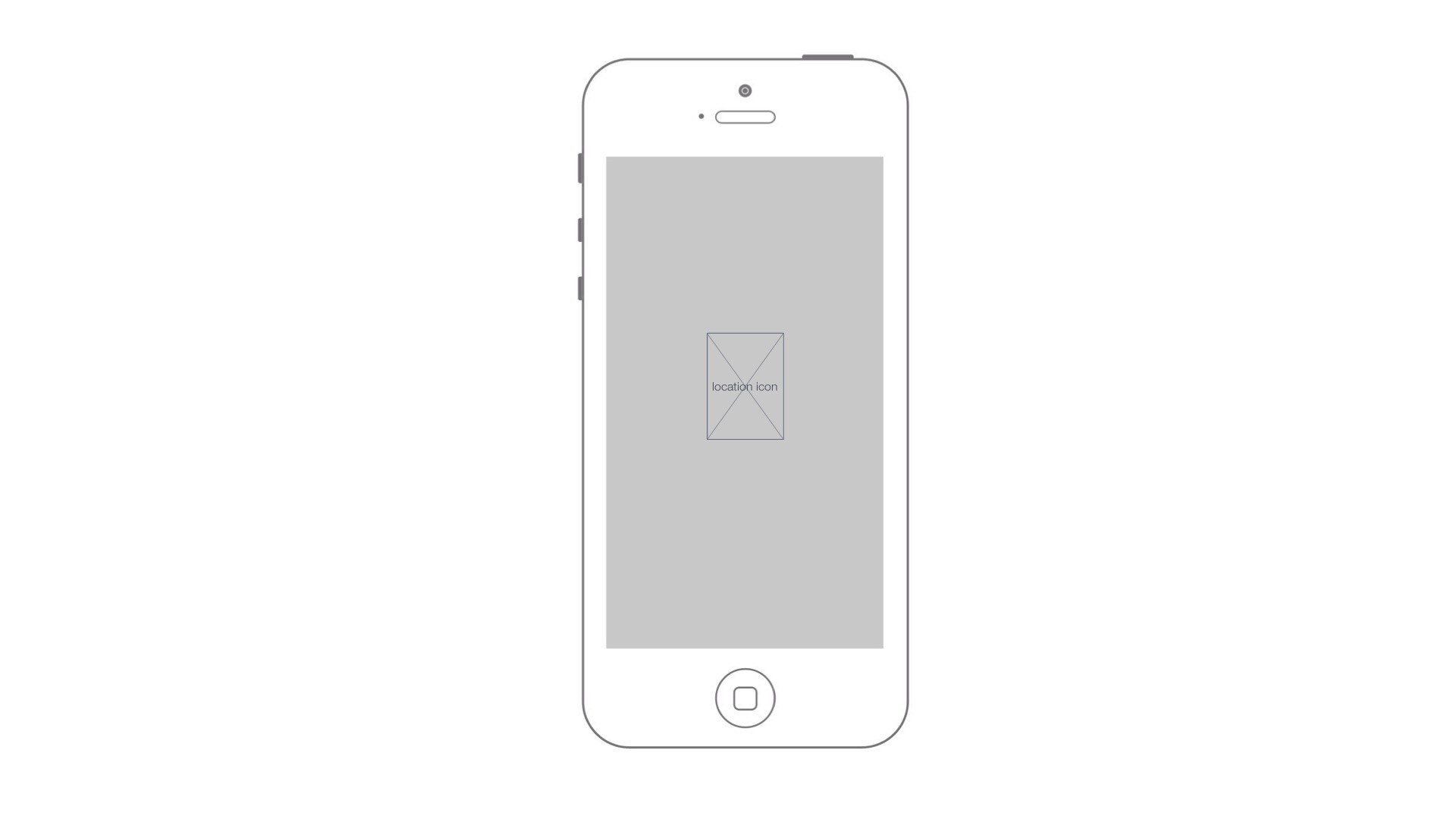
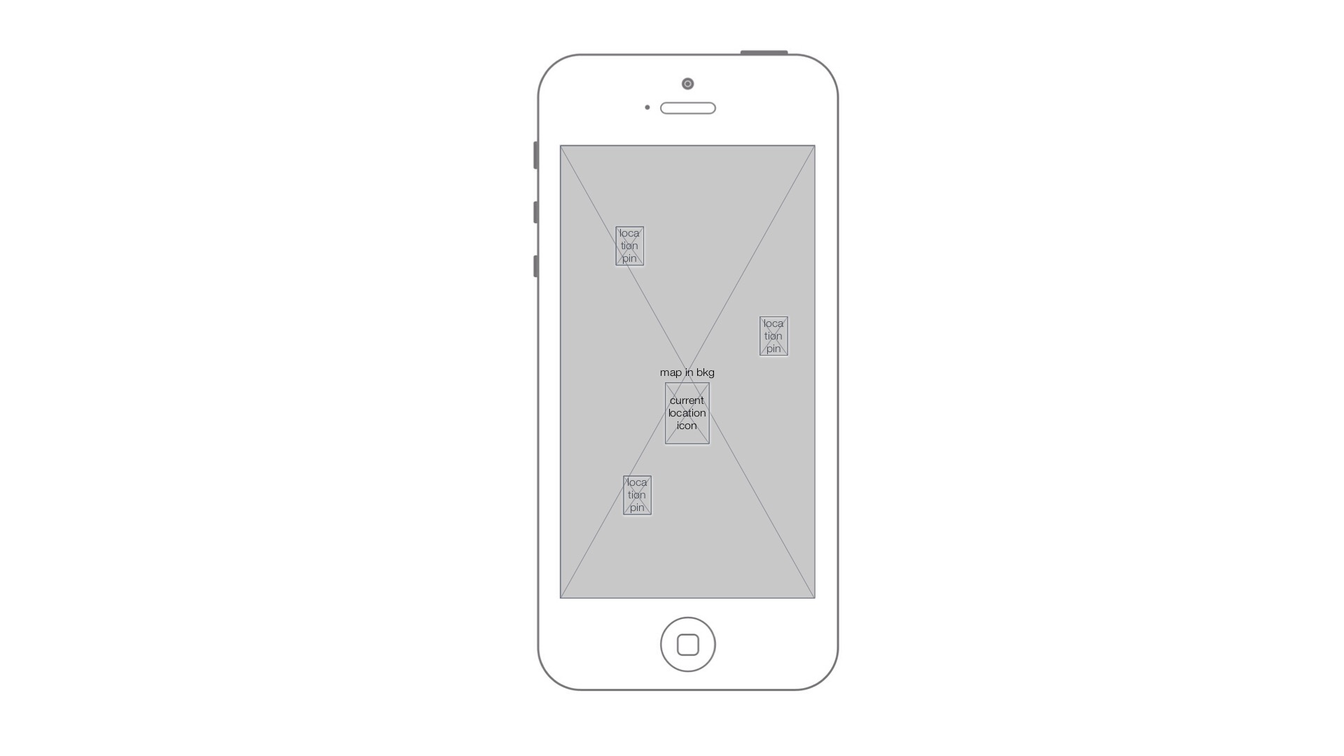
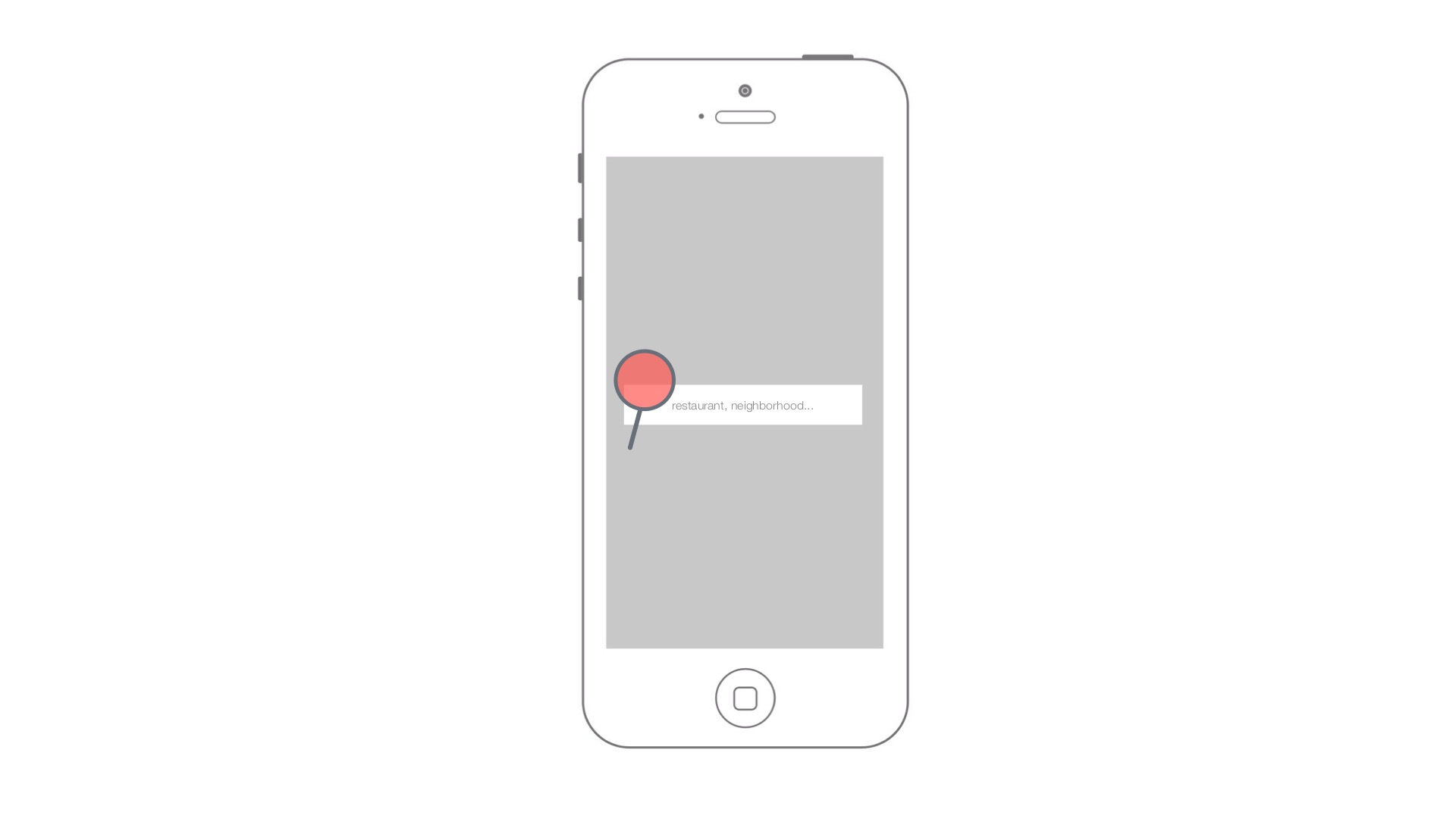
This was brought up in class, but the most important thing to do will be simplify your landing/main view. You can start with the map view with a search bar on top. There’s no need to have a view before there. The interactions on your existing starting view are complicated and would be hard to figure out.
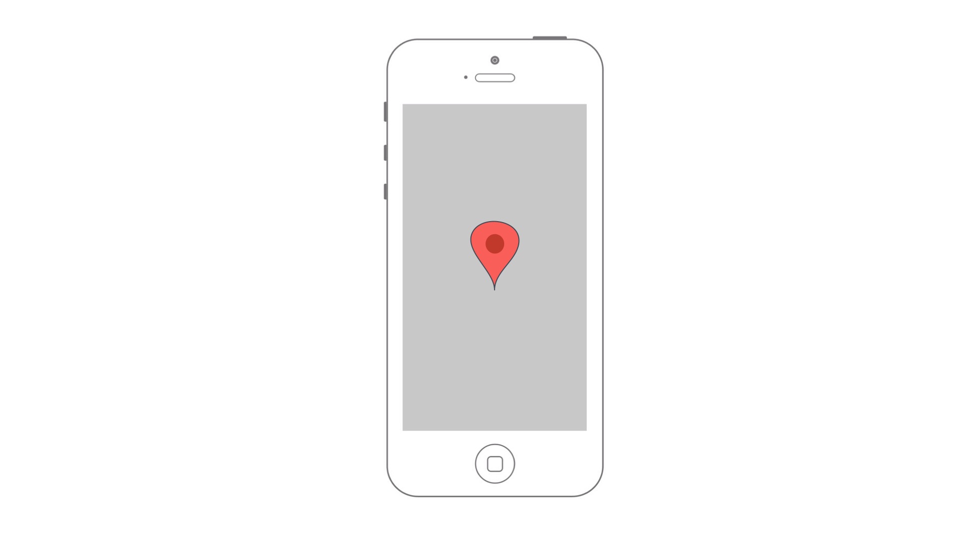
For the map view, which we’ll now consider the main/landing view, think about what would happen for a user from Ohio. Maybe you’d just see the whole of New York, or the area with all the pins of all the restaurants. It might be useful for folks in general to first see the overview of the city and then to optionally zoom into close by places. I’d imagine many users, perhaps the majority, would be thinking further out that finding a meal to eat soon that is nearby me.
I’m wondering if a list view could be valuable in addition to the map view as well. It might give you a different view of the content to highlight the restaurants in a different way.
Likewise, it could perhaps be useful to search by the time/date that I want to go out to eat, so that restaurants that are booked at that time won’t come up.
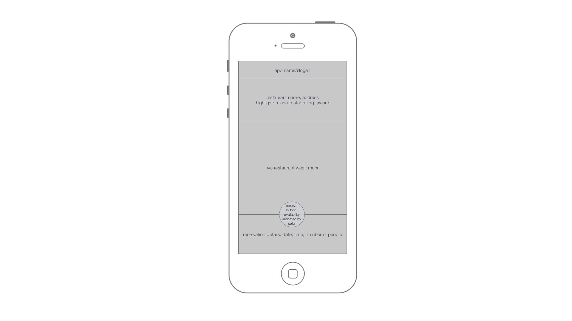
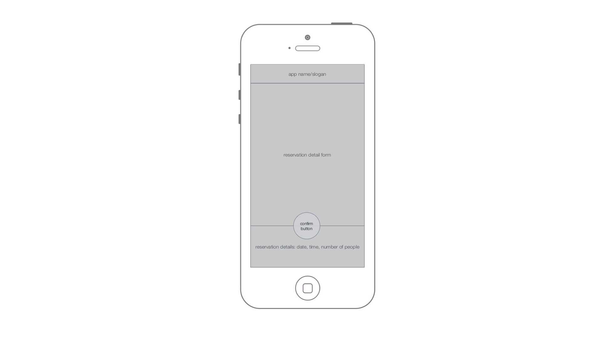
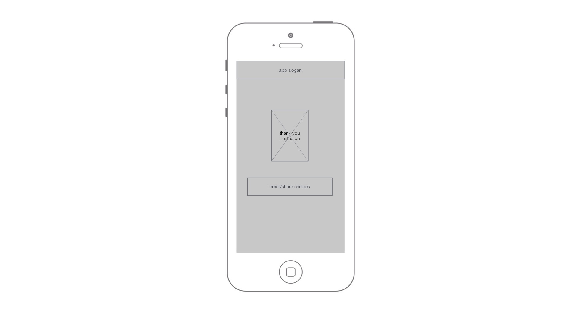
There’s no need to include the app name/slogan in the app. You’ve got the app icon to brand the app; it’s worth saving that area for functional content.
This came up in class, but it could be useful to see reservations that I have made, since many users may want to make more than one reservation, or at very least, they may want to be reminded about reservations that they have made.

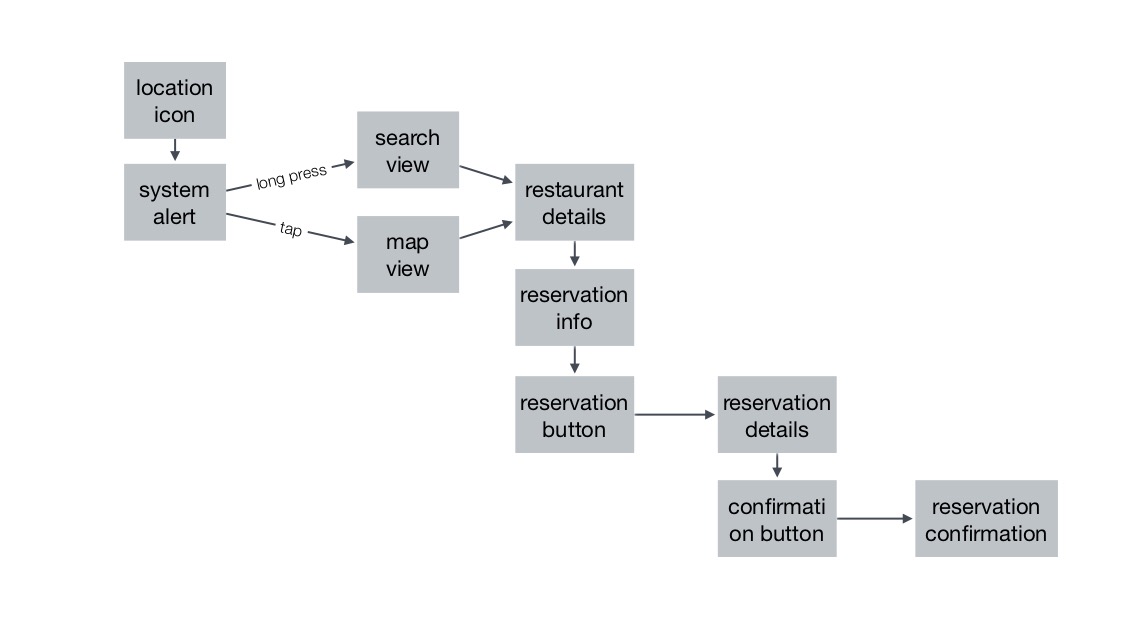
When presenting it’s helpful to start with your app map. It gives people an architectural overview of your app and gives you a chance to outline the major features of the app. It’d also be helpful if you labelled your each wireframe page view. I got a little lost about what view I was looking at, and that would help fix that.
Your presentation had a really nice justification why this app was necessary instead of using Open Table.
This was brought up in class, but the most important thing to do will be simplify your landing/main view. You can start with the map view with a search bar on top. There’s no need to have a view before there. The interactions on your existing starting view are complicated and would be hard to figure out.
For the map view, which we’ll now consider the main/landing view, think about what would happen for a user from Ohio. Maybe you’d just see the whole of New York, or the area with all the pins of all the restaurants. It might be useful for folks in general to first see the overview of the city and then to optionally zoom into close by places. I’d imagine many users, perhaps the majority, would be thinking further out that finding a meal to eat soon that is nearby me.
I’m wondering if a list view could be valuable in addition to the map view as well. It might give you a different view of the content to highlight the restaurants in a different way.
Likewise, it could perhaps be useful to search by the time/date that I want to go out to eat, so that restaurants that are booked at that time won’t come up.
There’s no need to include the app name/slogan in the app. You’ve got the app icon to brand the app; it’s worth saving that area for functional content.
This came up in class, but it could be useful to see reservations that I have made, since many users may want to make more than one reservation, or at very least, they may want to be reminded about reservations that they have made.