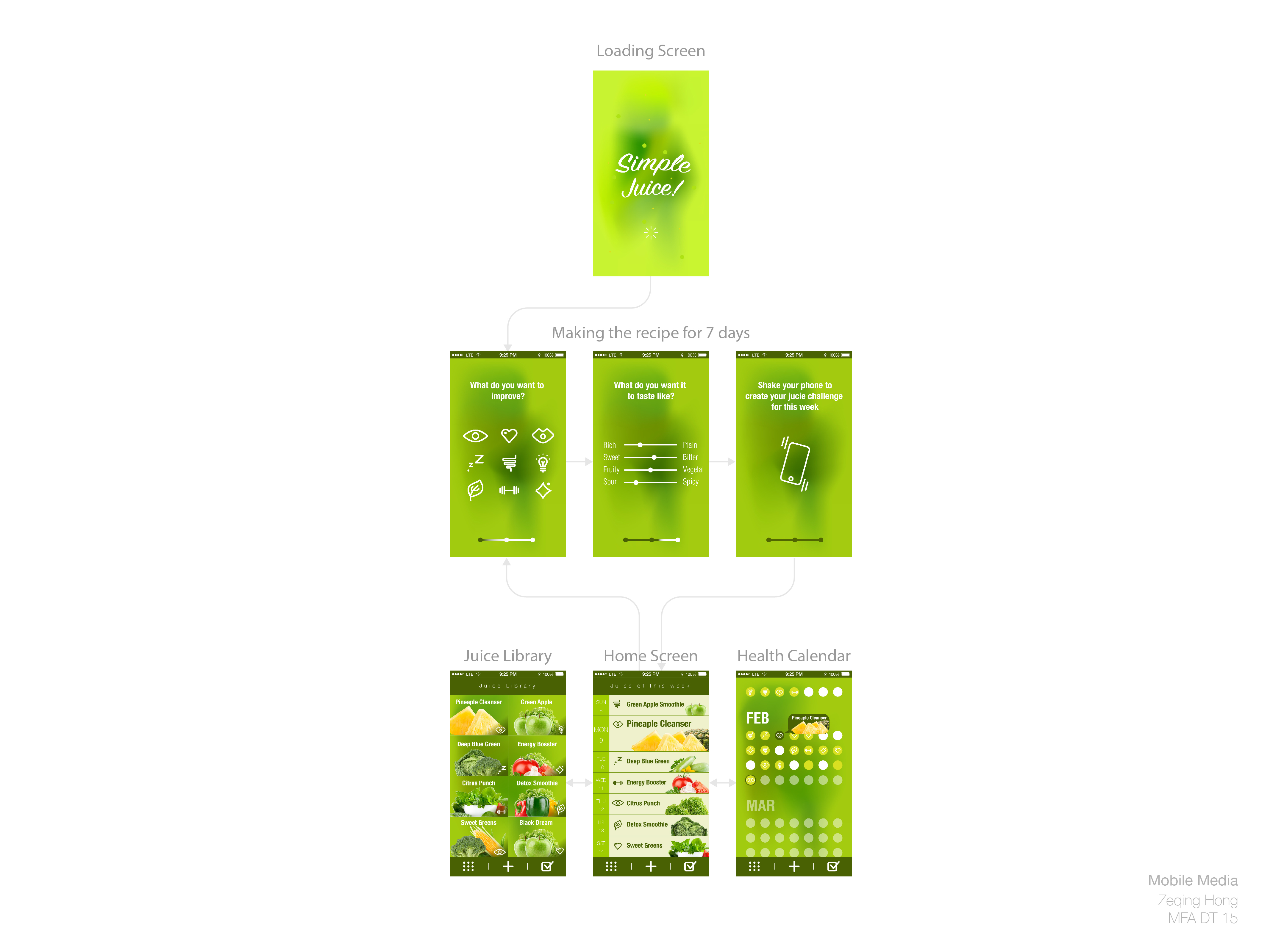
It looks like these are designs for your juice concept, not your audio review app, so I’m assuming that’s the direction that you’re going.
I’d highly suggest working in grey scale for your wireframes instead of moving directly into design. This will free you up to consider things interactive before working about visual design decisions.
I’m not really sure how to move around through the screens. Are you indicating that on the first run that I would need to make choices about what I’m targeting and then be taken to the ‘home’ screen where I see suggestions of juices for each day? How do I go back and change what I’m targeting? I feel very strongly that a shake gesture is unnecessary. It’s just an additional step in the way of the content that your user is trying to get. Additionally, I’m not particularly clear on what all the icons you’re using indicate. I could guess a few, but I think label are going to be necessary.
The same icon confusion applies on the tab bar in the bottom of the screen. Are those three views the views that are on the bottom row?
What’s the health calendar showing me? Days I ate? Or is it just a bigger view of the suggestions for daily juices. Also, you should play with the callout bubble for the selected day. That type of popover is very uncommon in phone apps, and more importantly, it will likely be quite tiny on screen and so be hard to read.
You’re also missing certain views such as the recipe page. It’d be great to see that and any other missing view, but also I’d highly recommend an app map that show all the views of the app. If you want to go for this type of hybrid app map and views, then be sure and create placeholders for all screens even if you haven’t wired/designed them out.