My app is a personal guide for restaurants, cafes, fast-food or bar/clubs. It is similar to Yelp except that I only get my own reviews to remember where I’ve been and what I’ve (dis)liked.
App Wireframe: Wireframe – Pauline Hadad
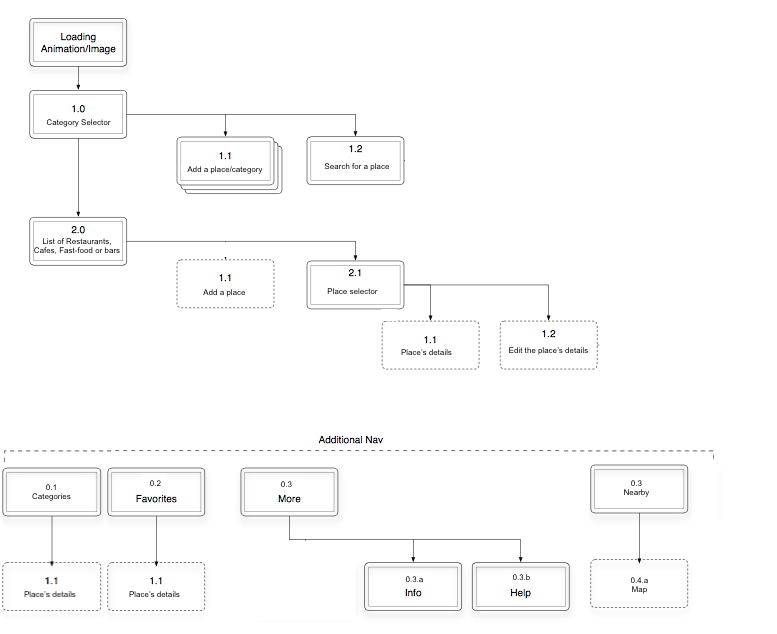
App Map:
My app is a personal guide for restaurants, cafes, fast-food or bar/clubs. It is similar to Yelp except that I only get my own reviews to remember where I’ve been and what I’ve (dis)liked.
App Wireframe: Wireframe – Pauline Hadad
App Map:
You must be logged in to post a comment.
My app map example that I get is a little misleading I think. For things that will go in your tab bar, I’d suggest having all those tabs on the same hierarchical level, with horizontal lines connecting them, instead of putting some under the ‘additional nav’. It’s a clearer way to see the overall hierarchy of the app.
We spoke about this in class, but some way to toggle between a map and a list of places for the main view could make sense. For moving between different categories or searching, you’re essentially filtering all of the places that you have recorded in the app, so that could come up as a modal over the list view or the map view, allowing you to choose what things should be appearing in the list/map view.
I wonder if you should have flexibility to create new categories as you wish with some defaults, or if we should require users to use pre-defined categories.
You’ll probably want to flesh out the add place view (2.0) a bit more. I think that all the content is in there, but before moving to design, you’ll want to figure out the interactions on that page a bit more, so is category view a picker? Is address one line or separate lines for street #/name and city and state? How do I edit or delete a photo after entering one?
Next, how does this page look when I’m editing it in the future or adding another entry? What type of new or ongoing information would be useful for me to record if I return to a place a second time?
It would also be helpful for me if you labelled your wires to match the views that you call out in your app map.
The favorites view could just be another filter on the main map/list view instead of having its own tab as well.
The more tab seems unnecessary. “Info” about your app will live on the App Store, so there’s no need to include it in the app, and your app should be so well designed and clear that you don’t need a help view.