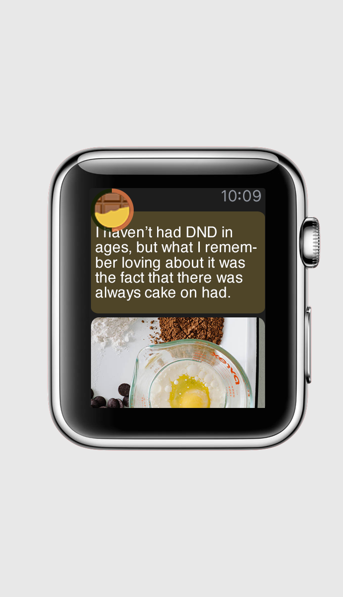
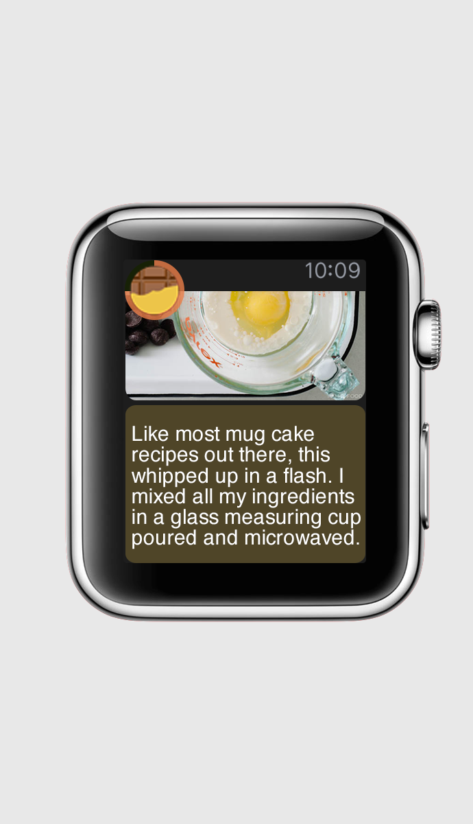
According to the feedback I got from last play test, I made some change on my apple watch app. Here is the digital prototype.
Instruction for my digital prototype: 1. Scrolling Down – tap the blank space on the bottom of page. 2. Force Tap – This function only exits in this page.(Should not, but for the test…) Press the blank space on the top of the page.
The change I made based on the feedback of the prototype test play:
1. I redesign the context menu. After researching, I believe the only thing we and change if the icon images and button labels. The color, position and also the typeface are template. We hardly change too much.

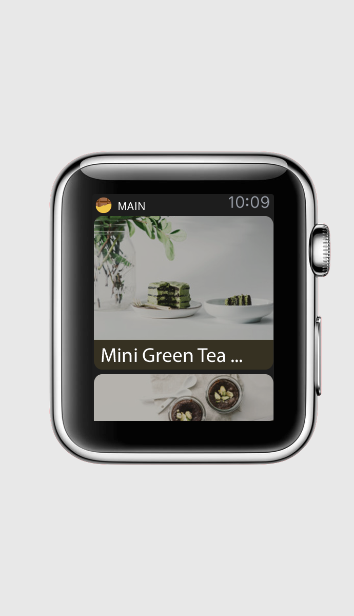
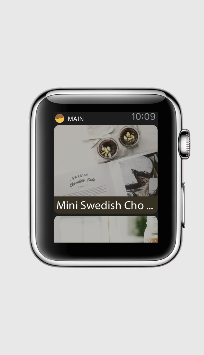
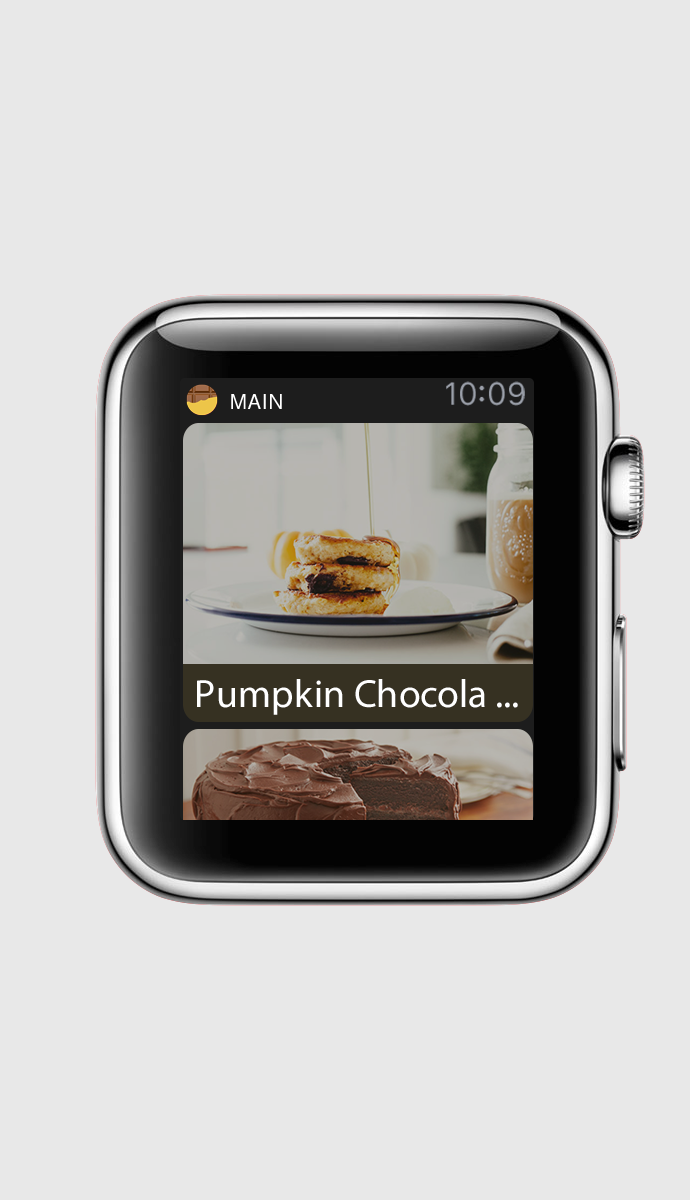
2. In the last version, my app mix the two systems, hierarchical system and the page based system. Therefore I redesign a few pages to make sure I am keeping using the page based system.
3. In my app, I wish when there is some thing(a bar or a label) could provide a hint where he is/how many steps will finish this recipe. I used a left side bar for this purpose. However, during the test I found the bar was hardly to see and also could confuse people to think that is something else. Therefore, I change the design. I use the pie chart under the main page button for this function.