Finally have obtained a brand-new computer after this week’s saga and am posting last week’s blog assignment: to read Apple’s HIG or Google’s Material Design Guide and give examples of 3 things we learned!!!
Since I studied the HIG last semester for my iOS class, I thought it would be useful to see Google’s approach. Although I can develop for iOS, using an iPad, I’m an Android user through and through with my phone. I’ve come to realize this actually gives me a very different subconscious and unintentional understanding of Android vs. iOS. One of learning through recognition, and user experience versus recall from principles learned for design.

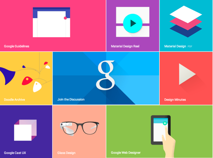
Material Design Concept Art
Just to take a small quote from material design is enough to see its overarching attention to form, space, layering, and symmetry – even if it seems a bit much.
Material is the metaphor
A material metaphor is the unifying theory of a rationalized space and a system of motion. The material is grounded in tactile reality, inspired by the study of paper and ink, yet technologically advanced and open to imagination and magic.
Compared to Apple’s HIG, Material Design reads like a coffee-table art book on how one might imagine layers of “material” in virtual spaces. However, it is actually quite inspired and illustrates the flowery summaries with solid and actionable design examples and methodologies.
Some of the most interesting things I learned about material design were actually things that I have never before noticed on my android devices.
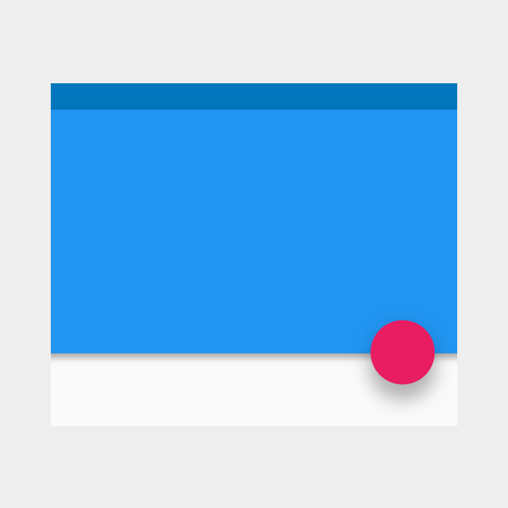
Material has Shadows
“Within the material environment, virtual lights illuminate the scene. Key lights create directional shadows, while ambient light creates soft shadows from all angles.”
In Material Design based Android apps (which isn’t a critical mass just yet) each square of material has this shadow effect, which makes for a really nice experience showing how it lays on top of content. The consistency of this gives the feel of depth, but doesn’t distract with lots of different shadow types. Also the shadow never extends to the material itself, just what is underneath it. The depth and fuzziness of the shadows combine to give a great layered effect to Android apps.

Material Properties
“When split, material can heal. For example, if you remove a portion of material from a sheet of material, the sheet of material will become a whole sheet again.”
I definitely never noticed these as a set of principles before, but lo and behold, as soon as I opened my Google Now Cards on my android, I began to see the magic!
Material has specific ways it can be manipulated as evident by the quote above. It also can only grow/shrink on X/Y axis, not get thicker (all material is 1px thick), and it can’t bend or fold its shape (like a folding piece of paper). It can also be “spontaneously” created and destroyed (lol) anywhere in the environment.
Components & Guidelines
I never realized Material was based on a responsive 12point grid and had very specific components and names for them that differ from iOS. I think this is because of the need to design for different screen sizes. Swift automatically allows for this when making iOS apps, but because of Android variety this must not work for developers, and instead guidelines are called for.

*All Quotes & Images from Google Material Design Guide