This week in Mobile Design we bring you Apple TV!!!!
Now I have my misgivings about Apple TV overall – in terms of its role as a home media center compared to other solutions – but I’m super excited about this project.
Designing for TV is a brand-new experience for me and very very different out of the box than designing for iOS.
According to Apple TV’s Human Interface Guideline, the biggest key differences I could find were:
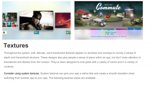
- Media-centric. Apple TV is meant to display high-quality picture & video media first! Makes use of layered images, large, beautiful and consistent layout to do this.
- The menu is an automatic back button, no need for it in navigation.
- Use refined and unobtrusive branding that doesn’t take away from the media you are presenting.
- New gestures. Tap vs. click. vs. click + hold etc.
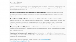
- Lots of Accessibility best-practices and back-end stuff about tagged images, text-to-voice etc.
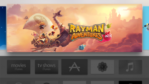
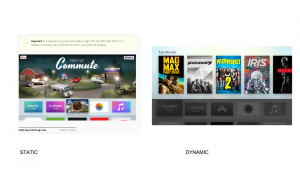
- Must create banner, icons, images to satisfy layering requirements. Consult guidelines for how to do this.


As a result of these key differences, I have had to rethink my app a bit. The biggest insight I had was thinking about my own experience using the PS4 or Wii interface at home – although it isn’t quite the same. I would never normally think to use food apps on these platforms, but if I did, the things I would want to do would be to order food (I’d probably be on the platform to watch/play media and would want to eat in).
You’d think it would be good to order with friends on the TV (kind of like passing your phone around with GrubHub, but I wonder if there is a real value-add here as well. You can’t all look at the menu together, since items are usually individually portioned, so maybe still easier to just look at your own device and use one of them (vs the TV) to make the order? I’m not sure, but just something to think about.
Random aside completed, this platform screams for big rich media, less text, and a seamless experience from one’s couch. So I think you’d most likely be using it to either order in food, or perhaps to find/book a nearby restaurant (after all if you have an Apple Tv… you might go to a restaurant requiring booking!)
So I have decided to refine my platform (can you still call it an app???) to satisfy those two primary needs.
Refined Concept Statement
Spice it Up helps spicy-food lovers discover spicy dishes near their home & order from or book a table at restaurants serving this dish.
Key Use Differences
- Using app at home, not on the go. Group using app.
- Prioritize ordering & booking tables.
- Looking to find different information…
- Nearby: within ordering distance, within traveling distance.
- Rating not important. Too hard without a keyboard.
- Want to know more about restaurant, although start search by dish.
- If ordering, need to order other dishes – not all of them spicy.
- If booking table, need more than one course & to accommodate friends/group.
Core Functionality Changes
- Prioritize discovery, ordering from nearby restaurants, booking tables.
- Sort all information by location, remove as a filter.
- Prioritize cuisine, trending, recent on Home screen.
- Others under filters.
- Provide feedback about distance/travel & if they deliver.
- Allow for user-login, but eliminate profile, just keep spice rating.
- Prioritize importance of restaurant. Use click + hold to quick-navigate to restaurant.
Presentation (App Mapp & Wireframe)
And here is my presentation of the app map and wireframe from in class this week. Can’t wait to design this baby. Sketch here I come!
