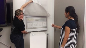
This week we presented our final design for our Apple TV version of our mobile apps from our first project.
Last time I presented several wireframes for Spice It Up TvOS that tried to communicate the essential experiences of the app as translated for an at home experience.
Throughout this process I did a lot more thinking about what it means to be using a TvOS app at home. How does it fit into one’s life? Who will you be using it with? What kind of interactions will change given this new technology?
One of the biggest changes I’ve noticed in the last 5 years, similarly influenced by an addition to the home-entertainment unit, was the effect of ChromeCast on DJing at parties. In the past, creating a party playlist on your iPod, computer, phone etc. was a bit of a singular activity, usually done by the host or an annoying friend who thought they were a DJ. But with the ChromeCast, most of the parties I have been going to actually had multiple users picking songs and queuing them up through the YouTube app on ChromeCast. It completely transformed the way music was done, and parties as music/media watching has become a focal point.
Given changes like this, what does Apple TV mean? I noted in class last week that the interesting thing about Apple TV isn’t really going to be output, we know that it is great at portraying high-class multimedia, video, photo, gaming output designed for being seen on big high-resolution screens.
- But given the new interface, the remote, and the physical separation between the users and the screen itself, it begs the question what is the best kind of input?
- How do you make it a nice navigation experience between items and screens?
- What is too much interface in terms of navigable items?
- What does this mean for text/voice input?
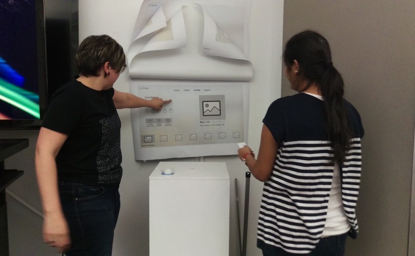
Feedback from User Testing Paper Prototype
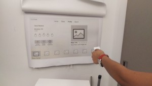
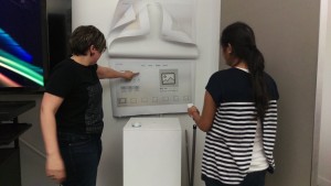
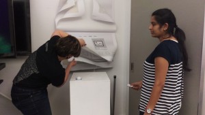
Last week I printed out the screens from my wireframe and tried to imagine the experience through paper-prototyping. I got alot of valuable feedback from this, mostly about ways I was not understanding the Apple TV interface (e.g. no infrared)
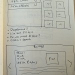
- Confusing to have the filters page go to a whole new page for results, would make more sense if it dynamically updates
- Whose profile is this? Synced with who downloaded app? With TV? Consider eliminating it.
- You should include a ratings page still, even though on TV, people will want to see reviews
- Consider including your filters directly in search – didn’t do this
Given all of these things, I decided to re-read the Apple TV HIG around navigation again, but to explore the actual developer notes for how to implement the code to see if I could better understand the best ways to streamline navigation.
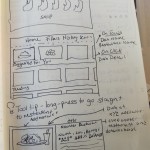
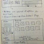
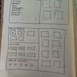
I did a lot of thinking over Spring Break about potential layouts for the app and ways I could cut down the navigation to make it more seamless. Below are some of the sketches I did trying to re-imagine problem areas that user testing revealed on the interface.
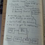
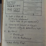
Final Design (Major Changes)
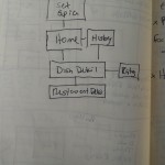
- No user log-in, set up spice entry upon each time (might be with group)
- Dish’s restaurant specific (they can be different at each)
- Make restaurants more easily accessible
- Limited results screens using dynamic updating
Presentation & Interactive Prototype
Check out my final in-class presentaiton and Interactive Prototype below.
Interactive Prototype:
https://marvelapp.com/16db808
Final Presentation:
https://docs.google.com/presentation/d/1F6jH9mbUllZ5KHzptAwUhc7RpsM5QNRKzhh_hCyVpSM/pub?start=false&loop=true&delayms=60000