Hello! This is Ting.
My background is Industrial Design with a year experience in exhibition design.
3 things I learn form IOS Human Interface Guideline is mostly about iPhone X:
1.Bolder navigation. To improve clarity and context when browsing and searching, apps can implement navigation bars that include large, bold titles.
2.Safe area layout guides. Adhering to the system’s safe area ensures appropriate insetting of content within layouts and prevents content from underlapping the status bar, navigation bar, toolbar, and tab bar.
3.Minimize the use of modality. Generally, people prefer to interact with apps in nonlinear ways. Consider creating a modal context only when it’s critical to get someone’s attention, when a task must be completed or abandoned to continue using the app, or to save important data.


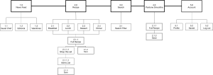
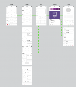
As mentioned in class, it seems like a miss to pass all of the purchasing to Amazon when it’s your main strategy.
All of the content should be driving you to the purchase view. Figure out a way to collapse all the different content and editorial strategies to simplify and drive towards purchase.
The modal isn’t buying you much for purchase. It should likely just be a push to a full view.
Saved seems pretty useful and perhaps worth not hiding under profile.