User Insights:
- Bubble icon – user thought that this was a place to chat
- User was drawn to check own profile
-
- Expected an account icon
-
- Missing back buttons
- Wanted a way to minimize the about section (chef profile) so that it doesn’t take up the whole screen
- Wanted to be able to rate recipe at the bottom of a recipe after making it
- Don’t need a confirmation page for posting a recipe
- User didn’t think settings was important enough to be its own nav item
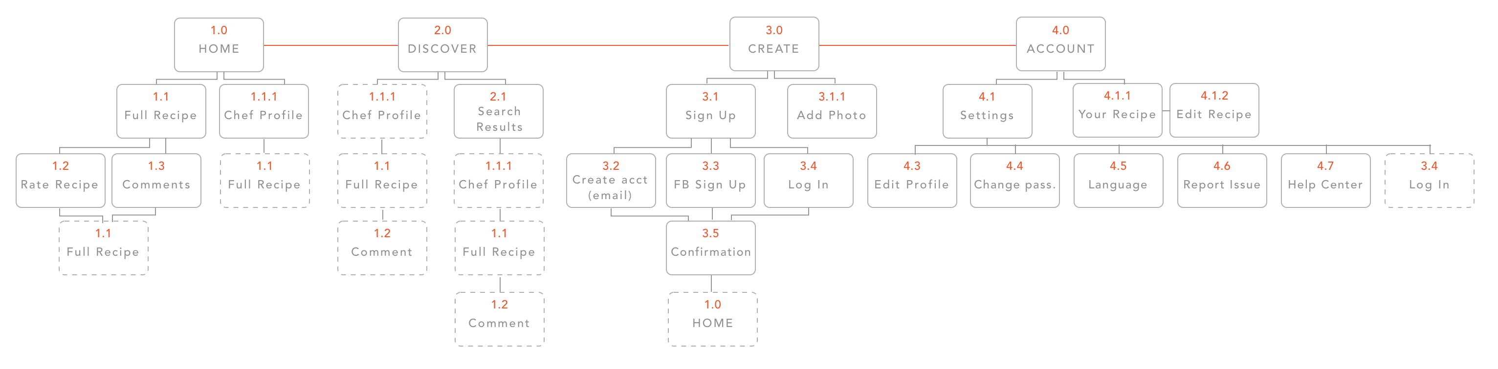
Old App Map
 I realized that a lot of the items that were on my app map were not actual screens, but rather states that occur on the same screen. I also got rid of the settings tab and replaced it with the profile tab, which houses settings.
New App Map
Detailed Wireframes
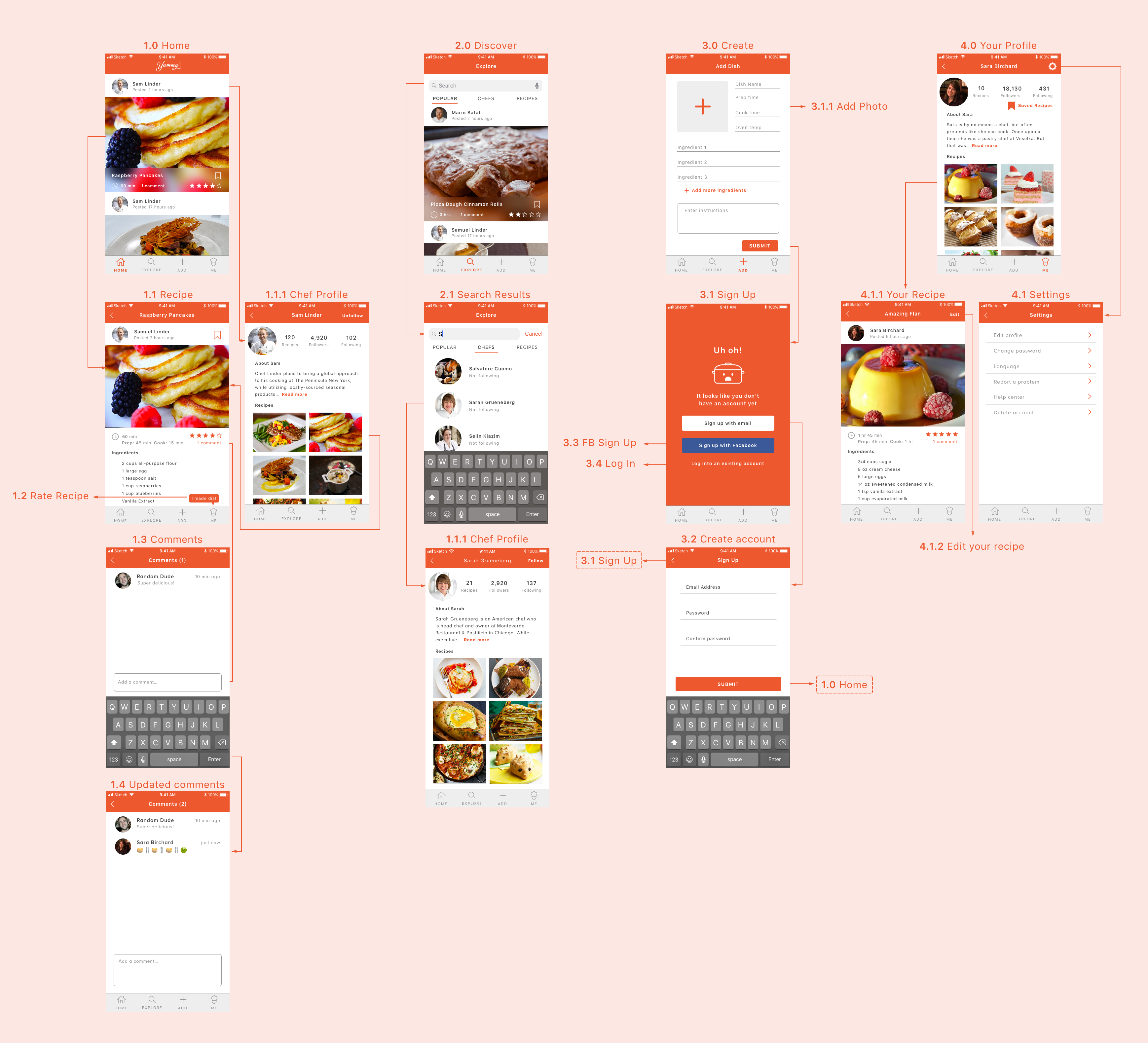
We talked about this plenty in class, but do consider both creation and featuring content of chef versus random users. How does that change the way you display information. It doesn’t feel completely intentional that they’re treated at the same level.
Look at all of your designs on device. The copy across the board looks quite small to me, but check it out on device to make a call.
I think you can push the discover tab a littler further to expose content that a person might browse through for fun or to find new content to follow. Think about what your main goals are for that ab and find a content and interface strategy that argues strongly that it would accomplish that goal.