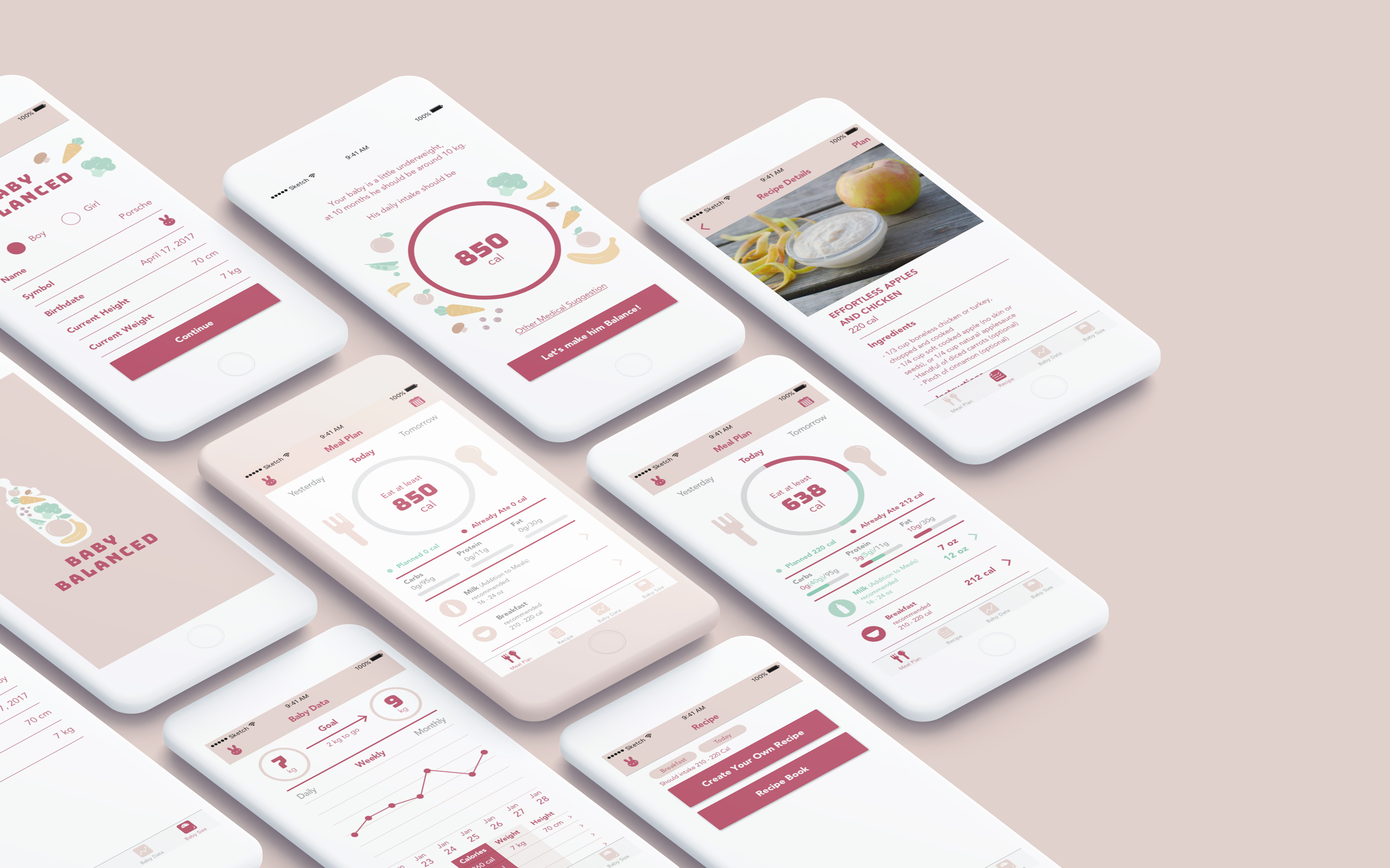
Insights from Week 5 presentation and user test:
- Login is not the right word
- Maybe more special symbols to resemble the baby
- Maybe the baby is not underweight should have space to input doctor’s recommendation
- Why can milk be planned like other meals
- If the family has more than one baby there should be an easier way to swap the baby’s data
- Missing tab bars in many views
- The color of text is hard to read
- Planning the meal is too heavy, should be more simple
- Recipe list confusing
- Easier way to check if the meal was already eaten
Final Version:
https://marvelapp.com/c1efe2j/screen/38996736
After Presentation Insights:
- The baby icon can be a baby picture
- Red psychologically seems to be unfinished and green is finished so the colors in the meal plan should be swapped
- The switch is not a common use for checkbox because it signifies on/off when the baby already ate the meal it can actually be a checkbox instead
- The snacks should still be there, babies eat a lot of meals
- The sign up should be broken down into three screens so it’s not very overwhelming at once
- Not sure of the differences between back button, done, and cancel button