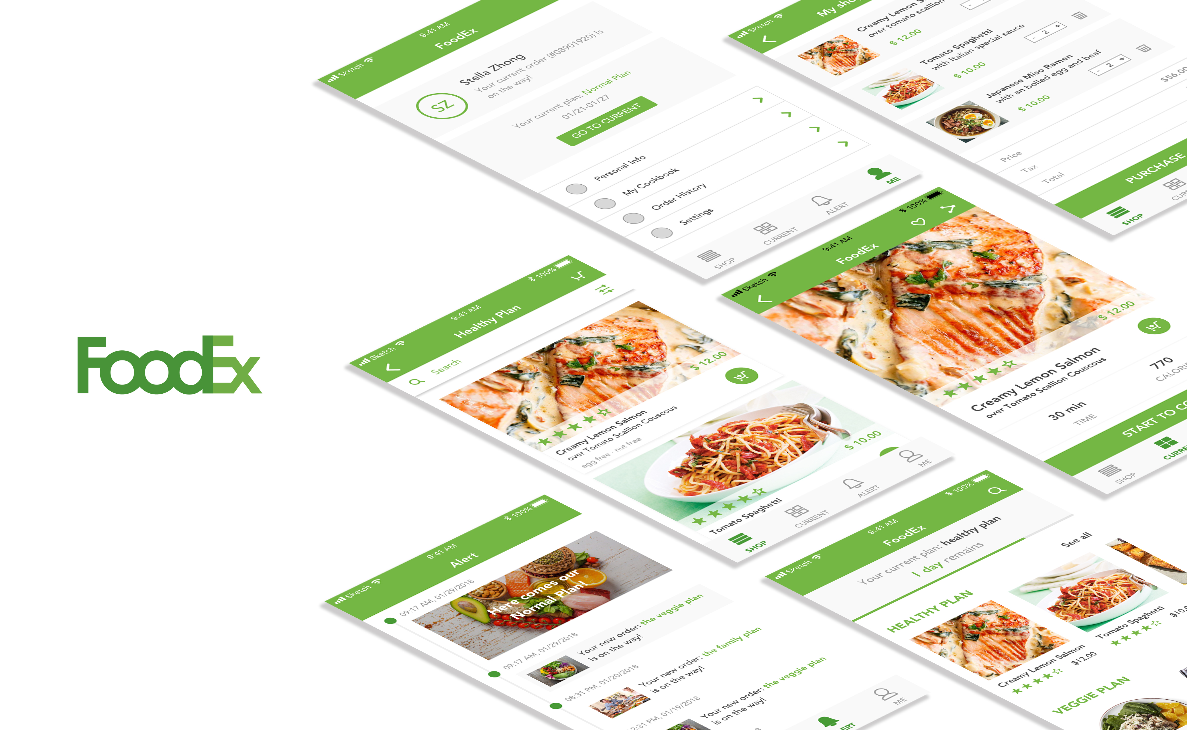
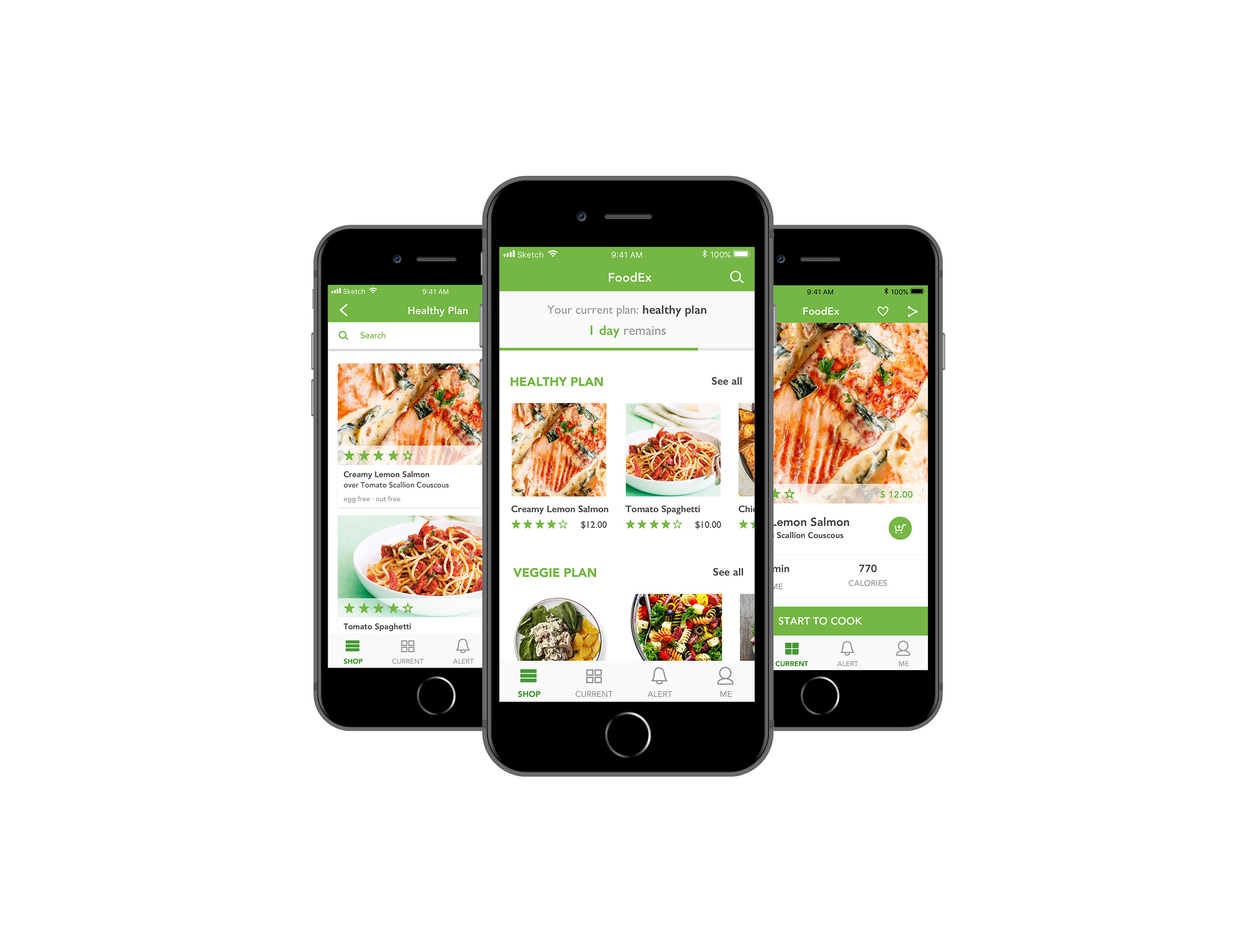
User insights:
- The processing bar on the “SHOP” view is clear enough so there is no need to have an extra view to show the details. Also, “remained” should be “remain”.
- The icon to add recipes in the shopping cart does not make much sense. An “add” icon may work.
- The color of the shopping cart checking button should be consistent.
- The first page of “SHOP” is not that efficient. More useful information should be shown on that view.