What I’ve learned from the Apple TV Human Interface Guidelines
- Consider the user’s distance from the screen. Design interface elements appropriately, so they’re legible, easy to find, and aren’t overwhelmed by background images or adjacent items. I feel that it may be one of the biggest differences between designing an iPhone APP and an Apple TV APP. Users’s distance from the screen should definitely be taken into designers’ consideration.
- Don’t display a cursor. People expect to navigate fixed numbers of items by changing focus, not by trying to drag a tiny cursor around a huge screen.
- No need to show the “BACK” button.
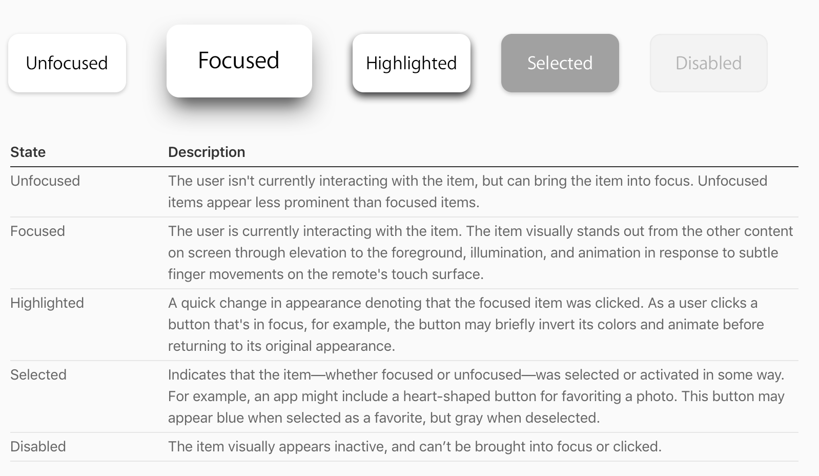
- Design for different focusable item states. On Apple TV, focusable items can have up to five different states, each of which should appear visually distinct.