(pdf) SarahWeverFinalFoodApp
[food app][fridge] ultimate edition
Fridge is a recipe book based on the ingredients that are currently available in your kitchen… and by extension a grocery management system.
The concept arises from the problems in the flow of how i cook, and apparently it is a really common flow:
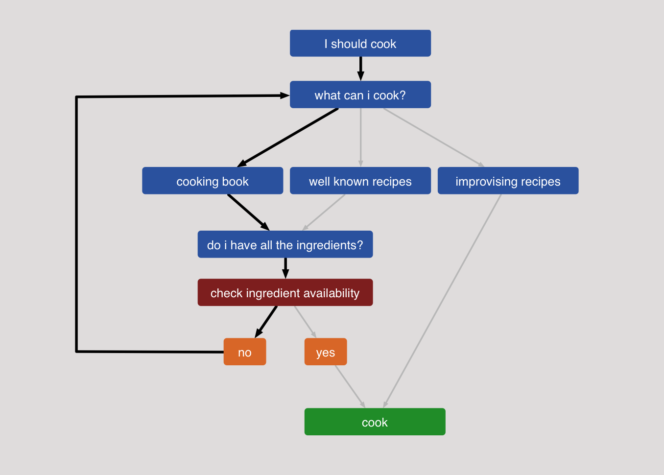
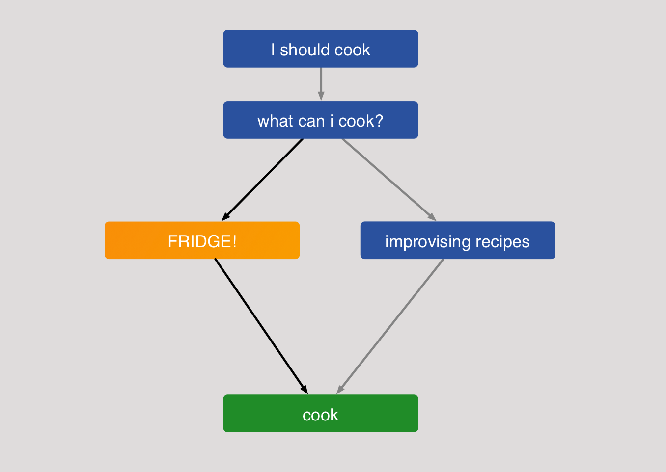
The aim of Fridge! [name in progress] is to eliminate that loop making cooking a less frustrating experience for the user. The way to achieve that is to rethink the flow and making it from the bottom up. Instead of looking for recipes we actually look for the ingredients that the user has and match them to a database that trows back the recipes that are possible to make.
Once the infinite resources that we have to make this app create create the database we can do more than just ask for what the user can cook, but suggest ingredients that the user can buy to expand the available recipes.
UX design
My first approach to this was overcomplicating the app trying to create a geofencing around the home of the user to change between functions and a tutorial. //
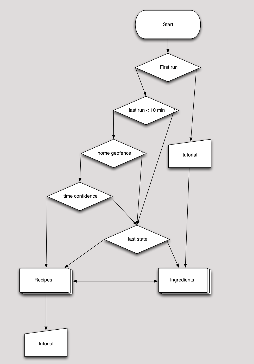
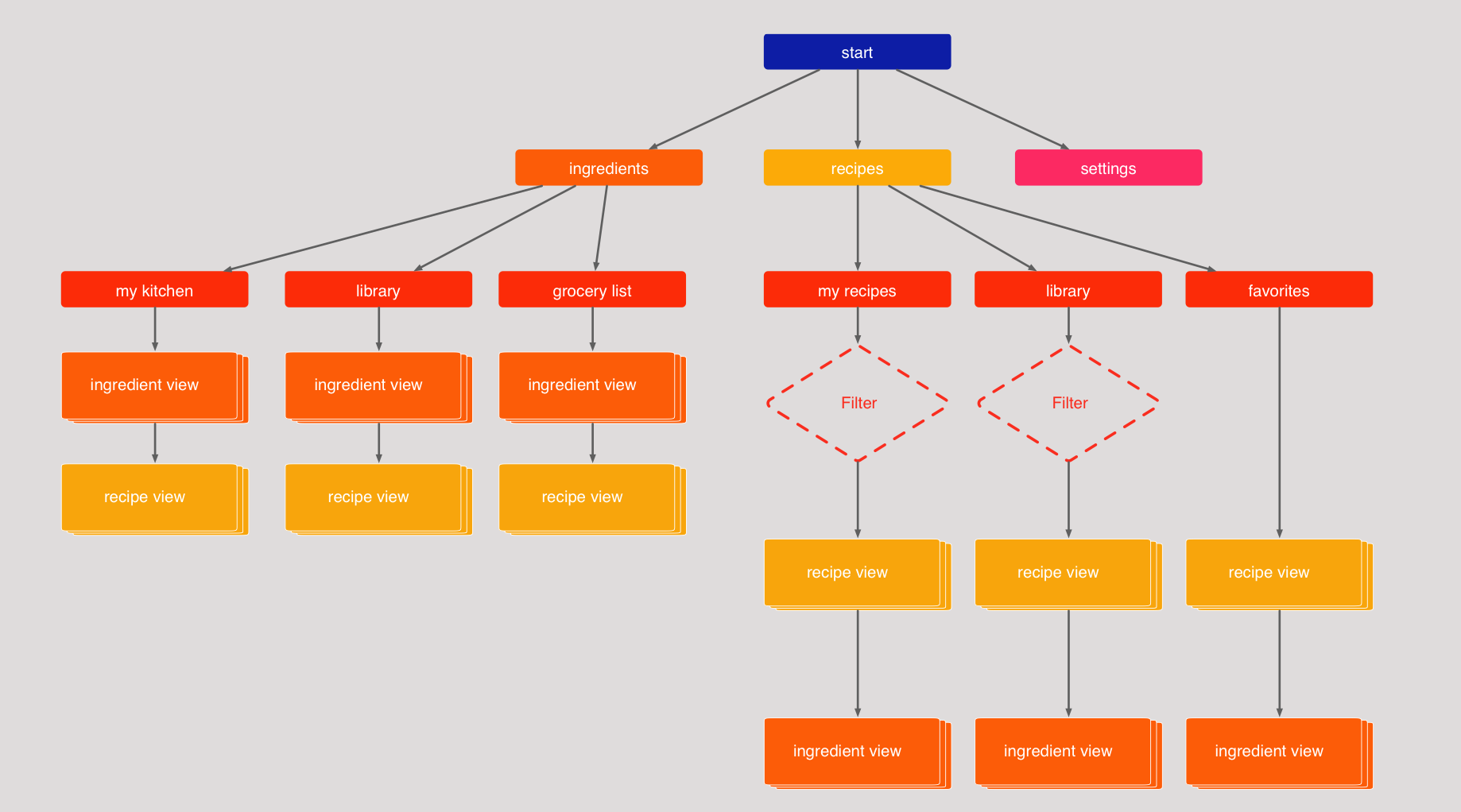
Thanks to the input of the testers and the various iterations of the app the final flow has a lot more functionality and creates a better experience for the normal vs the power user scenario.
UI Design
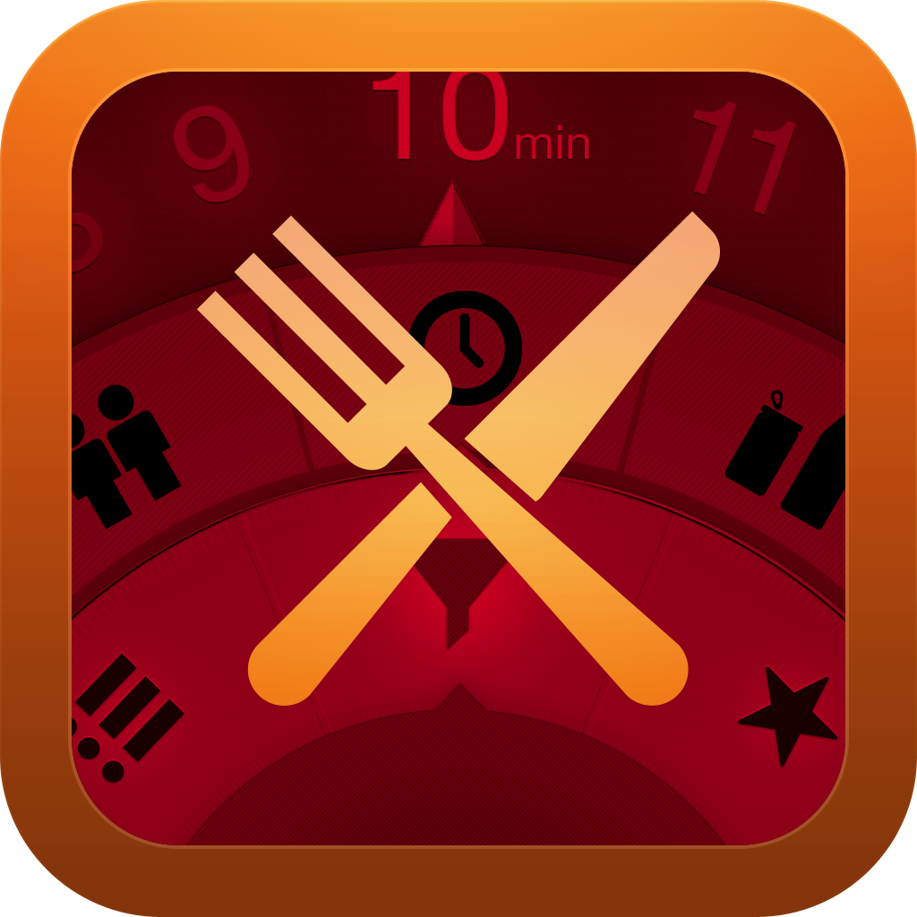
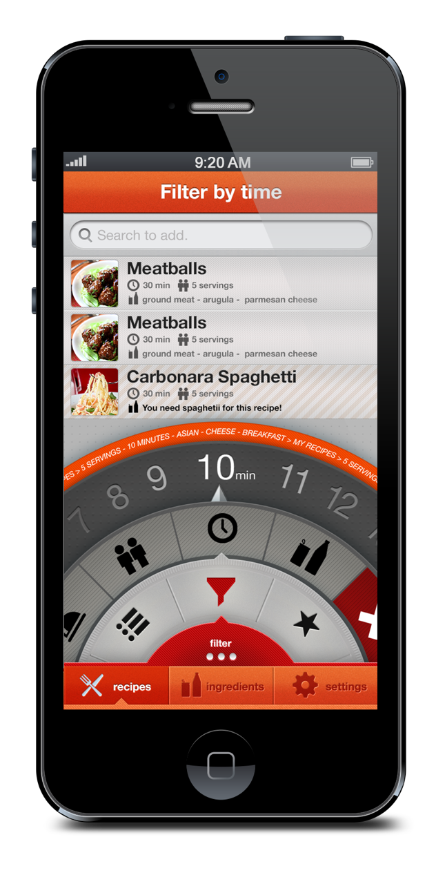
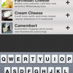
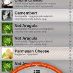
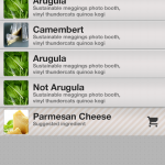
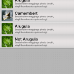
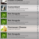
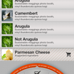
My first set of mockups focused on a very specific element of my interface, i consider that the rest of the app was self explanatory but the filtering system required a lot of thinking and research. I was having really big issues with the amount of information that my app require to keep on screen in order to filter the recipes, and I’m not a huge fan of how Seamless fixed the issue. i found this patent and got interested on circular interfaces. There is a huge amount of reseal around circular interfaces, yet very few of them focus on mobile devices and the “self collapsing half circle” //the pattern that i used is really no show. My biggest inspiration was the circular editing interface of the new tablet microsoft office suite. and the experiments by the old Quicksilver.app developers.

Some additional reading about circular interfaces
http://www.billbuxton.com/MMUserLearn.html // hi priority
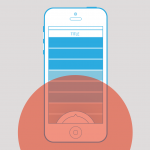

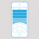
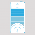
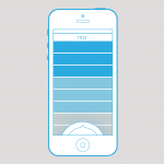
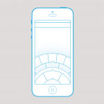
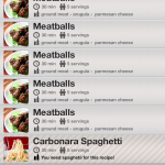
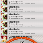
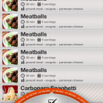
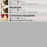
Final design iteration

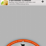

![]()

Yong: Seasonal Cooking Presentaion


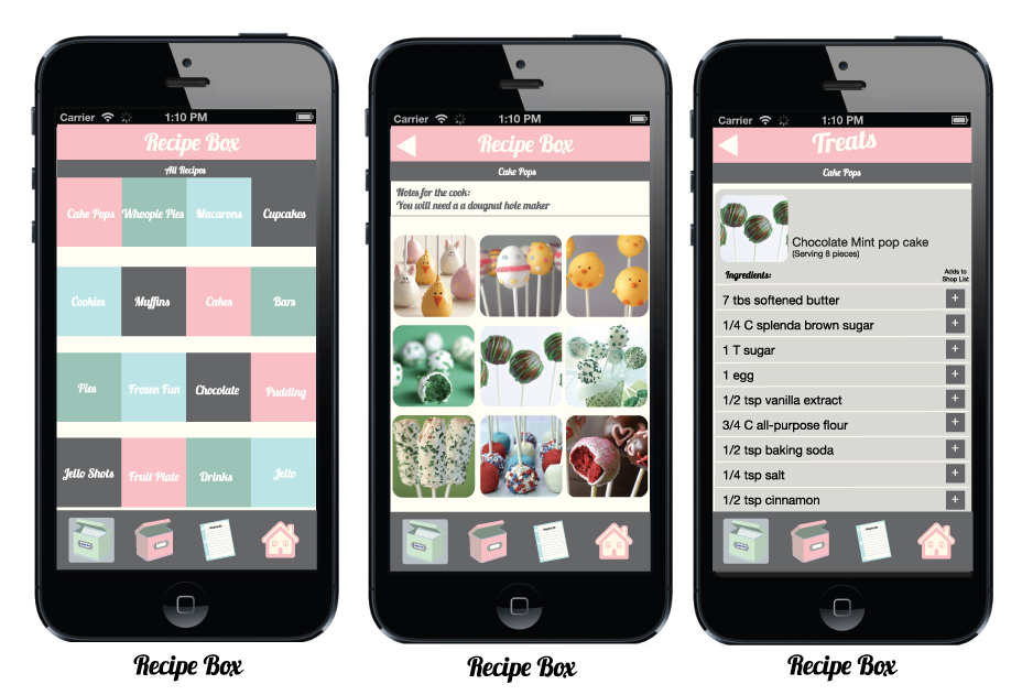
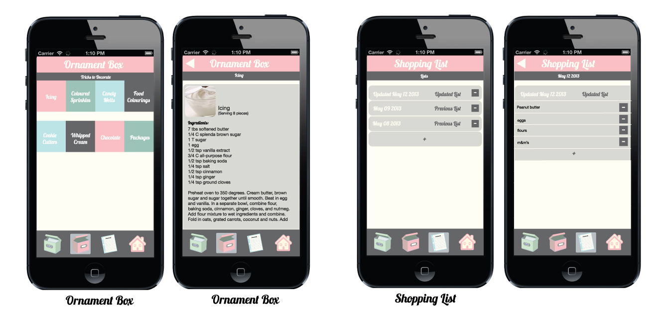
Design – Treats App – Ceyda Onal
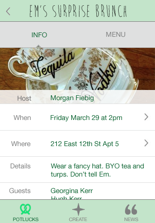
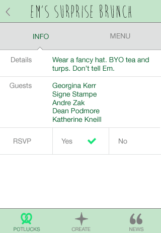
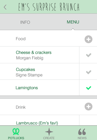
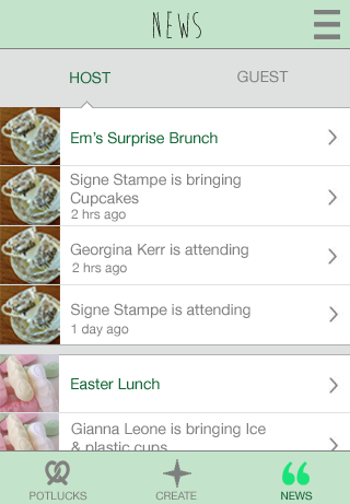
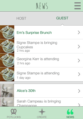
Potluckpal Final Designs
Design Problem:
Introducing…
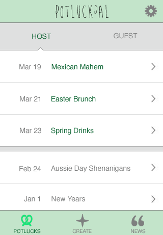
For the Host:


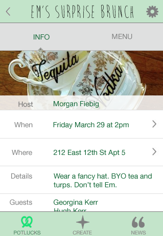
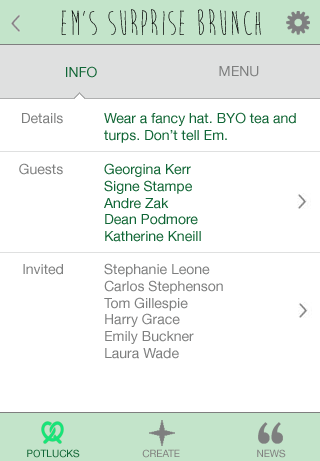

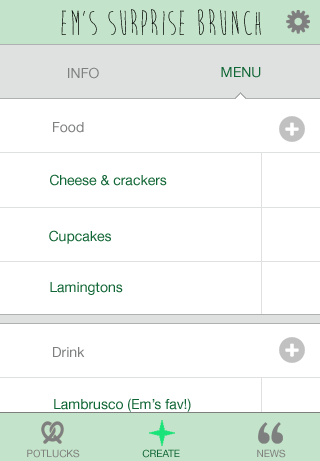


For the Guest:
News:

Suno App
Let’s face it. Waking up in the morning having slept nowhere close to enough hours is not an easy task. Having an app that wakes you up with a combination of light and smooth sounds has served me right over the past couple of weeks. Furthermore, the heavily gesture-based interface makes it cool to set up alarm clocks. Beautiful minimal design, nice typography, and “Clear”‘s alarm clock cousin does a nice job as an alarm clock app. Quoting the app’s website:
Two hundred years waking up hitting an alarm clock, what if we do something new? Try our application. It is called Suno (“sun” in esperanto), and it uses light for waking you up in a smooth way, preparing you for the day. You can select how you want to wake up by setting the light intensity and adding natural sounds to reinforce the process if you feel particularly lazy.
With Suno, your device’s screen becomes a beautiful dawn. Half an hour prior to the time set to wake up, Suno activates your smartphone screen and brightens the room gradually with a soft light, just like dawn. While you are still sleeping, the light gently prepares your body for the awakening. If you set the time to wake up at 8:00 am, the light will begin to increase gradually from 7:30 am. at 8:00, the light will reach its highest level, which can be adjusted according to your preferences. At the set time, your body will be prepared and the natural sounds will accompany the light. You will wake up feeling good.
http://www.nizolab.com/#!suno-app/c1otv
https://vimeo.com/59836941
[monday play][Skala preview]
http://bjango.com/mac/skalapreview/
Hands down the best preview software i found for prototyping on your phone, it uses one of the hidden features of photoshop to send the contents of your mockup to the phone at the correct size almost in real time.

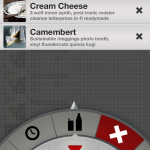
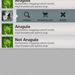
Prototyping: Ingredient Sleuth
 After having users test my application some the suggestions included:
1. Confusion between the LIST tab and FAVORITES tab.
2. Tabs should be present in ever screen
3.Search buttons should be on all screens
4.Typing in the ingredients and choosing how many miles should be in their own page…just put it in with the map screen.
5. Separate List view and Map view
[monday play][open paths]
This App tracks your location data and lets you access from the browser or download it to make interesting data visualizations like this one that i made for bootcamp.

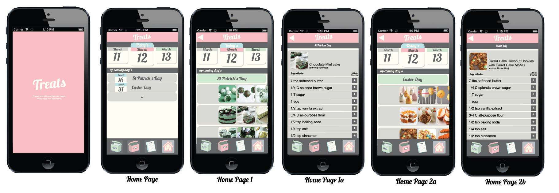
Digital Prototyping – Treat App – Ceyda Onal
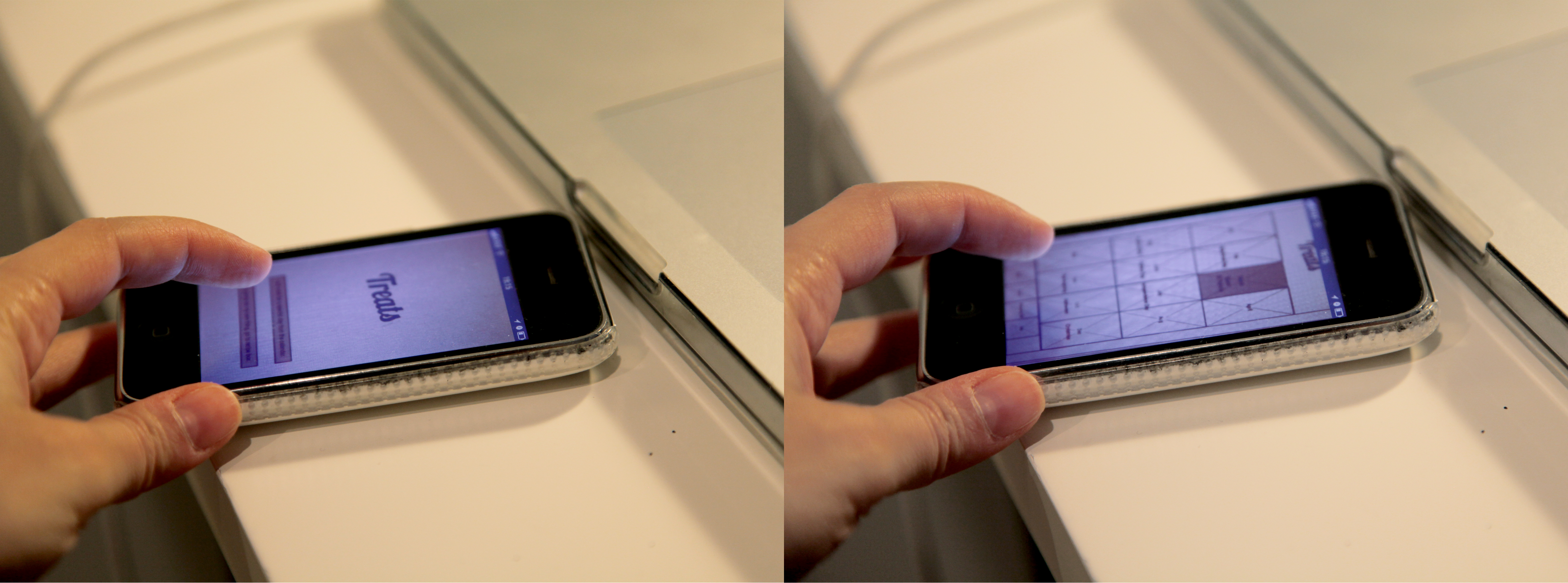
Digital prototyping with the use of POP application was really helpful and Maya’s test drive of the app made me decide to simplify some aspects of the interface
Feed backs to improve for next round are:
– to eliminate the calender interface and just to show the date we are in.
– Changing the home page