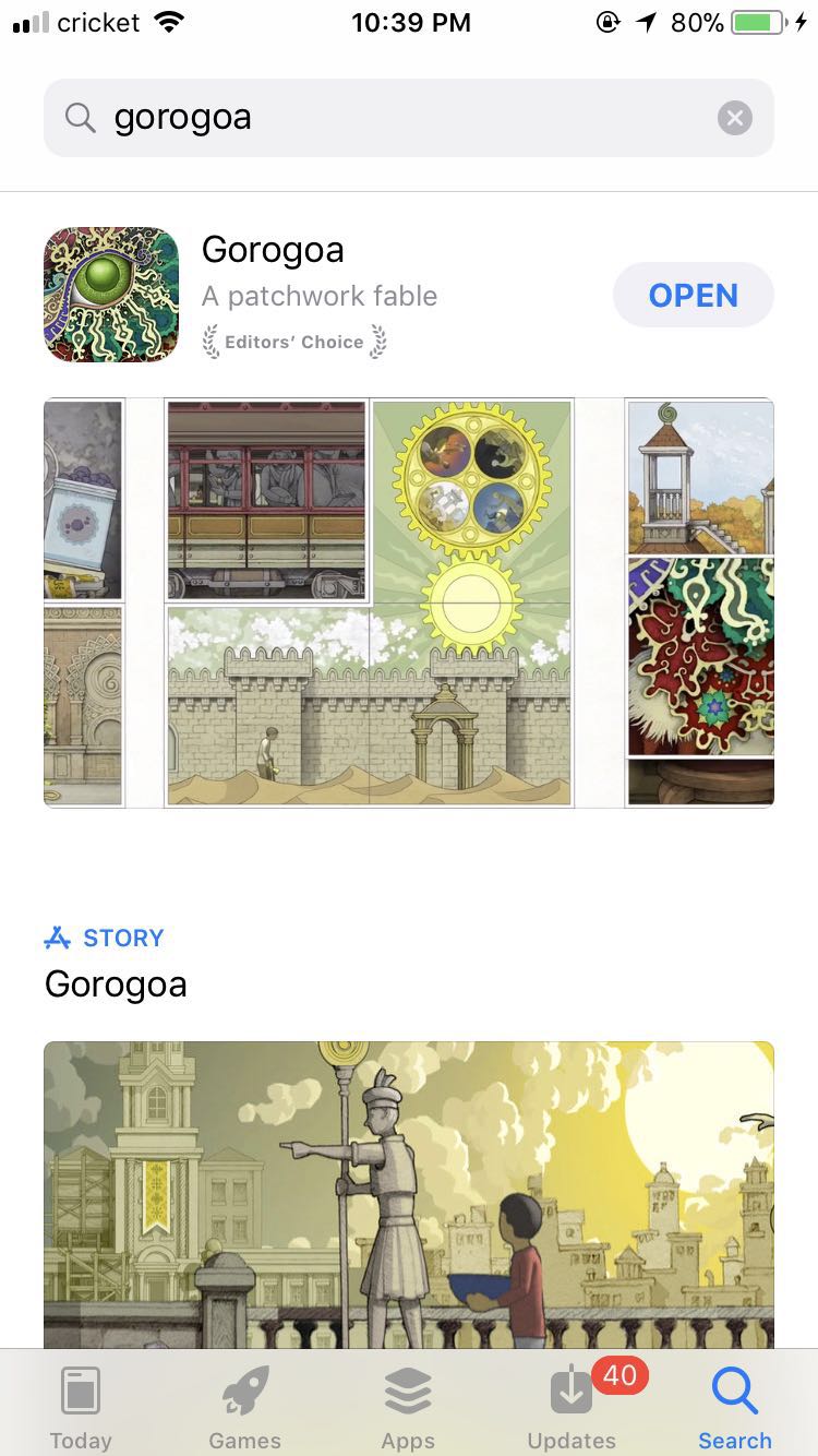
Gorogoa is a puzzle video game and it was released for Windows, Nintendo Switch, and IOS on 14 December 2017.
In Gorogoa players are presented with four images in a grid and must stack, combine, and explore each image to find a connection(buried signals) between them in order to advance and open new areas.Players are not guided through the process, as the game contains no language, and must work out what they need to do to finish each level.
The plot involves a boy seeking an encounter with a divine monster, exploring themes of spiritually and religion. The scenes in the game follow periods of time in the 20th century, including peace, war, and rebuilding.
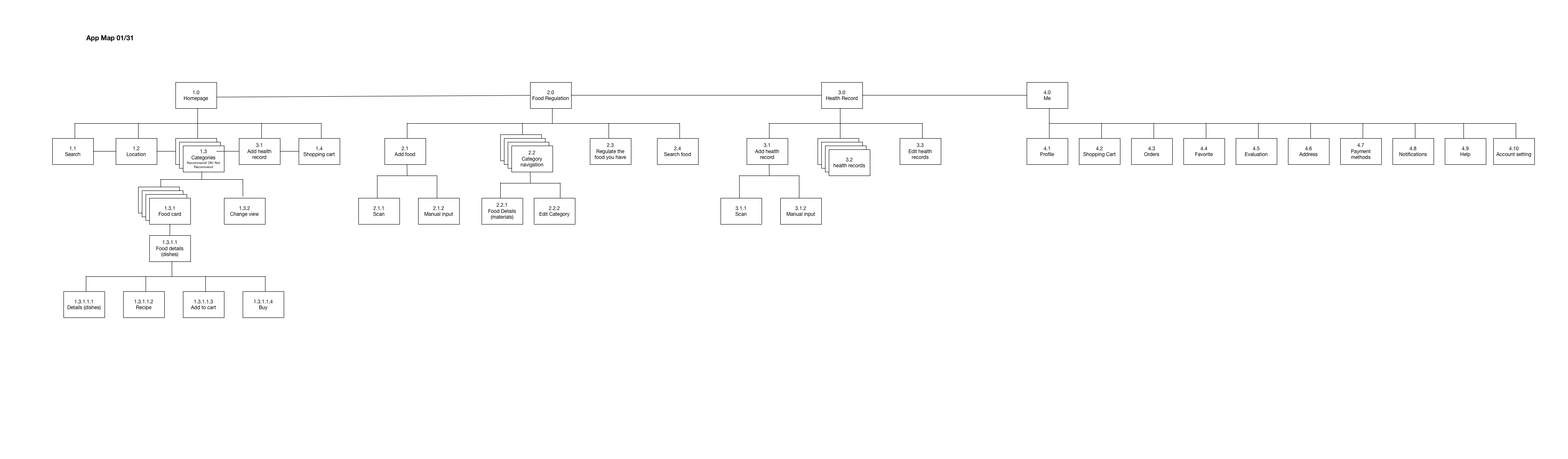
1.Since the health data is important, don’t use reminder page( at most time, users just ignore it). The first time the user uses this app, fill the health data view should be the first thing come out. refer to the baby food app.
2.in the dish details page, the user is likely to don’t know the meaning of the green background. Just repeat the recommended might be helpful.
3.in the health data tab, is the calendar necessary? simplify it. lists
The whole app:
Too many functions are mixed, which causes this app complicated. Home:
1. Give the “Home” tab a name which is related to the content of the tab rather than using “Home”.
2. “Adding to cart” function seems to have the logical problem. Food Regulation:
The name of “Food regulation” seems to confuse the user, which means that the user won’t think the food shown in this tab is the food the user has at home. Health Record:
1. How would you get the health data? Could it link to Health app to get part of the data?
2. The layout of this tab is confusing.
Navigation: Hierarchical Navigation, Flat Navigation, Content-Driven or Experience-Driven Navigation. I didn’t consider much about the types of navigations. This helps me to analyze the information architecture.
3D touch: in the past, when I design interactions, I didn’t consider applying varying levels of pressure to the touchscreen to access additional functions.
Layout Guides and Safe Area: it aids with the positioning, alignment, and spacing of content. I didn’t know safe areas and margins in UI.
About me
My name is Yin Hu, currently a first-year student in MFA DT. I studied Mass Communication in the undergraduate study. And I have two internships in UI&UX area. One is at the user experience lab of Tongji University, in China, the other one is at an internet company. I want to further study UI&UX design more systematically in my graduate study, so I chose Designing for Usability the last semester.
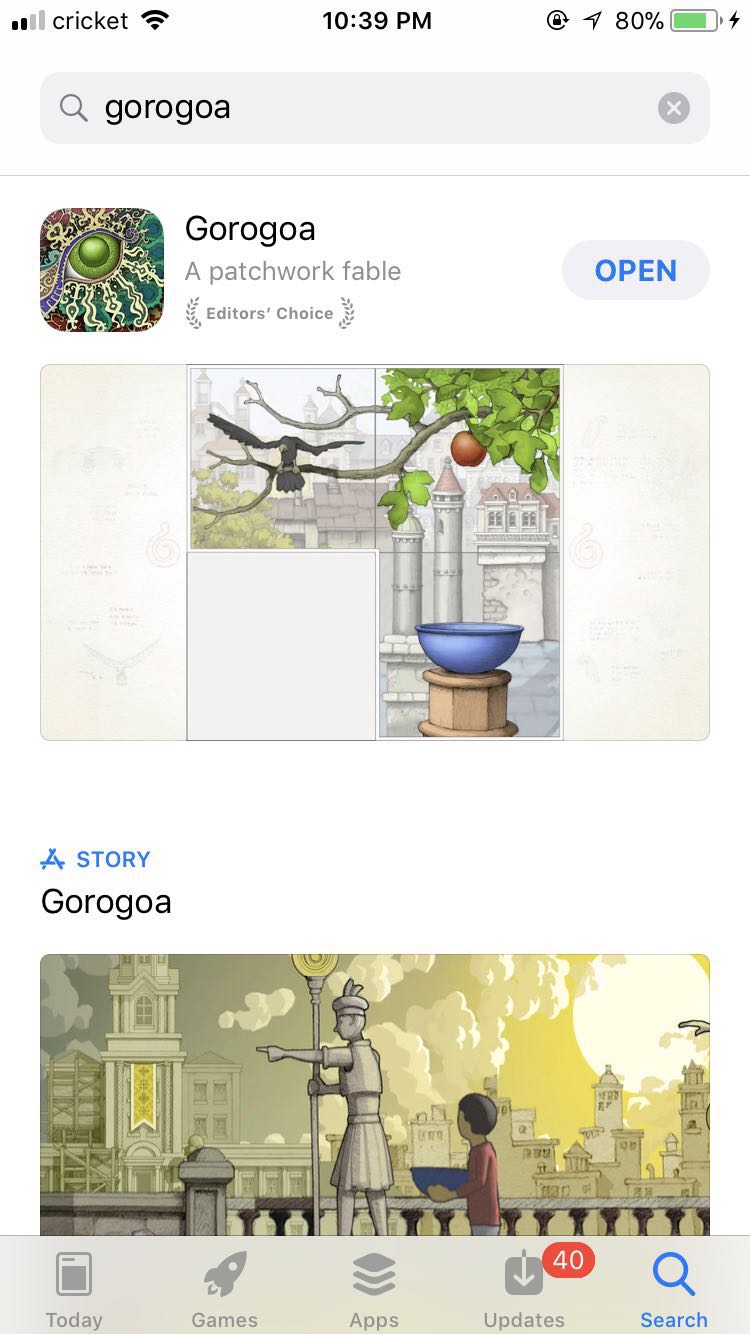 In Gorogoa players are presented with four images in a grid and must stack, combine, and explore each image to find a connection(buried signals) between them in order to advance and open new areas.Players are not guided through the process, as the game contains no language, and must work out what they need to do to finish each level.
.png)